
Chart of the Week: Mapping Unemployment in St. Louis
To add equity data to the national dialogue about growth and prosperity, every week the National Equity Atlas team posts a new chart from the Equity Atlas related to current events and issues.
If there’s one thing we know the candidates will talk about at the second presidential debate, hosted by Washington University in St. Louis on Sunday, it’s the economy. The most recent data available from the Bureau of Labor Statistics puts unemployment at 5.2 percent for the St. Louis metro area in August of 2016. But if want to see how unemployment varies by neighborhood and race/ethnicity in the region, the most recent data available is 2014 (which reflects a five-year average from 2010-2014). The unemployment rate for the St. Louis metro area was 9 percent in 2014—up from 5.5% in 2000. But this was not the case for all people: the unemployment rate for Whites in 2014 was 7 percent, while for people of color it was more than double that figure: 15 percent.
To provide context on the geography of unemployment within the St. Louis metro area, this week’s chart shows side-by-side census tract level maps of White unemployment and unemployment for people of color in 2014. To view the interactive maps online, check out our new mapping breakdown.
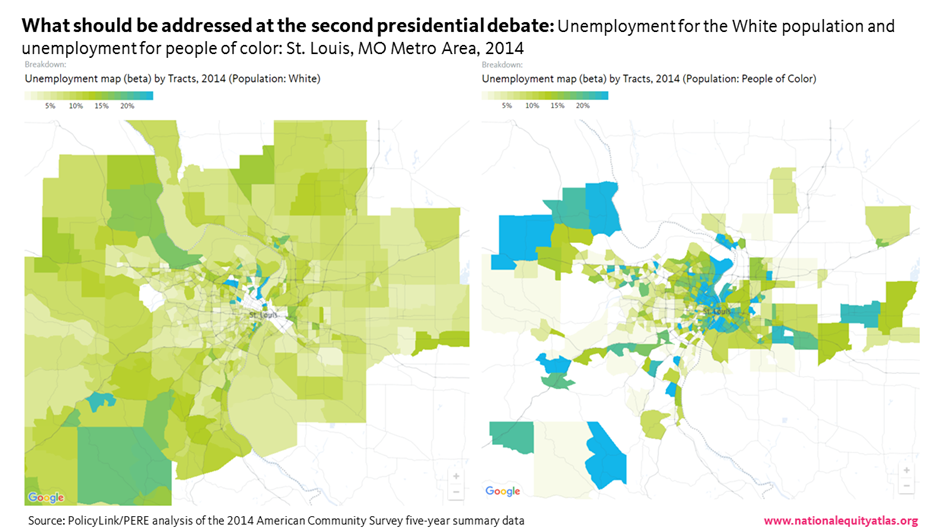
As the map legend describes, the lighter the green, the lower the unemployment rate. The blue census tracts, on the other hand, have an unemployment rate greater than 20 percent.
The map on the left shows White unemployment in the region, and the only blue areas are in North County and St. Clair. There are several tracts near the center of the map that are blank—these tracts do not have enough White people to report White unemployment (the Atlas threshold is at least 100 people in the denominator).
Meanwhile, the map on the right shows unemployment for people of color. It’s an entirely different picture, with several blue tracts throughout the region, including some of the same tracts that were green for Whites (indicating that some people of color experience significantly higher rates of unemployment compared with Whites even when they live in the same neighborhood). The blank census tracts on this map do not have enough residents of color to report unemployment.
In an equitable economy, unemployment would be low and all workers would have similar success in finding work, regardless of race or gender. These maps can support regions interested in addressing these spatial and racial inequities through developing targeted hiring initiatives as part of new development or through smart investments in infrastructure projects. In addition to information about the neighborhood-level unemployment rate, the maps also provide information on the total number of unemployed people. An analysis produced by PolicyLink/PERE for the FedUp Campaign found that if there were full employment in the St. Louis Area in 2015, over 100,000 more workers would be employed—contributing to a $7.8 billion increase in the GDP and $1.7 billion more in tax revenue to strengthen the social safety net.
To view the new maps added to the Atlas for your community, visit the National Equity Atlas and type in your city, region, or state. Download the map and share it on social media using #equitydata. You can read an overview of the new mapping breakdowns added to the Atlas, here.