
Chart of the Week: Location Matters For Health
To add equity data to the national dialogue about growth and prosperity, every week the National Equity Atlas team posts a new chart from the Equity Atlas related to current events and issues.
There is growing consensus among public health researchers and officials that what happens in your neighborhood matters more for your health than what happens in your doctor’s office. “In many ways, your zip code is more important than your genetic code when it comes to health,” said Jay Butler, Alaska’s chief medical officer and director of public health, in a recent Washington Post article. Just a few days ago, the California Endowment launched an online tool underscoring this claim: California residents can type in their home address and see how their life expectancy varies from those in other neighborhoods.
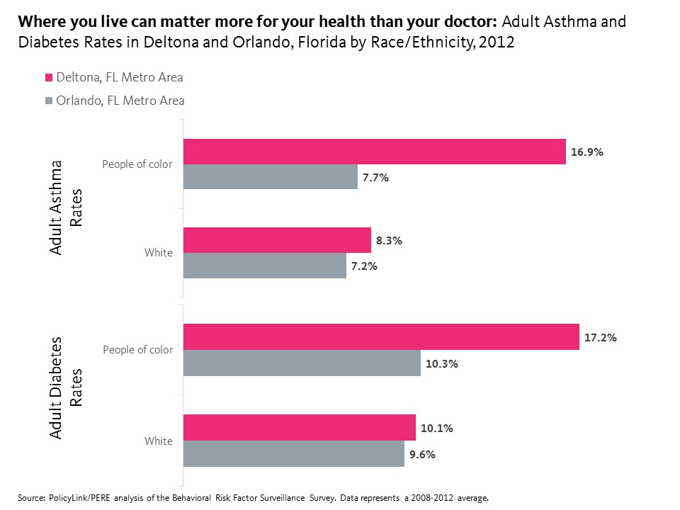
This week’s chart highlights some of these inequities by comparing the disparate health outcomes in two neighboring regions in Florida: Orlando and Deltona. As the chart below shows, both adult asthma and adult diabetes rates are significantly higher in the Deltona-Daytona Beach-Ormond Beach region than in the Orlando region for both people of color and Whites—though they are especially higher for people of color. People of color in the Deltona region are twice as likely as Whites to have asthma and nearly twice as likely as Whites to have diabetes.
Healthy neighborhoods provide residents with access to parks, healthy food, clean air, safe streets, and health care and social services. Due in part to racial residential segregation, many of the neighborhoods where people of color live lack these health-promoting ingredients, and these groups are more likely to suffer from obesity, asthma, diabetes, heart disease, and other chronic diseases. Policies that promote healthy communities for all include requiring health impact assessments as part of the planning process and creating dedicated funding streams like the Healthy Food Financing Initiative to support grocery stores and other fresh food markets in low-income underserved communities.
To see adult asthma and diabetes rates in your community and how your community ranks among the largest 150 metro areas, visit the National Equity Atlas, type in your metro area, and share the chart on social media using #equitydata.