Por Eliza McCullough y Brian Dolber de Rideshare Drivers United*
El uso de la letra “e” en vez de "a/o" cuando se refiere a una persona es intencional y es parte de nuestros principios de ser inclusivos. Se trata de asegurar que nuestres parientes trans y otres que no se identifiquen con el género binario sean incluides en nuestro reporte.
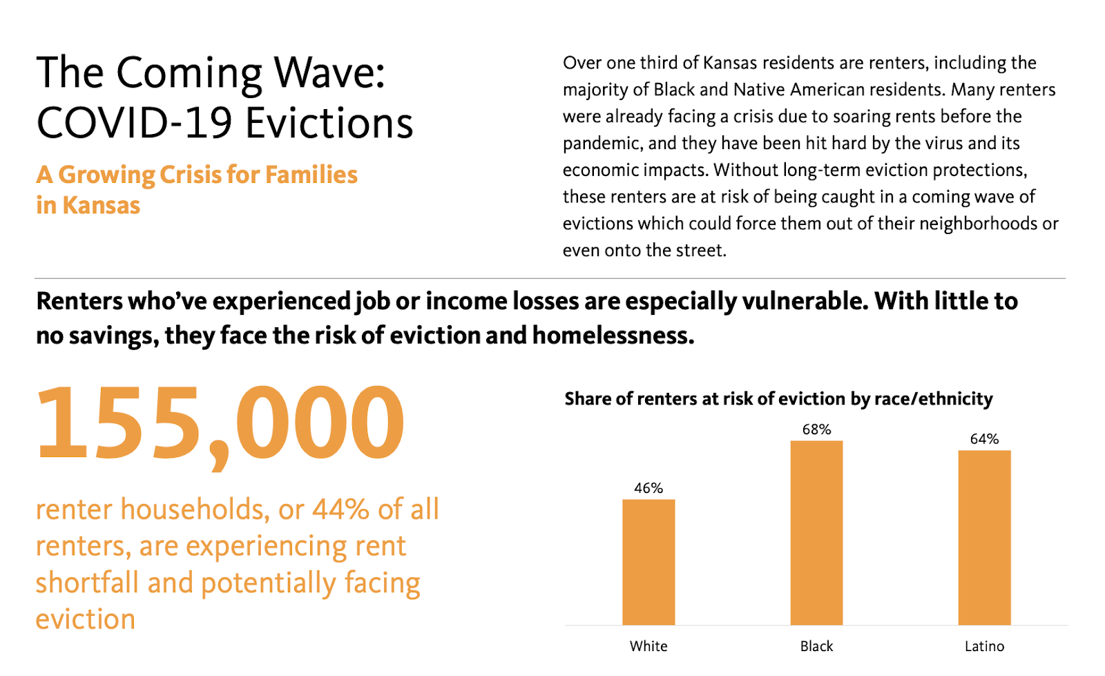
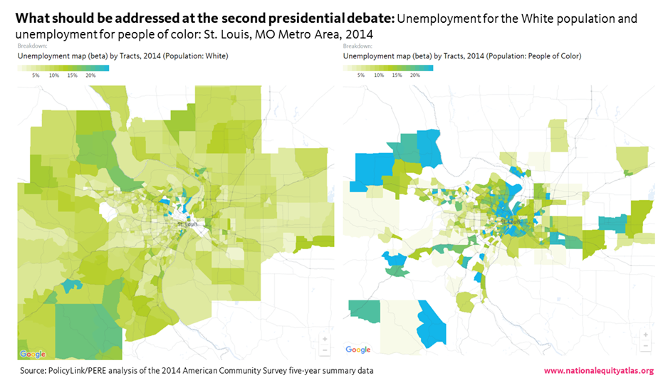
Una encuesta de más de 500 conductores revela que les conductores de viaje compartido (rideshare) de California, en particular les conductores Latines, están teniendo dificultad para tener acceso al seguro de la salud y un lugar de trabajo seguro.
En el 2020, Uber, Lyft, DoorDash, y otros gigantes de la industria tecnológica, se gastaron una cantidad sin precedentes de $220 millones para llevar a cabo una campaña de referendo para no tener que clasificar a sus trabajadores como empleades bajo la ley estatal de California, conocida como AB5. Las empresas argumentaron que la Propuesta 22 protegería la “flexibilidad” de les trabajadores que se contratan por aplicación en California, y que les proporcionaría beneficios incluyendo estipendios para seguro de salud y entrenamiento de seguridad. La Propuesta 22 fue aprobada en noviembre del 2020 con un porcentaje del 58 por ciento de los votos.
De hecho, el éxito de las empresas privó a les conductores de los derechos básicos en el trabajo, incluyendo beneficios para el cuidado de la salud, un salario mínimo por hora, y los niveles de salud y seguridad. La profesora de derecho laboral Veena Dubal le llamó a la Propuesta 22 “la ley laboral más peligrosa para les trabajadores desde la ley Taft-Hartley,” la cual restringió drásticamente a los sindicatos, argumentando que ésta crea un precedente peligroso para los niveles de empleo en todas las industrias.
Aunque la campaña de la industria se enfocó en las protecciones a les trabajadores de la Propuesta 22, estas protecciones están escasamente definidas en la ley y no son iguales a las protecciones legales dadas a les empleades. Les conductores tienen derecho a un estipendio parcial para cubrir las primas del seguro de salud, y solamente si cumplen con múltiples requisitos. [1] La propuesta 22 también requería que las empresas administren entrenamientos de seguridad a todos les conductores, y estos deben incluir información de cómo reportar situaciones de agresión y acoso sexual. Sin embargo, este requisito, es mucho más leve que las protecciones que les empleades tienen bajo la Occupational Safety and Health Act (la Ley de Sanidad y Seguridad Ocupacional). Con el brote del virus del Corona, la pérdida de seguro médico garantizado y de los niveles de seguridad en el lugar de trabajo han causado riesgos de salud sin precedente para les conductores.
Para comprender si les conductores están teniendo acceso a los beneficios, llevamos a cabo una encuesta de conductores miembros de Rideshare Drivers United (RDU), basados en California, preguntándoles acerca de su acceso al seguro de la salud, los estipendios para el seguro de la salud y los entrenamientos de seguridad. La encuesta se llevó a cabo entre el 19 de mayo y el 12 de junio del 2021, y fue completada por 531 conductores. Debido a las evidentes desigualdades raciales en los datos de la encuesta, tratamos de comprender mejor las experiencias de les conductores de color con entrevistas de seguimiento. Llevamos a cabo 10 entrevistas con conductores sin seguro quienes hayan manejado desde enero del 2021. Dos de esas entrevistas se llevaron a cabo con conductores primordialmente de habla hispana. [Para ver las citas en español, ver las anotaciones al pie de la página].
Nuestra encuesta reveló lo siguiente:
- Solamente el 10 por ciento de los encuestados reciben un estipendio, mientras que el 40 por ciento de les encuestades o nunca ha escuchado respecto a poder recibir los estipendios o no estaban seguros si habían recibido la notificación.
- Los conductores buscan las opciones de seguro público para la salud, o se privan totalmente del seguro para la salud. Veintinueve por ciento de les encuestades depende de Medi-Cal. Dieciséis por ciento de todos les encuestades no están asegurados, lo cual es el doble de la tasa nacional de personas sin seguro.
- Les Latines encuestades tienen menos posibilidad de saber respecto a los estipendios y mayor posibilidad que no estén asegurados.
- Uno de cada seis encuestades no ha recibido entrenamiento de seguridad de una empresa de entrega o rideshare.
Muchos de les conductores entrevistados expresaron frustración con los retos al tratar de conseguir seguro bajo la Propuesta 22, y la mayor parte lo ve como parte de un patrón más amplio de engaño y desconsideración hacia la fuerza laboral de parte de Uber y Lyft. En algunos casos, les conductores reportaron gran dificultad para obtener cuidado médico.
Para mejorar de inmediato el acceso al cuidado de la salud y la seguridad en el lugar de trabajo, recomendamos quitar las restricciones al estipendio para el cuidado de la salud, mejorar la transparencia en la implementación de los estipendios, enfocar ayuda a les conductores con mayor posibilidad de no estar asegurados, y mejorar la implementación de entrenamientos de seguridad. Además, se necesitan cambios a largo plazo a las políticas para crear una industria rideshare que proporcione trabajos de calidad. Les legisladores de California deberían revocar la Propuesta 22 y les legisladores de otros estados deberían prevenir que se aprueben propuestas similares a la Propuesta 22. El gobierno federal también juega un papel importante para asegurar las condiciones de trabajo justas y un salario digno para todos les trabajadores por obra, por medio de políticas como la PRO-Act, así como un programa de salud nacional de pagador único.
Una fuerza laboral en su mayoría inmigrantes y personas de color.
Entre nuestros encuestades, el 65 por ciento son personas de color, 52 por ciento nacieron fuera de los E.E.U.U., y el 37 por ciento habla primordialmente otro idioma que no es inglés. Ochenta y cinco por ciento de les encuestades conduce para Uber, el 68 por ciento conduce para Lyft, y el 59 por ciento de encuestados conduce para un servicio de entrega de alimentos (como Uber Eats, Postmates, o DoorDash). El sesenta y seis por ciento de les encuestades conduce para más de una plataforma y el 75 por ciento ha conducido desde el 1 de enero del 2021, cuando la Propuesta 22 entro en vigor. Cincuenta y uno por ciento de les encuestades eran mayores de 50 y el 21 por ciento de les encuestades eran mayores de la edad de 60, haciendo particularmente importante su acceso al seguro para la salud. No hay una fuente de información de calidad respecto a la demografía de les conductores para evaluar la representación de dicha muestra. Sin embargo, un estudio reciente de les conductores de San Francisco demuestra que, igual que la población de nuestros encuestades, la mayoría de les conductores son personas de color, inmigrantes, mayores de 30 años, y conducen para plataformas múltiples.
Uber y Lyft no notifican adecuadamente a sus conductores respecto a poder calificar para estipendios para la salud.
El cuarenta por ciento de les conductores encuestades no recuerda haber sido notificado respecto a los estipendios, con grandes diferencias entre los grupos raciales/étnicos. Les conductores Latines tienen menos posibilidad de saber respecto a los estipendios: Aproximadamente la mitad de les conductores Latines no recuerdan haber recibido ninguna notificación o no están seguros.
!function(){"use strict";window.addEventListener("message",(function(e){if(void 0!==e.data["datawrapper-height"]){var t=document.querySelectorAll("iframe");for(var a in e.data["datawrapper-height"])for(var r=0;r
Un conductor Latine de 31 años mencionó, “Nadie se comunicó conmigo para decirme lo que era”. La falta de comunicación de parte de las empresas no le sorprende. “Para ser sincero, a ellos no les importan los conductores. Yo sabía que (las promesas de la Propuesta 22) no iban a ser verdaderas.”
Quienes fueron notificados dicen haber recibido correos electrónicos o mensajes de texto de las empresas. Sin embargo, la simple información no significa acceso. Por ejemplo, un conductor de 36 años, hispanohablante en Los Ángeles, dijo: “Yo recibí un correo electrónico con la información. En la aplicación aparece también las horas que uno necesita registrar para cumplir los requisitos para el cupón. Yo también trabajé en DoorDash durante la pandemia. Yo cambiaba entre las plataformas, Uber, Lyft, DoorDash. Con Uber tengo que pasar 20 horas semanales con pasajeros para cumplir los requisitos. Ellos mintieron a los conductores respecto al seguro médico ya que yo estoy aquí, trabajando y no tengo seguro.” Las restricciones en los requisitos para la elegibilidad, además de la mala comunicación, han hecho difícil el acceso a los estipendios de seguro para muchos conductores, especialmente les conductores de color.
La Propuesta 22 redujo el acceso al cuidado de la salud: Menos de uno en cinco conductores reciben estipendios para el cuidado de la salud.
Los requisitos de la Propuesta 22 no han reparado los derechos perdidos de les trabajadores de recibir cuidado para la salud, ya que la mayoría de les conductores no reciben estipendios para el cuidado de la salud. Esto se debe en gran parte a la limitación en los requisitos para calificar para los estipendios bajo la Propuesta 22. Para poder calificar, les conductores no deben recibir cuidado de la salud por medio de Medicare, Medi-Cal, otro trabajo, o por medio de cónyuge o compañere/a. Les conductores deben conducir por lo menos 15 horas participadas por semana en una sola aplicación para recibir el estipendio mínimo. Les conductores también han reportado que deben “mostrar comprobante de seguro de la salud dentro cierto tiempo, antes de solicitar el estipendio,” indicando así que les conductores que no están asegurados podrían no calificar. Juntos, estos requisitos previenen que la mayoría de les conductores tengan acceso a los estipendios para el cuidado de la salud prometidos bajo la Propuesta 22.
!function(){"use strict";window.addEventListener("message",(function(e){if(void 0!==e.data["datawrapper-height"]){var t=document.querySelectorAll("iframe");for(var a in e.data["datawrapper-height"])for(var r=0;r
Muches conductores no son elegibles ya que sus horas se han reducido por lo tanto sus ingresos se han visto reducidos. Un conductor de 49 años en Los Ángeles, y su hijo de 18 años, ambos han estado sin seguro por nueve meses por esta razón. “Los precios han bajado a .50 cts. [por milla], así que raramente manejo estos días,” dijo.
Aunque él no votó por la Propuesta 22, la apoyaba. “pensé que recibiría seguro gratuito,” dijo. “Me siento tenso.” Él dice que su hijo tuvo una emergencia médica, y tuvo que depender de Medi-Cal, el programa de seguro público, para cubrir los gastos. “Me preocupo ya que casi cumplo 50 y no sé qué va a pasar si sigo conduciendo para Uber y Lyft.”
El conductor de habla hispana de 36 años en Los Ángeles mencionó, “Los conductores se sienten engañados. Estas empresas gastaron mucho dinero en campaña política. Ellos controlan la plataforma. Estos cambios en las empresas se ven muy bien hasta que se sabe la verdad. Las horas necesarias para cumplir los requisitos son demasiadas para ser justas. Nos mintieron. Uber ha estado haciendo demasiados cambios sin la participación de les conductores.
Un conductor de 66 años en el área de San Diego dice que no maneja lo suficiente para recibir un estipendio ya que tuvo que conseguir un trabajo adicional para subsistir. Él dice que es afortunado de vivir cerca de Tecate en la frontera de México-E.E.U.U. Él cruza la frontera para recibir cuidado asequible. “Algunos de los mejores médicos están en México,” dijo. “Lo máximo de espera son como 15 minutos.”
Entre les encuestades que han conducido desde que la Propuesta 22 entró en vigor, y no reciben seguro médico por medio de un programa público o por cónyuge, solamente el 19 por ciento reciben estipendios para el cuidado de la salud. Las personas que se identifican como de un grupo multirracial o de un grupo racial no incluido en la encuesta, fueron los que menos reciben un estipendio. Aun si solamente el 50 por ciento de les conductores cumplen con el requisito de tiempo-participado de la Propuesta 22 (un cálculo que creemos moderado), solamente un numero sorprendentemente bajo de conductores reciben los estipendios para la salud.
Algunos conductores también han dicho que los estipendios son demasiado bajos para cubrir los gastos. Un conductor de 53 años en Sacramento ha estado sin seguro desde el 2010 y ha tenido gastos médicos considerables a través de los años, incluyendo trabajo dental y cálculos en los riñones. Pero él menciona que aún con el estipendio, un plan de seguro es demasiado caro por que el estipendio solamente cubre una porción de la prima. “Yo me rehúso a pagar por algo así,” dijo. “Yo no voy a pagar para vivir. No está a mi alcance.” Él comenta que sus pagos de carro consumen gran parte de sus ingresos, haciendo que el seguro sea inasequible.
Entre todos los grupos raciales/ étnicos, les conductores Latines son los que tienen menos posibilidades de estar asegurados: un cuarto de les conductores Latines no tienen seguro para la salud.
La pérdida del derecho al seguro médico causado por la Propuesta 22 ha forzado a muches conductores a privarse del seguro médico: el dieciséis por ciento no están asegurados, lo cual es el doble de la tasa nacional de personas sin seguro. Les conductores Latines tienen más posibilidad de no tener seguro.Un cuarto de los encuestados indica no tener seguro.
!function(){"use strict";window.addEventListener("message",(function(e){if(void 0!==e.data["datawrapper-height"]){var t=document.querySelectorAll("iframe");for(var a in e.data["datawrapper-height"])for(var r=0;r
Un conductor de habla hispana de 25 años en Los Ángeles dijo, “Yo no tengo seguro de salud. No he tenido desde que trabajo para Uber. He trabajado tres años acá en los E.E.U.U., y todo ese tiempo he trabajado con Uber.
El conductor hispano hablante de 36 años en Los Ángeles mencionó que no ha tenido seguro por año y medio. Dijo “soy diabético. Tengo que prepararme mi medicina. Si no pago me toca endeudarme en los hospitales. Fui al hospital de Glendale, mi cuenta fue de $900. Recientemente cumplí los requisitos para el cuidado médico de emergencia. En un año he ido dos veces a urgencias.
Nos enteramos de que es altamente probable que los conductores dependan del sistema público: casi un tercio de les encuestados reciben seguro de salud por medio de Medi-Cal. Este dato indica que muches conductores tienen dificultad económica, ya que Medi-Cal está reservado primordialmente para les persones que están al 138 por ciento bajo el nivel de pobreza. También nos enteramos de que la mitad de les encuestades recién seguro por medio de Medi-Cal, Medicare, o por medio del cónyuge o compañere de vida, lo cual automáticamente los descalifica para recibir estipendios para el cuidado de la salud. Por medio de estos requisitos limitados, la Propuesta 22 permite que Uber y Lyft se ahorren miles de millones en costos de seguro para la salud que tenían que pagar antes que la legislación fuera promulgada.
!function(){"use strict";window.addEventListener("message",(function(e){if(void 0!==e.data["datawrapper-height"]){var t=document.querySelectorAll("iframe");for(var a in e.data["datawrapper-height"])for(var r=0;r
Uber y Lyft no proporcionan protección de seguridad adecuada a sus conductores
En lugar de las protecciones legalmente obligatorias de salud y seguridad para les empleades, la Propuesta 22 ordena entrenamiento de seguridad para les trabajadores contratados por aplicación. El noventa y tres por ciento de nuestros 531 encuestades han conducido desde el 1 de enero del 2021, cuando la propuesta entro en vigor. Por lo tanto, a Uber y Lyft se les requiere que proporcionen a estes conductores con entrenamientos de seguridad. Sin embargo, a uno de cada seis conductores que participaron en nuestra encuesta, las empresas Uber y Lyft les ha fallado en proporcionarles entrenamiento. También nos enteramos de que les conductores que se identifican como multirracial o de una raza de otra categoría no incluida en la encuesta, eran los que tenían menos posibilidades de haber recibido entrenamiento, más que otros conductores de otras razas. Este descuido es particularmente perjudicial hacia las mujeres y conductores LGBTQ, quienes tienen más posibilidad de ser sometidas a pasar por acoso y violencia en el trabajo. Sin un entrenamiento adecuado en cómo responder y reportar situaciones perjudiciales, les conductores están en riesgo de correr peligro en el trabajo.
!function(){"use strict";window.addEventListener("message",(function(e){if(void 0!==e.data["datawrapper-height"]){var t=document.querySelectorAll("iframe");for(var a in e.data["datawrapper-height"])for(var r=0;r
Para aumentar la seguridad en el lugar de trabajo y acceso al cuidado de la salud para les conductores de viaje compartido (rideshare) se necesitan cambios urgentes a la política.
Nuestros estudios revelan que la implementación de las protecciones delineadas en la Propuesta 22 son impredecibles, desiguales e inadecuadas. En lugar de corregir los problemas que les conductores contratados por aplicación enfrentan, la Propuesta 22 ha aumentado la vulnerabilidad de les conductores en cuanto a riesgos a la salud y la seguridad, así como también a sentimientos de confusión y desilusión. Esto ha sido particularmente grave entre les conductores Latines, quienes tienen menos posibilidades de estar enterados de los estipendios para el cuidado de la salud. Las empresas Rideshare y las agencias reguladoras deben comenzar inmediatamente a mejorar el acceso al cuidado de la salud y a los entrenamientos de seguridad para los conductores.
- Las empresas deben quitar las restricciones del estipendio para el cuidado de la salud. El estipendio debería cubrir el 100 por ciento de la prima de un plan promedio de Covered California Bronze. La suma total de las horas de trabajo de les conductores debería ser tomado en cuenta y no solo las horas participadas al calcular la participación para el estipendio.
- Las agencias regulatorias deben mejorar la transparencia en la implementación del estipendio, requiriendo que las empresas informen trimestralmente el porcentaje de conductores que reciben estipendios desagregándolos por raza y etnicidad para asegurarse que todos aquellos que cumplen los requisitos para un estipendio en realidad lo reciben.
- Uber, Lyft, y otras empresas deben enfocar sus enlaces comunitarios para aquellos conductores con menos posibilidades de estar asegurados. La información de cómo cumplir con los requisitos y recibir el estipendio para el cuidado de la salud debería estar disponible en múltiples idiomas y formatos.
- Las empresas Rideshare deben mejorar la implementación de los entrenamientos de seguridad asegurándose que todos les conductores reciben entrenamiento y proporcionando información pública respecto al porcentaje de conductores que han completado entrenamientos. Estos entrenamientos deberían también destacar información de como reportar situaciones de agresión o acoso sexual.
Aunque estos cambios mejoraran inmediatamente las condiciones de trabajo de millones de conductores, acciones políticas a largo plazo deben ser tomadas para crear una industria rideshare para beneficio de todos.
Les legisladores deben revocar la Propuesta 22 y clasificar nuevamente a los conductores rideshare como empleados, restaurándoles todos los derechos laborales que se les quitaron al aprobarla. Uber, Lyft y otras empresas de trabajos por obra ya están financiando campañas para legislación similar a la Propuesta 22 en Nueva York, Massachussets, Illinois y otros estados a nivel nacional. Legisladores estatales y partidarios laborales deben proteger los derechos cruciales de los conductores y prevenir la aprobación de esta legislación.
Aun sin la reclasificación de los conductores como contratistas independientes por medio de esta legislación, las protecciones actuales no son suficientes: Los legisladores federales deben asegurar condiciones justas de trabajo y un salario de vida para todos los trabajadores de obra por medio de políticas como la Pro Act.
Les legisladores deberían establecer un programa nacional de salud de pagador único, así como también programas orientados hacia la ciudadanía para proporcionar a todos en los E.E. U.U. cobertura completa para asegurar que les trabajadores de todas las industrias tengan acceso gratuito a un cuidado de salud de calidad.
*Brian Dolber es un profesor adjunto de Comunicaciones en la Universidad Estatal de San Marcos, y un organizador de Rideshare Drivers United. Rideshare Drivers United es una asociación independiente de conductores de US rideshare unidos para exigir pagos más altos y derechos en el lugar de trabajo para todos les conductores (de vehículos compartidos) rideshare.
Esta encuesta es la primera en una serie de análisis coproducidos por National Equity Atlas y Rideshare Drivers United que examinan el impacto a les conductores rideshare por la Propuesta 22. Los autores desean agradecer a Sarah Treuhaft y Michelle Huang de PolicyLink, Carla Tapia de Rideshare Drivers United y Justin Scoggins de Equity Research Institute.
Notes
(1) La Propuesta 22 requiere que las empresas de entregas y de vehículos de viaje compartido (rideshare) paguen un estipendio mensual del 82 por ciento de la prima mensual promedio del plan Covered California Bronze (el nivel más bajo de los planes disponible por medio del intercambio a nivel estatal) para les conductores que han estado ocupados un promedio de más de 25 horas por semana. Tiempo ocupado se define como el tiempo que les conductores pasan desde que recogen a un pasajero hasta que lo dejan en su destino y no incluye el tiempo pasado entre viaje y viaje. Para les conductores con un promedio de por lo menos 15 pero menos de 25 horas de tiempo ocupado, las empresas tienen que pagar un estipendio del 41 por ciento de la prima promedio. Les conductores que trabajan menos de 15 horas de tiempo ocupado por semana no cumplen los requisitos para un estipendio, lo mismo para les conductores que reciben seguro para la salud por medio de Medicare o Medi-Cal, de otro trabajo o por medio de su compañere.


 It’s important to note that not all immigrants are undocumented or refugees, but it’s not uncommon for families and households to be mixed-status—meaning some members of a household or family may have documentation while others do not. Even though the executive orders thus far have targeted undocumented people as well as refugees from seven majority-Muslim countries, this type of rhetoric, surveillance, and enforcement has cascading impacts on all immigrants and people of color.
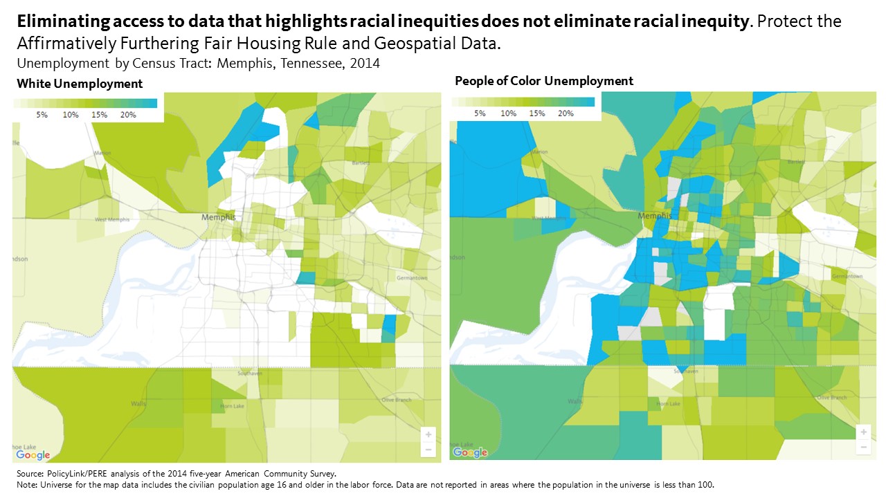
 Despite the threats to the AFFH rule and tool that arms local decision makers with the data to make informed decisions, some states and localities, including California and Philadelphia are vowing to push forward with their efforts to further fair housing. California Department of Housing and Community Development Director, Ben Metcalf, said in a


 Strategies for racial and gender justice


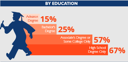
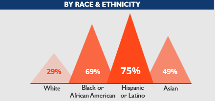
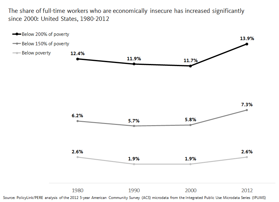
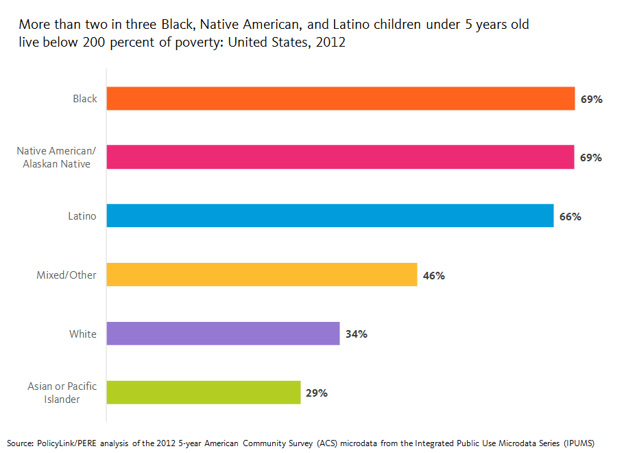
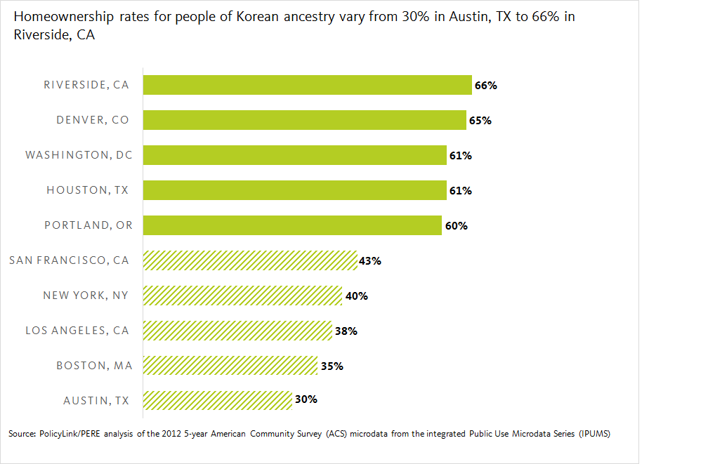
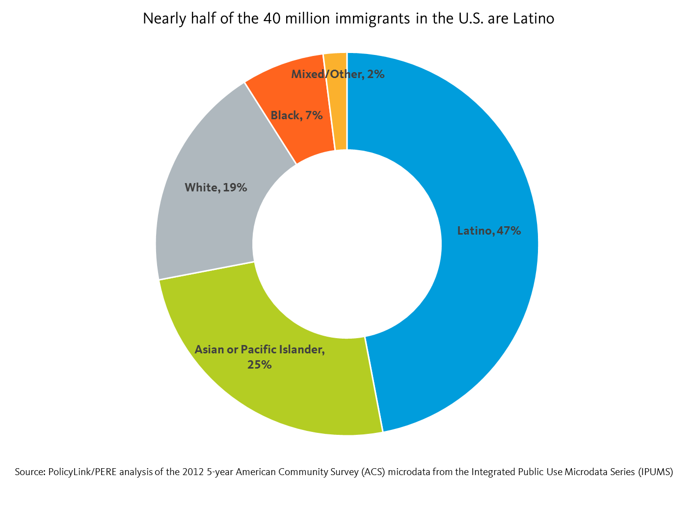 Latino immigrants made up 3 percent of the total U.S. population in 1990, a figure that doubled to 6 percent by 2012. Latino immigrants represent not only the largest share of immigrants in the U.S., but also the fastest growing. The API immigrant community is the second fastest growing and represent 3 percent of the total U.S. population as of 2012. White immigration has more or less stayed stagnant at 3 percent between 1990 and 2012. Finally, Black immigrants make up the smallest share of the total U.S. population at 1 percent, and are not growing as fast as their Latino and API immigrant counterparts.
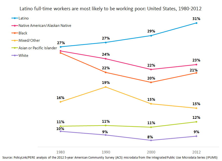
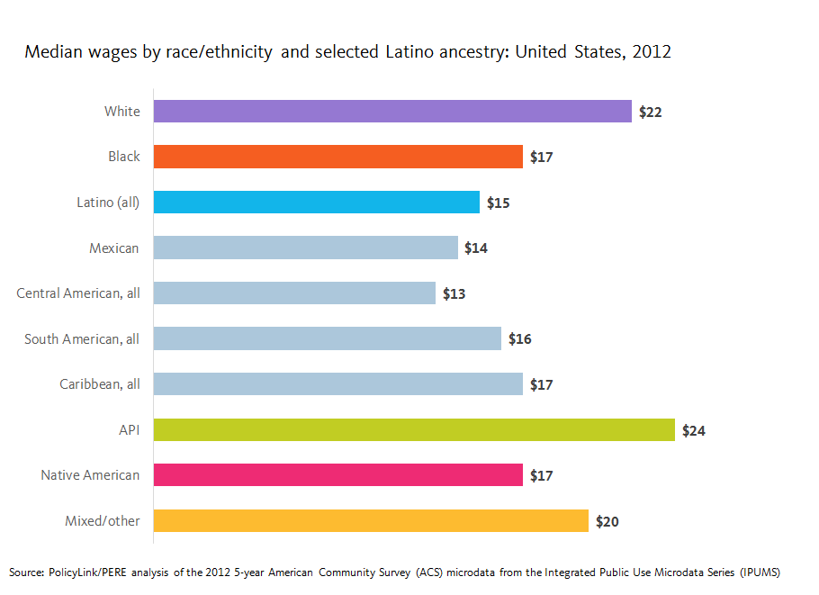
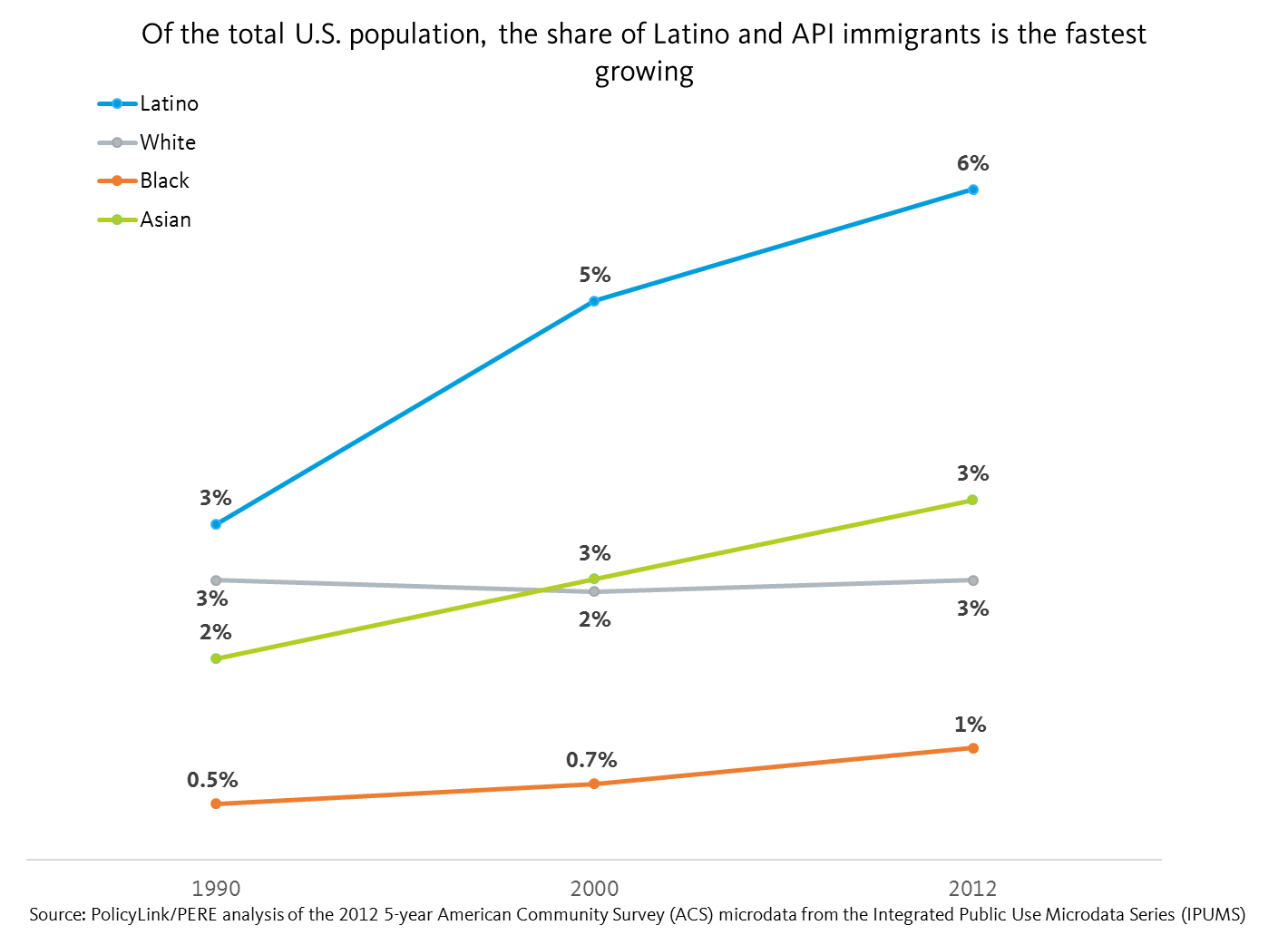 Despite their numbers, Latino immigrants face some of the largest barriers to inclusion. For example, they have the lowest median wage at less than $13/hour, which is $5/hour less than U.S.-born Latinos and half the median wage of White immigrants. Furthermore, 57 percent of Latino immigrants are living under 200 percent of poverty, and 25 percent are working poor.
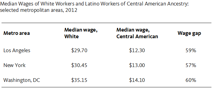
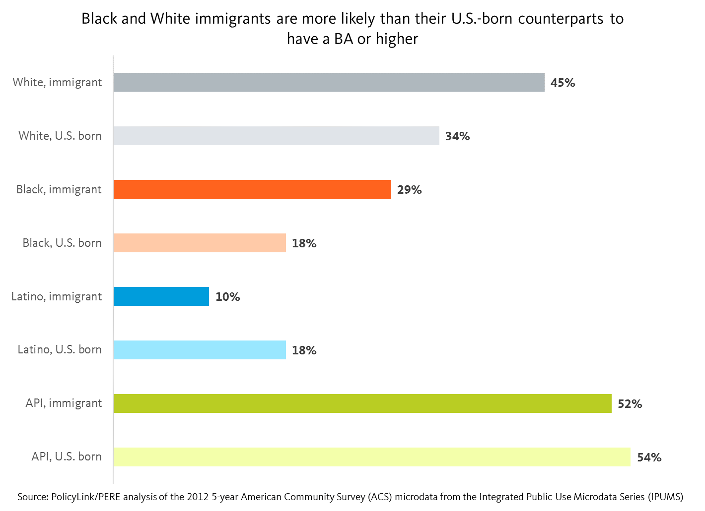 We can do a deeper with-in group analysis by looking at the disaggregated ancestry subgroup data by the nativity cuts. For instance, using median wage as an example, immigrant Whites as a whole earn more than U.S. born Whites. Looking at the disaggregated ancestry subgroup data by nativity cuts reveals the following: immigrant Whites of Western European and North American ancestry reported lower median wages than their U.S. born counterparts, but immigrant Whites of Eastern European ancestry reported higher median wages than their U.S. born counterparts. On the other hand, immigrant and U.S. born Whites of Middle Eastern/North African ancestry reported the narrowest gap with respect to the disparity in their reported median wages.
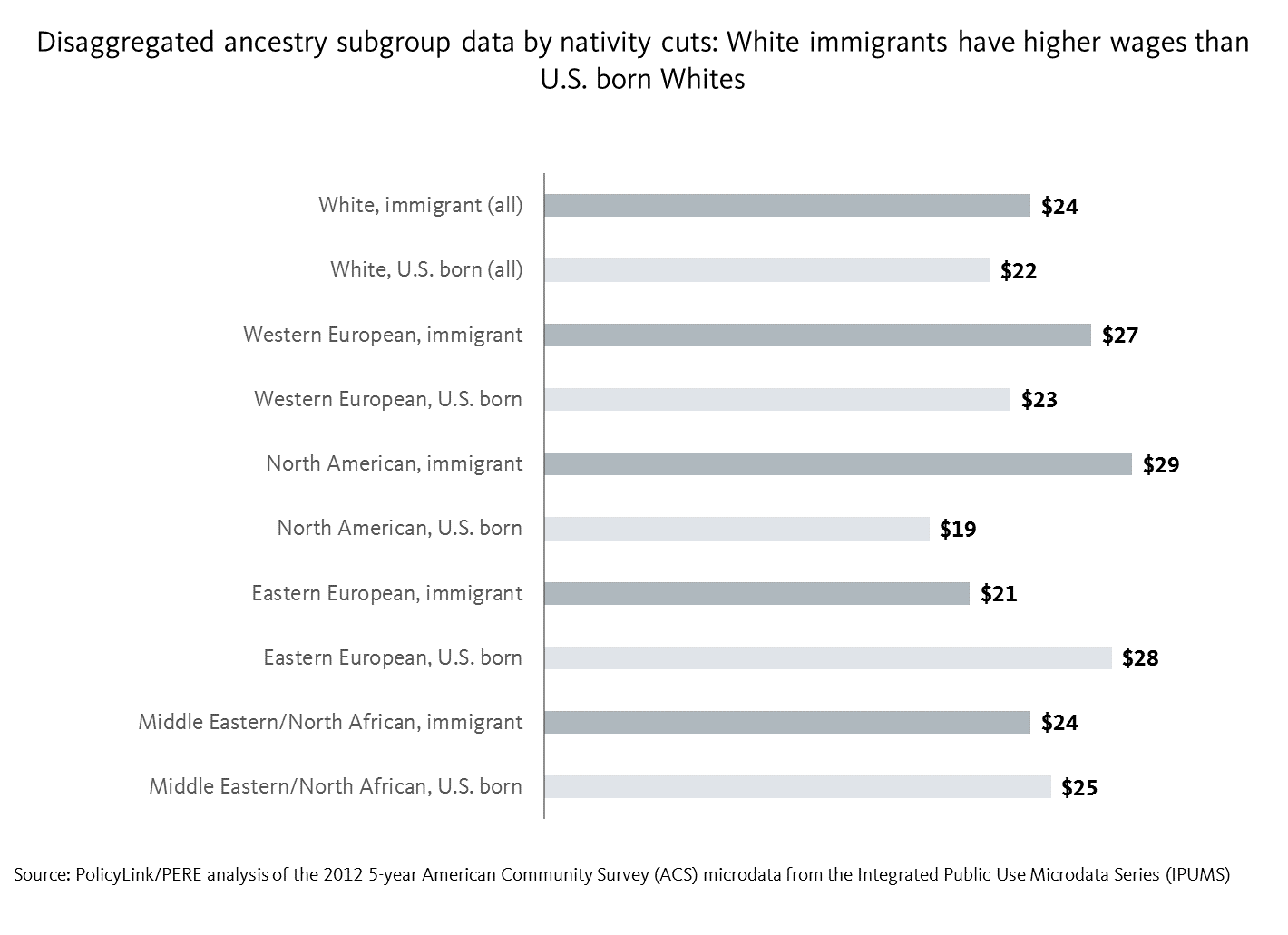 Studies show the significant economic contributions of Latino immigrants
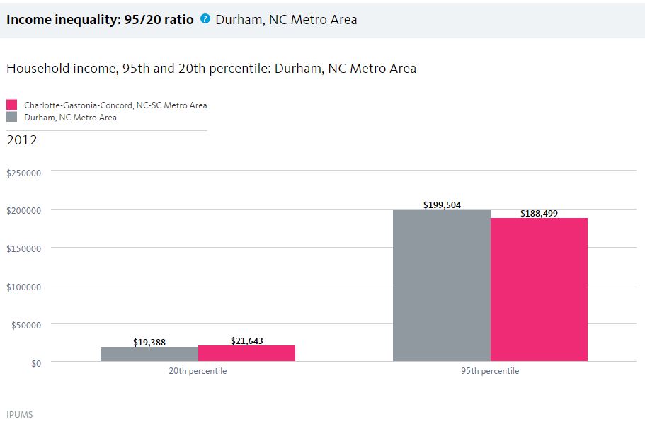
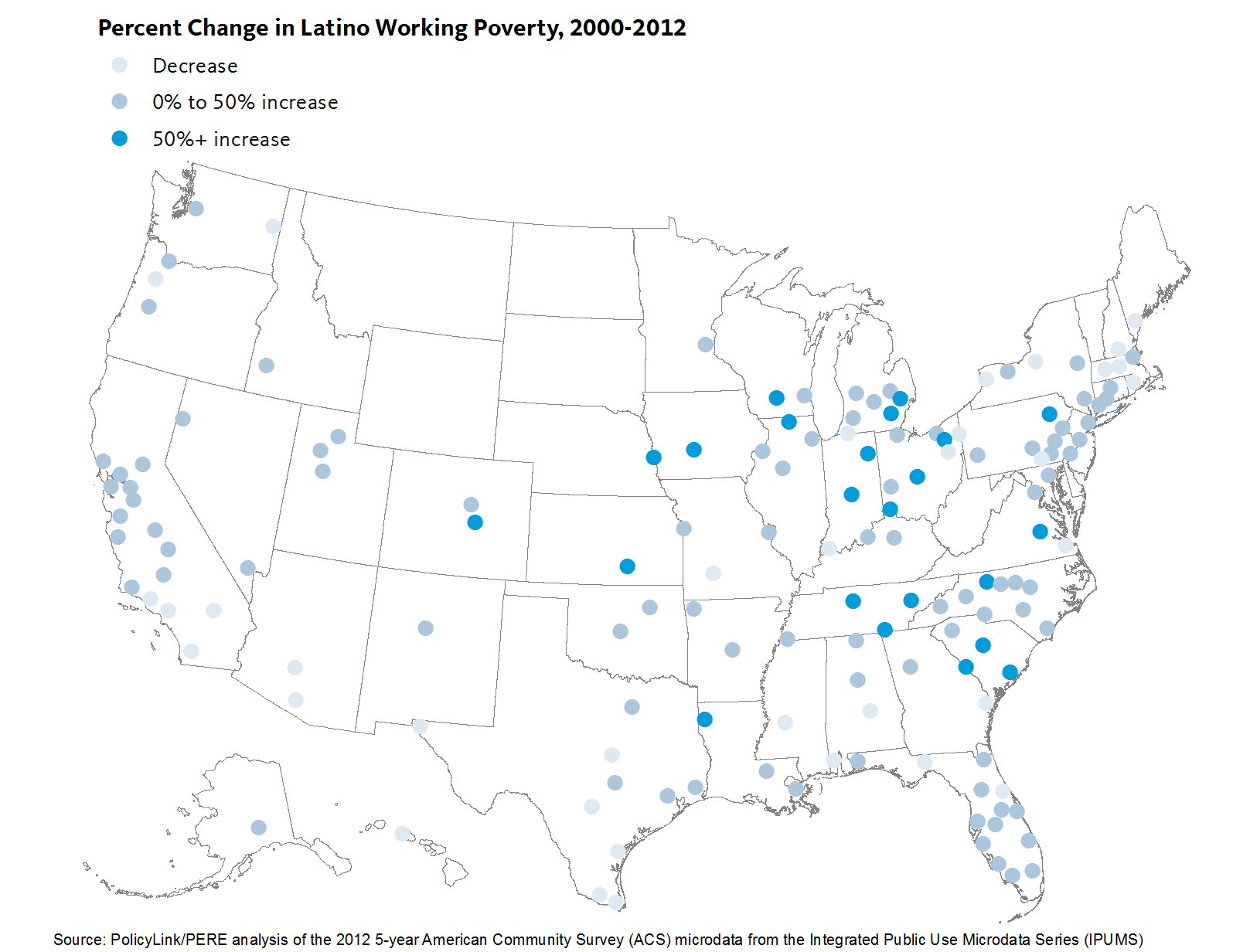
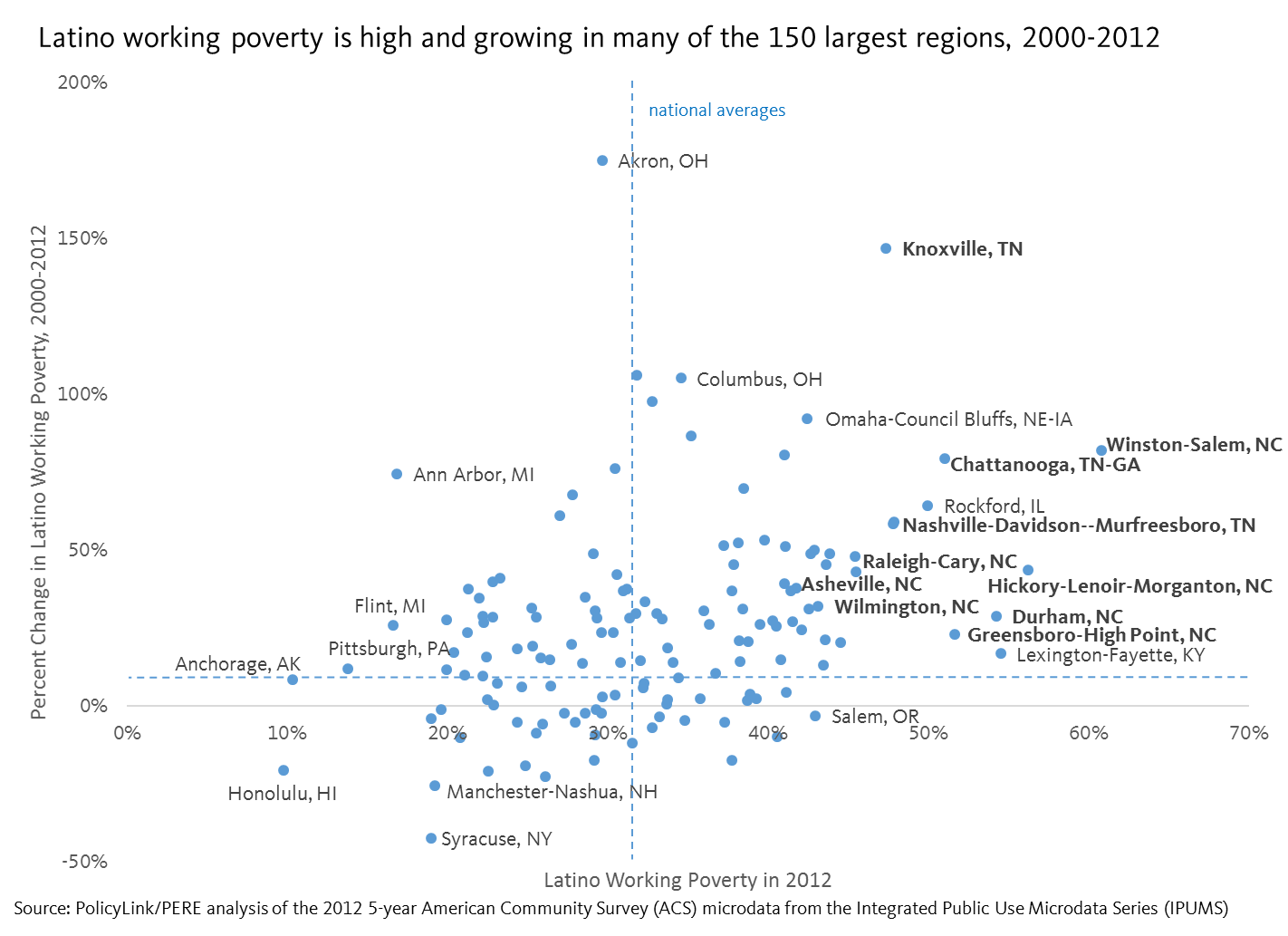 Regions in Tennessee and North Carolina have the highest rates of Latino working poverty
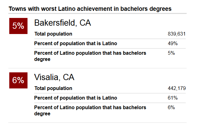
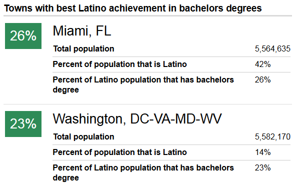
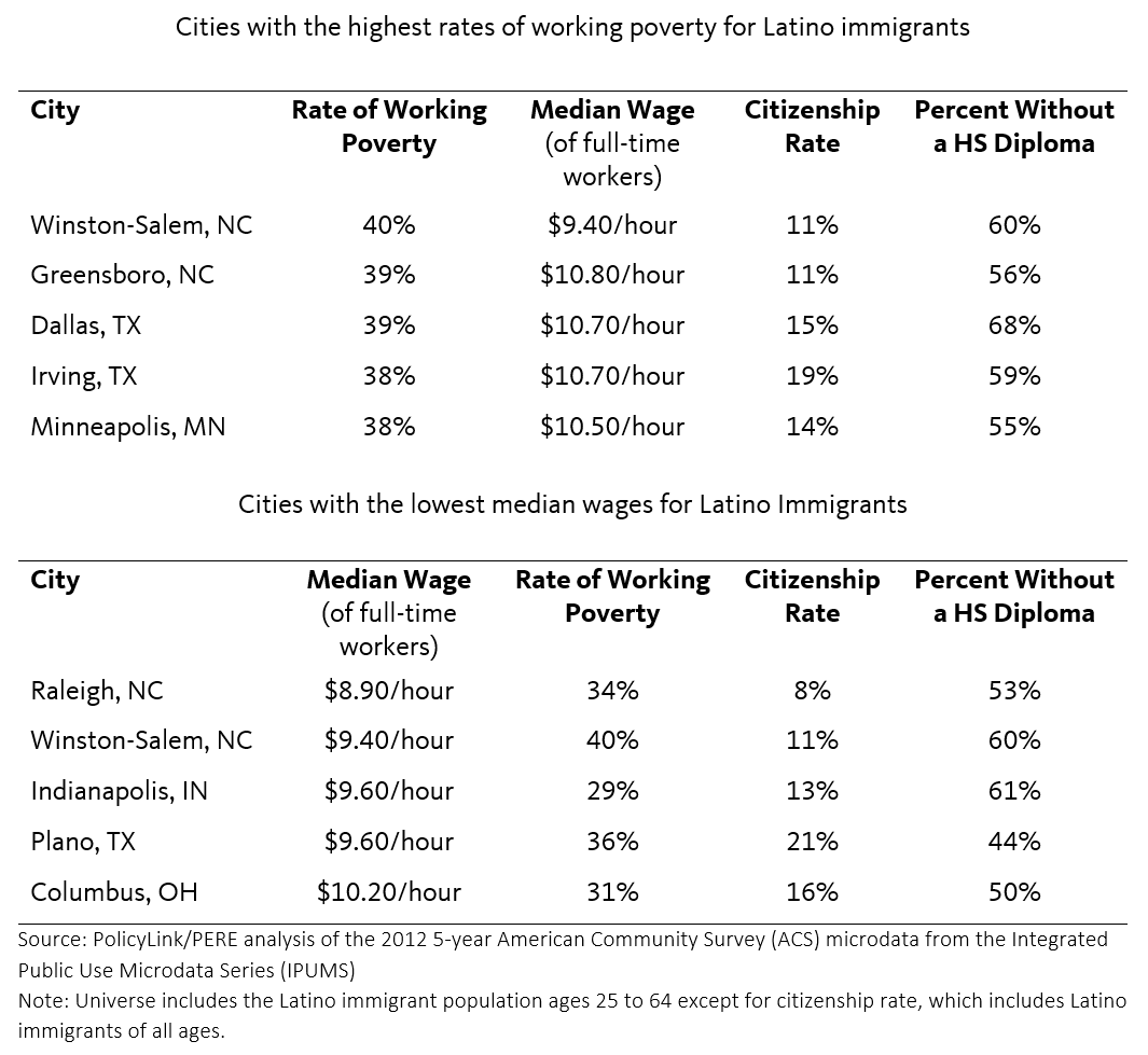
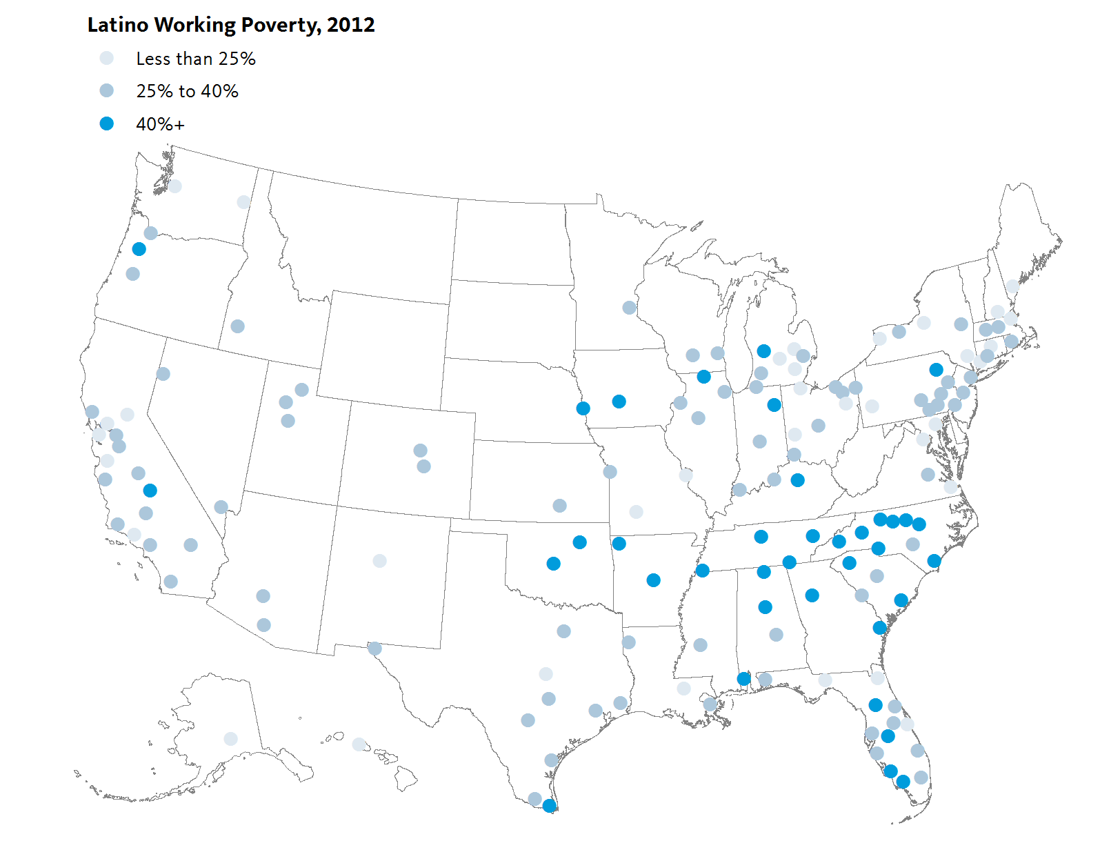

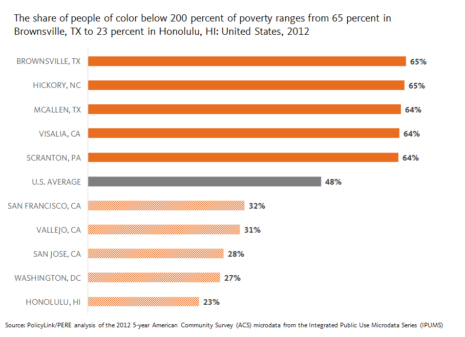

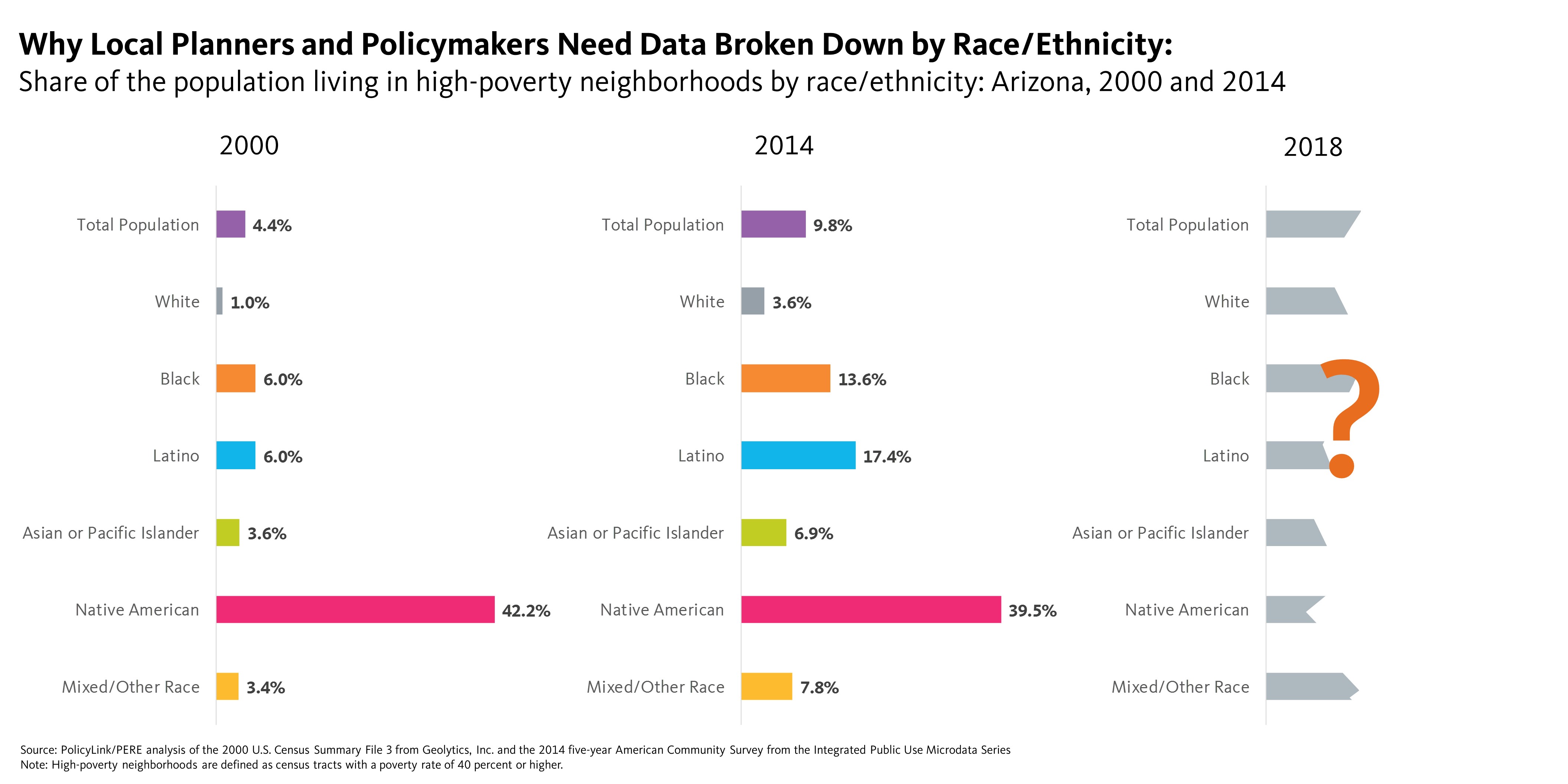
 Disaggregated Data Critical to Developing Regional Inclusive Growth Strategies