Chart of the Week: #RentersDayofAction

To add equity data to the national dialogue about growth and prosperity, every week the National Equity Atlas team posts a new chart from the Equity Atlas related to current events and issues.

Today, thousands are taking to the streets across the country to protest rising and unaffordable rents in what organizers are calling the “largest renter-led protest in recent history.” In 2012, more than half (51 percent) of renters were spending more than 30 percent of their incomes on rent, but the rates are even higher in some of the nation’s largest 100 cities.

To lift up the #RentersDayofAction demands calling for an end to rising rents and unjust evictions, this week’s chart looks at housing burden for renters, or the percent of renter-occupied households spending more than 30 percent of their income on rent, among the largest 100 cities. Though cost-burdened households have decreased slightly among renters based on the latest data, the greatest benefits have gone to homeowners with a mortgage.

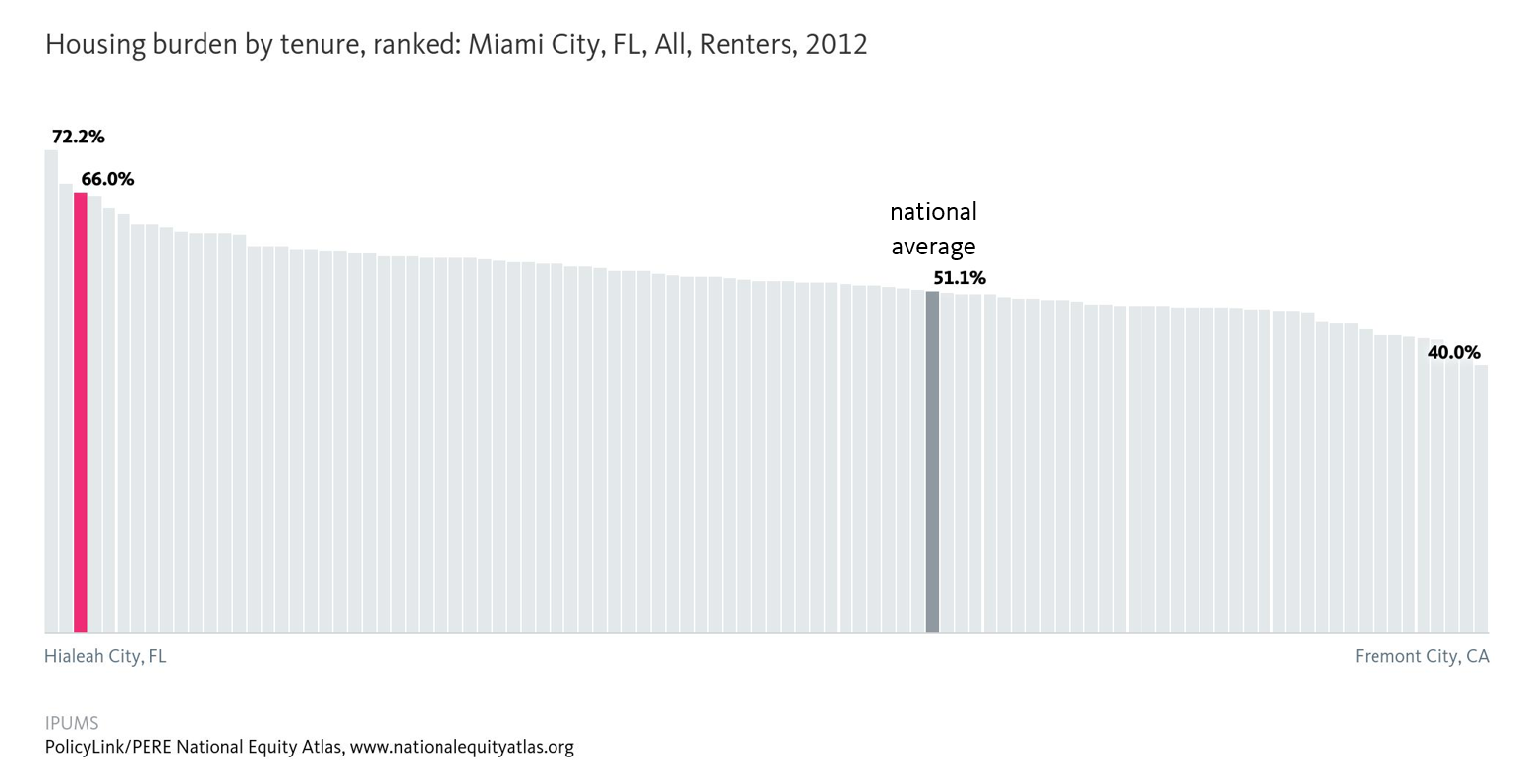
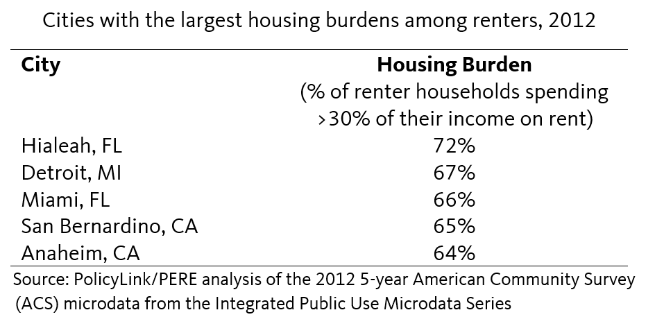
In 2012, 72 percent of renters in Hialeah, FL were housing burdened as were two in three Miami renters. The top five cities with the highest housing burdens were:

Housing is the single largest expense for most households and high housing costs squeeze household budgets leaving few resources to pay for other expenses, save for emergencies, or make long-term investments. The Urban Displacement Project, run by the University of California Berkeley, found that Bay Area cities with rent control laws saw less turnover in their renter populations and that rent control is most effective when paired with other tenant protections like just cause evictions policies. For a more extensive overview of strategies to resist gentrification, see Causa Justa Just Cause’s Development without Displacement report.

To view how affordability ranks in your community or how rates of housing burden vary by race/ethnicity or tenure, visit the National Equity Atlas and type in your city, region, or state. Download the charts and share them on social media using #RentersDayofAction and #equitydata.

Chart of the Week: Why the Latest U.S. Census Report Matters

To add equity data to the national dialogue about growth and prosperity, every week the National Equity Atlas team posts a new chart from the Equity Atlas related to current events and issues.

Yesterday, the Census Bureau released a report on 2015 income and poverty data, announcing that median household income increased by over 5 percent—the fastest growth on record. As President Obama described in a Facebook post and video with Jason Furman, Chairman of the Council of Economic Advisers, the gains were largest among the bottom fifth of households.

To highlight why this gain — especially among the bottom quintile of earners — is so important, this week’s chart looks at real earned income growth for full-time wage and salary workers in the United States from 1980 to 2012.

Over the three decades from 1980 to 2012, the inflation-adjusted earnings of the bottom 10 percent of workers decreased the most at more than 11 percent. In fact, the whole bottom half of workers experienced real declines in their incomes over this period. At the other end, those in the top 10 percent saw their earnings increase by nearly 15 percent. The announcement that real income growth in 2015 was the fastest since 1969 for households at the 10th, 20th, 40th, 50th, and 60th percentiles is a promising finding, though there is still more to be done.

These income increases, combined with refundable tax credits, lifted millions of families and children out of poverty. In 2015, 9.2 million Americans, including 4.8 million children, moved above the poverty line with the help of credits like the Earned Income Tax Credit (EITC) and the Child Tax Credit (CTC). Expanding these social safety net programs through a more equitable tax code and advancing pre-tax income strategies like minimum wage increases and stronger collective bargaining rights are key to supporting the more than 8 million families still in poverty. For more information on policies that contribute to wage growth, see the Economic Policy Institute’s Agenda to Raise America’s Pay.

To view the distribution of income growth in your community over the last three decades, visit the National Equity Atlas and type in your city, region, or state. Download the charts and share them on social media using #equitydata.

Chart of the Week: Disconnected Native Youth in North Dakota

To add equity data to the national dialogue about growth and prosperity, every week the National Equity Atlas team posts a new chart drawing from the Equity Atlas related to current events and issues.

In what some are calling the largest gathering of tribal nations in 150 years, a multigenerational coalition has assembled in North Dakota to stand with the Standing Rock Sioux Tribe to halt the construction of the Dakota Access Pipeline (#NoDAPL). Proponents of the 1,172-mile crude oil pipeline tout the economic benefits of the project in the wake of a declining state economy, but this project is not the way to foster sustainable and equitable growth in North Dakota’s Native communities.

To lift up this Native-led struggle to protect ancestral land and water in Standing Rock, this week’s chart looks at the share of young people ages 16 to 24 in North Dakota who are disconnected from work and school.

In North Dakota, Native American young people are the most likely among the major racial/ethnic groups to be disconnected from work and school. More than one in three Native American young people are neither working nor in school, compared with one in four Latinos and just 5 percent of Whites. Native Americans make up the second largest race/ethnic group in the state, but they continue to face steep barriers to economic inclusion, while inequitable development projects like the Dakota Access Pipeline threaten destruction of their sacred burial sites and water access.

Widespread youth disconnection hurts not only Native Americans and Latinos, but also the North Dakota economy. State policymakers can simultaneously invest in their economies and their most vulnerable populations by building robust cradle-to-career pipelines that support children and families, and by connecting young people of color to opportunities through targeted workforce training programs, apprenticeships, internships, and career academies.

To see how Native Americans fare across other indicators in North Dakota, visit the National Equity Atlas, type in North Dakota, and select an indicator. Download the charts and share them on social media using #equitydata and #NoDAPL.

Webinar Archive: 3 Ways to Use Equity Atlas Chart Downloads Webinar

The National Equity Atlas has improved chart downloads. To learn how to use this improved functionality, watch our latest webinar, “3 Ways to Use Equity Atlas Chart Downloads.” Here is the webinar recording and slides. We encourage you to share with your network.

Also, take a few minutes to review the material shared during the webinar. We created a mini-profile template and a social media tip sheet describing the different ways you can use our Atlas charts to promote your work.You can also follow our new #ChartoftheWeek series on the Atlas and on our @PolicyLink Twitter.       

Find analyses of our newest data updates here, in the “Data in Action” section:

·       Why U.S.-born Latinos Tend to Fare Better than Immigrant Latinos

·       Latino Immigrants Face Uphill Battle to Economic Inclusion

·       The Challenge of Youth Disconnectedness Among Latinas

We invite you to join our next live webinar, "Special Preview: Neighborhood Mapping on the Atlas", scheduled for Thursday, October 6, at 12:00 pm - 12:30 pm PT. We will be previewing our new mapping system and seeking feedback from you in advance of our public release in October. 

Please feel free to contact Sarah Treuhaft at sarah@policylink.org with any questions, or visit our “Frequently Asked Questions” section on the Atlas to scan commonly asked questions.

-- The National Equity Atlas team at PolicyLink and the USC Program for Environmental and Regional Equity (PERE)

Chart of the Week: #Fightfor15 this Labor Day

To add equity data to the national dialogue about growth and prosperity, every week the National Equity Atlas team posts a new chart drawing from the Equity Atlas related to current events and issues.

In honor of #LaborDay and the #Fightfor15, this week’s chart looks at the share of workers earning at least $15/hour in California. In an equitable economy, all workers would earn enough to support their family, or a “living wage.” What constitutes a living wage varies based on family size, but $15/hour is a good benchmark for understanding which groups are least likely to be earning a living wage. The fight for a $15/hour minimum wage is also an important campaign that continues to gain momentum.

In California, among full-time workers ages 25 to 64, Latinos are the least likely to make at least $15/hour. 49 percent of Latino women and 54 percent of Latino men earned at least $15/hour in 2012 compared with 81 percent of White women and 87 percent of White men. Latinos are the single largest ethnic group in California, but they continue to face some of the steepest barriers to economic inclusion.

Low wages among the growing Latino population is bad for families and bad for California’s economy: more money in the hands of workers means greater demand for goods and services. Research shows that companies can pay living wages and remain profitable, in part because paying higher wages reduces turnover and increases productivity.

Thanks to policy changes, we should soon see positive changes on this indicator. The minimum wage in California is currently $10/hour, but earlier this year, state lawmakers struck a deal to gradually raise the state minimum wage to $15/hour by 2022.

To see how the share of workers earning at least $15/hour varies by race/ethnicity and gender in your community, visit the National Equity Atlas, type in your city, region, or state, and select the “By gender” breakdown. Download and tweet at us the chart for your community using #equitydata and #Fightfor15.

Pages