An Overview of America’s Working Poor
Wage stagnation and the increasing number of people who are working yet still poor are significant challenges of our era. One recent study found that there isn’t a single congressional district in the country where a full-time minimum wage worker could afford a two-bedroom apartment. With the rapid growth of unstable, low-paying jobs and the failure of even full-time work to pay family-supporting wages, it is critical to understand working poverty in order to enact policies that lift working families out of poverty.
This analysis describes trends in the persistence of working poverty in America drawing from new data added to the National Equity Atlas. Most measures of the “working poor” count everyone who spent at least the last 6 months in the labor force—including those employed part-time, seasonally, and even the unemployed. We use a more restrictive measure in our analysis counting only full-time workers between the ages of 25 and 64 who fall below 200 percent of poverty. Users can explore rates of working poor at 100 percent, 150 percent, and 200 percent of poverty, but for this analysis, “working poor” is defined as full-time workers below 200 percent of poverty.
Why focus on 200 percent of the poverty line?
We believe that looking at the population below 200 percent of poverty provides a more accurate picture of economic insecurity in the United States. Some argue that the poverty level is too low, particularly in more expensive metro areas. Others point out that that experience of poverty is more porous than a poverty line, which fails to capture the millions of families who move in and out of poverty each year or those families at risk of falling into poverty if they lose a job or have a medical emergency. A family of four below 200 percent of poverty in 2012 had a family income less than $46,000 a year. There are currently over 100 million people living below this threshold in the U.S.—one in three people.
The 12 Million Working Poor
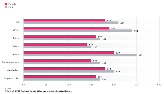
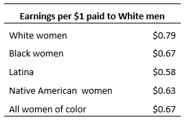
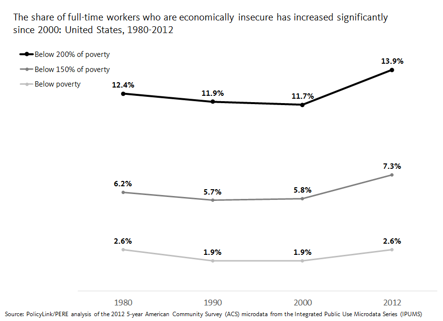
While a large number of that 100 million living at or below 200 percent of the poverty line are children and seniors, over 12 million of them are full-time workers between the ages of 25 and 64. Of these full-time workers earning less than 200 percent of poverty, the majority -- 56 percent -- are workers of color. Working poverty has increased dramatically over the last three decades, growing from less than 7 million in 1980 to today’s 12.4 million. Of all full-time workers ages 25 to 64, the share who were working poor declined slightly between 1980 and 2000 before increasing by 19 percent in 2012. In the 1980s and 1990s, the working poor rate hovered around 12 percent, but by 2012, was close to 14 percent.
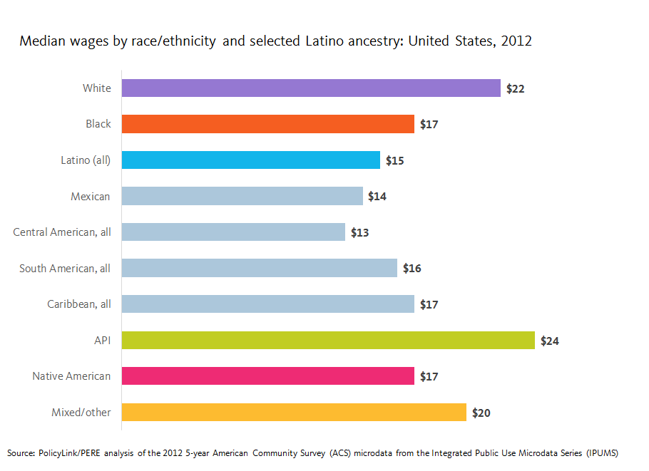
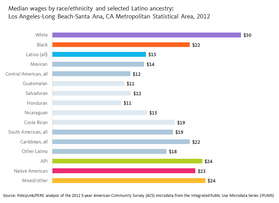
Latino workers face the highest and fastest-growing levels of working poverty
Breaking down the overall data by race reveals that Latinos are the only major racial/ethnic group to experience continual increases in working poverty over the last three decades. In fact, increases in the overall rate of working poverty are driven largely by increases among the Latino population. In 1980, about a quarter of Black and Latino prime-age full-time workers were working poor, more than twice the rates of Whites. But over the next two decades, as the rates declined among Black workers, it increased for Latinos. Even more alarming, Latino full-time workers are 4.5 times more likely than White full-time workers to earn below the federal poverty line and nearly one in three Latino full-time workers fall below 200 percent of poverty.
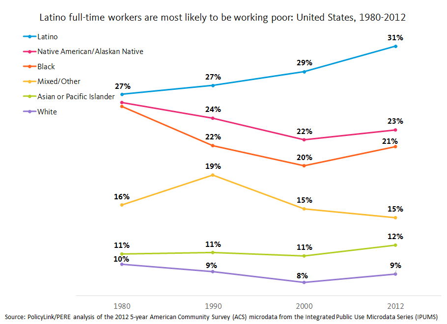
The nation’s demographic changes magnify the importance of these trends. Latinos and APIs are among the fastest growing groups in the U.S. and they not only saw the largest increases in working poverty over the last decade but they were also the only groups to experience increases since 1980. By 2012, Latinos were more than three times as likely as Whites to be working poor.
What this means for the future
The promise of work is part of the American Dream. Most Americans believe that people who work, especially those working full-time year round, should be earning enough to provide for their families. But nearly one in three Latino full-time workers between the ages of 25 and 64 still bring home a family income below 200 percent of poverty (and that includes the income of all other family members as well as income from sources other than work). And the experience of working poverty for most racial/ethnic groups in the U.S., including Whites, has increased since 2000, signifying a disturbing trend in the labor force and a need for policy that ensures all work pays a fair wage.
These increases in working poverty are explained, in part, by changes in economic structure and policy. Over the last several decades, businesses have generated a disproportionate amount of low-wage jobs and wages have been flat for all but the highest earners (see the Job and wage growth indicator). To make matters worse, growing unemployment during the Great Recession pushed down on wages even further. Lifting the wages of workers requires a robust policy agenda like the one proposed by the Economic Policy Institute that tilts power back into the hands of workers. To learn more about policies that lift full-time workers out of poverty like the Earned Income Tax Credit and minimum wage increases and to explore the new working poor indicator, click here.

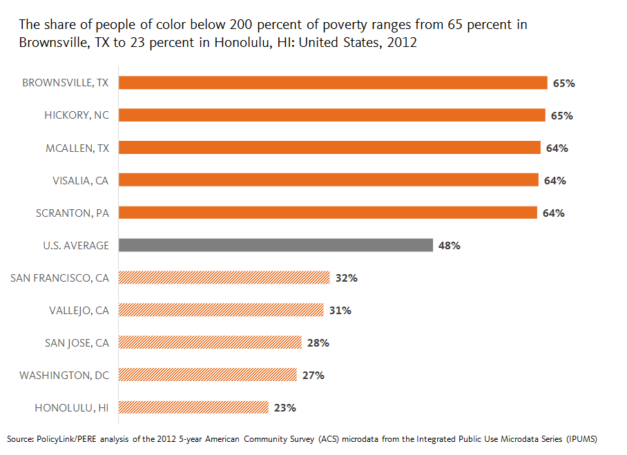
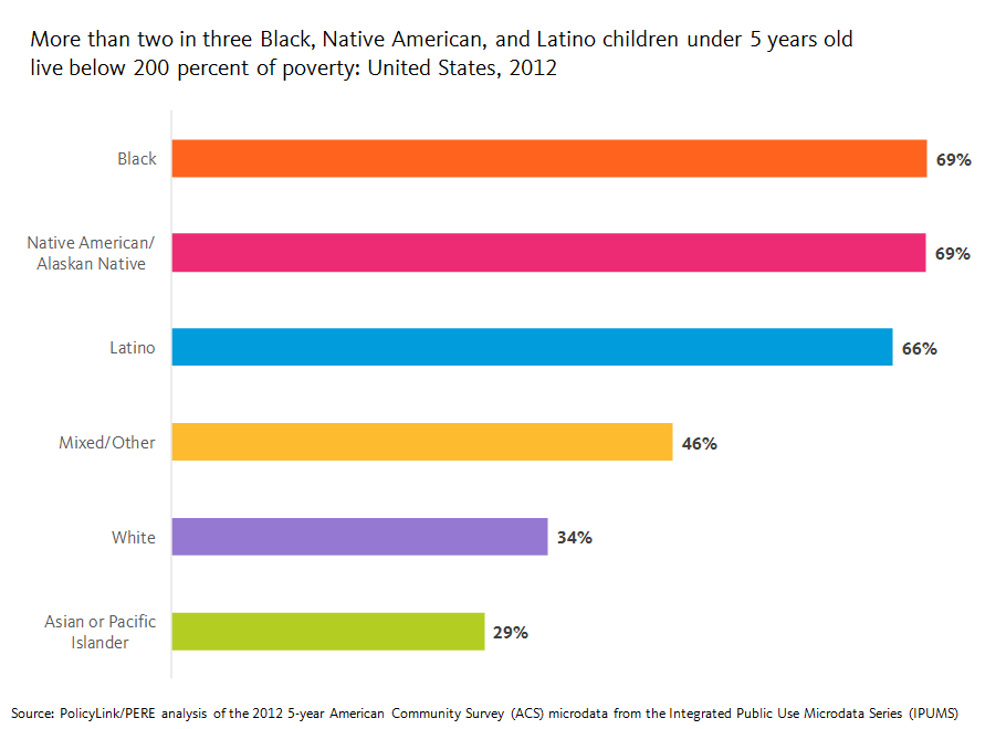

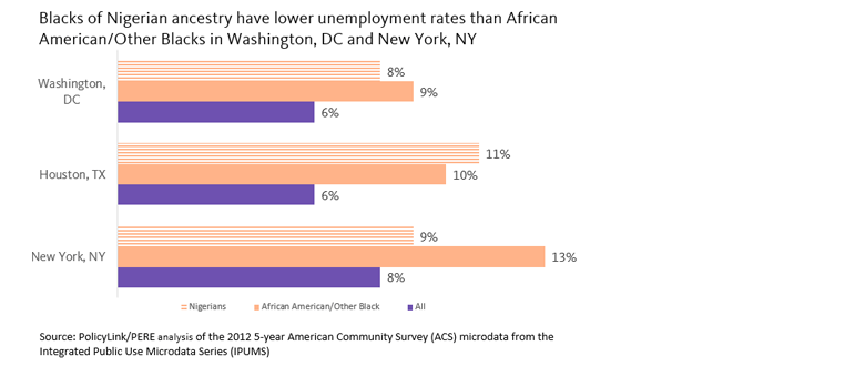
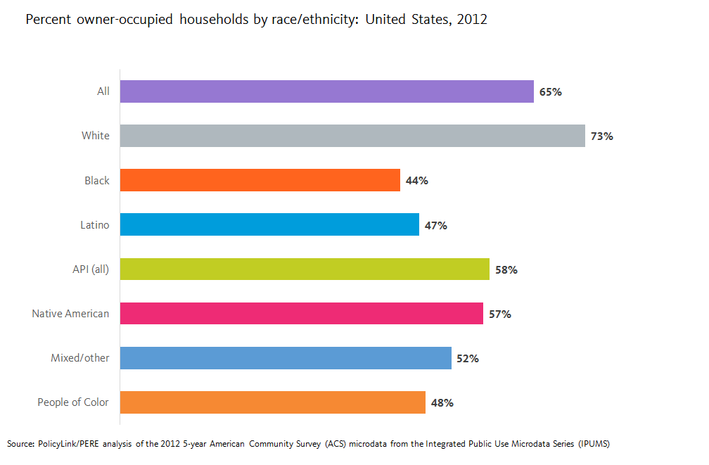
 Disaggregated Data Critical to Developing Regional Inclusive Growth Strategies