Using Atlas Data to Share Inclusive Innovation Economy Strategies at the Philadelphia Fed Conference
One of the main reasons why we built the National Equity Atlas was to provide changemakers with the data they need to frame why racial and economic inclusion matters to the future of their regions. So we are thrilled to learn how our allies are using Atlas data and visualizations to make compelling presentations and expose more people to the idea that equity is both an economic and moral imperative.
Last month, our partner Adam Friedman, who leads the Pratt Center for Community Development in New York City, used Equity Atlas data to talk about the importance of inclusive growth and urban manufacturing as a critical strategy at the Philadelphia Fed’s Equitable Economic Development Conference held in Lancaster, PA. “The Atlas is a quick, easy way to analyze how an area is doing in comparison to the rest of the nation” says Friedman, “More than an overview, it lets you do some quick diagnoses about current and future challenges.” (Download his presentation.)
The Federal Reserve of Philadelphia, in partnership with the Community First Fund, hosted the conference to explore how to include equity goals in economic development planning and decision-making. Lancaster Online coverage of the event reported over 100 in attendance to learn about regional strategies for more equitable growth.
Friedman used the Equity Atlas to describe the challenges of rising inequality and persistent racial inequities in Lancaster, PA: the site of the conference. Friedman presented Lancaster’s economic and workforce challenges and described how growing good, accessible jobs and investing in the skills and capabilities of its less-educated communities and growing communities of color are central to the region’s economic prosperity and competitiveness.
Friedman made several key points:
Income disparity is growing in Lancaster
While Lancaster is growing more middle-skills jobs than many other regions, wages are relatively stagnant across the board, contributing to widening inequality. Between 1980-2012, households at the 10th percentile (the bottom 10 percent) saw their incomes increase by a mere 0.3 percent compared to incomes at the 90th percentile (the top 10 percent) which increased 13 percent.
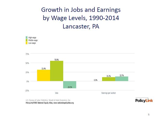
Credit: Adam Friedman/Presentation at the Equitable Economic Development Conference
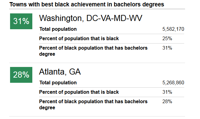
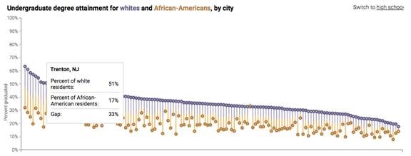
The region’s workers of color face a large wage gap. While about 67 percent of White workers earned at least $15/hour during the 2008-2012 period, only 44 percent of workers of color did.
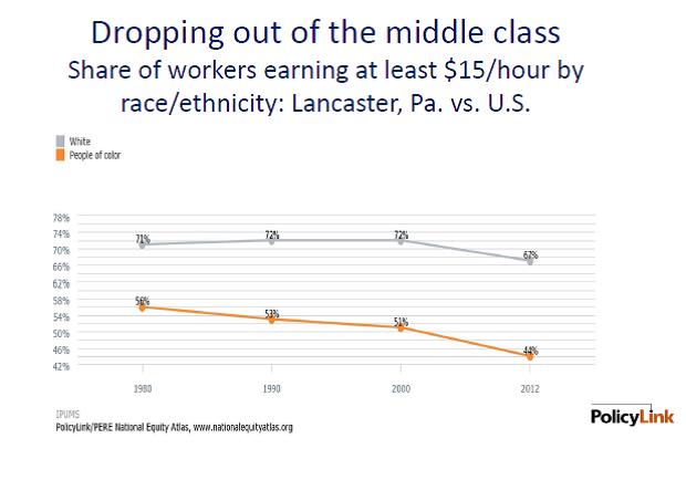
Credit: Adam Friedman/Presentation at the Equitable Economic Development Conference
The Lancaster region is not adequately preparing any of its racial/ethnic groups for the jobs of the future
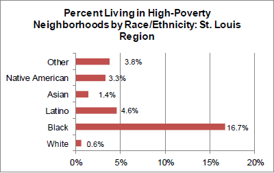
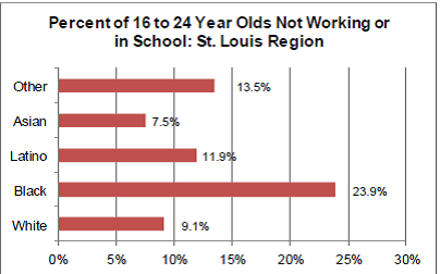
Latinos are the regions fastest growing population but only 13 percent of Lancaster’s U.S.-born Latinos will be prepared for the more than 44 percent of jobs that will require an Associate’s degree in 2020.
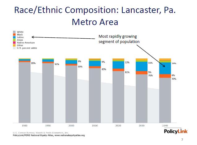
Credit: Adam Friedman/Presentation at the Equitable Economic Development Conference
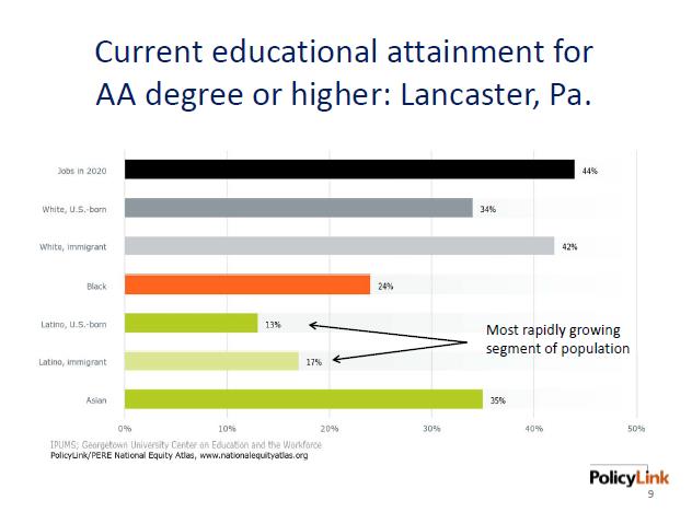
Credit: Adam Friedman/Presentation at the Equitable Economic Development Conference
Lancaster would be stronger with racial economic inclusion
These racial economic inequities take a toll on Lancaster’s economy: the regional economy could have been $1 billion larger in 2012 if there were no racial gaps in income.
Urban Manufacturing as a Strategy for Equitable Economic Development
Urban manufacturing is one equitable economic development and job creation strategy that regions like Lancaster should consider. Growing middle-wage jobs is critical for regions because they provide pathways to economic security and also because living wage jobs are the critical counterpoint to rising housing costs. While manufacturing has been in decline for decades, cities and regions are experiencing a new wave of urban manufacturing—including the “maker economy” and facilities like TechShop that are making it possible to launch small manufacturing companies in cities as well as advanced and supply chain manufacturers.
Most efforts focused on supporting innovation sector growth do not include a focus on equity and inclusion for workers or neighborhoods. The Pratt Center’s Equitable Innovation Economy (EIE) initiative is taking on this challenge to help cities develop strategies that increase access and economic inclusion within the innovation economy and local manufacturing sectors. This effort, a partnership between Pratt, the Urban Manufacturing Alliance, and PolicyLink, centers around a learning community with four cities that are each working on different inclusive innovation economy sectors and strategies. Indianapolis, for example, is focused on attracting employers by reviving legacy industrial properties. San Jose is trying to create more career pathways into hardware manufacturing and the maker economy. Portland is focusing on their tech, green-tech and athletic and outdoor industries. New York is seeking to extend innovation-sector opportunity across its five boroughs.
Working together to share equitable job creation strategies, the four Cities are rejecting the age old notion that Cities must compete with one another for jobs and are instead sharing program ideas and best practices to lift each other up. The goal is to expand their network and the number of cities that are building equitable innovation sectors.
We look forward to updates about how the partners are advancing their equitable economic development goals and will highlight their progress as they move forward. Many thanks to Adam for sharing with us how he is using the Equity Atlas.
How are you using the Atlas in your work? Please let us know by filling out this survey or writing me at tsmiley@policlink.org.