Getting to Equitable Growth in the Heartland Region

Nationally, the Omaha-Council Bluffs metro—locally dubbed the Heartland region—stands out for its admirably low unemployment rate. As of September 2014, only 3.6 percent of the region’s residents who are in the labor force were unemployed, compared with 5.7 percent nationally. That means the region is at full employment, if you measure it based on Dean Baker and Jared Bernstein’s standard of 4 percent.

But as is often the case, this broadbrush statistic masks quite a bit. Not everyone is thriving in the Heartland. The unemployment rate for African Americans is closer to 12 percent: three times the average. While communities of color are driving the region’s growth, more and more Latinos, African Americans, and Native Americans cannot make ends meet, even if they are working. And the region has not escaped the challenge of flat wages, either: when you account for inflation, most workers haven’t gotten a raise in the past two decades. (Hopefully Nebraska’s recent minimum wage hike will help budge that statistic.)

This afternoon, community leaders are gathering in Omaha to talk about these trends and why they matter not only for those who are being left behind now, but for the entire region’s economic future.

As a part of the Heartland 2050 process to plan for how the region can double in size by 2050 while increasing equity and resilience, PolicyLink and PERE partnered with the Metropolitan Area Planning Agency and many local organizations to develop a report that lays out the trends and presents strategies for equitable growth.

Released today at a pre-event to Voices for Children in Nebraska’s “Race Matters” conference, the Equitable Growth Profile of the Omaha-Council Bluffs Region illustrates the region’s changing demographics, shows how different groups are faring in the regional economy, and describes what can be done to reduce inequality and steer the region toward equitable growth. You can access the full profile and the summary (which includes the recommended strategies) here.

Here are a few of the trends highlighted in the report:

The region is experiencing a major demographic shift. Between 1980 and 2010, its people-of-color population doubled from 10 to 21 percent. Communities of color will continue to drive growth in the coming decades, growing to 39 percent of the population by 2040.


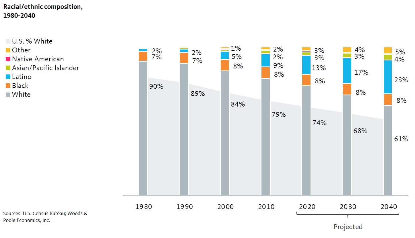
Credit: Racial/ethnic composition/National Equity Atlas 

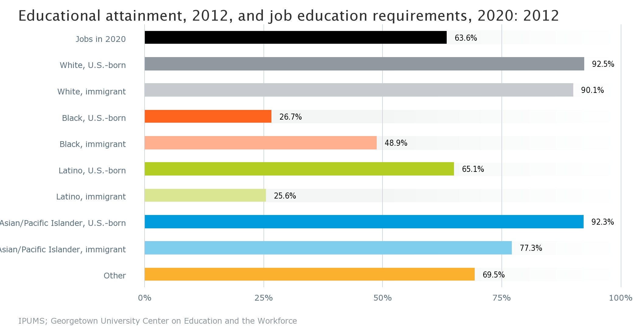
Omaha-Council Bluff's African Americans face disproportionately high rates of unemployment at every level of education.


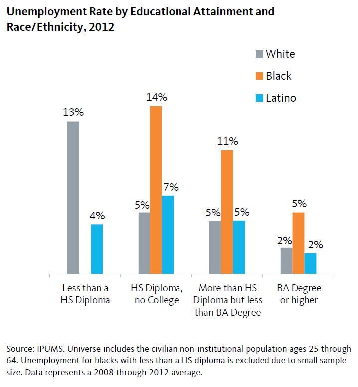
Credit: Unemployment rate by race/ethnicity and education/National Equity Atlas

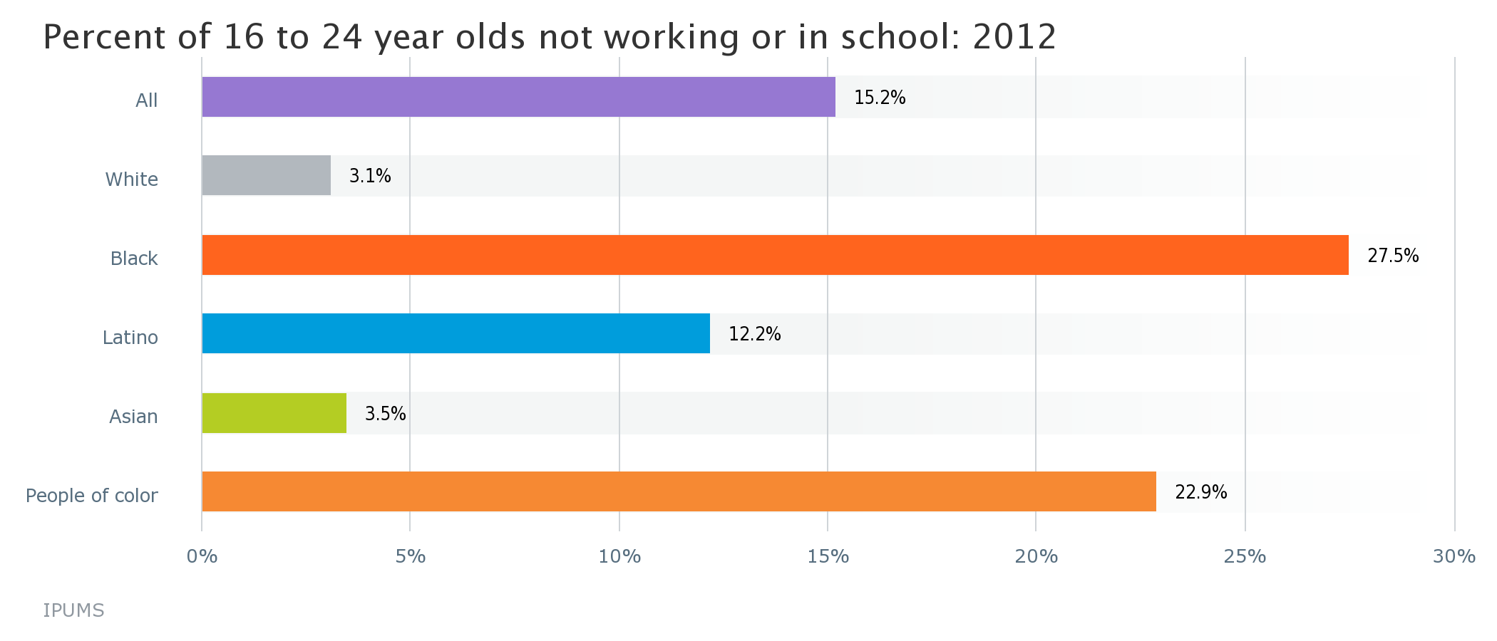
Working poverty, defined as working full-time with an income less than 1.5 times the poverty level, is on the rise regionally and is particularly high for Latinos and African Americans.

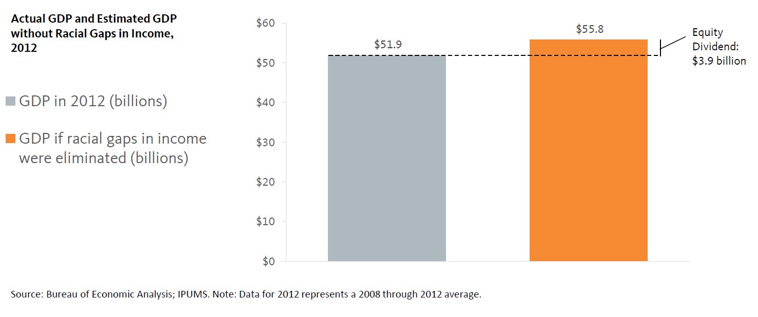
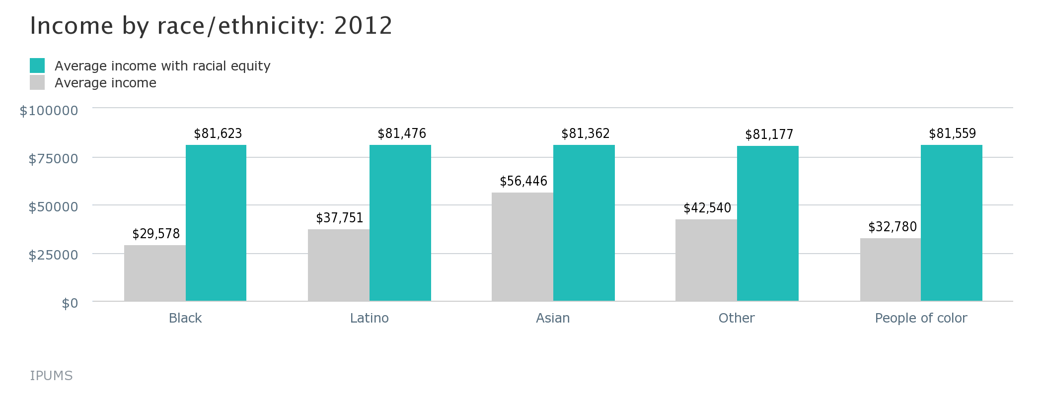
Credit: Actual GDP and estimated GDP without racial gaps in income/National Equity Atlas 

The Equity Atlas and DC KIDS COUNT: A Portrait of the Lived Experiences of DC Residents

Here at DC Action for Children, we recognize the power of data, when presented clearly and creatively, to shape the conversations we have about the well-being of children in Washington, DC. Given our interest in the intersection between data and public policy, we wanted to highlight the National Equity Atlas, a fascinating and instructive new data tool created by PolicyLink and the USC Program for Environmental and Regional Equity.                       

Taking the recent rapid growth of inequality in the America as a starting point, the site explores data on equity related indicators locally and nationally. Similar to our work with the Data Tool 2.0 for DC Kids Count, The Equity Atlas finds creative ways to visually represent data through interactive maps and charts, illustrating how complex issues like demographic and income trends vary over time and geography.

While their focus on income inequality is not explicitly related to children and youth, their work supplements and overlaps with ours. In this blog post, I wanted to highlight some of the Equity Atlas indicators that are especially relevant to understanding the relationship between education and child-well being in the District and inequality. Taken together, the data offered by The Equity Atlas and DC KIDS COUNT present a more encompassing portrait of the lived experiences of the residents of our city.

The gaps between the District’s white and minority residents—in both educational outcomes and economic well-being—are the defining challenges facing our city today and in the future. In order to begin closing this income gap, residents of all racial/ethnic backgrounds must have the education necessary to compete for jobs in the changing twenty-first century economy. In 2020, 63.6% of the jobs in the city will require at least an Associates degree, yet only around one-quarter of the District’s native born Black and immigrant Latino/Hispanic residents have the necessary educational attainment to qualify for these jobs.

Credit: Current educational attainment and projected state/national-level job education requirements by race/ethnicity/National Equity Atlas 

Furthermore 23% of the city’s 16 to 24 year olds of color are unemployed or not in school, a rate more than seven times greater than for white young adults of the same age. Given how interconnected educational attainment and income are, these figures offer a sobering prognostication for income inequality in the future.

Credit: Percent of 16 to 24 year olds not working or in school by race/ethnicity/National Equity Atlas 

The relationship between economic outcomes and educational attainment is also reciprocal; a 2010 study found that a $3,000 increase in income to a working family between a child’s prenatal year through the age of five is associated with 19% higher earnings when that child reaches adulthood. Closing racial gaps in income and employment would mean a nearly 150% increase in the average income for people of color in the city.

Credit: Income by race/ethnicity/National Equity Atlas

Combating inequality will require a comprehensive approach that includes both a quality education that gives all students the skills needed to succeed in careers when they graduate as well as increased economic investment in the city’s low-income neighborhoods and material assistance to help lift children and their families out of poverty. Our success today will go a long way in determining the type of city Washington will be in the future.

Welcome to the National Equity Atlas!

The Equity Atlas team at PolicyLink and the USC Program for Environmental and Regional Equity (PERE) are thrilled to share the National Equity Atlas with you!

We built the Atlas as a tool for those who are working to transform America's economy into one that is equitable, resilient, and prosperousregion by region, and state by state. 

Think of it as your one-stop-shop for accessing data and policy ideas to track, measure, and advance inclusive growthin your region, your state, and the United States. At the click of a button, you can access 20 relevant, useful, field-tested indicators of demographic change and racial and economic inclusion. The Atlas currently includes data for the largest 150 regions, all 50 states, the District of Columbia, and the United States as a whole.

The Atlas is a tool for social change. It equips community leaders and policymakers with facts and analyses to:

  • Understand how your community’s demographics are changing;
  • Assess how well diverse populations can participate in your community's economic vitality, contribute to its readiness for the future, and connect to its assets and resources;
  • Catalyze and inform new conversations about why—and how much—equity matters to your community’s future; and
  • Inform policies, plans, strategies, business models, and investments to advance equitable growth.
     

Our aim is to democratize data and make it easy for you to understand, discuss, and use. Explore the Atlas to find:

  • Data summaries that provide a snapshot of how your community is doing on six key indicators of demographic change, equity, and the economic benefits of equity;
  • Charts, graphs, and maps to share with your colleagues and add to your presentations, fact sheets, reports, and funding proposals;
  • Stories about how local leaders are using equity data to drive new conversations and implement new equitable growth strategies and policies; 
  • And much more!


The Atlas is a living resource. We will be adding new data on a regular basis and we invite you to tell us what data you'd like to see. We also invite you to share your story about using equity data for social change. Please sign up  for our email list to find out about new data, analyses, and stories about how people are using data to build an equitable economy.

Enjoy exploring! 

Sarah, Jennifer, and the entire Equity Atlas team (Justin, Pamela, Josh, Victor, Rosa, Angela, and Manuel)

Portland's Regional Equity Atlas: Institutionalizing Equity Since 2007

The nation’s first regional equity atlas originated out of Portland, Oregon. Launched by the planning and policy advocacy group Coalition for a Livable Future in 2007, the original Regional Equity Atlas provided a visual representation of equity and inequity across the region and catalyzed a metrowide discussion about equity and inclusion. Today, equity is seen as an outcome to strive for by advocates and government officials alike, and the equity atlas played a major role in that shift, according to Mara Gross, the coalition’s Executive Director.

The first Equity Atlas was a book that included maps and text about the distribution of people and assets in the region, and the relationship between demographics and opportunity. In 2013, CLF launched version 2.0, an online tool that maps a wide range of measures of health and well-being.

Equity Atlas 2.0 includes data on the issues that stakeholders from across the region view as priorities, including:  

  • Demographics:  Race/ ethnicity, income, age, and household composition
  • Access Measures:  How well the residents of a particular geographic area can access key opportunities including a healthy environment, food, housing, transportation, parks and nature, education, economic opportunity, services, and other community resources
  • Health Outcome Measures:  Key diseases that are affected by the conditions in which we live, such as the rates of asthma, diabetes, and cardiovascular disease, as well as other health outcomes such as obesity and birth outcomes
  •  

With the health outcome measures added, advocates and decision-makers can map different variables to see correlations with health outcomes. Seeing how race, income, geographic distribution, or access to transportation corresponds with health helps pinpoint where interventions and supports should be targeted.

As Beth Kaye, Healthy Eating Active Living Cities Campaign Manager at the Oregon Public Health Institute, says:

“Maps are the language of cities. They help tell the story of inequity because pictures don't lie.  It’s really powerful to show that obesity rates are higher in places with few sidewalks and poor access to transit, parks, and greengrocers. That correlation is usually invisible, but a good map makes it evident. Community voices add nuance by describing their experiences living in a place.  Maps push local governments to think about physical fixes, like installing sidewalks and safe crossings between an affordable housing development and a playground."

The impacts of the Equity Atlas are wide-ranging. Organizations and government agencies working on health equity, transportation and land use, affordable housing development, anti-poverty initiatives, and food access have all used the Atlas to inform their efforts.

Institutionalizing an equity focus within government agencies is a key outcome. “The greatest impacts from the Equity Atlas are that it has helped prompt local governments to start institutionalizing an equity lens,” says Gross. Atlas data has “shaped investment priorities, guided system design, and supported advocacy campaigns.”

Here are several examples of how government initiatives have used the Atlas:

  • The Oregon Prosperity Initiative used Equity Atlas maps to inform which communities should be targeted for a pilot program that aims to address and prevent poverty through systemic reforms in several areas, including education, economic and workforce development and healthcare. Atlas maps helped pinpoint which areas were most in need.
  • The Washington County Women Infants and Children (WIC) department located its new WIC office based on information provided through the Equity Atlas’s transit and demographic maps showing where transit was available in relation to where low-income populations live.
  • The Portland Bureau of Transportation used Equity Atlas data to determine where to prioritize investments in street lighting upgrades. They used Equity Atlas maps to see which neighborhoods had the highest level of need based on demographics, access to active transit, and transportation safety.


Still going strong and evolving to meet community data needs, Portland's Regional Equity Atlas illustrates how equity data and maps can be crucial tools for embedding equity throughout institutions and building inclusive communities across regions.

12 Facts About Wage Trends in the States and Regions Where Minimum Wage is on the Ballot

UPDATE (11/5): Voters said yes to raising the minimum wage in all of the state and city minimum wage propositions described below.

On Tuesday, voters in voters in four states—Alaska, Arkansas, Nebraska, and South Dakota—will decide whether to raise their states’ minimum wages. In Illinois, voters will also cast their ballots on an advisory measure to raise their state minimum. According to an analysis by Ben Casselman at FiveThirtyEight, raising the minimum wage in these five states (by a $0.25 per hour in Arkansas to $1.75 per hour in Illinois) could affect 680,000 low-wage workers. Minimum wage hikes are also on the ballot in the Bay Area cities of Oakland and San Francisco.

Moving the minimum wage closer to a family-supporting “living wage” is a critical policy to shift the nation toward inclusive growth. Most of the jobs being added to the economy are low-wage jobs, and nearly everywhere, the minimum wage is simply not enough to make ends meet (the federal minimum wage is $7.25 per hour). Since low-wage workers are disproportionately workers of color, raising the minimum wage has the double benefit of addressing racial as well as economic inclusion.

Interested in learning some more facts behind these wage debates? The National Equity Atlas is a great source of data on long-term wage trends in states and regions. Here are 12 facts—two about each of these five states and two from the San Francisco Bay Area—drawn from the Wages, Income Growth, and Job and Wage Growth indicators in the Atlas:

ALASKA

#1 Alaska’s full-time workers at the 10th percentile earned about $7,700 less in 2012 than in 1980—a 25 percent decline.

#2 Over the past two decades, Alaska grew low-wage jobs (74 percent increase) much more quickly than middle- (21 percent) or high-wage ones (53 percent).

ARKANSAS

#3 In Arkansas, full-time workers at the 10th percentile earned about $1,700 less in 2012 than in 1980—a 9 percent decline.

#4 Since 1980, the median wage for workers of color in Arkansas has been $13 per hour and the median wage for white workers has been $17 per hour.

ILLINOIS

#5 In Illinois, full-time workers at the 10th percentile earned about $5,000 less in 2012 than in 1980—a 20 percent decline.

#6 Since 1990, Illinois grew low-wage jobs (22 percent increase) much more quickly than middle- (.3 percent) or high-wage ones (7 percent).

NEBRASKA

#7 Nebraska’s full-time workers at the 10th percentile earned about $800 less in 2012 than in 1980.

#8 The median wage for Nebraska’s workers of color in 1980 was $18 per hour; in 2012 it was $13 per hour.

SOUTH DAKOTA

#9 South Dakota’s full-time workers at the 10th percentile earned just $670 more in 2012 than in 1980—a 3 percent raise over more than three decades.

#10 The median wage for both white workers and workers of color in South Dakota today is a dollar less per hour than it was in 1980.

SAN FRANCISCO-OAKLAND-FREMONT METRO AREA

#11 In the Bay Area, full-time workers at the 10th percentile earned about $2,500 less in 2012 than in 1980—a 10 percent decline.

#12 The median wage for white Bay Area workers has increased from $27 to $34 per hour between 1980 and 2012; for workers of color the median wage only increased from $22 to $23 per hour during that time period.

Follow us on Twitter (@PolicyLink and @PERE_USC) for more facts and charts about wages in these states and regions, as well as others that are debating legislation to raise their minimum wage.

Denver's Regional Equity Atlas: Improving Urban Planning With Equity Data

Data can, and should, play a central role in urban planning. In Denver, CO, the Denver Regional Equity Atlas overlays educational, income, health, and other equity metrics on the new transit network to paint a picture of how transit impacts equity. As a result, the Atlas has helped advocates fight for better transit access, strengthen existing partnerships and engage new partners. The Atlas continues to be an important organizing tool.

Using Data to Advocate for Transit

Transit routes that help connect people to the places in which they work are particularly important for low-income families, who heavily rely on public transportation. Using data from the Atlas, advocates were able to save a bus route that served low-income residents but had been slated for closure when the city’s new light rail service opened. Coalition coordinator Davian Gagne says, “The Equity Atlas helped us understand which communities we needed to be prioritizing for outreach and where bus services routes had the highest level of impact.”

Bringing Partners Together

Mile High Connects, the creator of the original Atlas, sees it as one of the most fundamental tools in forming their equity collaborative. A partnership between private, public, and nonprofit organizations that are committed to developing inclusive, affordable and livable communities within walking distance of public transit, Mile High Connects engaged new partners through the original Atlas. As Dace West, Director of Mile High Connects says, “The first Atlas was a static map and it was instrumental in bringing people to the table, especially the philanthropic community, which hadn’t been as involved in equity work until then. It was a way to invite our public sector partners to take a look at some of the other actions taking place around the region.”

The Atlas is now in its second iteration as an online interactive tool that creates custom maps and summaries of statistics for particular interest areas in the region. The online tool was launched in partnership between Mile High Connects and the Denver Regional Council of Governments, the regional planning office, along with the Piton Foundation. The planning agency hosts the website and the foundation created the data engine and open data framework that makes the data accessible and sharable. A Housing and Urban Development (HUD) Sustainable Communities Initiative Grant allowed these groups to deepen their relationship and have joint ownership over the Atlas. 

The Atlas also facilitates data sharing and coordination between the two, a benefit that will lead to more equitable long-term planning. “The Equity Atlas is a piece of the story and through the Sustainable Communities Initiative Grant there are a number of ways we are interacting with our MPO, including a longer term Memorandum of Understanding to preserve the work we have done together,” said West. “Over several months, we’ve had the opportunity to explore more ways in which we can work together that go even beyond the Atlas.”

Now that the Atlas is online, Mile High Connect is looking to respond more directly to the interests and needs of their partner organizations, especially when it comes to the data they are most interested in and that they access most frequently. The maps created through the Atlas help provide a visual tool to help advocates make the case for areas that need fresh food or transit connection from housing to job centers, for example. West say, “The Atlas has really provided the ability to visually represent where some of those mismatches are happening.”

A Tool for Organizing Communities

The Atlas can also be an important tool in organizing communities. Stephen Moore, a policy analyst at FRESC, uses the Atlas with community leaders so they can map their own communities and see what impact developments can have on their communities. When a development is proposed, Moore can show community leaders what happened in similar communities. Moore said, “We can show the displacement caused in other communities and say, ‘here’s some information about what these communities used to look like and what they look like now. The median house cost has increased and demographics have shifted. Looking at that neighborhood and looking at your own, what do you think about the kind of displacement that is likely to take place?”

By providing a visual understanding of the change taking place in the City, the Denver Regional Equity Atlas is helping advocates shape how they want their communities, and region, to look and advancing equity through smart, community based urban planning.

3 Ways to Use the National Equity Atlas

Last week, Angela Glover Blackwell, the founder and CEO of PolicyLink made a bold statement at a conference organized by the Federal Reserve Bank of Boston: “if people of color don’t become the middle class, there will be no middle class.”

Her statement, grounded in forecasts that predict that America’s population will be majority people of color by 2043, is a sharp synopsis for the subject of that conference, “The Inequality of Economic Opportunity.” It also poses a challenging follow-up question: “Now what?”

Enter the National Equity Atlas, a website that we built in partnership with PolicyLink and the Program for Environmental and Regional Equity (PERE) at the University of Southern California. 

At Bureau Blank, whenever we are faced with a big challenge, we look for whatever data we can find to inform our approach. Now, with the Atlas, policymakers, educators and community leaders can access a large pool of data to use in research and advocacy for racial equity. 

It’s not a vault of PDFs. It is truly a tool to visually analyze this data based on location and it’s easy to use!

So, how does the Atlas help users tackle the middle class question? Here are 3 step-by-step approaches to investigate key areas:

#1 Disconnected Youth: Are all young Americans ready to enter the workforce?

How to find it

  1. Click Indictators in the navigation bar
  2. Select the Equity indicator "Disconnected youth" under Readiness
  3. Here's what you'll see

The data

In 2012, 14% of all 16 to 24 year olds were not in school or working. Native-American and Black youth experienced the highest rates of disconnect, at 27% and 22%, respectively.

Why it matters

Educational and work opportunities for young people translate into higher lifetime earnings and decreased reliance on public assistance.

#2 Homeownership: How do my region’s rates compare to other U.S. regions?

How to find it

  1. Click Indicators in the navigation bar
  2. Select the Equity indicator "Homeownership" under "Economic Vitaility"
  3. Click "Ranking" in the "Breakdown" bar and "Region" in the "Geography" bar under the graphic
  4. Begin typing your city where you see "Enter a region state" and click the arrow
  5. Here's what you'll see

​The data

In 2012, 61.9% of Boston metro area homes were occupied by their owners, putting it in the bottom third of the 150 metro regions listed. Whites in Boston had the highest rate of homeownership at 68.4%, while Latinos had the lowest at 25.4%. Click "By race/ethnicity" in the "Breakdown" bar to toggle this data.

Why it matters

Communities of color were disproportionately affected by the foreclosure crisis, placing an imperative on policies like California’s Homeowner Bill of Rights to guarantee basic fairness and transparency for homeowners.

#3 Economic benefits: If we achieve a country with no inequality, what is the payoff?

How to find it

  1. Click Indicators in navigation bar
  2. Select the Economic Benefits indicator and click "GDP gains with racial equity"
  3. Here's what you'll see

The data

In 2012, the United State’s annual GDP was $15.6 trillion. If racial gaps in income or employment were closed, the projected GDP would increase by over $2 trillion. What’s not to love about that? 

Why it matters

Rising wages, particularly for households in the lowest income groups, leads to increased spending power which is a key driver of job creation and economic growth across groups and income levels.
 

Links to policy campaigns, advocacy groups and strategic initiatives accompany every indicator on the Atlas, so users can see real examples of action around the country. By aligning data, narrative and action, the Atlas demonstrates that these disparities are more than a matter of fairness – they will determine our collective economic future. 

As Angela Glover Blackwell says, understanding where we stand now, region by region, state by state is the first step toward building a more equitable and prosperous future for us all.

How will you use the Atlas to connect the dots in your work? Tell us about it on Twitter @bureaublank!

Cross-posted from Bureau Blank's blog. See the original story at http://bureaublank.com/#/blog. 

In New Orleans, A Deeper Look at Jobs Data Catalyzes Economic Strategy Focused on Connecting Black Men to Work

Data can be a jarring wake up call and prompt major institutional action. In 2013, the Lindy Boggs National Center for Community Literacy at Loyola University and The Data Center released a report on the economic potential for African American men in New Orleans with findings nothing less than shocking:

  • More than half of all working-age African American men – 52 percent – did not have jobs.
  • Four out of every 10 black men were not in the labor market, meaning they were discouraged and stopped looking for work.  
  • Between 1999 and 2011, the median wages of African American men fell while median wages for white men rose.
  • The median wage of white men in New Orleans, $60,075, is nearly twice that of African American men, $31,018.
     

Honing in on the key equity challenge

New Orleans would never be able to reverse its economic decline without addressing the employment and wage crisis among its African American men. As Allison Plyer, executive director of The Data Center says, "Black men are often marginalized as part of the solution for a lot of our community problems. You only have to think about that for a couple of minutes to see that’s silly."

While data collection was the necessary first step, knowing what data to present and how to present it was key to getting the right attention from decision makers. "There was a lot of data that we pulled together and it took some strategy not to release all of it. We wanted to highlight those pieces that really speak to the specific concerns and issues that leaders are thinking about and shift their attention to equity issues," Plyer said.

Prompting mayoral action  

The strategy succeeded. Calling the unemployment rate, "unacceptable," the Mayor's office worked with several stakeholders and advocacy groups, including PolicyLink, and in August 2014 Mayor Mitch Landrieu announced an ambitious economic opportunity strategy with a focus on connecting these men to the job opportunities associated with the city’s growing sectors.

"Who are the 52 percent? What are their barriers to employment?  How can we ensure that the people who need work are matched with employers who have jobs? said Landrieu. "What types of skills are employers looking for? And, how can we ensure the people of New Orleans rebuild New Orleans so that we do not leave anyone behind?"

Through focus groups and surveys, the city found a variety of issues preventing these 52 percent from securing jobs. Some individuals needed more training, some needed more education, and some, "just need to be given an opportunity." This information helped the Mayor’s office tailor their jobs program. 

Leveraging the economic power of anchor institutions  

The strategy builds around the strength of economic opportunities offered by the city’s anchor institutions – including hospitals, universities, and the New Orleans International Airport. The goal is to "pave the way for New Orleans to close the income gap and create equity for all New Orleanians."

The Strategy has generated $1.1 million in foundation support and the city is also leveraging its workforce and community development resources toward the effort. Several large employers and anchor institutions have stepped up as partners, including CMC Health, Louis Armstrong New Orleans International Airport, Louisiana State University Health Sciences Center, Ochsner Health System, Sewerage and Water Board of New Orleans, Southeast Louisiana Veterans Health Care System, Tulane University, and Xavier University of New Orleans.

Implementation will begin in Fall 2014 with five main strategies:

  1. Establish a collaborative of local anchor institutions committed to expanding economic opportunity to disadvantaged job seekers and businesses.
  2. Create a workforce intermediary that connects disadvantaged job seekers to employment opportunities through anchor institutions, providing case management, foundational skills training and supportive services.
  3. Start a procurement intermediary that connects qualified disadvantaged businesses to contracting opportunities through anchor institutions.
  4. Build a worker-owned cooperative that connects job seekers to employment by leveraging procurement and purchasing opportunities through anchor institutions.
  5. Establish and align customized job training based on employer needs that prepares disadvantaged job seekers for in-demand jobs through anchor institutions and major infrastructure projects. 

City and business community embrace equity as a growth strategy

Through the support and information provided by the Lindy Boggs National Center for Community Literacy and The Data Center, New Orleans is galvanizing city resources and the business community to fight the unacceptably high rate of non-employment among working-aged black men. The data on non-employment helped not just the Mayor’s office make equitable employment a priority for the mayor, it also helped the New Orleans Business Alliance make equity a priority. Plyer said that after the data was released, she received a call from the Business Alliance asking if they could highlight the non-employment data point to justify using equity as a growth strategy in their strategic plan for economic development.

Data Helps Set the Agenda and Expand Networks for Kansas City Region Advocates

In-depth data on community demographics and equity can provide a more complete picture of challenges and opportunities and help advocates prioritize their agenda. That's what happened in Kansas City when the regional planning agency and equity network partnered with PolicyLink and PERE to develop an equity profile of the region.

The Kansas City Regional Equity Network is a 16-member collaborative that meets monthly to strategize ways to ensure community members understand the importance of equity and inclusion in creating sustainable places. Data on the region's diversity has been key in helping the network form a plan for action. The Network has selected eight issue items as its focus, including housing, transportation, health, and workforce development.

Dean Katerndahl, a member of the group and director of the government innovation forum at the Mid-America Regional Council, explains how knowing more about their region's young people of color helped set their priorities. "The data point that intrigued me the most was the one showing the large number of youth of color who were disconnected, not in school or employed," Katerndahl said. The profile also revealed how a disproportionate share of Kansas City's 27,000 youth out of work and school in 2010 were black or Latino. "This finding has become a real priority for the equity network, as folks were really surprised, and so we have put together a committee around youth."

Maps highlighting the growing presence of Latinos in the eastern portion of the region and the large clusters of low-income neighborhoods not located near major employers also gave the network a point around which to rally for transportation equity, according to network member and WestSide Housing Organization Executive Director Gloria Fisher. A region-wide discussion about constructing a new streetcar line in Kansas City's urban core is now underway. "We hope to change the conversation around transportation by inserting equity," Fisher said. Fisher described how if equitable development were not prioritized, the route would likely only go through neighborhoods with money while avoiding those without any, perpetuating transportation inequality.

Data can also open conversation on why equity matters to those who may not be so familiar with these concepts. Katerndahl said the data, charts, and graphs presented in the profile resonated with the business community, including the Kansas City Chamber of Commerce. His group, the Mid-America Regional Council, which serves as the metropolitan planning organization for Kansas City, has also added equity to its long-run planning objectives "pretty much as a direct result of the work with PolicyLink," he said.

Kansas City's full equity profile can be found here.

Data Inspires Equity-Focused State Policy in Rhode Island

When done right, data can be more than a collection of numbers and statistics: it can uncover a reality that may not be immediately apparent to advocates or decision makers. In Rhode Island, new data on the state's changing demographics sparked policy changes to leverage its increasing diversity as an asset.

In 2013, PolicyLink and PERE worked with local partners to produce an Equity Profile of Rhode Island. The profile revealed a growing racial generation gap between the white senior population and the increasingly diverse youth population. Thirty-six percent of Rhode Islanders under the age of 18 were people of color in 2010, compared with 9 percent of those over age 64. This demographic divergence between young and old presents a challenge to securing adequate public funding for educational systems and community infrastructure.

The profile also showed that people of color fare worse in the state's labor market even when they have the same levels of education as their white counterparts. Unemployment rates for college graduates were, for example, 3.5 percentage points higher and wages about $6.50 per hour lower for Rhode Island's people of color than for its whites.

By painting a more complete picture of how the state's population is changing and the extent to which communities of color can participate in the state's economy, the profile lent critical facts to policy discussions. Amanda Martin, a planner for the state who worked with PolicyLink and PERE to produce the Equity Profile, said the data have fostered new discussions about her state's demographics.

And the data did more than change discussions. Shortly after the Equity Profile was released, Governor Lincoln D. Chafee issued an executive order to increase diversity among government employees and contractors. The order led to the creation of the state's Office of Diversity, Equity, and Opportunity, which will be opened in 2015 with a $1.1 million budget and a goal of ensuring fair-hiring and inclusion in all aspects of government.

Governor Chafee cited figures from the profile documenting how, in the past three decades, people of color had grown from 7 percent to 24 percent of Rhode Island's population, and that by the year 2040 Rhode Island was projected to be 41 percent people of color. These statistics undergirded the governor's proactive steps to ensure that Rhode Island's workforce and state government accurately reflected the state's changing demographics. Currently, the state employs 15,000 workers, but only 15 percent of them are people of color.

The Governor also highlighted the state's changing demographics during his State of the State and Budget Address, urging lawmakers to allocate more funding toward education. "This is the future of Rhode Island," he said in the January 2014 speech. "And the best way to prepare for it and translate it into prosperity is to ensure that all Rhode Islanders have access to quality public education. We cannot afford to have disparity in Rhode Island where there are areas of opportunity and others where poverty and lack of education self-perpetuate and hold back our economy as a whole."

Relevant data about changing demographics and the extent to which diverse groups can participate in economic life can lead to the process and policy changes necessary to work toward equity. "This has opened up a new focus on equity issues for our department, helped us to develop a new vocabulary, and given us information we need to incorporate equity into our work," Martin said.

Going forward Martin said she believes the data will continue to shape the public discussion about the equity imperative and contribute to a deeper understanding of where the state stands and how to plan for a prosperous future. Far from contributing to data overload, the equity profile is helping to build a more equitable Ocean State economy.

Pages