
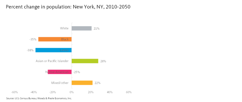
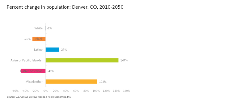
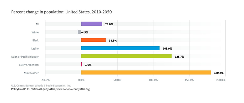
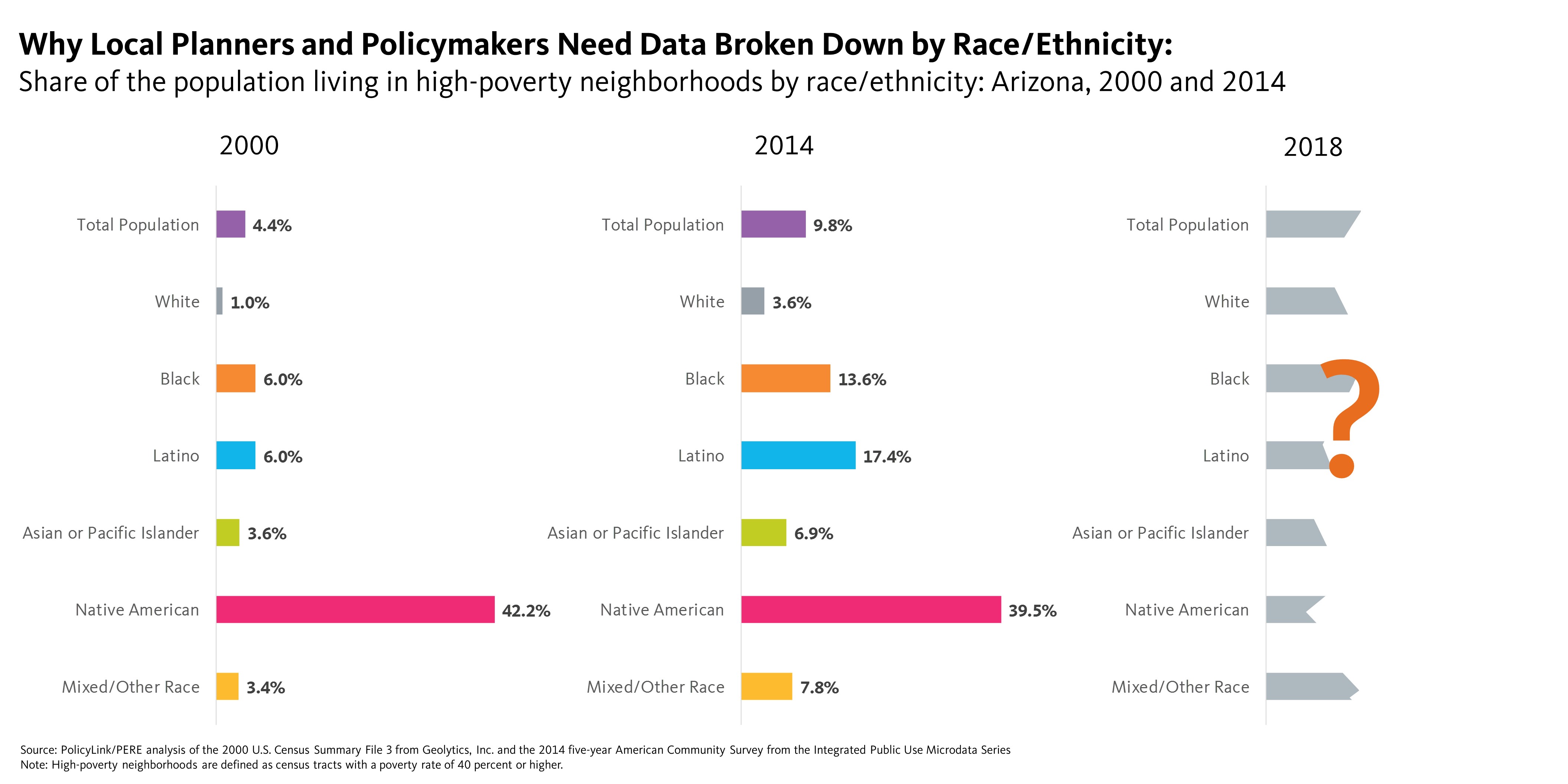
Chart of the Week: Cincinnati Becomes a Sanctuary City
To add equity data to the national dialogue about growth and prosperity, every week the National Equity Atlas team posts a new chart from the Equity Atlas related to current events and issues.
Immigration is a significant driver of population growth nationwide, yet the new administration continues to adopt hostile polices targeting immigrants and refugees — and the cities that seek to protect them. Just two weeks ago, the president signed an executive order blocking federal funds to sanctuary cities—jurisdictions that direct local law enforcement not to assist Immigration and Customs Enforcement (ICE) with deportations. There’s no standard definition of sanctuary cities and there’s a spectrum of local law enforcement cooperation with immigration authorities, ranging from notifying ICE when someone in custody will be released to actively enforcing civil immigration laws. Despite the new president’s threats, several mayors of “sanctuary cities” are doubling down on their sanctuary status and vowing to protect all residents, including those without documentation.
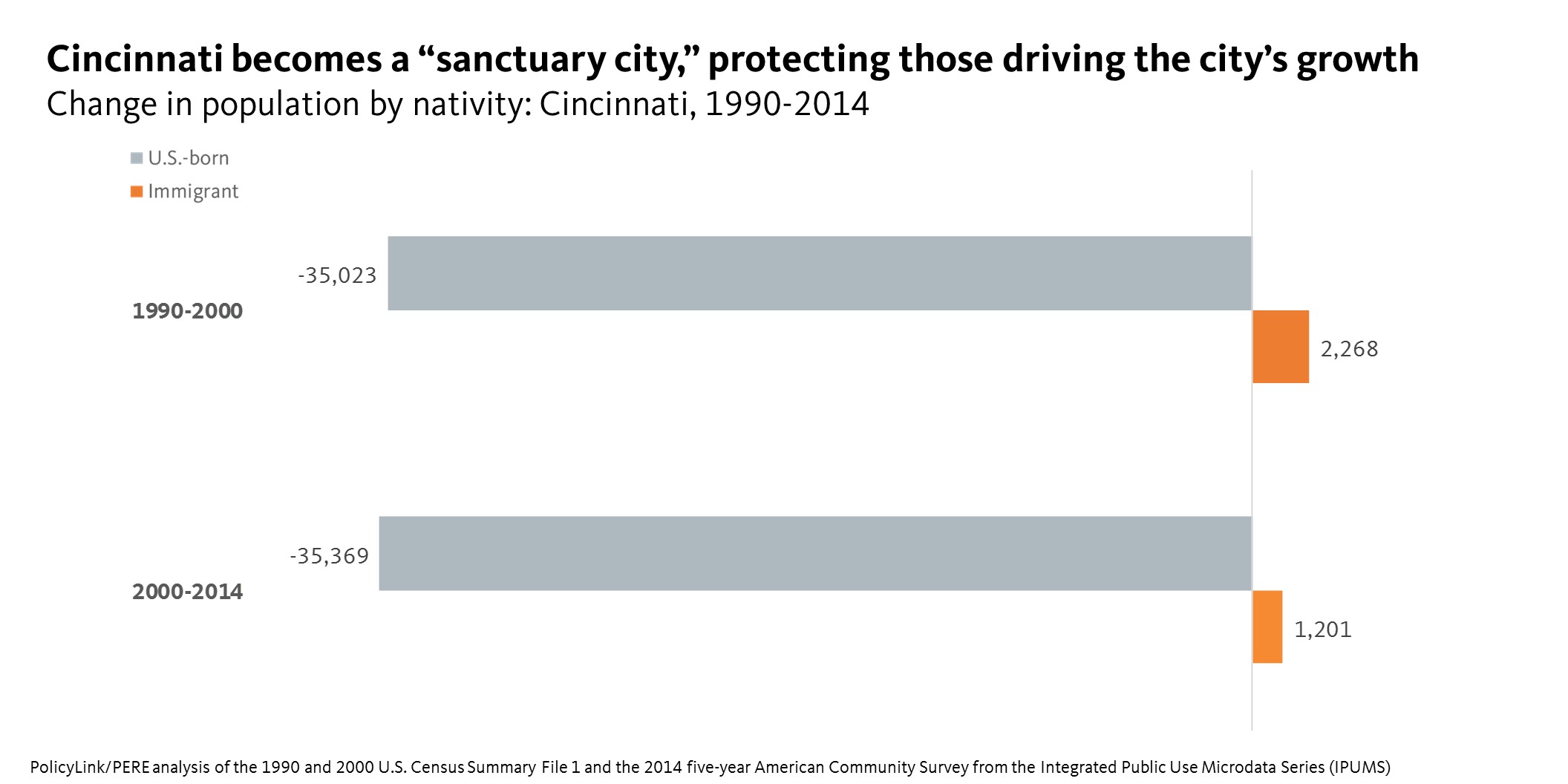
This week’s chart highlights immigrants’ contribution to growth in one of the newest cities to defy the president and declare itself a “sanctuary city”: Cincinnati. Immigrants make up less than 5 percent of the Cincinnati population, but have accounted for all of the city’s population growth since 1990. As the chart below shows, from 2000 to 2014, the U.S.-born population of Cincinnati declined by over 35,000 people while the immigrant population added 1,200 new residents. Cincinnati was one of 20 cities (among the 100 largest cities in the country) where immigrants accounted for 100% of net population growth during that time.
 It’s important to note that not all immigrants are undocumented or refugees, but it’s not uncommon for families and households to be mixed-status—meaning some members of a household or family may have documentation while others do not. Even though the executive orders thus far have targeted undocumented people as well as refugees from seven majority-Muslim countries, this type of rhetoric, surveillance, and enforcement has cascading impacts on all immigrants and people of color.
In addition to Cincinnati, the city of Birmingham, Alabama, adopted a “welcoming city” policy, and will not require proof of citizenship when granting business licenses. San Francisco has taken an even more proactive stance and filed suit against the executive order, charging that it violates the states’ rights provisions of the Constitution.
The Immigrant Legal Resource Center (ILRC) has explained that “local jurisdictions have no legal obligation to assist with civil immigration enforcement, which is the responsibility of the federal government.” For a list of policies local jurisdictions can adopt, such as eliminating the use of local and statewide gang databases and the importance of county-level policies, check out “Expanding Sanctuary” and “Searching for Sanctuary.”
To see how immigrants have contributed to growth in your city, region, or state, visit the National Equity Atlas, type in your community, and share the chart using #equitydata.
 Despite the threats to the AFFH rule and tool that arms local decision makers with the data to make informed decisions, some states and localities, including California and Philadelphia are vowing to push forward with their efforts to further fair housing. California Department of Housing and Community Development Director, Ben Metcalf, said in a