The Equity Atlas and DC KIDS COUNT: A Portrait of the Lived Experiences of DC Residents

Here at DC Action for Children, we recognize the power of data, when presented clearly and creatively, to shape the conversations we have about the well-being of children in Washington, DC. Given our interest in the intersection between data and public policy, we wanted to highlight the National Equity Atlas, a fascinating and instructive new data tool created by PolicyLink and the USC Program for Environmental and Regional Equity.                       

Taking the recent rapid growth of inequality in the America as a starting point, the site explores data on equity related indicators locally and nationally. Similar to our work with the Data Tool 2.0 for DC Kids Count, The Equity Atlas finds creative ways to visually represent data through interactive maps and charts, illustrating how complex issues like demographic and income trends vary over time and geography.

While their focus on income inequality is not explicitly related to children and youth, their work supplements and overlaps with ours. In this blog post, I wanted to highlight some of the Equity Atlas indicators that are especially relevant to understanding the relationship between education and child-well being in the District and inequality. Taken together, the data offered by The Equity Atlas and DC KIDS COUNT present a more encompassing portrait of the lived experiences of the residents of our city.

The gaps between the District’s white and minority residents—in both educational outcomes and economic well-being—are the defining challenges facing our city today and in the future. In order to begin closing this income gap, residents of all racial/ethnic backgrounds must have the education necessary to compete for jobs in the changing twenty-first century economy. In 2020, 63.6% of the jobs in the city will require at least an Associates degree, yet only around one-quarter of the District’s native born Black and immigrant Latino/Hispanic residents have the necessary educational attainment to qualify for these jobs.

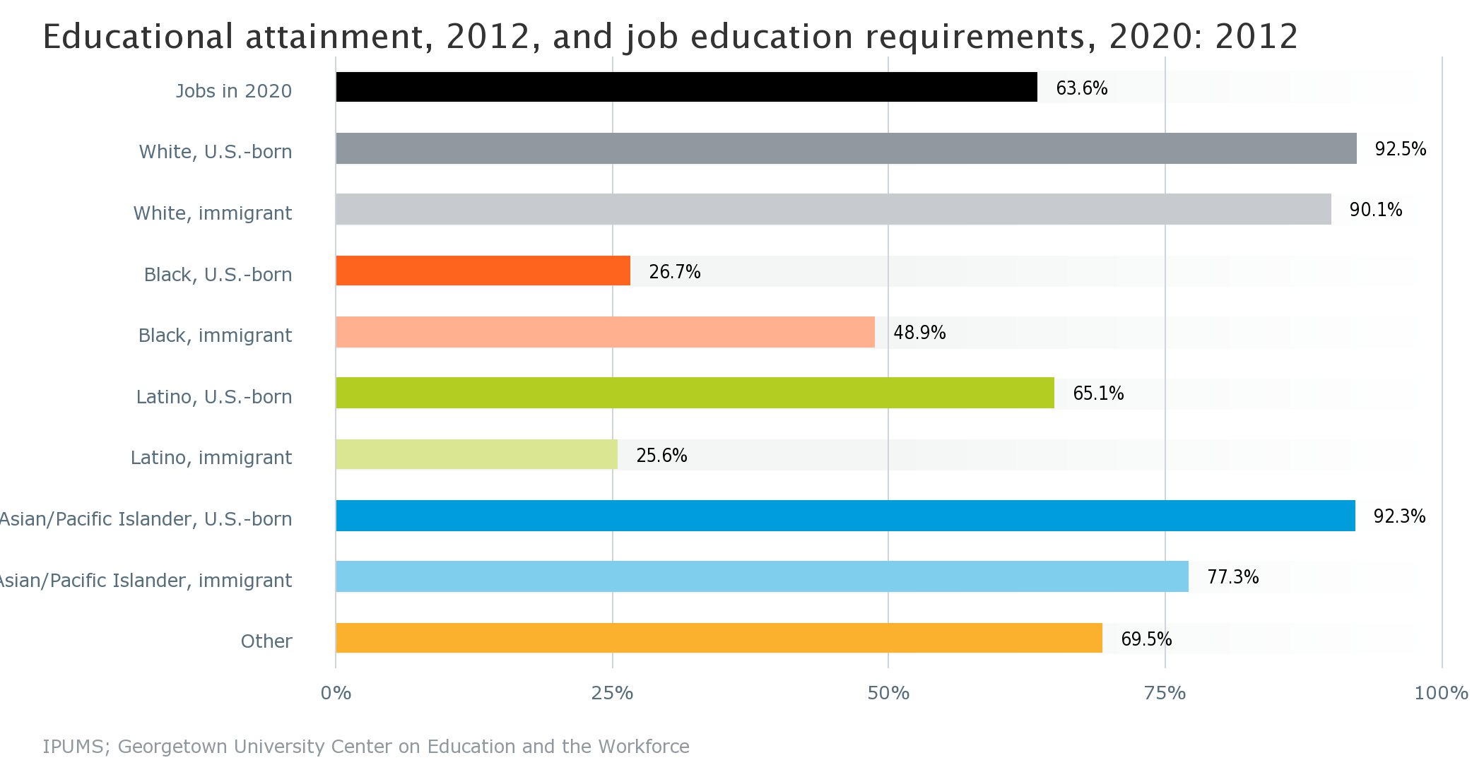
Credit: Current educational attainment and projected state/national-level job education requirements by race/ethnicity/National Equity Atlas 

Furthermore 23% of the city’s 16 to 24 year olds of color are unemployed or not in school, a rate more than seven times greater than for white young adults of the same age. Given how interconnected educational attainment and income are, these figures offer a sobering prognostication for income inequality in the future.

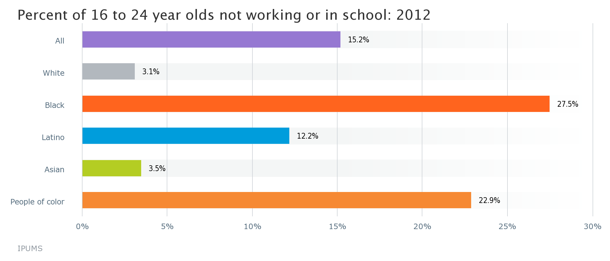
Credit: Percent of 16 to 24 year olds not working or in school by race/ethnicity/National Equity Atlas 

The relationship between economic outcomes and educational attainment is also reciprocal; a 2010 study found that a $3,000 increase in income to a working family between a child’s prenatal year through the age of five is associated with 19% higher earnings when that child reaches adulthood. Closing racial gaps in income and employment would mean a nearly 150% increase in the average income for people of color in the city.

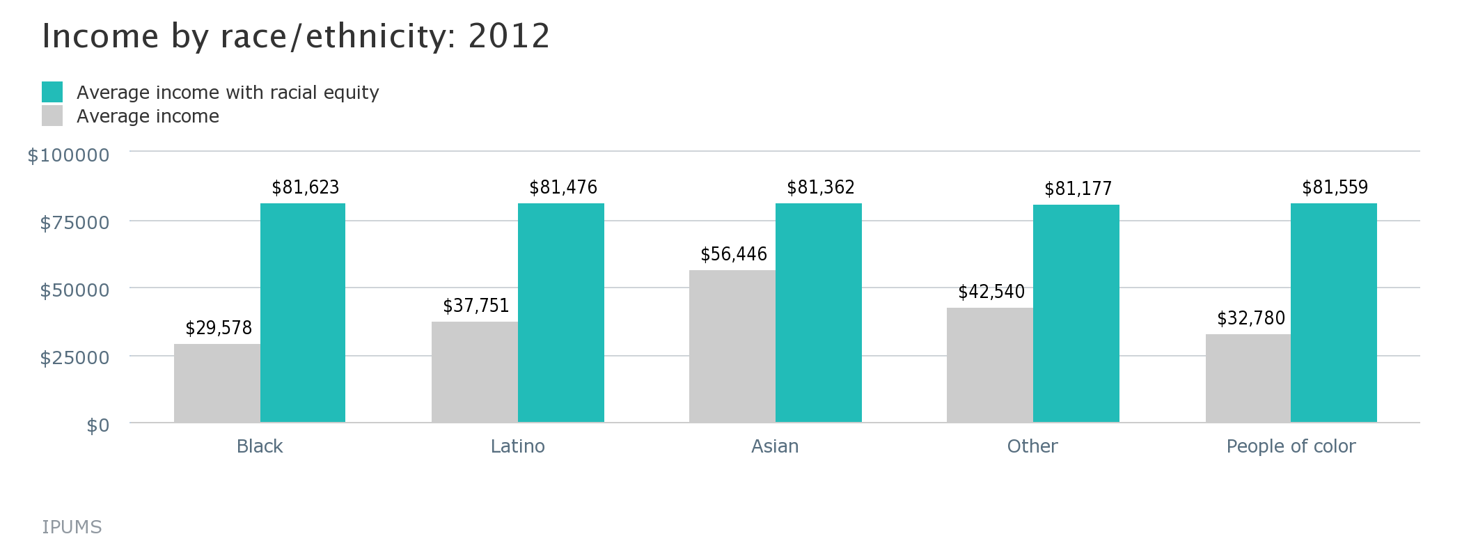
Credit: Income by race/ethnicity/National Equity Atlas

Combating inequality will require a comprehensive approach that includes both a quality education that gives all students the skills needed to succeed in careers when they graduate as well as increased economic investment in the city’s low-income neighborhoods and material assistance to help lift children and their families out of poverty. Our success today will go a long way in determining the type of city Washington will be in the future.

Welcome to the National Equity Atlas!

The Equity Atlas team at PolicyLink and the USC Program for Environmental and Regional Equity (PERE) are thrilled to share the National Equity Atlas with you!

We built the Atlas as a tool for those who are working to transform America's economy into one that is equitable, resilient, and prosperousregion by region, and state by state. 

Think of it as your one-stop-shop for accessing data and policy ideas to track, measure, and advance inclusive growthin your region, your state, and the United States. At the click of a button, you can access 20 relevant, useful, field-tested indicators of demographic change and racial and economic inclusion. The Atlas currently includes data for the largest 150 regions, all 50 states, the District of Columbia, and the United States as a whole.

The Atlas is a tool for social change. It equips community leaders and policymakers with facts and analyses to:

  • Understand how your community’s demographics are changing;
  • Assess how well diverse populations can participate in your community's economic vitality, contribute to its readiness for the future, and connect to its assets and resources;
  • Catalyze and inform new conversations about why—and how much—equity matters to your community’s future; and
  • Inform policies, plans, strategies, business models, and investments to advance equitable growth.
     

Our aim is to democratize data and make it easy for you to understand, discuss, and use. Explore the Atlas to find:

  • Data summaries that provide a snapshot of how your community is doing on six key indicators of demographic change, equity, and the economic benefits of equity;
  • Charts, graphs, and maps to share with your colleagues and add to your presentations, fact sheets, reports, and funding proposals;
  • Stories about how local leaders are using equity data to drive new conversations and implement new equitable growth strategies and policies; 
  • And much more!


The Atlas is a living resource. We will be adding new data on a regular basis and we invite you to tell us what data you'd like to see. We also invite you to share your story about using equity data for social change. Please sign up  for our email list to find out about new data, analyses, and stories about how people are using data to build an equitable economy.

Enjoy exploring! 

Sarah, Jennifer, and the entire Equity Atlas team (Justin, Pamela, Josh, Victor, Rosa, Angela, and Manuel)

Portland's Regional Equity Atlas: Institutionalizing Equity Since 2007

The nation’s first regional equity atlas originated out of Portland, Oregon. Launched by the planning and policy advocacy group Coalition for a Livable Future in 2007, the original Regional Equity Atlas provided a visual representation of equity and inequity across the region and catalyzed a metrowide discussion about equity and inclusion. Today, equity is seen as an outcome to strive for by advocates and government officials alike, and the equity atlas played a major role in that shift, according to Mara Gross, the coalition’s Executive Director.

The first Equity Atlas was a book that included maps and text about the distribution of people and assets in the region, and the relationship between demographics and opportunity. In 2013, CLF launched version 2.0, an online tool that maps a wide range of measures of health and well-being.

Equity Atlas 2.0 includes data on the issues that stakeholders from across the region view as priorities, including:  

  • Demographics:  Race/ ethnicity, income, age, and household composition
  • Access Measures:  How well the residents of a particular geographic area can access key opportunities including a healthy environment, food, housing, transportation, parks and nature, education, economic opportunity, services, and other community resources
  • Health Outcome Measures:  Key diseases that are affected by the conditions in which we live, such as the rates of asthma, diabetes, and cardiovascular disease, as well as other health outcomes such as obesity and birth outcomes
  •  

With the health outcome measures added, advocates and decision-makers can map different variables to see correlations with health outcomes. Seeing how race, income, geographic distribution, or access to transportation corresponds with health helps pinpoint where interventions and supports should be targeted.

As Beth Kaye, Healthy Eating Active Living Cities Campaign Manager at the Oregon Public Health Institute, says:

“Maps are the language of cities. They help tell the story of inequity because pictures don't lie.  It’s really powerful to show that obesity rates are higher in places with few sidewalks and poor access to transit, parks, and greengrocers. That correlation is usually invisible, but a good map makes it evident. Community voices add nuance by describing their experiences living in a place.  Maps push local governments to think about physical fixes, like installing sidewalks and safe crossings between an affordable housing development and a playground."

The impacts of the Equity Atlas are wide-ranging. Organizations and government agencies working on health equity, transportation and land use, affordable housing development, anti-poverty initiatives, and food access have all used the Atlas to inform their efforts.

Institutionalizing an equity focus within government agencies is a key outcome. “The greatest impacts from the Equity Atlas are that it has helped prompt local governments to start institutionalizing an equity lens,” says Gross. Atlas data has “shaped investment priorities, guided system design, and supported advocacy campaigns.”

Here are several examples of how government initiatives have used the Atlas:

  • The Oregon Prosperity Initiative used Equity Atlas maps to inform which communities should be targeted for a pilot program that aims to address and prevent poverty through systemic reforms in several areas, including education, economic and workforce development and healthcare. Atlas maps helped pinpoint which areas were most in need.
  • The Washington County Women Infants and Children (WIC) department located its new WIC office based on information provided through the Equity Atlas’s transit and demographic maps showing where transit was available in relation to where low-income populations live.
  • The Portland Bureau of Transportation used Equity Atlas data to determine where to prioritize investments in street lighting upgrades. They used Equity Atlas maps to see which neighborhoods had the highest level of need based on demographics, access to active transit, and transportation safety.


Still going strong and evolving to meet community data needs, Portland's Regional Equity Atlas illustrates how equity data and maps can be crucial tools for embedding equity throughout institutions and building inclusive communities across regions.

12 Facts About Wage Trends in the States and Regions Where Minimum Wage is on the Ballot

UPDATE (11/5): Voters said yes to raising the minimum wage in all of the state and city minimum wage propositions described below.

On Tuesday, voters in voters in four states—Alaska, Arkansas, Nebraska, and South Dakota—will decide whether to raise their states’ minimum wages. In Illinois, voters will also cast their ballots on an advisory measure to raise their state minimum. According to an analysis by Ben Casselman at FiveThirtyEight, raising the minimum wage in these five states (by a $0.25 per hour in Arkansas to $1.75 per hour in Illinois) could affect 680,000 low-wage workers. Minimum wage hikes are also on the ballot in the Bay Area cities of Oakland and San Francisco.

Moving the minimum wage closer to a family-supporting “living wage” is a critical policy to shift the nation toward inclusive growth. Most of the jobs being added to the economy are low-wage jobs, and nearly everywhere, the minimum wage is simply not enough to make ends meet (the federal minimum wage is $7.25 per hour). Since low-wage workers are disproportionately workers of color, raising the minimum wage has the double benefit of addressing racial as well as economic inclusion.

Interested in learning some more facts behind these wage debates? The National Equity Atlas is a great source of data on long-term wage trends in states and regions. Here are 12 facts—two about each of these five states and two from the San Francisco Bay Area—drawn from the Wages, Income Growth, and Job and Wage Growth indicators in the Atlas:

ALASKA

#1 Alaska’s full-time workers at the 10th percentile earned about $7,700 less in 2012 than in 1980—a 25 percent decline.

#2 Over the past two decades, Alaska grew low-wage jobs (74 percent increase) much more quickly than middle- (21 percent) or high-wage ones (53 percent).

ARKANSAS

#3 In Arkansas, full-time workers at the 10th percentile earned about $1,700 less in 2012 than in 1980—a 9 percent decline.

#4 Since 1980, the median wage for workers of color in Arkansas has been $13 per hour and the median wage for white workers has been $17 per hour.

ILLINOIS

#5 In Illinois, full-time workers at the 10th percentile earned about $5,000 less in 2012 than in 1980—a 20 percent decline.

#6 Since 1990, Illinois grew low-wage jobs (22 percent increase) much more quickly than middle- (.3 percent) or high-wage ones (7 percent).

NEBRASKA

#7 Nebraska’s full-time workers at the 10th percentile earned about $800 less in 2012 than in 1980.

#8 The median wage for Nebraska’s workers of color in 1980 was $18 per hour; in 2012 it was $13 per hour.

SOUTH DAKOTA

#9 South Dakota’s full-time workers at the 10th percentile earned just $670 more in 2012 than in 1980—a 3 percent raise over more than three decades.

#10 The median wage for both white workers and workers of color in South Dakota today is a dollar less per hour than it was in 1980.

SAN FRANCISCO-OAKLAND-FREMONT METRO AREA

#11 In the Bay Area, full-time workers at the 10th percentile earned about $2,500 less in 2012 than in 1980—a 10 percent decline.

#12 The median wage for white Bay Area workers has increased from $27 to $34 per hour between 1980 and 2012; for workers of color the median wage only increased from $22 to $23 per hour during that time period.

Follow us on Twitter (@PolicyLink and @PERE_USC) for more facts and charts about wages in these states and regions, as well as others that are debating legislation to raise their minimum wage.

Denver's Regional Equity Atlas: Improving Urban Planning With Equity Data

Data can, and should, play a central role in urban planning. In Denver, CO, the Denver Regional Equity Atlas overlays educational, income, health, and other equity metrics on the new transit network to paint a picture of how transit impacts equity. As a result, the Atlas has helped advocates fight for better transit access, strengthen existing partnerships and engage new partners. The Atlas continues to be an important organizing tool.

Using Data to Advocate for Transit

Transit routes that help connect people to the places in which they work are particularly important for low-income families, who heavily rely on public transportation. Using data from the Atlas, advocates were able to save a bus route that served low-income residents but had been slated for closure when the city’s new light rail service opened. Coalition coordinator Davian Gagne says, “The Equity Atlas helped us understand which communities we needed to be prioritizing for outreach and where bus services routes had the highest level of impact.”

Bringing Partners Together

Mile High Connects, the creator of the original Atlas, sees it as one of the most fundamental tools in forming their equity collaborative. A partnership between private, public, and nonprofit organizations that are committed to developing inclusive, affordable and livable communities within walking distance of public transit, Mile High Connects engaged new partners through the original Atlas. As Dace West, Director of Mile High Connects says, “The first Atlas was a static map and it was instrumental in bringing people to the table, especially the philanthropic community, which hadn’t been as involved in equity work until then. It was a way to invite our public sector partners to take a look at some of the other actions taking place around the region.”

The Atlas is now in its second iteration as an online interactive tool that creates custom maps and summaries of statistics for particular interest areas in the region. The online tool was launched in partnership between Mile High Connects and the Denver Regional Council of Governments, the regional planning office, along with the Piton Foundation. The planning agency hosts the website and the foundation created the data engine and open data framework that makes the data accessible and sharable. A Housing and Urban Development (HUD) Sustainable Communities Initiative Grant allowed these groups to deepen their relationship and have joint ownership over the Atlas. 

The Atlas also facilitates data sharing and coordination between the two, a benefit that will lead to more equitable long-term planning. “The Equity Atlas is a piece of the story and through the Sustainable Communities Initiative Grant there are a number of ways we are interacting with our MPO, including a longer term Memorandum of Understanding to preserve the work we have done together,” said West. “Over several months, we’ve had the opportunity to explore more ways in which we can work together that go even beyond the Atlas.”

Now that the Atlas is online, Mile High Connect is looking to respond more directly to the interests and needs of their partner organizations, especially when it comes to the data they are most interested in and that they access most frequently. The maps created through the Atlas help provide a visual tool to help advocates make the case for areas that need fresh food or transit connection from housing to job centers, for example. West say, “The Atlas has really provided the ability to visually represent where some of those mismatches are happening.”

A Tool for Organizing Communities

The Atlas can also be an important tool in organizing communities. Stephen Moore, a policy analyst at FRESC, uses the Atlas with community leaders so they can map their own communities and see what impact developments can have on their communities. When a development is proposed, Moore can show community leaders what happened in similar communities. Moore said, “We can show the displacement caused in other communities and say, ‘here’s some information about what these communities used to look like and what they look like now. The median house cost has increased and demographics have shifted. Looking at that neighborhood and looking at your own, what do you think about the kind of displacement that is likely to take place?”

By providing a visual understanding of the change taking place in the City, the Denver Regional Equity Atlas is helping advocates shape how they want their communities, and region, to look and advancing equity through smart, community based urban planning.

Pages