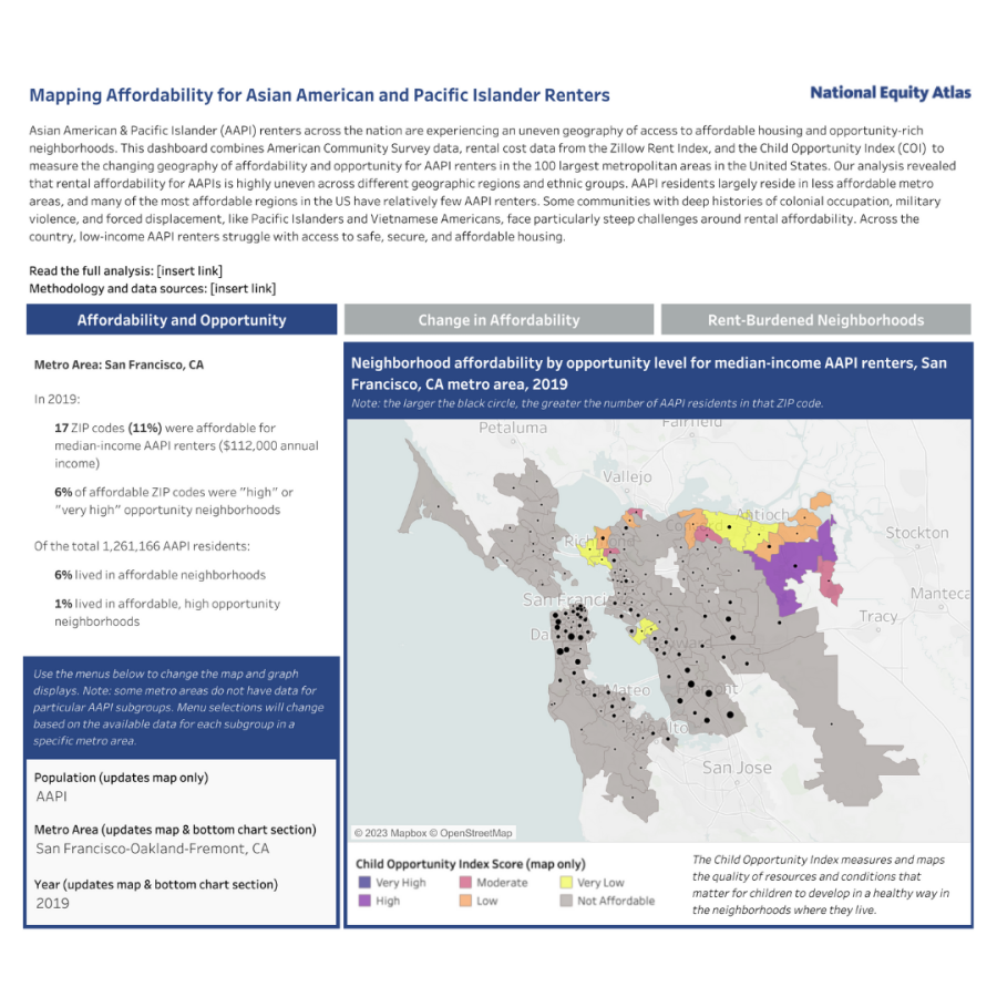
Dashboard: Mapping Affordability for Asian Americans and Pacific Islanders Renters
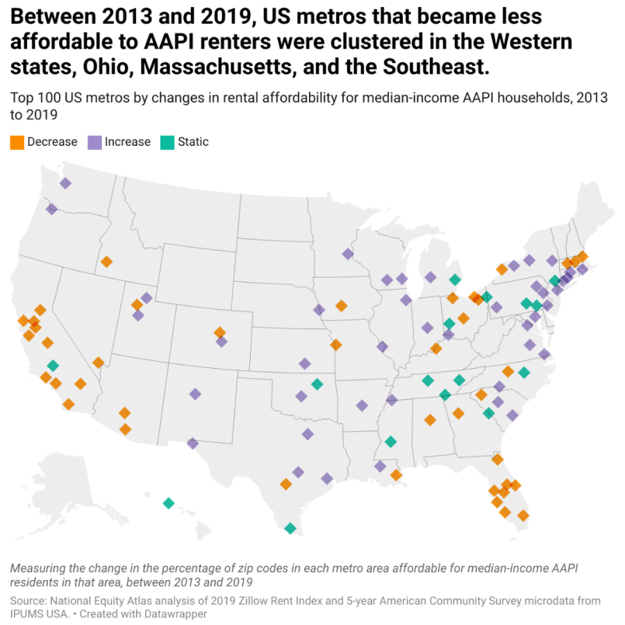
In April 2023, the National Equity Atlas released The Uneven Geography of Opportunity for Asian Americans and Pacific Islanders in Metro America. The report examines differences in affordability between Asian American and Pacific Islander (AAPI) subgroups in 2013 and 2019 in the largest 100 metropolitan areas, which account for the geographies where the vast majority of Asian Americans and Pacific Islanders reside. While we developed the analysis, we connected with several advocates who noted their lack of access to data and voiced the need for data disaggregated by subgroups within the AAPI diaspora. This accompanying dashboard was designed to provide advocates direct access to data we pulled for the analysis.
The following visual highlights several key design elements we used in the strategic design of this dashboard. Click on the questions below to explore more about our approach to designing this dashboard.
Key Design Highlights
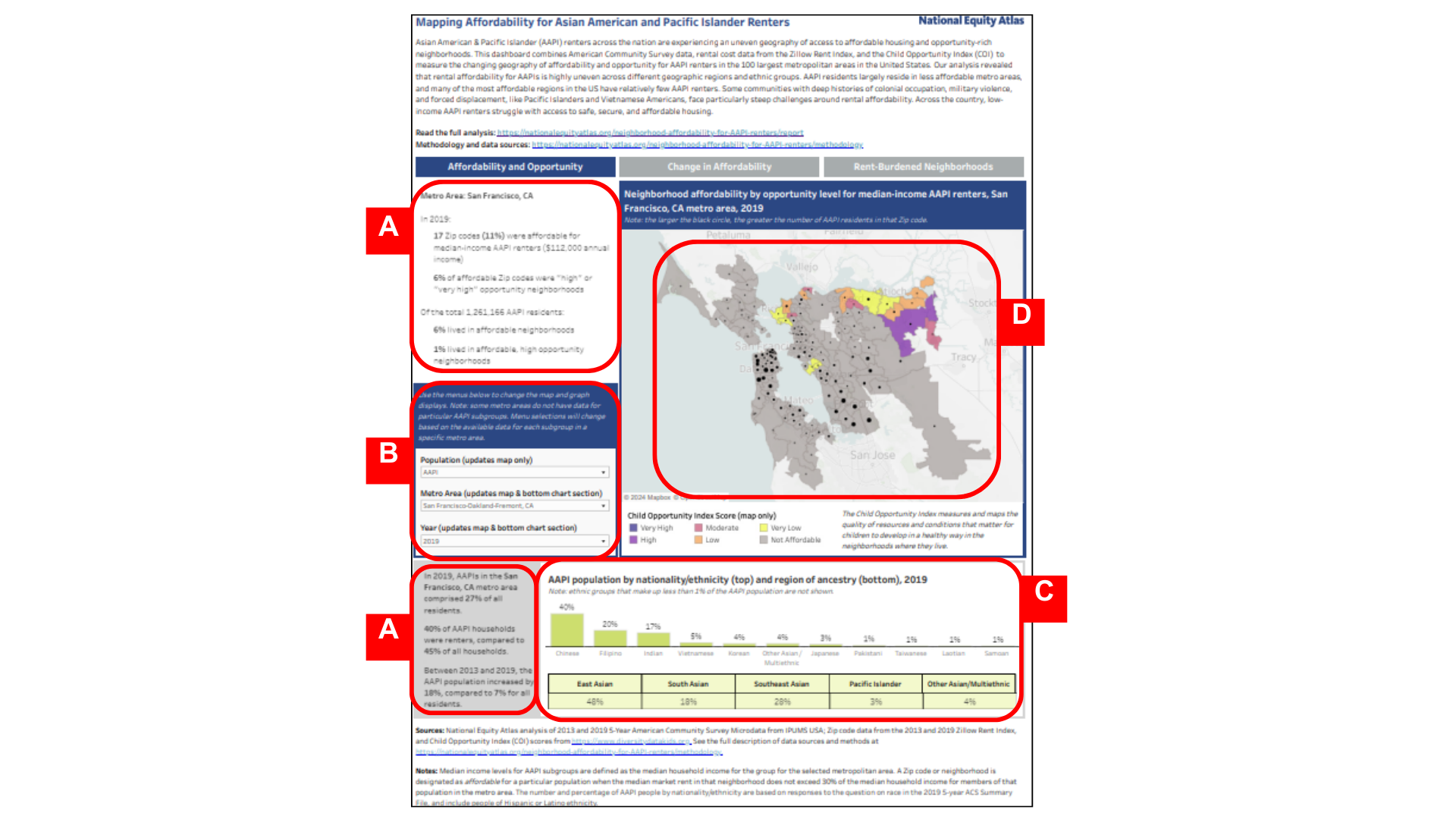
(A) Text that is expressed as descriptive statements to help users quickly access and interpret data
(B) The inclusion of multiple filters that allow users to customize views and explore data for specific AAPI subgroups, metropolitan areas, and years
(C) Multiple displays that show the different disaggregations (nationality and region of ancestry) of AAPI subgroups
(D) A color legend and dynamically resized dots that enabled us to visualize two different indicators within one map display
Who was the dashboard created in partnership with?
This dashboard was created in partnership with the advocacy organizations we spoke with who informed the development of the The Uneven Geography of Opportunity for Asian Americans and Pacific Islanders in Metro America report.
Who was the dashboard created for?
This dashboard was created for advocacy organizations that serve AAPI communities at the metro level, with a focus on renters within those communities.
What was the intended use of the dashboard?
During the development of the analysis, advocacy partners we spoke with expressed an ongoing struggle to access and identify data disaggregated for AAPI subgroups. This dashboard was designed to provide advocates direct access to all the data we pulled for the analysis, with the hope that doing so would be useful for them and their work. We also aimed to democratize data for advocates in the field as part of our research justice approach.
What data is included in the dashboard?
This dashboard combines American Community Survey data, rent data from the Zillow Rent Index, and data from the Child Opportunity Index (COI) to measure the changing geography of affordability and opportunity for AAPI renters in the 100 largest metropolitan areas in the United States. The data it features is disaggregated by AAPI subgroups.
What was the design approach?
The dashboard was designed to share data in an easily digestible format and to enable users to customize and explore the data for use in their work. We kept the chart titles more technical and the framing text to a minimum to maximize the display space available for charts and text.
By minimizing the narrative and framing text, we only included text that supported the use of the dashboard and data. While the dashboard was released as part of a longer analysis, it was designed to be a standalone tool for users to access the data separate from our findings and takeaways. The resulting design included enough text to guide users in navigating the dashboard and interpreting the data.