Dashboard: Rent Debt in America
This dashboard was produced by the National Equity Atlas, in partnership with the Right to the City national alliance, to support strong renter protections for those impacted by the pandemic-driven rent debt crisis. It provides timely data on the number of households who owe back rent, the characteristics of those renters, their estimated rent debt, and the allocation and distribution of renter relief funds.
The visual below highlights several key design elements used in the strategic design of this dashboard. Continue to the questions below the display to explore more about our approach to designing this dashboard.
Key Design Highlights
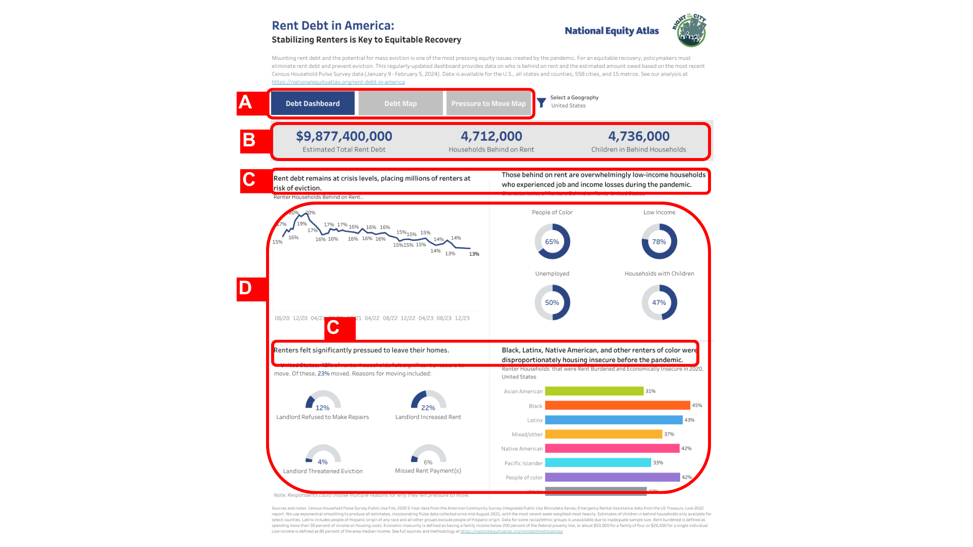
(A) Navigation buttons that are placed along the top to guide users in exploring the available data
(B) A header bar that draws attention to data highlighting the magnitude of rent debt
(C) Bolded header text that provides the narrative frame, with technical titles included in a smaller font size
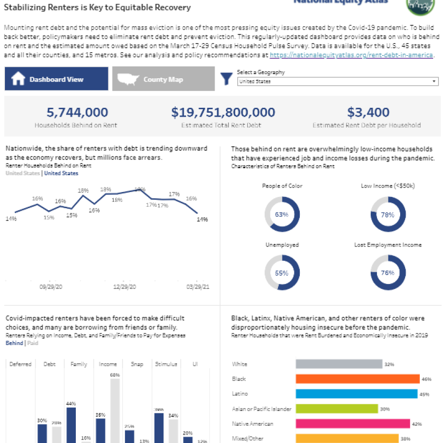
(D) Selected indicators that provide an overview of rent debt for each geography highlighted in the dashboard, as well as a default view that helps provide a broader framing of the issue of rent debt
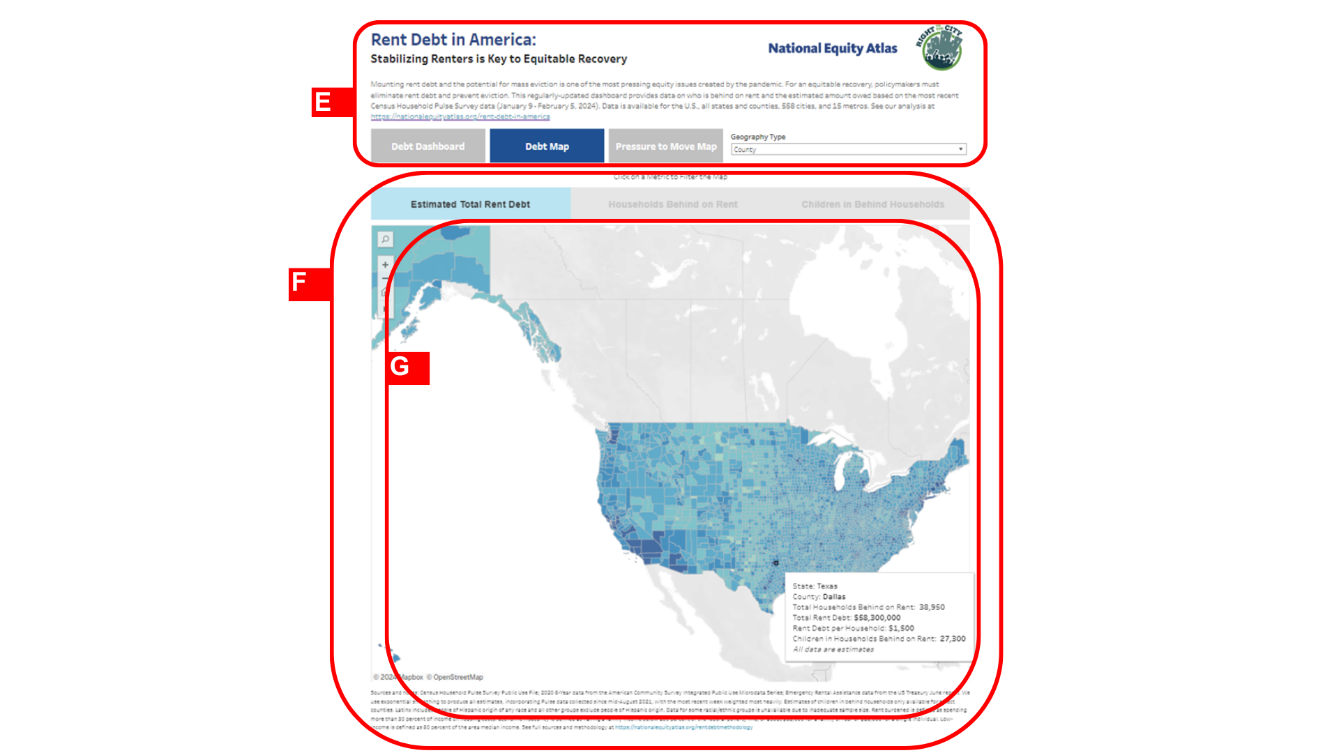
(E) Consistent visuals (text, graphics, and navigation buttons) along the top of each layer that support ease of use and navigation
(F) Minimal text in the secondary layers that allows users to more freely explore the data
(G) A choropleth map that helps show comparisons between geographies and tooltips that provide further information when users hover over geographies
Who was the dashboard created in partnership with?
The dashboard was created in partnership with Right to the City, which provided key insights into the information needed by housing advocates across the country and how the data would be used by advocates. The initial dashboard was designed in partnership with Chantilly Juggernauth of Lovelytics.
Who was the dashboard created for?
This dashboard was created for housing advocates who focused on advancing eviction and tenant protection policies during the Covid-19 pandemic.
What was the intended use of the dashboard?
The dashboard was developed to support advocacy efforts aimed at showing policymakers the extent of the impact of pandemic-related rent debt, to ensure funds from the Emergency Rental Assistance Program (ERAP) were both available and sufficient, and to hold governments accountable for distributing those funds.
What data is included in the dashboard?
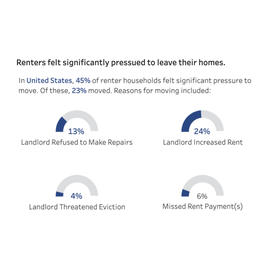
The dashboard’s data provides information on who is behind on rent and the estimated amount owed. It includes characteristics of the households most likely affected by rent debt. The dashboard also previously tracked ERAP funds distributed by state and local governments.
The dashboard includes estimates of the amount of rent debt, the number of households with debt, the number of children living in those households, and the average back rent owed for the US, states, counties, and select regions and cities. It also reports the amount of governmental aid allocated through the Emergency Rental Assistance Program (ERA1). Drawing current data from the Census Bureau’s Household Pulse Survey, the US Department of the Treasury, and the University of Southern California Center for Economic and Social Research's Understanding Coronavirus in America survey, the dashboard was approximately refreshed with each new release of the Household Pulse Survey data tables.
What was the design approach?
The dashboard layout allows users to quickly see the data across four indicators of rent debt. The layout of the indicators follows the narrative regarding overall trends in rent debt burden and the characteristics of the households experiencing rent debt. Given that most housing advocates who are part of the Right to the City national alliance focus on a specific geographic area, the default view of the dashboard is designed to provide an overview of a particular geography, rather than a comparison across places. The interactive map layer then provides an easy-to-read geographic comparison between counties and cities in a given state.