Original post on NTEN.org.
Compelling facts have always been a key ingredient in winning policy campaigns, and the rise of web technology has opened the floodgates for data that would have been out of reach to all but the most dogged advocates just 20 years ago.
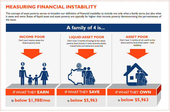
But while we are awash in data, it is often like Coleridge’s famous line: “Water, water, everywhere; nor any drop to drink.” The sheer volume of data is overwhelming, and the data that is accessible is often not the right data. Advocates working for equity—just and fair inclusion for all—need data that is broken down by race, age, geography, income, and other dimensions. They also need a way to frame the data—a narrative that explains how and why these inequities matter.
As an organization founded to advance economic and social equity through policy change, PolicyLink is working to fill this need and equip changemakers with a data-backed narrative to help them win.
Equity Is the Superior Growth Model
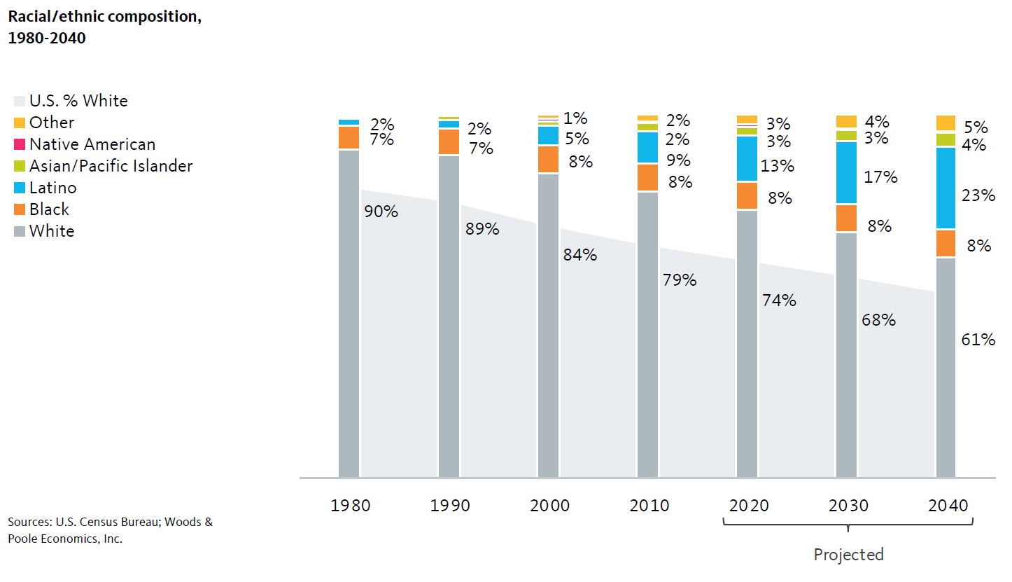
About five years ago, Angela Glover Blackwell, the founder and CEO PolicyLink, saw the kernels of a new and powerful narrative for equity advocates. The 2010 Census results were out and they showed that the country was continuing to grow more diverse. Meanwhile, the Occupy Wall Street movement was bringing inequality to the public’s attention and new research was showing how rising inequality was a risk not just for those being left behind, but for the growth and prosperity of entire regions and nations.
Angela wove these threads together into a new story about the centrality of racial and economic inclusion not only as a moral imperative—which it continues to be—but as an economic one. America is bolting toward having a multiracial, people-of-color majority within just a few decades. Our growing, diverse workforce and population is a tremendous asset in the global economy—one that can only be fully manifested if people of color can access the resources and opportunities they need to participate in and contribute to growth and democracy. Dismantling lingering racial barriers and creating pathways to educational and economic security and success is critical to their future and the future of their communities and the country as a whole. The take-home is clear—equity is the superior growth model.
Building a Data-Backed Narrative
Data was at the heart of this framing from the beginning. Recognizing the importance of disaggregated and regularly updated data to keep the message fresh and give it legs, PolicyLink joined forces with the Program for Environmental and Regional Equity at the University of Southern California (PERE). PERE is a research and policy shop headed by Dr. Manuel Pastor who is a prominent researcher, speaker, and writer on issues of changing demographics, racial equity, and the economy. PERE conducts all kinds of research, but our partnership drew on their deep-bench strength in quantitative research and the development, maintenance, and facility with large datasets.
Our team worked together to produce a framing paper, America’s Tomorrow: Equity Is the Superior Growth Model (PDF), that bolstered the narrative with powerful statistics, maps, and charts and shared it with our networks of advocates and the broader world.
Going Local: Tailoring the Narrative to Regional Realities
The national story was critical for starting this narrative shift work, but we knew that advocates and policymakers needed data for their own community to put it to use. PERE painstakingly built the data infrastructure to make that possible, drawing from multiple data sources including historical economic data and demographic projections, aligning this data to consistently-defined boundaries for 202 geographies: the 150 largest regions, all 50 states, the District of Columbia, and the United States as a whole.
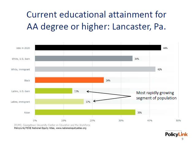
Equipped with this data, we began working with collaborations of local leaders who were developing regional sustainability plans. In about a dozen diverse counties, regions, and states, we developed Equity Profiles that document their changing demographics and performance on a host of equity indicators. These profiles helped these changemakers understand the trends in their communities, link these trends to the experiences of their constituents and community members, and develop shared narratives about how and why equity and inclusion mattered to their economic futures.
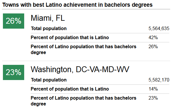
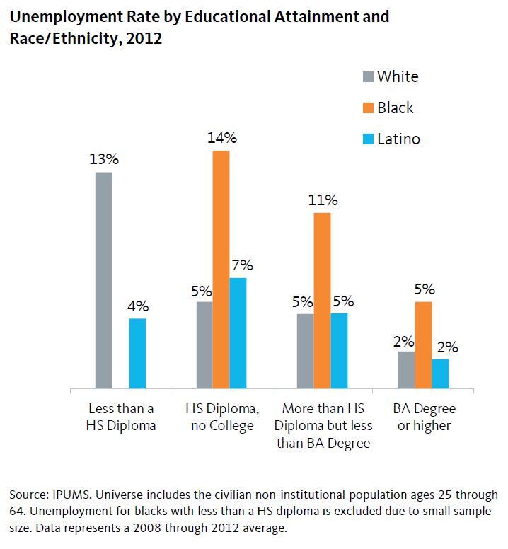
From the Heartland metros of Omaha and Kansas City to diverse regions like Miami and Houston, demographic change was a salient issue. Even in predominantly-White communities, Latinos, Asians, African Americans and other communities of color are usually driving population growth, and breathing new life into disinvested commercial corridors. Combining the demographic data with metrics showing how different groups are excelling—or in many cases, being left behind—on key indicators of economic success, health, education, and more was a good starting point for having productive local discussions about race, equity, and opportunity.
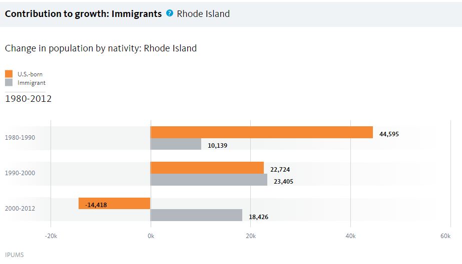
Coming together around the data helped these collaborations grow stronger, identify areas of focus, and bring on new partners. In Rhode Island, the profile led directly to policy action. After seeing how communities of color were responsible for all of the state’s population growth yet faced major barriers to economic opportunity, then-Governor Chafee opened a new Office of Diversity, Equity, and Opportunity focused on inclusive hiring and contracting in government jobs.
The local data strengthened our own advocacy as well. In California, the Alliance for Boys and Men of Color, which we coordinate, married economic imperative data and messaging with the voices of youth leaders to successfully win a slate of state policies that reform harmful “zero tolerance” school discipline approaches, invest in career pathways for men returning from prison, and more. As youth advocate Angel Diaz put it, “If adults look at young people as assets to be developed instead of problems to solve, we can change the future.” We found that the mix of data, narrative, and testimonials is a potent advocacy tool.
Democratizing Data via the National Equity Atlas
From the beginning, our goal was to democratize this data and make it widely available to advocates and policymakers. Released last October, the National Equity Atlas is a one-of-a-kind resource to track, measure, and make the case for inclusive growth at the local, state, and national level.
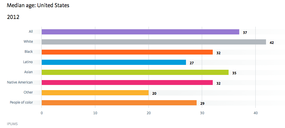
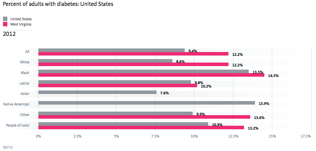
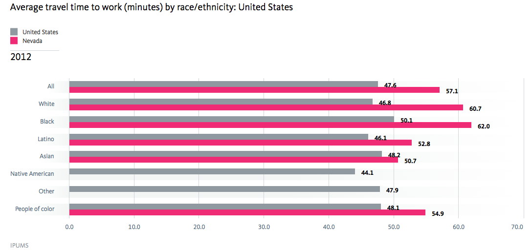
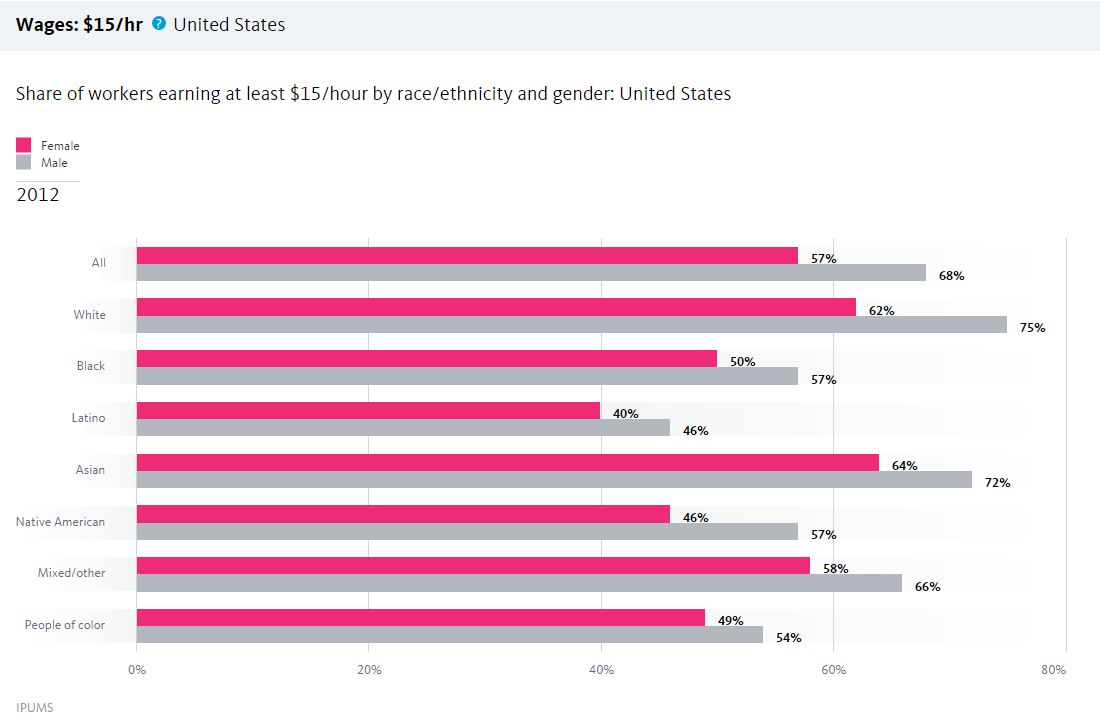
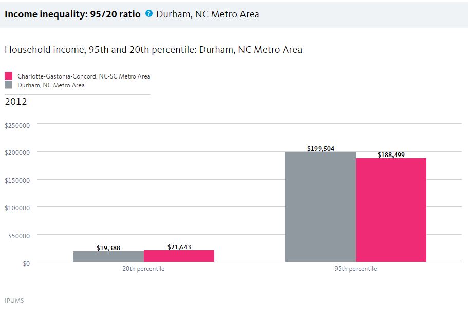
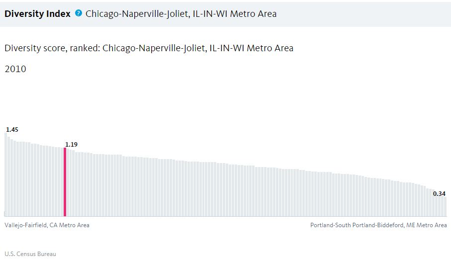
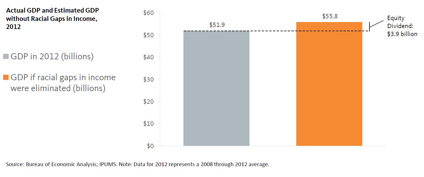
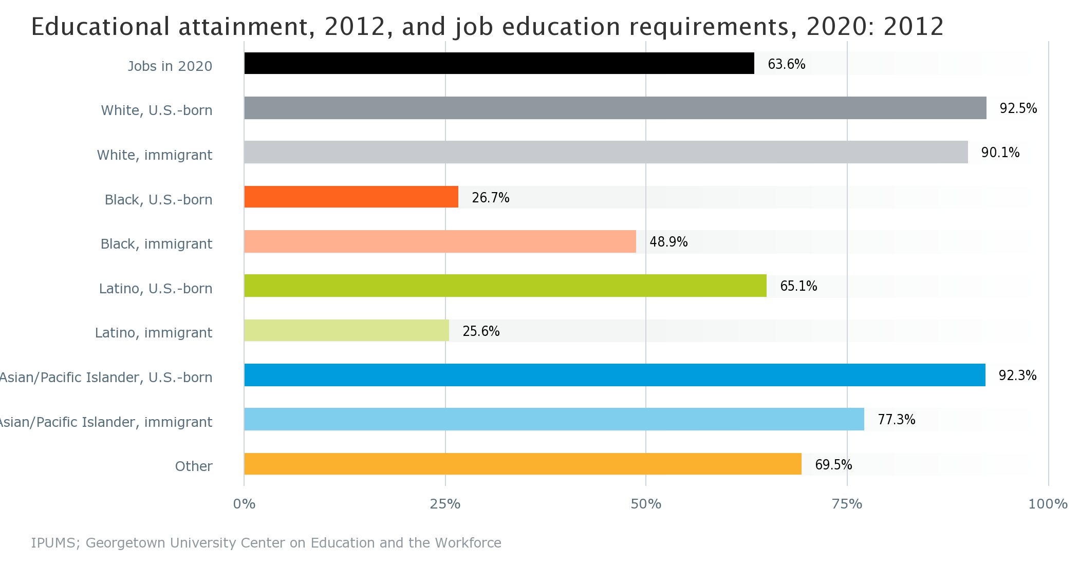
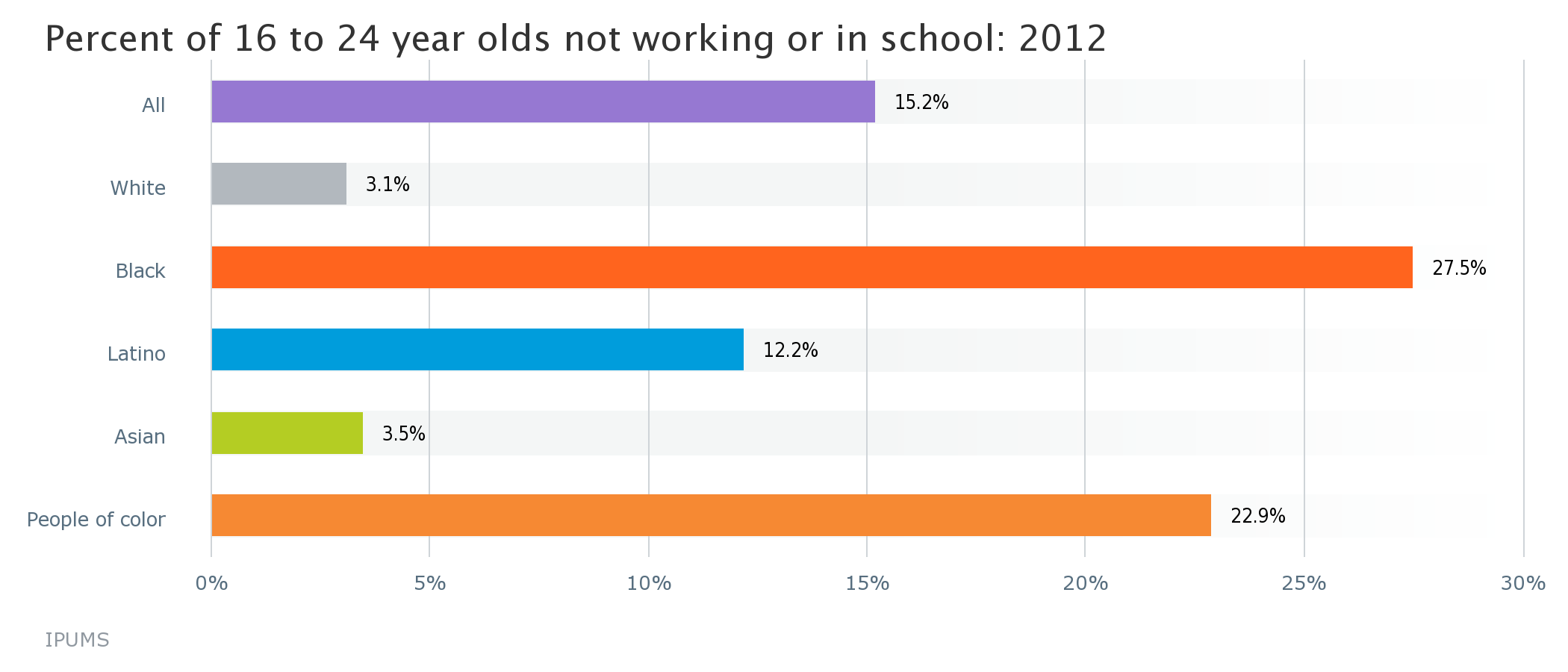
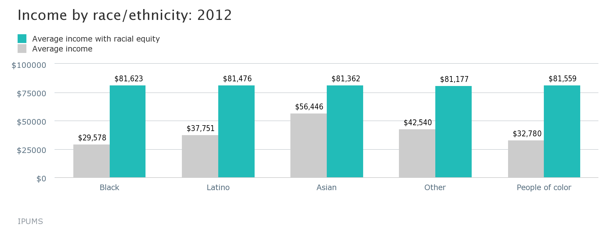
The Atlas makes detailed data disaggregated by race, nativity, education, income, and more available through a user-friendly interface. At the click of a button, you can access 29 field-tested indicators of demographic change, racial and economic inclusion, and the economic benefits of equity for the 202 geographies in our database. The “equity is the superior growth model” narrative is embedded throughout the site, providing context for how the data matters for equitable growth, along with policy ideas, real-world examples, and links to additional data and policy resources
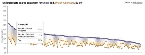
The Atlas is also a living resource, and next week we will be adding data for the 100 largest cities to the site (join us for the release webinar), and more indicators and data cuts (including disaggregating the Asian population) are in the works.
Data itself is not social change. But data combined with a story can power the bolder, smarter, more targeted strategies that communities need to leverage their increasing diversity as an asset and secure a bright economic future for all of their residents.