Chart of the Week: #RentersDayofAction

To add equity data to the national dialogue about growth and prosperity, every week the National Equity Atlas team posts a new chart from the Equity Atlas related to current events and issues.

Today, thousands are taking to the streets across the country to protest rising and unaffordable rents in what organizers are calling the “largest renter-led protest in recent history.” In 2012, more than half (51 percent) of renters were spending more than 30 percent of their incomes on rent, but the rates are even higher in some of the nation’s largest 100 cities.

To lift up the #RentersDayofAction demands calling for an end to rising rents and unjust evictions, this week’s chart looks at housing burden for renters, or the percent of renter-occupied households spending more than 30 percent of their income on rent, among the largest 100 cities. Though cost-burdened households have decreased slightly among renters based on the latest data, the greatest benefits have gone to homeowners with a mortgage.

In 2012, 72 percent of renters in Hialeah, FL were housing burdened as were two in three Miami renters. The top five cities with the highest housing burdens were:

Housing is the single largest expense for most households and high housing costs squeeze household budgets leaving few resources to pay for other expenses, save for emergencies, or make long-term investments. The Urban Displacement Project, run by the University of California Berkeley, found that Bay Area cities with rent control laws saw less turnover in their renter populations and that rent control is most effective when paired with other tenant protections like just cause evictions policies. For a more extensive overview of strategies to resist gentrification, see Causa Justa Just Cause’s Development without Displacement report.

To view how affordability ranks in your community or how rates of housing burden vary by race/ethnicity or tenure, visit the National Equity Atlas and type in your city, region, or state. Download the charts and share them on social media using #RentersDayofAction and #equitydata.

Chart of the Week: Why the Latest U.S. Census Report Matters

To add equity data to the national dialogue about growth and prosperity, every week the National Equity Atlas team posts a new chart from the Equity Atlas related to current events and issues.

Yesterday, the Census Bureau released a report on 2015 income and poverty data, announcing that median household income increased by over 5 percent—the fastest growth on record. As President Obama described in a Facebook post and video with Jason Furman, Chairman of the Council of Economic Advisers, the gains were largest among the bottom fifth of households.

To highlight why this gain — especially among the bottom quintile of earners — is so important, this week’s chart looks at real earned income growth for full-time wage and salary workers in the United States from 1980 to 2012.

Over the three decades from 1980 to 2012, the inflation-adjusted earnings of the bottom 10 percent of workers decreased the most at more than 11 percent. In fact, the whole bottom half of workers experienced real declines in their incomes over this period. At the other end, those in the top 10 percent saw their earnings increase by nearly 15 percent. The announcement that real income growth in 2015 was the fastest since 1969 for households at the 10th, 20th, 40th, 50th, and 60th percentiles is a promising finding, though there is still more to be done.

These income increases, combined with refundable tax credits, lifted millions of families and children out of poverty. In 2015, 9.2 million Americans, including 4.8 million children, moved above the poverty line with the help of credits like the Earned Income Tax Credit (EITC) and the Child Tax Credit (CTC). Expanding these social safety net programs through a more equitable tax code and advancing pre-tax income strategies like minimum wage increases and stronger collective bargaining rights are key to supporting the more than 8 million families still in poverty. For more information on policies that contribute to wage growth, see the Economic Policy Institute’s Agenda to Raise America’s Pay.

To view the distribution of income growth in your community over the last three decades, visit the National Equity Atlas and type in your city, region, or state. Download the charts and share them on social media using #equitydata.

Chart of the Week: Disconnected Native Youth in North Dakota

To add equity data to the national dialogue about growth and prosperity, every week the National Equity Atlas team posts a new chart drawing from the Equity Atlas related to current events and issues.

In what some are calling the largest gathering of tribal nations in 150 years, a multigenerational coalition has assembled in North Dakota to stand with the Standing Rock Sioux Tribe to halt the construction of the Dakota Access Pipeline (#NoDAPL). Proponents of the 1,172-mile crude oil pipeline tout the economic benefits of the project in the wake of a declining state economy, but this project is not the way to foster sustainable and equitable growth in North Dakota’s Native communities.

To lift up this Native-led struggle to protect ancestral land and water in Standing Rock, this week’s chart looks at the share of young people ages 16 to 24 in North Dakota who are disconnected from work and school.

In North Dakota, Native American young people are the most likely among the major racial/ethnic groups to be disconnected from work and school. More than one in three Native American young people are neither working nor in school, compared with one in four Latinos and just 5 percent of Whites. Native Americans make up the second largest race/ethnic group in the state, but they continue to face steep barriers to economic inclusion, while inequitable development projects like the Dakota Access Pipeline threaten destruction of their sacred burial sites and water access.

Widespread youth disconnection hurts not only Native Americans and Latinos, but also the North Dakota economy. State policymakers can simultaneously invest in their economies and their most vulnerable populations by building robust cradle-to-career pipelines that support children and families, and by connecting young people of color to opportunities through targeted workforce training programs, apprenticeships, internships, and career academies.

To see how Native Americans fare across other indicators in North Dakota, visit the National Equity Atlas, type in North Dakota, and select an indicator. Download the charts and share them on social media using #equitydata and #NoDAPL.

Webinar Archive: 3 Ways to Use Equity Atlas Chart Downloads Webinar

The National Equity Atlas has improved chart downloads. To learn how to use this improved functionality, watch our latest webinar, “3 Ways to Use Equity Atlas Chart Downloads.” Here is the webinar recording and slides. We encourage you to share with your network.

Also, take a few minutes to review the material shared during the webinar. We created a mini-profile template and a social media tip sheet describing the different ways you can use our Atlas charts to promote your work.You can also follow our new #ChartoftheWeek series on the Atlas and on our @PolicyLink Twitter.       

Find analyses of our newest data updates here, in the “Data in Action” section:

·       Why U.S.-born Latinos Tend to Fare Better than Immigrant Latinos

·       Latino Immigrants Face Uphill Battle to Economic Inclusion

·       The Challenge of Youth Disconnectedness Among Latinas

We invite you to join our next live webinar, "Special Preview: Neighborhood Mapping on the Atlas", scheduled for Thursday, October 6, at 12:00 pm - 12:30 pm PT. We will be previewing our new mapping system and seeking feedback from you in advance of our public release in October. 

Please feel free to contact Sarah Treuhaft at sarah@policylink.org with any questions, or visit our “Frequently Asked Questions” section on the Atlas to scan commonly asked questions.

-- The National Equity Atlas team at PolicyLink and the USC Program for Environmental and Regional Equity (PERE)

Chart of the Week: #Fightfor15 this Labor Day

To add equity data to the national dialogue about growth and prosperity, every week the National Equity Atlas team posts a new chart drawing from the Equity Atlas related to current events and issues.

In honor of #LaborDay and the #Fightfor15, this week’s chart looks at the share of workers earning at least $15/hour in California. In an equitable economy, all workers would earn enough to support their family, or a “living wage.” What constitutes a living wage varies based on family size, but $15/hour is a good benchmark for understanding which groups are least likely to be earning a living wage. The fight for a $15/hour minimum wage is also an important campaign that continues to gain momentum.

In California, among full-time workers ages 25 to 64, Latinos are the least likely to make at least $15/hour. 49 percent of Latino women and 54 percent of Latino men earned at least $15/hour in 2012 compared with 81 percent of White women and 87 percent of White men. Latinos are the single largest ethnic group in California, but they continue to face some of the steepest barriers to economic inclusion.

Low wages among the growing Latino population is bad for families and bad for California’s economy: more money in the hands of workers means greater demand for goods and services. Research shows that companies can pay living wages and remain profitable, in part because paying higher wages reduces turnover and increases productivity.

Thanks to policy changes, we should soon see positive changes on this indicator. The minimum wage in California is currently $10/hour, but earlier this year, state lawmakers struck a deal to gradually raise the state minimum wage to $15/hour by 2022.

To see how the share of workers earning at least $15/hour varies by race/ethnicity and gender in your community, visit the National Equity Atlas, type in your city, region, or state, and select the “By gender” breakdown. Download and tweet at us the chart for your community using #equitydata and #Fightfor15.

Chart of the Week: #BlackWomensEqualPay

As America becomes a majority people-of-color nation, equity—just and fair inclusion—is the key to building strong communities and a strong economy. Understanding the state of equity in your community is critical for developing and making the case for solutions that foster equitable growth.

To add equity data to the national dialogue about growth and prosperity, today the National Equity Atlas team is launching a new “Chart of the Week” series. Every week, we will post a new chart drawing from the Equity Atlas related to current events and issues.

In honor of #BlackWomensEqualPay, this week’s chart looks at median wages for Black women in Atlanta, Georgia.

As the chart shows, Black women earn the lowest wages among full-time workers in Atlanta. With a median wage of $14/hour, Black women earn $20/hour less than White men and $13/hour less than White women. While White men and women earn more in Atlanta than the national average for their race and gender, Black women earn less in Atlanta than the national average for Black women ($16/hour), exacerbating racial inequities in the city.

There are many strategies that communities can take to address race and gender equity in pay, such as Boston’s 100% Talent Compact, in which businesses commit to sharing disaggregated data with the city’s Women’s Workforce Council to inform targeted policy solutions. In King County (Seattle), Washington, businesses are signing on to a similar initiative and pledging to identify internal gender equity issues, share lessons with other employers, and implement best practices to close the gender wage gap.

To see how Black women fare in your community, visit the National Equity Atlas, type in your city, region, or state, and select the “By gender” breakdown. Download and tweet at us the chart for your community using #60cents #equitydata @PolicyLink.

The Challenge of Youth Disconnectedness Among Latinas

By the end of this decade, the majority of youth under age 18 will be people of color. Their ability to succeed in the labor force will determine the strength of our economy in the decades to come. Yet, data on youth disconnectedness show we are failing the very people we are supposed to nurture, educate, and prepare to become the leaders of tomorrow. As the National Equity Atlas shows, there are 5.5 million young people ages 16 to 24 who are “disconnected” — neither working nor in school — and the majority of them are people of color.

Reconnecting these young people to education, skills, and career pathways is critical for their economic futures — and for our national prosperity. A study by scholars at Queens College, City University of New York and Teachers College, Columbia University calculates that every disconnected youth costs society $700,000 throughout their lifetime. To develop targeted solutions, it is critical to understand which youth face the greatest challenges, and that is why we added gender breakdowns to the “Disconnected youth” indicator on the Atlas.

A look at this new data reveals some surprising differences in youth disconnectedness by gender for Black and Latino young people. Below, we examine how youth disconnectedness varies by race and gender nationally, followed by a closer look at cities with the highest rates of disconnected Latinas.

Latinas face particularly high rates of youth disconnectedness

Of all major race and gender combinations, young Native American men are the most likely to be disconnected in the U.S. as a whole: 28 percent of Native American men ages 16 and 24 are neither in school nor working, followed by 25 percent of Native American young women. Young Black men are about as likely as Native American women to be disconnected. An unexpected finding is that one in five young Latinas are disconnected from school and work — a rate four percentage points higher than that for young Latinos.

Black and Native American young men are more likely to be disconnected than their female counterparts, while Latino and Asian and Pacific Islander young men are less likely to be disconnected than their female counterparts.

Cities with the highest share of disconnected Latinas 

To explore how youth disconnectedness varies for young Latinas across the largest 100 cities, we looked at the cities with the highest and lowest rates of disconnection among Latinas. There was enough data on Latinas ages 16 to 24 in 69 of the 100 largest cities. The share of Latinas in this age group who are not working or in school ranges from 40 percent in Detroit to 2 percent in Irvine, California. Detroit also has the greatest overall share of disconnected youth at 30 percent of all young people, but Latinas have the highest rate of disconnectedness in that city—6 percentage points higher than the share of disconnected Black men. In four of the five cities with the largest share of disconnected Latinas, Latinas are the most likely of all race-gender groups to be disconnected. In Nashville, Tennessee and Charlotte, North Carolina, one in three Latinas ages 16 to 24 is disconnected.

There could be a number of reasons for the higher rates of Latina disconnectedness in these cities. The Queens College/Teachers College study found that female disconnected youth are more likely to have family responsibilities while male disconnected youth are more likely to be incarcerated. Another study reported that 30 percent of female disconnected youth have children compared with 11 percent of all 16- to 24-year-old females. And in 2014, national Black and Latina teen birth rates were more than two times higher than the rate for White teens. Importantly, poverty and low levels of education correlate with teen pregnancy, and young people in the child welfare system are also more likely to become pregnant.

Early disconnection can have profound impacts later in life, particularly when it comes to employment, health, and participation. The American Public Health Association explained in a recent video that an 18-year-old male in California was more likely to be arrested in 2014 than he was to vote. And there is even evidence suggesting that employers use gaps in work history as a proxy for criminal activity or incarceration, which disproportionately impacts the job prospects of Black men. 

Where do Latinos have higher rates of disconnection than Latinas?

The share of disconnected Latinos is larger than the share of disconnected Latinas in only 11 of the 69 cities with sufficient data on Latina disconnection. In most of those cities, the difference is just a couple percentage points, except in Henderson, Nevada, San Francisco, California, and Irvine, California—the three cities with the lowest rates of disconnection among Latinas. The difference is largest in Irvine, California, where 12 percent of Latinos are disconnected compared with just 2 percent of Latinas.

Strategies for racial and gender justice

Ensuring that all young people are healthy, educated, and connected to opportunities is essential for economic prosperity. Solutions are comprehensive and require participation across education, juvenile justice, and child welfare systems. Reforming harsh, “zero tolerance” school discipline policies that put boys and girls of color on track to jail rather than college is key to keeping young people in classrooms. And transforming classroom learning by integrating work-based and linked learning opportunities as well as culturally relevant education can help ensure that students are college and career ready at graduation.

In the quest for targeted strategies that focus resources toward historically disadvantaged populations, disaggregated data is ever more important to ensure that resources reach and benefit the most affected groups. The new gender data added to the National Equity Atlas for the Working poor, Disconnected youth, and Education levels and job requirements indicators allows communities to capture some of this variation in order to better inform local knowledge and strategies.

To learn more about how women and men of color are faring in your community, go to the Indicators tab, select one of the five equity indicators that have data by gender (Working poor, Disconnected youth, Education levels and job requirements, Wages: $15/hour, and Wages: Median), and click on the “By gender” breakdown.

National Equity Atlas: August Updates

Since the movement to build an equitable economy takes no summer vacation, we’ve been hard at work and are happy to share new features on the Equity Atlas:
 
Gender Data Added to Three Indicators
Racial gaps in health, income, employment, and education between Whites and people of color are well established, but how do women of color fare compared with their male counterparts? And what are the effects of race and gender when it comes to economic barriers and opportunities? Today, we added gender breakdowns to three indicators to help answer these questions. In addition to median wage and $15 an hour indicators, which already included these cuts, you can now access data by gender for three more indicators:


To see the new gender cuts for your city/region/state, select one of the three indicators mentioned above and click on the “By gender” breakdown.

New and Improved Chart Downloads
To support you in using the Atlas charts, today we are launching new and improved chart downloads that include full titles. When looking at an indicator, simply scroll underneath the graphic display and click on “Graphic (jpeg)” to create presentation and social media-ready images to supplement your campaigns, reports, grant proposals, etc. The titles of the chart provide you with all the information you need to share the chart with others including the indicator, the breakdowns, the geography, and the year.
 
Upcoming Webinar
To learn about three simple ways you might use the new chart downloads to advance equity in your community, register for our next webinar on Thursday, September 1, 2016 from 12pm-12:30pm PST. Video from last month’s webinar, “Explore New Data on Immigrants in the National Equity Atlas” can be viewed here.
 
Understanding How Nativity Matters for Economic Inclusion
Check out our latest analyses of Atlas data: “Now on the National Equity Atlas: Nativity Cuts Added to Eight Indicators” explores the contributions of immigrants to the economy, “Latino Immigrants Face an Uphill Battle to Economic Inclusion” explores working poverty among Latinos, and “Why U.S.-born Latinos Tend to Fare Better than Immigrant Latinos” examines the median wage, educational attainment and socioeconomic indicators between the two groups.
 
Thank you!

The National Equity Atlas team at PolicyLink and the USC Program for Environmental and Regional Equity (PERE)

Why U.S.-born Latinos Tend to Fare Better than Immigrant Latinos

Second generation immigrants show improved socioeconomic outcomes over their parents. Despite America’s many challenges in creating equitable opportunities, it is a rare bright spot in the nation’s racial and ethnic landscape. New data added to the National Equity Atlas in July shows how U.S.-born Latinos trail U.S.-born Whites in education, wages, and poverty, but still fare better than their immigrant counterparts (with one notable exception).

The recently added nativity breakdowns in the National Equity Atlas allow users to compare outcomes for immigrants and U.S.-born people. In the analysis below, we compare the outcomes of Latinos and Whites with a specific focus on those who are U.S.-born across three socioeconomic indicators: median wage, educational attainment, and poverty, and suggest some reasons why this stratification might persist. For reference, two thirds of Latinos were born in the United States, while 95 percent of Whites are U.S.-born citizens.  

The White-Latino wage gap is smaller among the U.S.-born population

The median wage for Latino workers is $7 less than the median wage for White workers. When looking only at U.S.-born workers, however, the wage gap decreases: U.S.-born Latinos only trail U.S.-born Whites by $4. This narrower wage gap can be explained, in part, by the fact that U.S.-born Latinos earn a much higher median wage ($18/hour) than their immigrant counterparts ($13/hour).


Regions with the greatest numbers of Latinos have larger wage gaps

To better understand how this wage gap varies by region and with the size of the overall Latino population, we looked at the six U.S. metro areas with the largest numbers of Latinos: Los Angeles, New York, Miami, Houston, Chicago, and Riverside, California. Taken together, these six metro areas are home to 37 percent of the total Latino population in the United States.

In nearly all of these regions, the wage disparities between U.S.-born Whites and U.S.-born Latinos are higher than the national average. The wage gap in the Los Angeles and New York metros reach as high as $10/hour—$6/hour more than the national wage gap between U.S.-born Latinos and U.S.-born Whites. Only Miami has a wage gap comparable to the national average.

Why is the wage gap between U.S.-born Latinos and U.S.-born Whites so much higher than the national average in the regions where the most Latinos live? It is mainly being driven by the particularly high wages of U.S.-born Whites in these regions. As the chart above illustrates, U.S.-born Latinos in all six regions have higher median wages than the national average of $18/hour, reaching as high as $21/hour in the New York metro area. U.S.-born Whites in all six regions also have median wages that are above the national average of $22/hour, reaching as high as $31/hour in New York. As a consequence, the median wage gap tends to be significantly above the national average in these regions, despite U.S.-born Latinos also reporting higher median wages.

Both place and educational attainment affect median wages

Metropolitan regions attract high-skilled and educated workers, and the fact that these metro areas are home not only to the largest populations of Latinos but also to some of the biggest cities in our nation could help explain the wage gaps described above. But how do U.S.-born Latinos and Whites in these regions compare in terms of educational attainment?

The figure below reveals that the share of residents with at least a bachelor’s degree (BA) in most of these regions is much higher than the national average for both U.S.-born Whites and U.S.-born Latinos. In four of the six regions, a greater share of U.S.-born Latinos has a bachelor’s degree compared to the national average of 18 percent for all U.S.-born Latinos. There is also considerable variation in educational attainment among the U.S.-born White population. Only in Riverside is the share of U.S.-born Whites with at least a BA smaller than the national average of 34 percent.

A report from the Federal Reserve Bank of Philadelphia shows that workers with and without college degrees tend to earn higher wages in larger cities, but college graduates experience a much faster growth in their median wages in big cities. The big-city factor might be one reason for these above-average wages.

Comparing the data on wages and education levels for U.S.-born Latinos from the charts above reveal how Miami’s U.S.-born Latinos tend to be highly educated yet do not earn particularly high wages, while Riverside’s U.S.-born Latinos are less educated and earn particularly high wages.

The poverty rate is similar for immigrant and U.S. born Latinos

While U.S.-born Latinos do better than immigrant Latinos when it comes to median wages and educational attainment, when you look at poverty (at the 100 percent of the federal poverty level threshold), you will see a different story. As the chart below illustrates, U.S.-born Latinos and Latino immigrants experience poverty at about the same rate—24 percent—compared with 10 percent for Whites. This suggests that U.S.-born Latinos are not better off than their immigrant counterparts when it comes to poverty, and, in fact, the unrounded numbers show that their poverty rates are actually slightly higher—24.4 percent versus 24.0 percent. When looking at 200 percent of poverty, however, the trend is similar to one we saw with wages and education: U.S.-born Latinos are less likely than Latino immigrants to fall below 200% of poverty (51 percent versus 57 percent). Still, the fact that U.S.-born Latinos experience deep poverty at the same rate as their immigrant counterparts is troubling.

One potential explanation for this could be that many U.S.-born Latinos belong to recent immigrant households whose socioeconomic status often has reverberating effects for their children and the generations that follow. Another possible explanation is that immigrant-headed households tend to be larger with more workers, raising their family-based poverty threshold while U.S.-born Latinos are more likely to be in smaller, nuclear families.

Inclusion and integration for the fastest growing community in the U.S.

The U.S. Latino community, the fastest growing group in the richest country on earth, should not be steeped in this magnitude of poverty. The astounding numbers of U.S.-born Latinos and Latino immigrants living under the poverty line underscore not only how great the challenges are to Latino immigrant integration and inclusion, but more shockingly how great the challenges are to achieving equity for their U.S.-born counterparts.

One starting point to address this lack of integration in the Latino community is to insure the children and youth within this community have access to quality education that could launch them on a positive trajectory to achieve economic success.

To learn more about how U.S.-born people and immigrants are faring in your community, go to the Indicators tab, select one of the eight equity indicators that have data by nativity (Wages: $15/hour, Unemployment, Homeownership, Wages: Median, Working poor, Poverty, Disconnected youth, or Education levels and job requirements), and click on the “By nativity” breakdown.

Webinar Archive: Explore New Data on Immigrants in the National Equity Atlas


The National Equity Atlas has added nativity cuts to eight economic indicators: the percent of workers earning at least $15/hour, median wages, unemployment, homeownership, education levels, disconnected youth, poverty, and working poor. 

To learn more, watch our “Explore New Data on Immigrants in the National Equity Atlas” webinar. Here is a link to the webinar recording and slides.

You can also find analyses of our new nativity data here, in the "Data In Action" section:

Also, please see our “Frequently Asked Questions” to learn more about the Atlas.

Here are some data resources on rural immigrant and tribal communities:                     

We also invite you to our next live webinar, 3 Ways to Use Equity Atlas Chart Downloads, scheduled for Thursday, September 1, 12:00 pm - 12:30 pm PT. We will be demonstrating three ways that you can use our improved chart downloads to advance equity locally.

Please feel free to contact us with any additional questions about the Atlas. You can write to Sarah Treuhaft at sarah@policylink.org.

Latino Immigrants Face an Uphill Battle to Economic Inclusion

This blog post by Angel Ross was first published on the National Equity Atlas August 9, 2016.

Immigrants have been an integral part of the social, political, and economic fabric of this nation since its inception. But increasingly hostile local, state, and national policies and climates put many immigrants in precarious situations, restricting both their participation and potential, and ultimately hurting the economy as a whole.

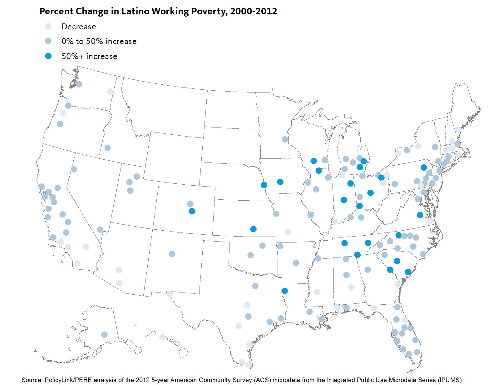
In June, we released data on working poverty in the Atlas, and found the number of Latinos working full-time yet still struggling economically has increased steadily over the last three decades. Last week, we added breakdowns on immigrant status to eight Atlas indicators, including working poverty. This new data reveals the significant challenges of working poverty among Latino immigrants and the vast differences within the Latino immigrant and U.S.-born populations. For instance, nationwide Latino immigrants are twice as likely as U.S.-born Latinos to be working poor.

This analysis describes working poverty among Latino immigrants, examines the cities with the worst outcomes on this indicator, and highlights policies to support immigrant integration and ensure economic security.

Employed Latino immigrants have higher poverty rates than U.S.-born Latinos

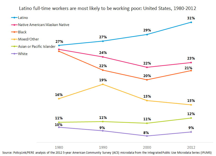
One in four Latino immigrants between the ages of 25 and 64 is working full-time but has a family income below 200% of the federal poverty level, compared with just 12 percent of U.S.-born Latinos. Mexican immigrants, who account for more than half of all Latino immigrants, have the highest overall rate of working poverty among Latinos at nearly 29 percent followed by Guatemalans (28 percent) and Hondurans (26 percent). 

Multiple factors contribute to these numbers. In addition to lower wages and lower levels of educational attainment on average, another important reason is that immigrants, half of whom are Latino, are less likely to be enrolled in public benefits programs. Poverty is calculated based on family income, which includes earnings as well as sources other than work like the Supplemental Nutrition Assistance Program (SNAP) and Temporary Assistance for Needy Families (TANF). Undocumented people are currently ineligible for many of these programs, but we see lower rates of enrollment even among eligible immigrant families. Increasing enrollment in these programs is one way to ease the burden that many low-income immigrant families face in the U.S.

Many immigrants are also part of mixed status families, which might include authorized immigrants, undocumented immigrants, and U.S. citizens. By 2010, close to a quarter of all children had at least one immigrant parent. But due to the precarious status of undocumented workers and discrimination against Latino immigrants, exploitation and wage theft is rampant.

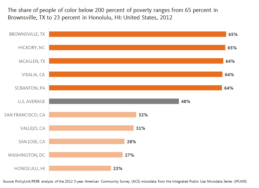
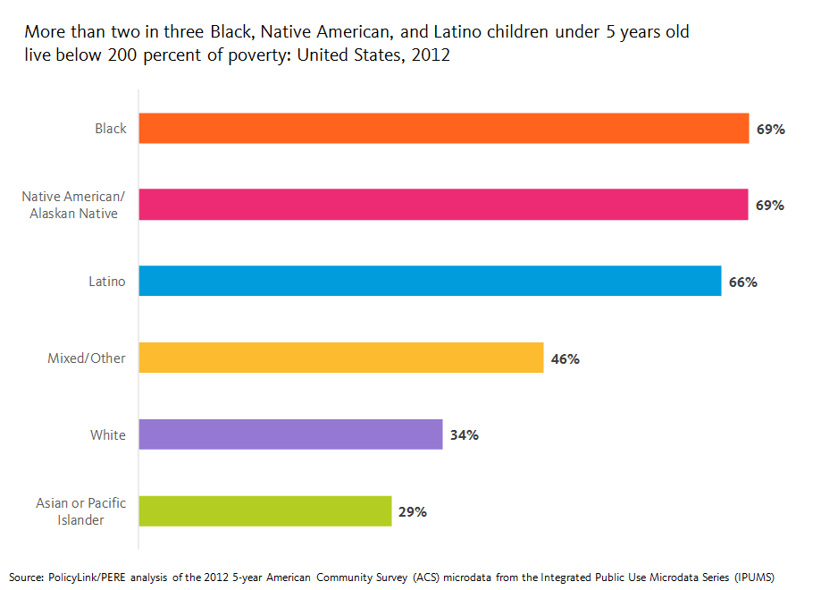
The high rates of working poverty among working-age Latino immigrants translates into high levels of economic insecurity among Latino children, who are a large and growing segment of our future workforce. Nearly 63 percent of Latinos under 18 years old live below 200 percent of poverty as do two in three Latino children under 5 years old.

Where do Latino immigrants face the biggest barriers?

To better understand the geography of economic insecurity among Latino immigrants, we ranked the 100 largest cities in the U.S. by the rate of working poverty and the median wage among Latino immigrants. Because both citizenship and education are associated with higher earnings, we also looked at the citizenship rate and the percent without a high school diploma.

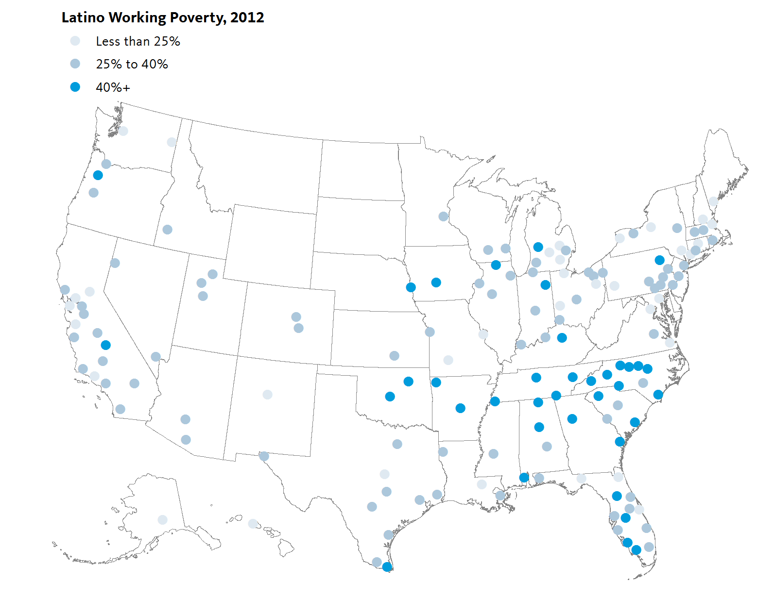
The cities with the highest levels of working poverty among Latino immigrants—with 38 to 40 percent of their Latino immigrants working poor—included the North Carolina cities of Winston-Salem and Greensboro, along with the Texas cities of Dallas and Irving, followed by Minneapolis, Minnesota. These cities also had lower median wages, lower levels of citizenship, and lower levels of educational attainment than Latino immigrants nationally. The national citizenship rate of all Latino immigrants, for example, is 30 percent and the median wage for full-time workers is $12.70/hour. Yet the citizenship rate among the five cities with the highest levels of working poverty ranged from 11 percent in Winston-Salem and Greensboro to 19 percent in Irving. The median wage ranged from $9.40/hour in Winston-Salem to $10.70/hour in Dallas. Similarly, just under half of Latino immigrants nationally lack a high school diploma, but that number goes as high as 68 percent in Dallas.

The cities with the lowest median wages among Latino immigrants—ranging from just $8.90/hour to $10.20/hour—are Raleigh and Winston-Salem, North Carolina, Indianapolis, IN, Plano, TX, and Columbus, OH. Indianapolis has the third lowest median wage but a significantly lower rate of working poverty than other cities. The wage difference in Irving and Plano, Texas show the extent to which labor markets are truly local: the median wage is more than a dollar lower in Plano than in Irving or Dallas even though both are part of the Dallas metropolitan area and educational attainment is higher in Plano. Importantly, Latino immigrants as a whole account for a much smaller share of the total population in Plano than in Irving (7 percent in Plano versus 20 percent in Irving).

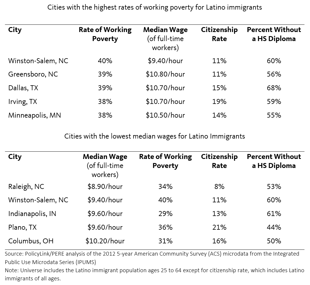
Winston-Salem, NC is the only city ranking both in the top five on working poverty and in the bottom five on median wages. With roughly 36,000 Latinos, 20,000 of whom are immigrants, Winston-Salem is home to the largest share of Latinos out of all big cities in North Carolina while neighboring Greensboro has one of the smallest shares of Latinos. Yet in both cities, Latino immigrants face significant barriers to economic inclusion. Four in ten Latino immigrants ages 25 to 64 in Winston-Salem and Greensboro are working poor and half earn less than $9.50/hour in Winston-Salem and $10/hour in Greensboro.

Latino immigrants in the capital of North Carolina at the heart of the Research Triangle (anchored by North Carolina State University, Duke University, and University of North Carolina at Chapel Hill) have the lowest median wage for full-time workers of the largest 100 cities and even the largest 150 metropolitan areas in the country. With more than half of Latino immigrants in Raleigh earning less than $9/hour, combining the income of two working parents still doesn’t add up to a living wage for a family of three or four. Latino immigrants are more than three times as likely as U.S.-born Latinos in Raleigh to be working poor.

Interestingly, the median wage of Latino immigrants in Durham, also in the Research Triangle, is nearly $3/hour higher than in Raleigh even though a higher percentage of Latino immigrants in Durham lack a HS diploma and the citizenship rates in both cities are nearly identical. The Latino population also accounts for roughly the same share of the population in both cities, but Durham is majority people of color and Raleigh is majority White. Despite the higher median wage, 29 percent of Latino immigrants in Durham are working poor.

Municipal IDs and the state preemption of local policies benefiting immigrants

The North Carolina economy relies on immigrant labor, but last year Governor Pat McCrory signed a bill banning local governments from establishing “sanctuary cities” and preventing government agencies from accepting local or foreign-issued IDs. The mayor of Greensboro viewed this legislation as targeted towards their local efforts to welcome immigrants with one of the first programs in the South that offered ID cards to immigrants. Law enforcement officials successfully pushed back last year and the law only bars city officials from accepting the ID cards, not police or hospitals.

But this year, new legislation was introduced in the state that would prohibit law enforcement from accepting municipal IDs. This law was passed in spite of evidence that local ID cards help to foster a sense of community among all residents and that law enforcement has actually solved more cases due to increased trust from the undocumented community. This type of state preemption to local authority is a threat to equitable development, but continues to gain momentum across the country, particularly in more conservative states, curbing the ability of local leaders to build inclusive and equitable cities.

Immigrant integration is a moral and economic imperative

In an increasingly hostile political environment, one promising strategy for immigrant integration is increasing naturalization. Not only does naturalization strengthen democracy through voter representation, it also results in economic gains. A recent study by our partners at the Center for the Study of Immigrant Integration found that reducing the eligible to naturalize population by half over 5 years is estimated to result in a $75 billion gain to the national economy over ten years. Ending the criminalization of undocumented immigrants by providing a pathway to citizenship and increasing citizenship supports for authorized immigrants has benefits extending far beyond the immigrant population.

In additional to municipal ID cards, other state and local strategies include providing access to health care for undocumented people, as SB 10 did in California, and separating local policing from immigration enforcement as HB 13-1258 did in Colorado. Policies that contribute to the just and fair inclusion of those residents who are often left behind help to create thriving and sustainable communities. To learn more about these policies, visit our immigrant contribution to growth indicator.

To explore data on immigrants for your city, region or state, visit the National Equity Atlas. For more information on the nativity cuts, see our previous blog.

Now on the National Equity Atlas: Nativity Cuts Added to Eight Indicators

From the high-skilled workers who contribute to groundbreaking research and innovation, to day laborers who are the backbone of the economy, immigrants have played a critical role in positioning the U.S. as a world leader on many fronts. In a context of increasing xenophobic sentiment, understanding the economic engine that is the immigrant population in the U.S. and ensuring immigrant integration is an important cultural, political, and economic imperative.

Understanding the characteristics of the local immigrant community is critical to developing effective strategies to help newcomers reach their potential, and that is why we added new nativity breakdowns to eight economic opportunity indicators in the National Equity Atlas: median wage, unemployment, the percentage of workers making $15/hour, disconnected youth, homeownership, educational attainment, poverty, and working poor. With these breakdowns, you can find out how immigrants are faring in the largest 100 cities, largest 150 metros, and all 50 states.

This is a treasure trove of data for you to explore. Below, we describe a few highlights from our own review of this new data.

An overview of the 40 million immigrants in the U.S.

There are 39.8 million immigrants in the U.S., representing 13 percent of the total population. Latinos make up nearly half (47 percent) of the immigrant population followed by Asians and Pacific Islanders (API) who account for another 25 percent. This is a testament to the growing body of Latinos and APIs residing in the U.S. White and Black immigrants follow at 19 and 7 percent respectively.

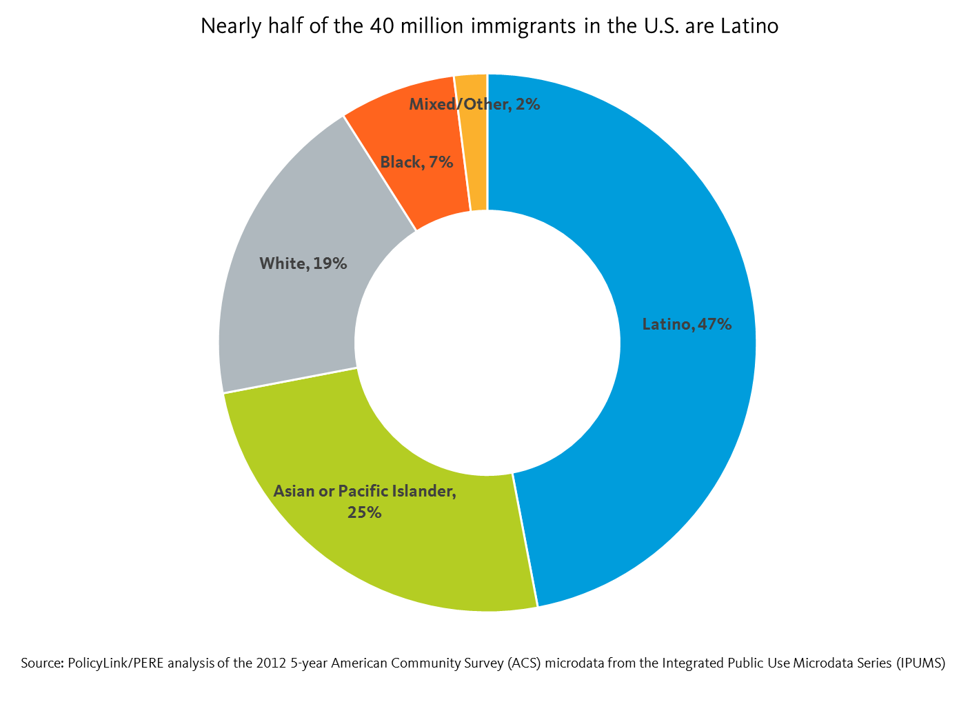
Latino immigrants made up 3 percent of the total U.S. population in 1990, a figure that doubled to 6 percent by 2012. Latino immigrants represent not only the largest share of immigrants in the U.S., but also the fastest growing. The API immigrant community is the second fastest growing and represent 3 percent of the total U.S. population as of 2012. White immigration has more or less stayed stagnant at 3 percent between 1990 and 2012. Finally, Black immigrants make up the smallest share of the total U.S. population at 1 percent, and are not growing as fast as their Latino and API immigrant counterparts.

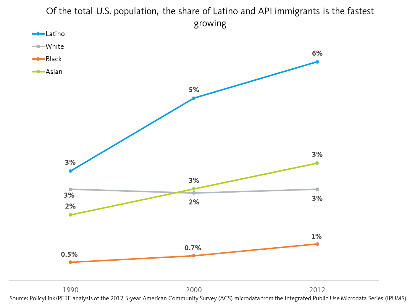
Despite their numbers, Latino immigrants face some of the largest barriers to inclusion. For example, they have the lowest median wage at less than $13/hour, which is $5/hour less than U.S.-born Latinos and half the median wage of White immigrants. Furthermore, 57 percent of Latino immigrants are living under 200 percent of poverty, and 25 percent are working poor.

Black and White immigrants report higher levels of education than their U.S.-born counterparts

The new nativity cuts also allow for a within-group analysis that sheds light on how immigrants and U.S.-born people of the same race fare in comparison with one another.

For instance, using education as an example, we can see that higher rates of White and Black immigrants report having a BA or higher when compared with their U.S.-born counterparts. But the opposite is true for Latino and API immigrants: they are less likely than their U.S.-born counterparts to have a BA or higher.

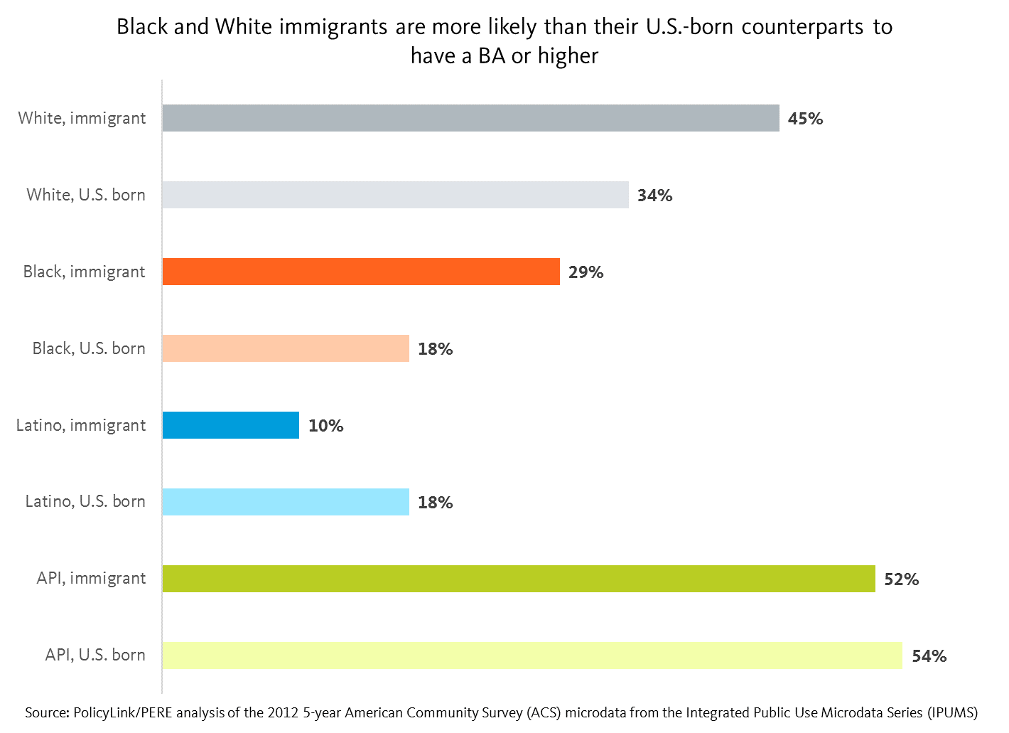
We can do a deeper with-in group analysis by looking at the disaggregated ancestry subgroup data by the nativity cuts. For instance, using median wage as an example, immigrant Whites as a whole earn more than U.S. born Whites. Looking at the disaggregated ancestry subgroup data by nativity cuts reveals the following: immigrant Whites of Western European and North American ancestry reported lower median wages than their U.S. born counterparts, but immigrant Whites of Eastern European ancestry reported higher median wages than their U.S. born counterparts. On the other hand, immigrant and U.S. born Whites of Middle Eastern/North African ancestry reported the narrowest gap with respect to the disparity in their reported median wages.

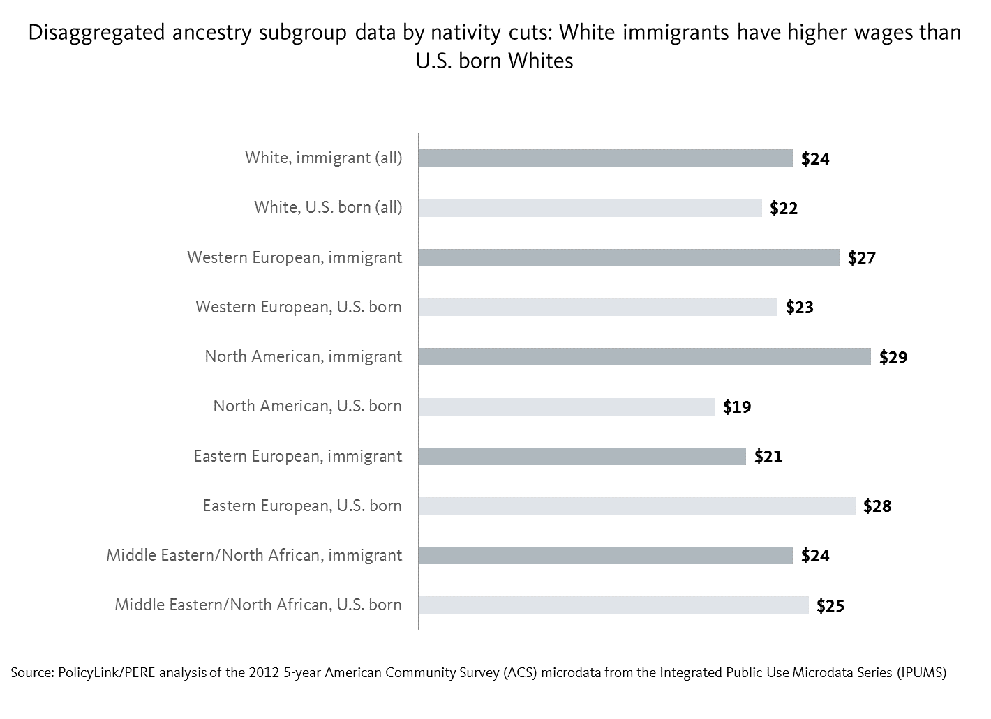
Studies show the significant economic contributions of Latino immigrants

In addition to the rich diversity and culture that immigrants bring to this country, studies show that immigrants continue to play a critical role in driving economic growth in their communities. According to a recent study by economists Dennis Coates and T.H. Gindling, “income growth that tends to accompany Latino population growth in rural counties is even greater where native-born, non-Hispanic populations have otherwise been shrinking”.  

This study shows that immigrant spending in Nebraska generated up to $2.4 billion worth of output, in which the Latino immigrant community contributed up to $1.1 billion. There is a similar story in Iowa of Latino immigrant spending reaching up to $963 million of the estimated $2.5 to $3.2 billion in immigrant spending. Furthermore, the study found that the absence of Latino immigrants in the Omaha-Council Bluffs economy would lead to a 7.8 percent reduction in total production – an amount that translates to $6.5 billion.

Immigrant integration is an economic and moral imperative

Removing barriers to immigrant participation in the economy is key to a thriving and prosperous economy. The California Immigrant Policy Center, based in the state that is home to the largest population of immigrants, has policy priorities for 2016 ranging from access to health care to workers’ rights. Such advocacy efforts are crucial to ensure the socioeconomic inclusion of the immigrant community that has historically played an integral part in the making of a nation.

To access the data for your city, region, or state, go to nationalequityatlas.org, click on Indicators, and in the Equity menu, select one of the eight indicators listed above. On the indicator page, choose the “By nativity” breakdown to see the nativity cuts. Additionally, if you click on the “By ancestry” breakdown, a nativity filter appears below the graphic display that allows you to look at the data for U.S.-born people or immigrants.

National Equity Atlas: July Update

Dear Equity Atlas Users,

It is our goal to make the National Equity Atlas as robust a resource as possible to help you make the case for equity in your community. So we are happy to introduce to you the latest round of Equity Atlas news and updates.
 
New Data on Immigrants
Immigrants have and continue to play an important role in the U.S. economy. Understanding the barriers and opportunities that different groups face is key to moving equitable policies forward. Today, we added nativity cuts to eight economic indicators in the National Equity Atlas that also include data by ancestry: median wages, the percent of workers earning at least $15/hour, unemployment, homeownership, education levels, and disconnected youth as well as our two newest indicators: poverty and working poor. This new breakdown allows users to assess how immigrants and U.S.-born people fare by race/ethnicity and across more detailed racial subgroups.
 
To see the new nativity data in your city/region/state, select one of the eight indicators mentioned above and click on the “By nativity” breakdown. You can also click on the “By ancestry” breakdown, scroll down to the “Nativity” filter, and select either U.S.-born or immigrant.
 
Webinars
We will walk you through how to access this new data Monday August 8, 2016 at 12PM-12:30PM PST. Register here. Video from last month’s webinar exploring the poverty and working poor indicators can be viewed here
 
Recent “Data in Action” Posts
In 2012, nearly one in three Latino full-time workers, ages 25 to 64, earned below 200 percent of poverty – up from 27 percent in 1990 and compared with 9 percent for their White counterparts. Wondering what other trends the new Equity Atlas indicators reveal? Several new analyses have been posted to Data in Action:
 
 
Fairfax County Equity Resolution
In 2015, community leaders working inside and outside of government in Fairfax County, Virginia, partnered with the National Equity Atlas team at PolicyLink and PERE to produce an equitable growth profile of the county. Through a newly adopted policy, the Fairfax County Board of Supervisors has made its commitment to equity official when it voted to develop a racial and social equity policy to assess all county-wide decisions through an equity lens.
 
Are you using Equity Atlas data in your work? Let us know.
 
Thank you!
 
The National Equity Atlas team at PolicyLink and the USC Program for Environmental and Regional Equity (PERE)
 

Fairfax County Adopts “One Fairfax” Resolution, Committing to Equitable Growth

Fairfax County, Virginia is one of the wealthiest counties in the nation — but not all of its residents have been able to participate and share in its prosperity. In 2015, as part of a larger effort to address structural barriers to inclusion, community leaders working inside and outside of government partnered with the National Equity Atlas team at PolicyLink and PERE to produce an equitable growth profile of the county. That report highlighted how communities of color are driving the county’s rapid population growth and now represent 45 percent of its population, yet racial inequities persist across a multitude of indicators.

Equipped with the facts, local leaders worked to educate decisionmakers and build broad support for an equity approach. In 2015, the Board of Supervisors acknowledged equity as a key principle in its Strategic Plan to Facilitate Economic Success, and a core group of equity leaders proposed a countywide “One Fairfax” resolution, asking county and school district leaders to develop and implement a data-driven racial and social equity policy. The Fairfax County Board of Supervisors adopted the resolution last week, making its commitment to equity official; the school board is expected to vote on “One Fairfax” before the end of the month. 

Latinos See the Highest Increases and Levels of Working Poverty in Many Regions


As Latinos drive population growth and change in America, their ability to thrive is increasingly critical to the health of our economies locally and nationally. Yet, new data on working poverty in the National Equity Atlas reveals the extent to which many Latinos are working full-time yet still struggling economically. In 2012, nearly one in three Latino full-time workers, ages 25 to 64, earned below 200 percent of poverty – up from 27 percent in 1990 and compared with 9 percent for their White counterparts.

This post takes a closer look at Latino working poverty across the nation’s largest 150 metropolitan regions. Working poverty describes full-time workers with a family income below 200 percent of poverty, and the rates of working poverty in this post reflect the working poor as a share of full-time workers ages 25 through 64. While poverty is defined at the family level, based on combined income from all family members, in this post we make reference to individual earnings for simplicity. Given that an individual’s family income must be as high or higher than their personal earnings, the rates of working poverty reported here understate the rates that would be found if only an individual’s earnings were considered.

Latino Working Poverty High and Increasing in Many Regions

Not only do many regions have high rates of Latino working poor, conditions are getting worse over time. This is shown by the scatter plot below, which plots the largest 150 regions by the share of Latino full-time workers who earn below 200 percent of poverty in 2012 and the percent increase in Latino working poverty between 2000 and 2012. The farther to the right, the greater the share of Latino working poverty in 2012. The higher up on the chart, the greater the percent increase in Latino working poverty between 2000 and 2012. As illustrated by the number of metros in the upper-right quadrant, there appears to be a positive relationship: the regions with higher rates of working poverty among Latinos also saw a sharp growth in Latino working poverty.

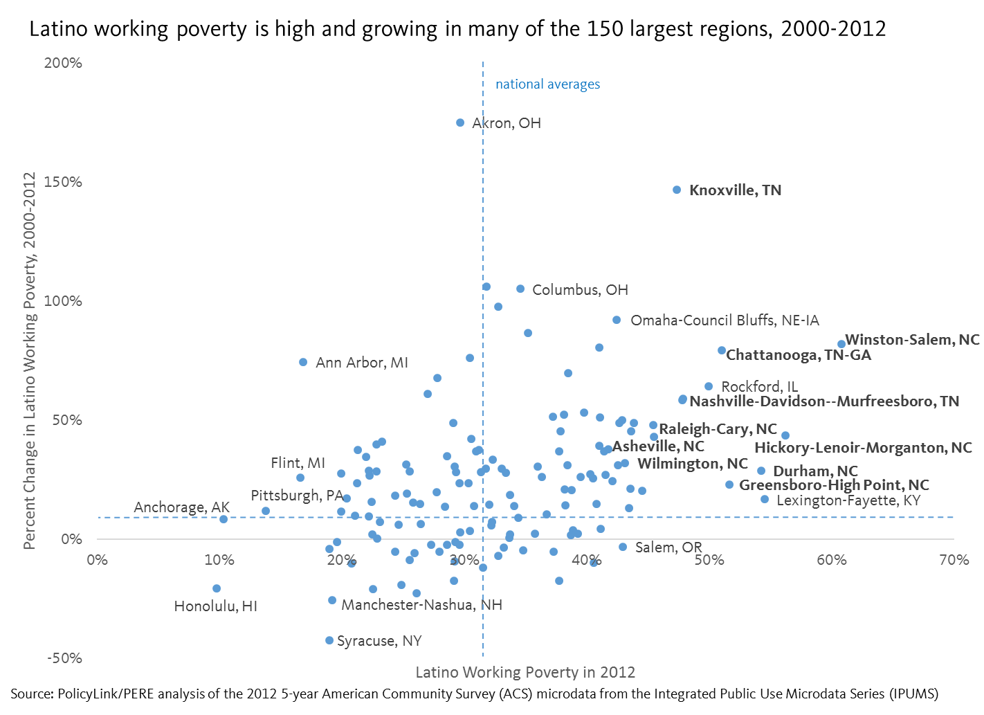
Regions in Tennessee and North Carolina have the highest rates of Latino working poverty

Mapping the data reveals additional geographic patterns, including the clustering of Latino working poverty in the South and particularly in the states of Tennessee and North Carolina. Of the largest 150 metro regions in the U.S., all nine in North Carolina saw substantial increases in working poverty among Latino full-time workers, ranging from a 23 percent increase in Greensboro to an 82 percent increase in Winston-Salem. Each region also had a Latino working poverty rate greater than the national average except for Fayetteville, which matched it. More than half of Latino full-time workers in Greensboro, Durham, Hickory, and Winston-Salem earned less than 200 percent of poverty.

Similarly, the four regions in Tennessee included in the Atlas saw higher than average increases in the overall rates of Latino working poverty. One in two Latino full-time workers in Chattanooga earned less than 200 percent of poverty in 2012, up from 28 percent in 2000. Over the same time period, the Latino population grew significantly faster than any other group in the region.

Tennessee and North Carolina are among the roughly 15 states that currently ban local governments from adopting their own minimum wage laws. Part of the controversial HB2 law passed earlier this year in North Carolina, which restricts usage of multiple occupancy bathrooms for transgender and gender non-conforming people, also includes state preemptions to local minimum wage increases. The current minimum wage in Tennessee and North Carolina is the same as the federal: $7.25 an hour. The MIT Living Wage Calculator, however, estimates that a living wage for a family of four ranges from $13 to $22 an hour in Tennessee and from $14 to $23 an hour in North Carolina. The state preemption laws also prevent localities from allowing workers to earn paid sick leave.

This is a growing and alarming trend: eight states have considered restrictions on local minimum wage increases this year and the story is often similar. When states fail to pass increases in minimum wages in step with increases in cost of living and inflation, some jurisdictions take matters into their own hands by increasing local minimum wages. State legislatures—especially those led by Republicans—push back by adopting laws preventing local action. Raising wages would be especially beneficial to workers of color. In North Carolina, for example, 11 percent of White full-time workers earn less than 200 percent of poverty compared with nearly half of Latino full-time workers. Even more striking, 12 percent of Latino full-time workers earn less than 100 percent of poverty.

Addressing working poverty is a moral and economic imperative. If Latinos, the fastest growing group in many regions, are unable to participate, prosper, and reach their full potential, the impacts will go far beyond the Latino population. To learn more about working poverty in your city, region, or state, and learn about policies that lift the wages of workers, explore the new working poor indicator.

Webinar Archive: Explore New Equity Atlas Indicators on Poverty and Working Poor


The National Equity Atlas has released two new indicators: Poverty and Working Poverty. 

To learn more, watch our “Explore New Equity Atlas Indicators on Poverty and Working Poor” webinar.

Here is a link to the webinar recording and slides

We also created one-page “Indicator Snapshots” for Poverty and Working Poor that you can print out as a reference, and you can find several new analyses here: 

An Overview of America’s Working Poor

Latinos See the Highest Increases and Level of Working Poverty in Many Regions

New Data Highlights Vast and Persistent Racial Inequities in Who Experiences Poverty in America

Also, check out our “Frequently Asked Questions” section for more information about the Atlas. 

Please feel free to contact us with any additional questions about the Atlas. You can write to Sarah Treuhaft: sarah@policylink.org.

-- The National Equity Atlas team at PolicyLink and the USC Program for Environmental and Regional Equity (PERE)

An Overview of America’s Working Poor

Wage stagnation and the increasing number of people who are working yet still poor are significant challenges of our era. One recent study found that there isn’t a single congressional district in the country where a full-time minimum wage worker could afford a two-bedroom apartment. With the rapid growth of unstable, low-paying jobs and the failure of even full-time work to pay family-supporting wages, it is critical to understand working poverty in order to enact policies that lift working families out of poverty.

This analysis describes trends in the persistence of working poverty in America drawing from new data added to the National Equity Atlas. Most measures of the “working poor” count everyone who spent at least the last 6 months in the labor force—including those employed part-time, seasonally, and even the unemployed. We use a more restrictive measure in our analysis counting only full-time workers between the ages of 25 and 64 who fall below 200 percent of poverty. Users can explore rates of working poor at 100 percent, 150 percent, and 200 percent of poverty, but for this analysis, “working poor” is defined as full-time workers below 200 percent of poverty.

Why focus on 200 percent of the poverty line?

We believe that looking at the population below 200 percent of poverty provides a more accurate picture of economic insecurity in the United States. Some argue that the poverty level is too low, particularly in more expensive metro areas. Others point out that that experience of poverty is more porous than a poverty line, which fails to capture the millions of families who move in and out of poverty each year or those families at risk of falling into poverty if they lose a job or have a medical emergency. A family of four below 200 percent of poverty in 2012 had a family income less than $46,000 a year. There are currently over 100 million people living below this threshold in the U.S.—one in three people.

The 12 Million Working Poor

While a large number of that 100 million living at or below 200 percent of the poverty line are children and seniors, over 12 million of them are full-time workers between the ages of 25 and 64. Of these full-time workers earning less than 200 percent of poverty, the majority -- 56 percent -- are workers of color. Working poverty has increased dramatically over the last three decades, growing from less than 7 million in 1980 to today’s 12.4 million. Of all full-time workers ages 25 to 64, the share who were working poor declined slightly between 1980 and 2000 before increasing by 19 percent in 2012. In the 1980s and 1990s, the working poor rate hovered around 12 percent, but by 2012, was close to 14 percent.

Latino workers face the highest and fastest-growing levels of working poverty

Breaking down the overall data by race reveals that Latinos are the only major racial/ethnic group to experience continual increases in working poverty over the last three decades. In fact, increases in the overall rate of working poverty are driven largely by increases among the Latino population. In 1980, about a quarter of Black and Latino prime-age full-time workers were working poor, more than twice the rates of Whites. But over the next two decades, as the rates declined among Black workers, it increased for Latinos. Even more alarming, Latino full-time workers are 4.5 times more likely than White full-time workers to earn below the federal poverty line and nearly one in three Latino full-time workers fall below 200 percent of poverty.

The nation’s demographic changes magnify the importance of these trends. Latinos and APIs are among the fastest growing groups in the U.S. and they not only saw the largest increases in working poverty over the last decade but they were also the only groups to experience increases since 1980. By 2012, Latinos were more than three times as likely as Whites to be working poor.

What this means for the future

The promise of work is part of the American Dream. Most Americans believe that people who work, especially those working full-time year round, should be earning enough to provide for their families. But nearly one in three Latino full-time workers between the ages of 25 and 64 still bring home a family income below 200 percent of poverty (and that includes the income of all other family members as well as income from sources other than work). And the experience of working poverty for most racial/ethnic groups in the U.S., including Whites, has increased since 2000, signifying a disturbing trend in the labor force and a need for policy that ensures all work pays a fair wage.

These increases in working poverty are explained, in part, by changes in economic structure and policy. Over the last several decades, businesses have generated a disproportionate amount of low-wage jobs and wages have been flat for all but the highest earners (see the Job and wage growth indicator). To make matters worse, growing unemployment during the Great Recession pushed down on wages even further. Lifting the wages of workers requires a robust policy agenda like the one proposed by the Economic Policy Institute that tilts power back into the hands of workers. To learn more about policies that lift full-time workers out of poverty like the Earned Income Tax Credit and minimum wage increases and to explore the new working poor indicator, click here.

New Data Highlights Vast and Persistent Racial Inequities in Who Experiences Poverty in America

Already the majority of children under five years old in the United States are children of color. By the end of this decade, the majority of people under 18 years old will be of color, and by 2044, our nation will be majority people of color. This growing diversity is an asset, but only if everyone is able to access the opportunities they need to thrive. Poverty is a tremendous barrier to economic and social inclusion and new data added to the National Equity Atlas highlights the vast and persistent racial inequities in who experiences poverty in America.

On June 28, we added a poverty indicator to the Atlas, including breakdowns at three thresholds: 100 percent, 150 percent, and 200 percent of the federal poverty line. We also added an age breakdown to the new poverty indicator, in response to user requests for child poverty data, which allows you to look at poverty rates across different age groups including the population under 5 and 18 years old as well as those 18 to 24, 25 to 64, and 65 and over.

Why examine different levels of poverty? In 2012, the federal poverty level was less than $12,000 for a single person and roughly $23,000 for a family of four with two adults. Many believe that this is too low. The National Center for Children in Poverty argues, for example, that families need an income at least double the federal poverty level to meet basic needs. Another critique relates to the varying costs of living across communities. $23,000 will go much further in a lower-cost region like McAllen, TX compared with a high-cost one like San Francisco or Washington, DC. To understand the broader universe of families experiencing economic insecurity, this analysis focuses mainly on the population below 200 percent of poverty.

 People of color have the highest rates of economic insecurity, while Whites saw largest increase since 2000

Looking at how the share of people living at or below 200 percent of poverty has changed since 1980, we see a few trends. First, economic insecurity (defined in this way) decreased for all racial/ethnic groups except Latinos, who saw an increase of two percentage points over the three decades. During the same time period, Latinos went from just 6 percent of the population to 16 percent and were the fastest growing population over the last decade. In other words, the same demographic group driving growth and change is increasingly experiencing economic insecurity.

Second, the largest overall increases in economic insecurity over the past three decades in the U.S. occurred between 2000 and 2012. During that period, rates increased for all groups except Asian and Pacific Islanders (APIs). Interestingly, Whites have seen the largest increase in economic insecurity since 2000 despite having the lowest rate by far of all major racial groups.

Third, while there are large racial inequities in who experiences economic insecurity, it is a widespread challenge that affects all racial/ethnic groups including Whites. Half of people of color live below 200 percent of poverty compared with only a quarter of Whites but that does not mean Whites are immune to poverty – that percentage represents nearly half of the total U.S. population below 200 percent of poverty.

The share of people of color experiencing economic insecurity ranges from less than a quarter of people of color in Honolulu to nearly two in three people of color in Brownsville, TX

While nationally just under half of all people of color fall below 200 percent of poverty, local percentages vary considerably across metropolitan regions, from 65 percent in Brownsville, TX to 23 percent in Honolulu. In order to understand these numbers, it is important to consider the local cost of living, since poverty rates are universal, while costs of living vary tremendously by region. We can do that by looking at “regional price parities" (or RPPs). Calculated by the U.S. Department of Commerce Bureau of Economic Analysis, RPPs indicate relative differences in the cost of goods and services across states and metropolitan areas.  They are expressed as a percentage of the average national price level, and range from the highest cost region, Honolulu, at 123 down to McAllen, TX, the lowest cost region in the Atlas, at 84.9.

In general, places with the highest rates of economic insecurity also tend to have lower costs of living: Four out of the five regions with the largest shares of people of color living at or below 200 percent of poverty fall within the bottom third of the 150 largest U.S. metros with the lowest cost of living. And the five regions with the lowest shares of people of color below 200 percent of poverty fall within the 10 most expensive metros in the Atlas. But an affordable rent under this poverty threshold would be less than $1,150 a month for a family of four—which would be nearly impossible to find in these higher cost regions.

The demographic makeup of the regions with the largest shares of people of color experiencing economic insecurity are at both ends of the spectrum: Hickory and Scranton are much whiter than the U.S. as a whole while Brownsville, McAllen, and Visalia are much browner. But they all have one thing in common: people of color are projected to drive the vast majority of population growth over the next couple decades while the White population is expected to decline.

Communities of color are actually the fastest growing segments of the population in most regions, including those with majority White populations, but they continue to face barriers to educational and economic opportunities, stifling their own potential, the potential of the regions where they live, and that of the country as a whole.

Black and Native American children most likely to experience poverty

When looking at the population under 18 years old, roughly 63 percent of Black and Native American youth live below 200 percent of poverty compared with 31 percent of White and API youth. Children of color are nearly twice as likely as White children to be economically insecure. Even more alarming is that the share of kids under 5 years old, who are already predominately children of color, is even higher. More than two in three Black, Native American, and Latino children under five years old live below 200 percent of poverty. Given what we know about the adverse effects of child poverty, it is alarming that the two largest groups of kids of color, Latinos and Blacks, have the highest poverty rates.

The implications of these findings are far-reaching. Not only will the children of today become the workers of tomorrow, who will be expected to support the growing retired population, but child poverty is also estimated to cost the U.S. economy $500 billion a year, underscoring the importance of racial equity for enduring prosperity. Explore poverty in your city, region, or state here. For more data highlighting the gap between the aging white population and the growing population of youth of color, see the racial generation gap indicator.

National Equity Atlas: June Update

Over the past several weeks, we've been analyzing our new ancestry data and also just added two new indicators on poverty and working poverty.
 
Analyzing Ancestry Data 

We recently completed a series of analyses of last month’s racial subgroup data update. Our analysis of homeownership among the Asian and Pacific Islander (API) population found that rates of homeownership range from 25 percent for Samoans up to 68 percent for Taiwanese. Looking at educational attainment and youth disconnectedness among the API population we saw that Southeast Asian and Pacific Islander groups fare much worse than their South and East Asian counterparts. Examining wage disparities within the Latino population, we found that Central Americans tend to earn the least. And our review of unemployment in the Black population shows how certain Sub-Saharan Africans, many of whom are immigrants, have unemployment rates more comparable to the national average. Check out the Data in Action section of the Atlas website to stay up to date on analyses released throughout the month.

New Poverty and Working Poor Indicators

High rates of poverty impact everyone, costing our economy billions of dollars annually and weakening the middle class and democracy. And as the low-wage sector has grown, the share of adults who are working full-time jobs but still cannot make ends meet has increased, particularly among Latinos and other workers of color. The Atlas now includes indicators for the percentage of individuals living below three poverty thresholds (100, 150, and 200 percent of the federal poverty line) and by age so you can understand child poverty, as well as the percentage of full-time workers living below each of the three thresholds
 
Webinars

Join the National Equity Atlas team for a live demo of our new Poverty and Working Poor equity indicators on July 12, 12:00 – 12:30 pm PT / 3:00 – 3:30 pm ET. During this 30-minute webinar, we will walk you through these indicators and policy strategies to advance racial economic inclusion and equitable growth in your community. Register here. Video from the June 22 live demonstration of the Atlas, sponsored by the W.K. Kellogg Foundation, can be viewed here

National Equity Atlas in Measure Up

The Build Healthy Places Network — which connects leaders and practitioners across the health and community development sectors—has just added the National Equity Atlas to its microsite of resources and tools, MeasureUp. You can find the National Equity Atlas on their Mapping Tools page.
 
Thank you!
The Equity Atlas team at PolicyLink and the USC Program for Environmental and Regional Equity (PERE)

A Closer Look at Black Unemployment Using Ancestry Data

The Black population in the United States historically faced widespread discrimination in the labor market, and studies reveal that employers continue to discriminate on the basis of race. Racial bias as well as other structural and institutional barriers are reflected in the Black unemployment rate, which is consistently about double the rate for Whites. However, disaggregating such socioeconomic indicator data shows that this is not true of every subgroup within this population. As with other racial/ethnic groups in the U.S., the Black population is quite diverse with varying levels of success in the labor market. Examining the diversity of experiences within the Black community in the United States can provide a better understanding of barriers to unemployment.

This analysis explores the variation in the unemployment rate within the Black population. On May 23, PolicyLink and the USC Program for Environmental and Regional Equity added new ancestry breakdowns to six indicators in the National Equity Atlas. This is the fifth in a series of analyses of the new data.

The unemployment rates reported in the Atlas for 2012 reflect a five-year average of the American Community Survey (ACS) microdata, which reflect the state of the U.S. job market at the height of the recession (and thus are higher than today’s rates for all groups). The Black population had the highest unemployment rate at 13 percent, compared to the national average of 8 percent. Disaggregating the data reveals that some subgroups had unemployment rates more comparable to the national average.

Blacks of North and Sub-Saharan African Ancestry Have the Lowest Rates among the Black Population

At 9 and 11 percent respectively, Blacks of North and Sub-Saharan African ancestry have the lowest rates of unemployment within the Black population. Both of these groups are predominantly comprised of immigrant communities. Although those figures appear to be low relative to the overall Black average, they still are above the national average of 8 percent.

But even within the Sub-Saharan population, rates vary widely, from as low as 6 percent for Blacks of Kenyan ancestry to as high as 21 percent for Blacks of Somalian ancestry. These two neighboring countries in the horn of Africa ironically represent each end of the spectrum of unemployment rates for Blacks in America. Blacks of Nigerian and Ethiopian/Eritrean ancestry – the two largest subgroups of Sub-Saharan immigrants residing in the U.S. — both have unemployment rates of 9 percent, well below the average for all Blacks in the U.S.

Blacks of North and Sub-Saharan African Ancestry Have Higher Levels of Education

As with unemployment, the various Black subgroups differ in levels of educational attainment. Black immigrants tend to have higher levels of education: Among Black immigrants in the U.S., 29 percent reported having a BA or higher, compared with 18 percent for U.S.-born Blacks. Some Black communities have much higher education levels. For instance, 63 percent Blacks of Nigerian ancestry, 49 percent Blacks of Egyptian ancestry, 47 percent Blacks of Kenyan ancestry indicated they have a BA or higher, compared with 34 percent of Whites.


A Closer Look at Unemployment in the Nigerian Community

Blacks of Nigerian ancestry, 63 percent of whom are immigrants, represent the largest Sub-Saharan subgroup in the U.S. The New York, Houston, and Washington, DC metro areas have the largest populations of Nigerians in the country, and together account for 34 percent of all Nigerians living in America.

As illustrated in the chart above, the unemployment rate for Blacks of Nigerian ancestry is 9 percent in New York, 11 percent in Houston, and 8 percent in Washington, D.C. By contrast, unemployment among the African American subgroup is 13 percent in New York, 10 percent in Houston, and 9 percent in Washington, D.C. The trend in the greater Houston metro area is not consistent with the rest - the African American/Other Black subgroup has lower unemployment rates when compared to Blacks of Nigerian ancestry in that region. When looking at factors such as education levels for these two subgroups in the Houston area, the data shows the opposite of what we would expect.  Blacks of Nigerian ancestry still have a greater number of their population with a B.A or higher at 66 percent, when compared to only 22 percent for African American/Other Blacks in that region.

Furthermore, although both subgroups have higher unemployment rates when compared to the overall unemployment rates in these regions — 8 percent in New York, 6 percent in Houston, and 6 percent in Washington, D.C. — the gap is wider for the African American/Other Black subgroup in two of the three cities with the largest concentration of Blacks of Nigerian ancestry.

Solutions to High African American Unemployment

While a combination of factors such as systemic racist policies and widespread employment discrimination have certainly played a part, it is hard to ignore a problem unique to the U.S., a country with the highest levels of incarceration rates that puts a disproportionate amount of able-bodied African American men and women out of the workforce. Moreover, disaggregated data shows that those who indicated to be African American/Other Black represent one of the subgroups that fare the worst when it comes to unemployment rates and education levels, whereas their immigrant counterparts are either doing as well as the national average or in some cases better. This begs the question of what causes this disparity.

Although it is easier to address the skill deficiency part of the puzzle rather than the discrimination piece when explaining rampant unemployment levels in the Black community, a combination of policies and advocacy efforts to address both issues could remedy parts of the problem. Policies that increase workforce development programs for African Americans by itself may not be sufficient as Blacks of the same skill set have a harder time finding a job due to discrimination when compared to their White counterparts. Therefore, pairing workforce development programs with aggressive job placement programs might do a better job of increasing the chances of employment. Additionally, while it is difficult to change the explicit and implicit biases of employers towards Black applicants, implementing subsidy programs that would reward employers to hire qualified members of the Black community may also increase the chances of employment for Blacks.

Lastly, unless drastic measures are taken to decrease the prolific rates of mass incarceration in the U.S. that has disproportionately impacted the African American community and to implement policies such as Ban the Box that would increase the employment chances of formerly incarcerated individuals, no amounts of job training and job placement programs will truly address the issue of high unemployment rates in the African American community.

Pages