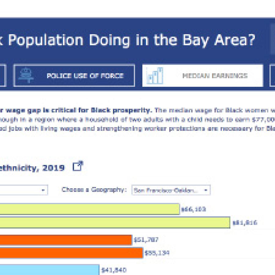
Dashboard: Black Prosperity in America
This dashboard provides critical data on Black-white income gaps for the nation, all 50 states, the 150 largest metro regions, and the 100 largest cities. It includes insights on how trends have changed over time, inequities in educational attainment, the impacts of education on earnings, and the economic benefits of closing racial gaps in wages and employment.
The visual below highlights several key design elements used in the strategic design of this dashboard. Continue to the questions below the display to explore more about our approach to designing this dashboard.
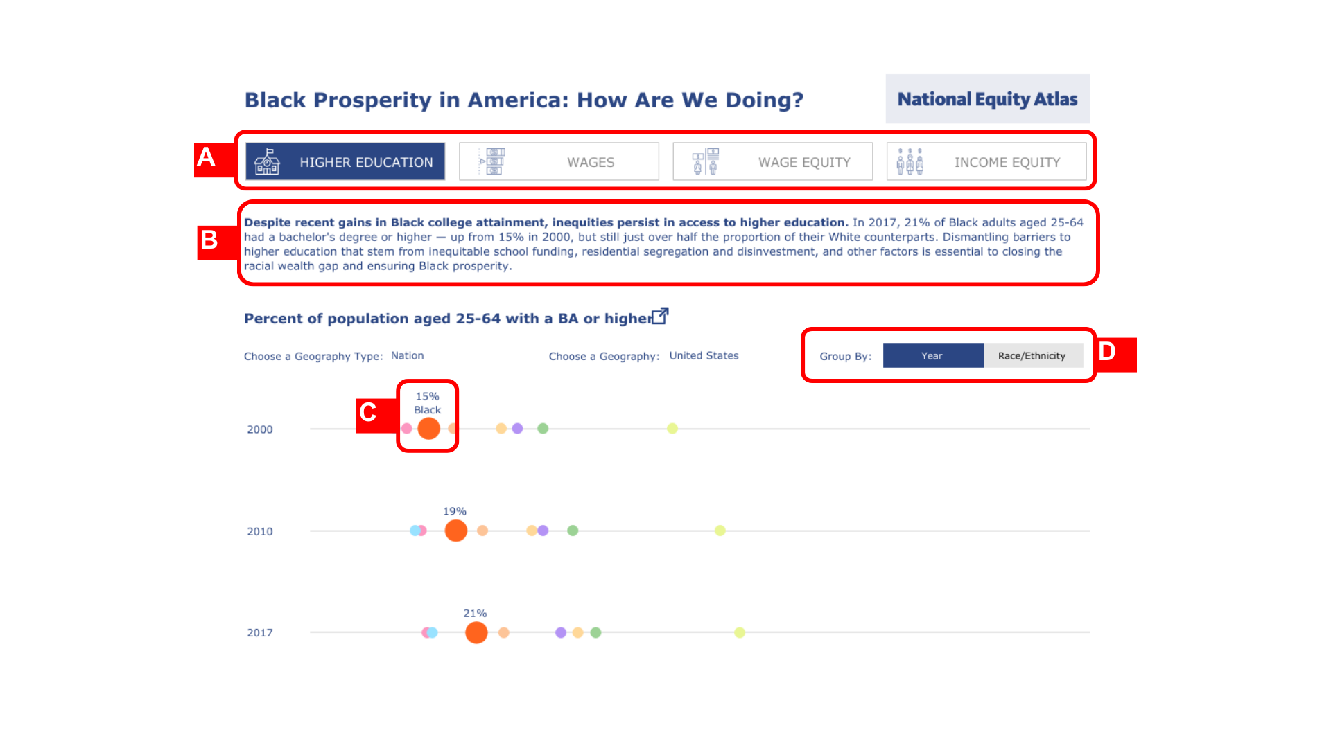
Key Design Highlights
(A) Navigation buttons that name key indicators to support users in exploring the dashboard and the data it presents
(B) Narrative text at the top that explains each indicator and frames the broader context for the data
(C) Chart marks that are enlarged for the Black population to increase visibility and draw attention to the racial/ethnic group as the key focus of this dashboard
(D) “Group By” function allows users to visualize the data in two different ways (by year, or by race/ethnicity)
Who was the dashboard created in partnership with?
The dashboard was created in partnership with the Tableau Foundation for its Data Equity Hub. It was designed in partnership with Chantilly Juggernauth of Lovelytics, another partner of the Tableau Foundation.
Who was the dashboard created for?
This dashboard was created for the Tableau Foundation’s Data Equity Hub as part of its efforts to democratize access to data. The audience for the dashboard was Tableau users and the foundation’s grantee network. The dashboard is one of the featured Data Equity Stories, which showcases examples of how equity-focused data and the Tableau software can be used in advocacy efforts.
What was the intended use of the dashboard?
The dashboard was created to analyze disparities in the Black-white wage gap. The data it features directly addresses the false narrative that higher educational attainment and employment alone will solve the racial wage gap. The data also shows that the wage gap continues to persist despite the consistent increase in the share of Black adults with a bachelor’s or higher degree.
What data is included in the dashboard?
This dashboard includes data from the educational attainment, median wages, and income inequality indicators on the National Equity Atlas. The original data source is the US Census American Community Survey microdata from IPUMS USA.
What was the design approach?
To highlight our focus on the Black population, we only included data for Black and white workers for most of the displays and emphasized data points about the Black population through the color and size of the data marks. We also framed the contextual narrative around the disparities visible in the dashboard’s various displays. The indicators on the dashboard were deliberately ordered to address the false narrative that educational attainment alone can increase wages and close the racial wealth gap. This ordering also helps users understand how addressing wage and income equity is the pathway to an equitable labor market.