Chart of the Week: Maine’s New Minimum Wage Law is a Win for Equity

To add equity data to the national dialogue about growth and prosperity, every week the National Equity Atlas team posts a new chart from the Equity Atlas related to current events and issues.

Earlier this week, voters in various cities, counties, and four states approved minimum-wage increases that have the potential to raise incomes for millions of working Americans.  Washington state will raise its minimum hourly wage to $13.50 by 2020, while Arizona, Colorado, and Maine will raise their respective state minimums to $12.00 in the same time frame. These are important victories for the equity movement and the #FightFor15.

Maine’s plan is especially encouraging; not only will it boost the current minimum of $7.50/hour by 60 percent over the next few years, it will tie the minimum wage to inflation after 2020 and eliminate the sub-minimum “tipped wage” by 2024. No other state east of the Mississippi has moved to end the so-called tip credit that allows employers to pay tipped workers less than minimum wage.

Atlas data underscore how inequitable income growth contributes to rising inequality and creates a drag on the overall economy of a region and the nation as a whole. As this week’s chart illustrates, real income for full-time workers at the 10th percentile in Maine has remained virtually unchanged for many decades – growing just 1.4 percent since 1980. For workers at the 90th percentile, on the other hand, incomes have grown by more than 21 percent. 

Increasing the income of low-wage workers is essential to build an economy that works for all

Equitable growth would mean rising wages for all workers, but with the largest gains going to those at the bottom of the income distribution. In Seattle, the first major city to pioneer a $15 minimum wage, the pay of workers covered by the new law grew by 12 percent during the first-stage of the phase-in increase — compared to just 5 percent for workers in similar, neighboring places — and the employment stability of low-wage workers increased, as well.

To see how earned income growth for full-time wage and salaried workers varies across the income distribution for your state, region, or city, visit the National Equity Atlas, download the chart for your community, and post to social media using #equitydata.

Chart of the Week: Vote for Candidates Who Will Invest in our Future

To add equity data to the national dialogue about growth and prosperity, every week the National Equity Atlas team posts a new chart from the Equity Atlas related to current events and issues.

News stories about broad demographic shifts and the changing face of America are increasingly common. Last year, California — the most populous state in the nation — became the fourth “majority-minority” state. Already the majority of youth under age 5 nationwide are people of color, and by 2044, the nation will be majority people of color.

Today’s policy decisions will affect the future growth and prosperity of the nation for years to come. To illustrate the importance of racial equity, this week’s chart is a GIF showing the percent people of color in the U.S., by county, from 1980 to 2040. With each decade going forward, the strength of our economy increasingly depends on the readiness and full inclusion of people of color as workers, innovators, entrepreneurs, and leaders. On Tuesday, vote for candidates who will invest in our future workforce and build an economy that works for all.

In 1980, the U.S. was 20 percent people of color. The dark orange counties, representing areas where people of color comprised more than 80 percent of the population, were located throughout the South and Southwest, with the exception of Native American reservations in the Dakotas and Wisconsin. From 1980 to 2020, the share of people of color in the United States is expected to more than double to 41 percent. By 2040, the U.S. is projected to be 49 percent people of color.

According to 2015 Census data, 370 counties, home to nearly one in three Americans, are already majority people of color. That’s up from 339 counties in 2010. Some of the counties that have become majority people of color in the last five years include parts of Fort Worth and Austin in Texas and Charlotte, North Carolina.

To see how the share of people of color is expected to change through 2040 in your community, visit the National Equity Atlas, and type in your region or state. Download the chart and share it on social media using #equitydata.

Chart of the Week: Oregon's Measure 98 Invests in Educational Equity

To add equity data to the national dialogue about growth and prosperity, every week the National Equity Atlas team posts a new chart from the Equity Atlas related to current events and issues.

With less than two weeks left until Election Day, many voters across the country are sifting through sample ballots to determine which state and local measures to support. In Oregon, Measure 98 would commit at least $147 million annually to programs in dropout prevention, career and technical education, and college readiness. The measure is designed to boost high school graduation rates, particularly among low-income students, students of color, and students with disabilities, while addressing the serious shortage of skilled and educated workers in the state.

Atlas data underscore how important boosting educational attainment among students of color is for Oregon’s economic future especially considering the current education levels of adults 25 to 64 years old.

As this week’s chart illustrates, by 2020, 43 percent of jobs in Oregon are expected to require at least an Associate’s degree (AA). Yet most of Oregon’s workers do not possess this level of education, and its fastest-growing demographics are the furthest behind. Between 2010 and 2040, Latinos will grow from 12 to 24 percent of Oregon’s population. Yet, today, just 28 percent of U.S.-born Latinos and 10 percent of immigrant Latino’s have an associate’s degree or higher.

Measure 98 aligns well with the type of equity-focused policy agenda that Oregon’s state policymakers are seeking to implement. On October 5th, PolicyLink staff led a workshop with more than 50 Oregon government leaders in policy arenas including economic development, education, healthy communities, and environment, to help them integrate an equity and inclusion focus throughout their work.

To see how education levels and job requirements vary for your state, region, or city, visit the National Equity Atlas, download the chart for your community, and post to social media using #equitydata.

New Atlas Maps Highlighted in CityLab

Yesterday, CityLab published a story on the new mapping breakdowns added to the National Equity Atlas. The author, Laura Bliss, underscores the role spatial data has played in understanding and addressing inequity. She writes,

"Mapmakers are still figuring out the best ways to plot disparities across all sorts of measures—jobs and school quality, environmental health, and transportation access, for example—to advocate for policy change. The National Equity Atlas, developed by PolicyLink and the University of Southern California’s Program for Environmental and Regional Equity (PERE), might be the best and most comprehensive graphic call for economic equality available today.”

The article highlights disconnected youth and unemployment maps in communities of color for the United States overall and in the city of Chicago. Check out the new maps for yourself on the following indicators: people of color, race/ethnicity, unemployment and disconnected youth.

Introducing New Neighborhood Opportunity Maps

We know that opportunity differs by neighborhood, and maps are one way to visualize this variation across a given city, region, or state. That’s why today, we are adding mapping breakdowns to the following four indicators on the National Equity Atlas:


These new interactive maps allow you to visualize data by county or by census tract as well as by city, region, or state. You can also toggle back and forth between different years to see how the geography of opportunity has changed over time and create custom maps using an interactive filter and scroller. On the race/ethnicity map, for example, the scroller allows you to visualize measures of opportunity (e.g. homeownership) in relation to neighborhood composition (e.g. the share of the Latino population). And on the disconnected youth and unemployment maps, the scroller allows you to visualize the indicator as neighborhood compositions (e.g. share of the Black or Native American population) vary.

This blog walks you through how to access and use the new maps. Register for our 30-minute webinar on November 2 for a live walk through.

How to find the new maps

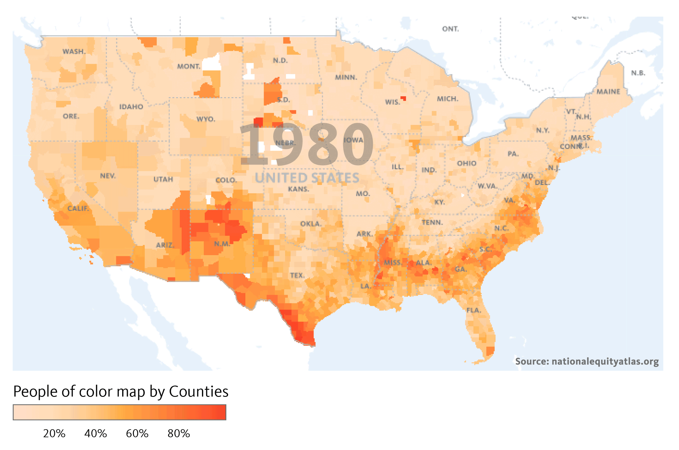
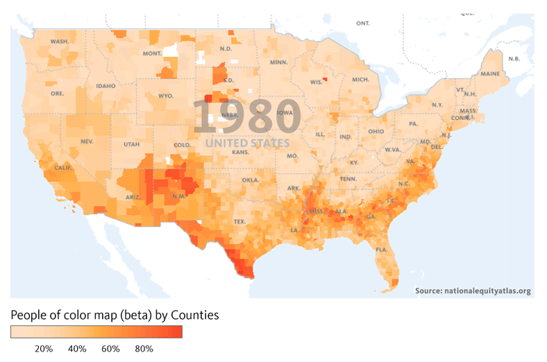
To access the new maps for the people of color indicator, click on the Indicators tab in the top navigation bar. Then under the Demographics menu, select “People of color.” You can look at the data by county (the default), by the largest 150 regions, or by state. You can also toggle back and forth between every decade from 1980 to 2040 to see how the share of people of color in the U.S. has changed over time. The GIF below pulls from the new maps to show how the share of people of color has changed from 1980 to 2010 and how it is projected to change by 2040. You can also see the new people of color map on the homepage of the Atlas.

You can filter by White areas, Black areas, Latino areas, etc. in the people of color, unemployment, and disconnected youth maps, and you can also filter by different measures of opportunity in the race/ethnicity map. To get to the race/ethnicity indicator, select Race/ethnicity (also in the Demographics menu).

The default breakdown shows a chart of how the racial/ethnic composition of the country has changed from 1980 to 2010, and how it’s projected to change through 2040. Underneath the graphic display, you’ll see the different breakdowns, the second of which is the “Race and ethnicity map.” The default map is the percent people of color in 2014, but you can also look at the data from 2000. Under the year options, you’ll see the six major race/ethnicity groups and all people of color. If you select “Native American”, for example, you’ll get a map of the percent Native American by county. The darker purple counties represent areas with a Native population larger than 40 percent (see screenshot below).

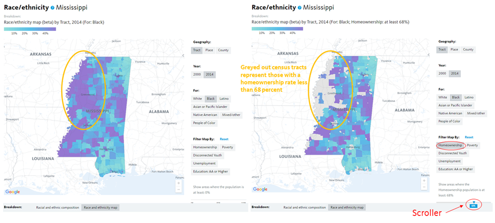
Using the opportunity filters

The filters located on the bottom right of the page allow you create custom maps based on various measures of opportunity such as homeownership and the share of the population with an associate’s degree or higher. To illustrate how the filters work and how to access data by neighborhood, take the state of Mississippi as an example.

You’ll notice that census tracts are not one of the geography options in the map above. In order to view the data by census tract, you must type in a state, region, or city in the Explore box. After typing in and selecting Mississippi, you get a map of the state by tracts (the default geography at the sub-national level). If you click on “Black”, you get a map of the Black population share. The purple tracts are neighborhoods with a Black population greater than 40 percent. The light blue areas, on the other hand, have a Black population under 10 percent.

To use the filters, first select one, like homeownership, then move the scroller at the bottom to only show areas where the homeownership is at least a given percentage. The overall homeownership rate in Mississippi is 68 percent, but moving the scroller to 68 percent, creates a map of census tracts where the homeownership rate is 68 percent or higher and many of the purple tracts (representing majority Black tracts) in the northwestern part of the state disappear as a result (see maps below). Those tracts that disappear have a homeownership rate less than 68 percent.

Using maps to inform decision-making

These maps can be especially helpful in developing targeted employment or workforce development initiatives. The overall unemployment rate in Mississippi was 10 percent, but this was clearly not the case across all census tracts. Filtering the map by tracts with an unemployment rate of at least 15 percent produces a map with several majority Black tracts. This map can support programs and initiatives through the state workforce investment board by ensuring that resources are targeted to communities that need them most.

Note: While the size (land area) of the census tracts in the state varies widely, each has a roughly similar number of people. A large tract in a more rural part of the state likely contains a similar number of people as a seemingly tiny tract in an urban area. Care should be taken not to pay an unwarranted amount of attention to large tracts just because they are large.

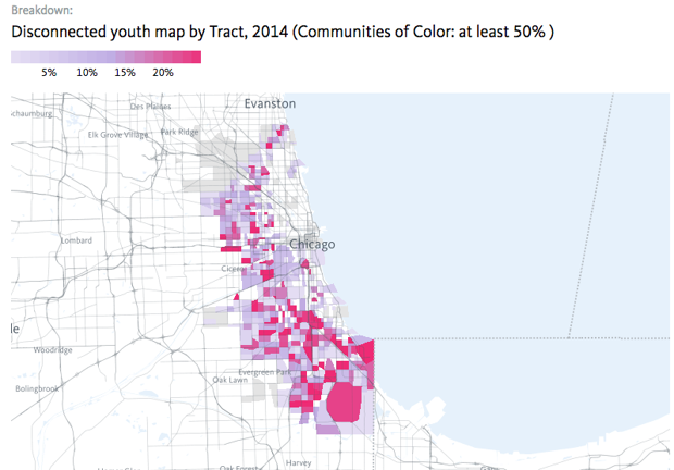
Mississippi has the highest rate of disconnected youth of all states, so understanding how the number and share of disconnected youth varies across the state is central to developing an effective workforce development or education program. To find the map for disconnected youth, select “Disconnected Youth” in Readiness section of the Equity menu. The very last breakdown is the mapping breakdown. As you’ll see in the map below, there are several red census tracts, symbolizing areas where the share of disconnected youth is greater than 20 percent. As you hover over different tracts, you can see both the share and the total number of disconnected youth. In census tract 9504 in Prentiss County, for example, more than 100 young people, or 57 percent of 16 to 19 year olds, were disconnected from both school and work.

The filters and scroller on this map allow you to visualize disconnectedness in relation to neighborhood composition. As you filter to majority White or majority Black neighborhoods, you’ll notice how disconnectedness varies geographically.

For a walk through of the unemployment maps, view our previous blog. For a live walk through of the new maps, register for our webinar. Share your thoughts or questions during the webinar or through our contact form.

National Equity Atlas Update


Dear Equity Atlas Users,

The Atlas is a living resource, and as such, we are happy to share new features, upcoming webinars, and data-in-action posts that add equity data to the national dialogue about growth and prosperity.

New Neighborhood Maps Added to the Atlas
Today we are launching interactive neighborhood-level mapping for four indicators on the Equity Atlas: people of color, race/ethnicity, unemployment, and disconnected youth. These new maps allow you to visualize data by county or by census tract as well as by city, region, or state. You can also toggle back and forth between different years to see how the geography of opportunity has changed over time and create custom maps using the race/ethnicity and neighborhood opportunity filters.

These maps can help inform targeted hiring and workforce development initiatives as well as infrastructure investments. Learn how they work in the latest data-in-action post which provides a step-by-step guide to this new feature, as well as examples of how to use these maps in your advocacy. You can also register for our 30-minute webinar on November 2 for a live walk through.

Welcoming America Webinar
On October 7, Angel Ross from PolicyLink and Justin Scoggins from the USC Program for Environmental and Regional Equity (PERE) participated in a Welcoming America webinar about immigration and equitable economic development. Participants examined the economic indicators to get a sense of how immigrants are faring in their communities. The archive of the webinar is available on the Welcoming America website.

“Chart of the Week” Series
Every week, we post a new chart drawing from the Equity Atlas related to current events and issues. There are three new posts in our “Chart of the Week” series: a neighborhood-level look at unemployment in St. Louis, an examination of “jobless growth” in Ohio, and a look at working poor in Pittsburgh related to last week’s p4 conference.

Thank you!

The National Equity Atlas team at PolicyLink and the USC Program for Environmental and Regional Equity (PERE)

Chart of the Week: Addressing Working Poverty Critical for Equitable Development in Pittsburgh

To add equity data to the national dialogue about growth and prosperity, every week the National Equity Atlas team posts a new chart from the Equity Atlas related to current events and issues.

This week, PolicyLink joined more than 600 participants at the second p4 conference in Pittsburgh to discuss how to create a new sustainable, innovative, and inclusive model for development designed to establish Pittsburgh as a city of the future. This includes acknowledging how historical and institutionalized practices of discrimination continue to impact the economic and health outcomes of people of color today.

To provide additional context for the conference and the p4 initiative moving forward, this week’s chart looks at working poverty by race/ethnicity and gender in the city.

As the chart shows, Black women have the highest rates of working poverty in Pittsburgh. One in five Black women ages 25 to 64 is working full time with a family income less than 200 percent of poverty compared with 15 percent of Black men and just 8 percent of White men. Black women are three times more likely than White women in the city to be working poor. Asian women are the least likely to be working poor.

Equitable development requires an intentional focus on eliminating these racial inequities and barriers, and making accountable and catalytic investments to assure that the lower-wealth residents connect to economic and ownership opportunities. To learn more about an equitable development strategy that works to ensure that everyone participates in and benefits from the region’s economic transformation—especially low income residents, communities of color, immigrants, and others at risk of being left behind—read the new PolicyLink report: Equitable Development: The Path to an All-In Pittsburgh.

To view how working poverty varies by race/ethnicity and gender in your community, visit the National Equity Atlas, select the “By gender” breakdown, and type in your city, region, or state. Download the chart and share it on social media using #p4pgh and #equitydata.

Chart of the Week: Jobless Growth in Ohio

To add equity data to the national dialogue about growth and prosperity, every week the National Equity Atlas team posts a new chart from the Equity Atlas related to current events and issues.

A couple weeks ago, the Bureau of Economic Analysis (BEA) released its third estimate of second quarter growth in gross domestic product (GDP). Real annualized GDP growth for the nation was 1.4 percent in Q2 up from 0.8 percent in Q1. While GDP is often the measure of economic health and well-being, the nation's recovery from the Great Recession has been characterized as a "jobless recovery," in which job growth has lagged behind GDP growth. In a typical post-recession recovery, macroeconomic indicators of recovery like GDP growth are often accompanied by job growth and declining unemployment, but this hasn’t been the case for many states and regions across the country. To provide context for this new release in one of this year’s election battleground states, this week’s chart looks at post-recession GDP and job growth in Ohio compared to the national average — an Atlas indicator that was just updated today!

While Ohio’s GDP grew faster from 2009-2014 than that of the U.S. as whole, job growth in the state lagged behind. GDP increased by an annual rate of 2.2 percent in the state compared with 1.8 percent for the nation overall, but jobs grew at an annual rate of only 0.9 percent in Ohio compared with 1.3 percent in the U.S.

Jobless growth indicates that the benefits of an expanding economy are not reaching as many workers and their families as they could be underscoring the importance of growing good jobs for all. Policies that support this kind of growth include building 21st century, resilient infrastructure (with inclusive hiring and contracting), as well as targeting economic and workforce development strategies to grow high-opportunity industries that offer good jobs and careers for people without college degrees.

To view how GDP growth has compared to job growth pre- and post-recession in your region, visit the National Equity Atlas and type in your metro area or state. Download the chart and share it on social media using #equitydata.

Webinar Archive: Special Preview: Neighborhood Mapping on the Atlas

The National Equity Atlas had a beta release for its new neighborhood mapping functionality. To learn how to use it and offer feedback, watch our latest webinar: “Special Preview: Neighborhood Mapping on the Atlas.” Here are the webinar recording and slidesWe encourage you to share then with your network.


Here are some additional mapping tools mentioned during the webinar:


Find analyses of our newest data featured below or in the “Data in Action” section; and follow our 'Chart of the Week' series here and on Twitter @PolicyLink using #equitydata:


We also invite you to join our next live webinar, "Exploring New Neighborhood Maps Added to the Atlas," scheduled for Wednesday, November 2, at 12:00 pm - 12:30 pm PT. We will release new interactive neighborhood-level mapping for three additional indicators: people of color, race/ethnicity, and disconnected youth. These new maps allow you to visualize the geography of opportunity by race/ethnicity across neighborhoods within your community. Register here.

If you have additional feedback about the new mapping features, please contact Sarah Treuhaft at sarah@policylink.org or visit our “Frequently Asked Questions” section on the Atlas to scan commonly asked questions.
 
Thank you,

-- The National Equity Atlas team at PolicyLink and the USC Program for Environmental and Regional Equity (PERE)


Chart of the Week: Mapping Unemployment in St. Louis

To add equity data to the national dialogue about growth and prosperity, every week the National Equity Atlas team posts a new chart from the Equity Atlas related to current events and issues.

If there’s one thing we know the candidates will talk about at the second presidential debate, hosted by Washington University in St. Louis on Sunday, it’s the economy. The most recent data available from the Bureau of Labor Statistics puts unemployment at 5.2 percent for the St. Louis metro area in August of 2016. But if want to see how unemployment varies by neighborhood and race/ethnicity in the region, the most recent data available is 2014 (which reflects a five-year average from 2010-2014). The unemployment rate for the St. Louis metro area was 9 percent in 2014—up from 5.5% in 2000. But this was not the case for all people: the unemployment rate for Whites in 2014 was 7 percent, while for people of color it was more than double that figure: 15 percent.

To provide context on the geography of unemployment within the St. Louis metro area, this week’s chart shows side-by-side census tract level maps of White unemployment and unemployment for people of color in 2014. To view the interactive maps online, check out our new mapping breakdown.

As the map legend describes, the lighter the green, the lower the unemployment rate. The blue census tracts, on the other hand, have an unemployment rate greater than 20 percent.

The map on the left shows White unemployment in the region, and the only blue areas are in North County and St. Clair. There are several tracts near the center of the map that are blank—these tracts do not have enough White people to report White unemployment (the Atlas threshold is at least 100 people in the denominator).

Meanwhile, the map on the right shows unemployment for people of color. It’s an entirely different picture, with several blue tracts throughout the region, including some of the same tracts that were green for Whites (indicating that some people of color experience significantly higher rates of unemployment compared with Whites even when they live in the same neighborhood). The blank census tracts on this map do not have enough residents of color to report unemployment.

In an equitable economy, unemployment would be low and all workers would have similar success in finding work, regardless of race or gender. These maps can support regions interested in addressing these spatial and racial inequities through developing targeted hiring initiatives as part of new development or through smart investments in infrastructure projects. In addition to information about the neighborhood-level unemployment rate, the maps also provide information on the total number of unemployed people. An analysis produced by PolicyLink/PERE for the FedUp Campaign found that if there were full employment in the St. Louis Area in 2015, over 100,000 more workers would be employed—contributing to a $7.8 billion increase in the GDP and $1.7 billion more in tax revenue to strengthen the social safety net.

To view the new maps added to the Atlas for your community, visit the National Equity Atlas and type in your city, region, or state. Download the map and share it on social media using #equitydata. You can read an overview of the new mapping breakdowns added to the Atlas, here.

Pages