Introducing New Maps: Unemployment by Neighborhood

This blog provides step-by-step directions for using the new mapping breakdown in the National Equity Atlas. The beta version is now live for the unemployment indicator, and we will be adding maps for three additional indicators next month.

While overall city and regional averages are helpful for establishing a benchmark on an indicator like unemployment — as well as understanding how a place ranks in comparison to neighboring localities or the U.S. as whole — there is often considerable variation within a given place. It’s critical to understand this variation in order to develop targeted strategies that tackle spatial inequities. If a substantial share of the unemployed population lives in just a few neighborhoods, it’s important for workforce development and targeted hiring initiatives to focus on those areas.

How to find the new maps

Take the Memphis, Tennessee, metro area as an example. To see the map, go to the Indicators section of the National Equity Atlas and under the Equity menu, select Unemployment. Underneath the graphic display, select the “Unemployment map (beta)” breakdown. Under Geography, on the upper right-hand side of the page, select “Regions” and zoom into Tennessee. As you hover over Memphis, you’ll see that the unemployment rate for the region was 11 percent in 2014 (which reflects a five-year average from 2010-2014).

Then in the search box at the top of the page, type in Memphis and select the “Memphis, TN-MS-AR Metropolitan Statistical Area.” The result is a census-tract level map of the region. The overall unemployment rate was 11 percent — but clearly this was not the case across all neighborhoods or across all race/ethnic groups. For Whites in the region, the unemployment rate was 7 percent, while the unemployment rate for people of color was more than double at 15 percent. Similarly, census tract 33 in East Midtown (in Shelby County), which is more than 90 percent White, had an unemployment rate under 2 percent in 2014. Just four miles down the road in South Memphis is census tract 78.21, which is less than 1 percent White, with an unemployment rate of 40 percent (see screenshot of map below).

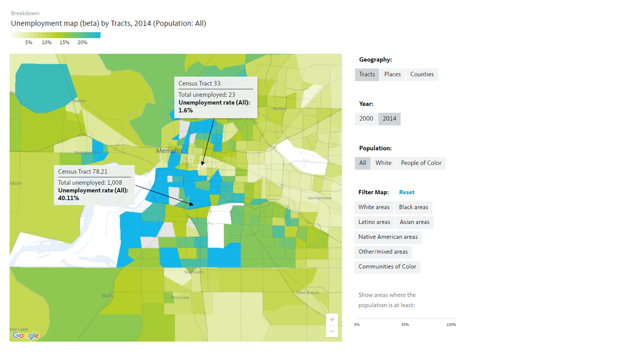
(Note: the census tract level maps are only available at the state, region, or city level.)

As you hover your mouse over a census tract, an info box will appear with the unemployment rate for that tract as well as the total number of people who are unemployed. In Census Tract 33, just 23 people are unemployed, while over 1,000 people are unemployed in Census Tract 78.21. These maps are especially helpful in developing targeted hiring or workforce development initiatives because they allow users to see where such programs would be most impactful.

Comparing over time and across race/ethnicity

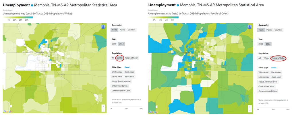
Another interactive component of the maps allows users to toggle between geography, years, and race/ethnicity. In the panel to the right of the map are several options: You can view the map by tract, place, or county and you can select data from either 2000 or 2014 to see how the geography of unemployment has changed over time. You can also view unemployment rates for Whites and for people of color independently.

The screenshots below show the unemployment rate for Whites on the left and for people of color on the right. Many tracts in the White unemployment map are blank because there aren’t enough White people living in those tracts to report data. Toggling back and forth between White unemployment and unemployment for people of color provides a clear visual example of persistent racial residential segregation and enduring employment barriers for people of color.

Assessing unemployment in communities of color

The last and perhaps most interactive element of the maps is the race/ethnicity filter. The filters powerfully illustrate both segregation and disinvestment in communities of color. If you select, for example, “Black areas”, then move the scroller at the bottom of the page to 50 percent, you will only see tracts where the Black population is at least 50 percent (see screenshot below). All tracts with a Black population less than 50 percent are greyed out, and you’ll notice that many of the lightest green areas, those tracts with the lowest unemployment rates, disappear. Meanwhile, the darkest blue tracts, symbolizing the neighborhoods with the highest unemployment rates, remain. These maps can inform both infrastructure investments and targeted hiring to ensure that the communities most affected by unemployment are the ones who receive resources.

 (Note: the filter only works when the population selected is “All”.)

Explore the maps and share your feedback

It was in response to user requests for county and sub-county data, and data for rural areas, that we added maps by county, tract, and place for the entire country, including areas that are not part of the largest 100 cities or the largest 150 metro areas.

We invite you spend some time exploring this new feature ahead of the public release of maps for three additional indicators (people of color, race/ethnicity, and disconnected youth) at the end of the month. Register for our 30-minute webinar on Thursday, October 6 at 12PM PDT for a more extensive walk-through of the unemployment maps and to share your feedback on the beta version. You can also share your feedback about the maps using our contact form.

Fairfax County Reaffirms Equity with a Resolution for “One Fairfax”

For many years, officials, advocates, and agency staff in Fairfax County, Virginia, have been concerned with the inequities affecting low-income residents and people of color in the county — and in its 2015 Strategic Plan to Facilitate Economic Success the County Board of Supervisors acknowledged the central importance of equity as a driver of regional economic growth and vitality. But they needed deeper, cross-sectoral data to help underscore their day-to-day experiences and to point the way toward actionable policy solutions.

With just over a million residents, Fairfax County has seen a surge of growth, primarily driven by people of color.  Between 2000 and 2010, the population of the county grew 11 percent, while there was a 42 percent increase of people of color in the county.

"Fairfax is generally a suburban community known typically to be affluent so these issues are sometimes masked in our general data," said Karla Bruce, deputy director of the Fairfax County Department of Neighborhood and Community Services.

In 2015, county officials and local community leaders partnered with PolicyLink and the University of Southern California's Program for Environmental and Regional Equity (PERE) to release an Equitable Growth Profile for Fairfax County, Virginia. The disaggregated data reported in the profile brought Fairfax County's racial inequities into clear focus, and catalyzed a local coalition into action. By supporting the development of the profile, Fairfax leadership demonstrated its commitment to equity and a vision of "One Fairfax" — a community in which all can participate and prosper.

As the profile pointed out, Fairfax County ranks second nationally in terms of household income, with a median of $110,292. At the same time, the middle class is shrinking: workers in the bottom 20 percent saw their wages stagnate between 1979 and 2012, while workers in the highest 20 percent have seen above-national-average wage increases. More than 10 percent of Latinos and Blacks lived in poverty in 2012 compared to less than 3 percent of Whites.

"I think the Equitable Growth Profile affirmed some things that many folks had been talking about anecdotally in terms of demographic shifts, population needs, and concerns that a number of people were having," said Patricia Mathews, president and CEO of the Northern Virginia Health Foundation. "I think it wasn't so much a new statement, but rather it allowed people to say, 'Now we have data. Now we can think about this a lot more strategically.'" Community leaders like Mathews were engaged in the process of producing the profile and in discussions about its findings. The county has been guided by a collective impact framework to advance equity, characterized by its "respect for and integration of the wisdom, voice, experience, and leadership of community residents."

"We need to understand and improve our work"

This summer, Fairfax County rededicated itself to equity by passing the One Fairfax Resolution, a formal declaration of commitment to racial and social equity passed by both the County Board of Supervisors and the Fairfax County School Board. The resolution will direct the development of a One Fairfax policy, which the boards hope to adopt as early as next summer.

The resolution formalizes the county's definition of racial and social equity and acknowledges the importance of equity to fostering greater opportunities and inclusive growth: "to truly create opportunity, we need to understand and improve our work through a racial and social equity lens from the very core of the organization outward, focusing intentionally and deliberately towards sustainable structural changes."

Over the last several years, Fairfax County has undertaken several initiatives to address racial and social disparities in a variety of areas, including juvenile justice, education, employment, health, and child welfare. Prior to the publication of the Equitable Growth profile, a 2012 study from the Center for the Study of Social Policy encouraged government leaders to scrutinize the pathways and institutions — including the police and school systems — that caused Black and Latino youth to be disproportionately represented in the juvenile justice system. They created an interagency team to go through the analysis and drill into what could be done to address disparities. They also joined the Government Alliance on Race and Equity (GARE).

Karen Shaban, strategic project manager of Fairfax County government, said that all of these efforts helped officials to realize that sustainable change goes beyond human services and moved them to look at other parts of their system, such as zoning policies, transportation, and land use. "All of these efforts set the stage for us to formally say there needs to be more intentionality to make sure that Fairfax County's institutions and systems are not contributing to the disparities that exist."

Currently, the County is using the equity concepts of the new One Fairfax resolution to guide planning related to a number of strategic initiatives in the areas of early childhood education, community development, and recreation.  "These are ripe opportunities to bring an equity lens to the work," said Shaban. The lens can help guide future redevelopment projects like the planning for a 10-acre campus of a former high school. 

Experimenting with "equity-in-practice" — particularly expanding community engagement beyond common public meetings — will give county staff an opportunity to try out some tools and processes to see what works best as they continue to develop the equity policy mandated by the One Fairfax resolution.

"I think we have a really progressive government in Fairfax County," said Karen Cleveland, president and CEO of Leadership Fairfax, a community leadership development organization. "But when you work for the government, you can very easily get drawn into policy development and policy implementation. What this One Fairfax resolution does is lift the work above that. It says, 'This is going to be our umbrella.'"

Leadership Fairfax, the Northern Virginia Health Foundation, and other organizations are working as thought partners with county staff to make sure that community needs are consistently prioritized — and not just from a government services perspective.

"It's helped us to not only have a common agenda but also to really commit to outcomes," added Bruce, "so that we can shift the possibility for progress and share in the responsibility for change. We haven't reached our destination, but there is definitely power in the networks that we are creating. I am hopeful that we will be able to realize this vision of One Fairfax."

Originally published in America's Tomorrow

National Equity Atlas Update

Dear Equity Atlas Users,
 
We have some great September updates for you, but first of all we are excited to announce the beta version of a new feature that highlights the equity movement on-the-ground:
 
Preview neighborhood-level mapping added to the Atlas
Today, we released the beta version of new interactive neighborhood-level mapping on the Atlas. These new maps allow users to understand how selected indicators (e.g., unemployment) vary across neighborhoods within a city or region, and can help inform targeted employment and workforce development initiatives as well as infrastructure investments. This beta release features county and census-tract level maps of the unemployment indicator. Register for our special preview of the maps on October 6 specifically for Atlas subscribers and share your feedback ahead of the public release next month.
 
Welcoming America webinar
Welcoming America helps communities across the country achieve prosperity by becoming more welcoming toward immigrants and all residents. On October 7 the National Equity Atlas will be featured in a webinar on eelcoming and economic development. Participants will examine selected economic indicators on the Atlas to get a sense of how immigrants are faring in their communities. Angel Ross, Research Associate at PolicyLink and Justin Scoggins, Data Manager at the USC Program for Environmental and Regional Equity (PERE) are featured speakers. Register here.
 
Forward Community Investments webinar
Last week, the National Equity Atlas kicked off the Forward Community Investments 2016-2017 Racial Equity Webinar Series. The goal of this series is to provide FCI partners with tools and approaches that can be used to advance social, racial, and economic equity and inclusion within their work. The webinar provided an overview of the Atlas framework and a walk through of the Atlas, focusing specifically on Wisconsin.

New Report Makes Case for Equity in Metro Atlanta
A new report from the Partnership for Southern Equity (PSE), Growing the Future: The Case for Economic Inclusion in Metro Atlanta, describes how equity is both a moral and economic imperative for the Atlanta region and for the nation as a whole. The report highlights our full employment analysis and GDP with racial equity analysis, both of which underscore how eliminating racial inequities results in “equity dividends” for the broader economy. See our short post about the report here.

New “Chart of the Week” series
We've launched a new "Chart of the Week" series to add equity data about growth and prosperity to the national dialogue. Every week, we post a new chart drawing from the Equity Atlas related to current events and issues. Our inaugural post lifted up #BlackWomensEqualPay and looked at median wages for Black women in Atlanta, Georgia. We also shared charts highlighting the #Fightfor15, #NoDAPL, and the most recent Census report. Follow our posts on social media using #equitydata, #Fightfor15, and #NoDAPL and in our Data in Action section.
 
Thank you!

The National Equity Atlas team at PolicyLink and the USC Program for Environmental and Regional Equity (PERE)


Chart of the Week: #AB1726 in CA Highlights Need for API Subgroup Data

To add equity data to the national dialogue about growth and prosperity, every week the National Equity Atlas team posts a new chart from the Equity Atlas related to current events and issues.

Yesterday, California Governor Jerry Brown signed AB 1726, the Accounting for Health and Education in API Demographics (AHEAD) Act, into law. AB 1726 amends current state code to require the California Department of Public Health to expand the number of Asian and Pacific Islander subgroups for which they collect and report data to also include Bangladeshi, Hmong, Indonesian, Malaysian, Pakistani, Sri Lankan, Taiwanese, Thai, Fijian, and Tongan Americans. The final amendments to the bill removed requirements for public higher education institutions and the Department of Healthcare Services. The University of California and the California State University systems agreed to voluntarily disaggregate Asian and Pacific Islander (API) data, but the California Community Colleges system has yet to signed on.

AB 1726 is a step in the right direction, but all of California’s public higher education and health agencies should report data for more detailed API subgroups, especially because California has the largest and most diverse Asian American, Native Hawaiian, and Other Pacific Islander population.

This week's chart highlights the importance of data disaggregation within the API community, particularly when it comes to higher education, by showing the share of the population ages 25 to 64 with an Associate degree (AA) or higher by selected API ancestry groups.

By 2020, a projected 44 percent of jobs in California will require an associate degree or higher. And while 60 percent of the API population as a whole in California has at least an AA, this varies considerably by ancestry. Among Taiwanese people in California, the number is 81 percent, but it drops to 19 percent for Samoans and Laotians. Similarly, Hmong and Tongan Americans have lower levels of education than both African Americans and U.S.-born Latinos. At the other end, Asian Indians and Pakistanis are twice as likely as African Americans and U.S.-born Latinos to have an AA or higher. Less detailed API data can mask barriers faced by certain sub-populations.

For more information about the wide range of outcomes within the API population, check out Asian Americans Advancing Justice’s report A Community of Contrasts: Asian Americans, Native Hawaiians and Pacific Islanders in the West.

To see how educational attainment varies by ancestry in your state or region, explore the education levels and job requirements indicator, type in your state or region in the Explore box, then select the “By ancestry” breakdown. Download the charts and share them on social media using #AllCACounts and #equitydata.

New Report Makes Case for Equity in Metro Atlanta

A new report from the Partnership for Southern Equity (PSE), Growing the Future: The Case for Economic Inclusion in Metro Atlanta, describes how equity is both a moral and economic imperative for the Atlanta region and for the nation as a whole. The report highlights the full employment analysis and GDP with racial equity analysis conducted by the National Equity Atlas team, both of which underscore how eliminating racial inequities results in “equity dividends” for the broader economy. PSE writes:

“The Partnership for Southern Equity defines economic inclusion as: ‘Increasing equity in the distribution of income, wealth building, employment, and entrepreneurial opportunities for vulnerable populations.’ In this definition, equity is a step beyond equality because it takes into account that people may not start from the same place and, therefore, ‘equal’ treatment may not resolve the gap that exists. […] Economic inclusion is a win-win for society because an increase in productive citizens who can participate in the economy, purchase goods, and contribute to cultural and business innovation leads to that society’s growth and sustainability.”

Growing the Future is data driven and includes spatial analyses of several indicators including unemployment, job location, income, and education that show how the historical roots of segregation persist today. 

The report also describes several examples of strategies already in action locally and across the country that address regional inequities, and lays out six principles of economic inclusion to guide development of policies moving forward. To learn more about the Partnership for Southern Equity, click here

Chart of the Week: #RentersDayofAction

To add equity data to the national dialogue about growth and prosperity, every week the National Equity Atlas team posts a new chart from the Equity Atlas related to current events and issues.

Today, thousands are taking to the streets across the country to protest rising and unaffordable rents in what organizers are calling the “largest renter-led protest in recent history.” In 2012, more than half (51 percent) of renters were spending more than 30 percent of their incomes on rent, but the rates are even higher in some of the nation’s largest 100 cities.

To lift up the #RentersDayofAction demands calling for an end to rising rents and unjust evictions, this week’s chart looks at housing burden for renters, or the percent of renter-occupied households spending more than 30 percent of their income on rent, among the largest 100 cities. Though cost-burdened households have decreased slightly among renters based on the latest data, the greatest benefits have gone to homeowners with a mortgage.

In 2012, 72 percent of renters in Hialeah, FL were housing burdened as were two in three Miami renters. The top five cities with the highest housing burdens were:

Housing is the single largest expense for most households and high housing costs squeeze household budgets leaving few resources to pay for other expenses, save for emergencies, or make long-term investments. The Urban Displacement Project, run by the University of California Berkeley, found that Bay Area cities with rent control laws saw less turnover in their renter populations and that rent control is most effective when paired with other tenant protections like just cause evictions policies. For a more extensive overview of strategies to resist gentrification, see Causa Justa Just Cause’s Development without Displacement report.

To view how affordability ranks in your community or how rates of housing burden vary by race/ethnicity or tenure, visit the National Equity Atlas and type in your city, region, or state. Download the charts and share them on social media using #RentersDayofAction and #equitydata.

Chart of the Week: Why the Latest U.S. Census Report Matters

To add equity data to the national dialogue about growth and prosperity, every week the National Equity Atlas team posts a new chart from the Equity Atlas related to current events and issues.

Yesterday, the Census Bureau released a report on 2015 income and poverty data, announcing that median household income increased by over 5 percent—the fastest growth on record. As President Obama described in a Facebook post and video with Jason Furman, Chairman of the Council of Economic Advisers, the gains were largest among the bottom fifth of households.

To highlight why this gain — especially among the bottom quintile of earners — is so important, this week’s chart looks at real earned income growth for full-time wage and salary workers in the United States from 1980 to 2012.

Over the three decades from 1980 to 2012, the inflation-adjusted earnings of the bottom 10 percent of workers decreased the most at more than 11 percent. In fact, the whole bottom half of workers experienced real declines in their incomes over this period. At the other end, those in the top 10 percent saw their earnings increase by nearly 15 percent. The announcement that real income growth in 2015 was the fastest since 1969 for households at the 10th, 20th, 40th, 50th, and 60th percentiles is a promising finding, though there is still more to be done.

These income increases, combined with refundable tax credits, lifted millions of families and children out of poverty. In 2015, 9.2 million Americans, including 4.8 million children, moved above the poverty line with the help of credits like the Earned Income Tax Credit (EITC) and the Child Tax Credit (CTC). Expanding these social safety net programs through a more equitable tax code and advancing pre-tax income strategies like minimum wage increases and stronger collective bargaining rights are key to supporting the more than 8 million families still in poverty. For more information on policies that contribute to wage growth, see the Economic Policy Institute’s Agenda to Raise America’s Pay.

To view the distribution of income growth in your community over the last three decades, visit the National Equity Atlas and type in your city, region, or state. Download the charts and share them on social media using #equitydata.

Chart of the Week: Disconnected Native Youth in North Dakota

To add equity data to the national dialogue about growth and prosperity, every week the National Equity Atlas team posts a new chart drawing from the Equity Atlas related to current events and issues.

In what some are calling the largest gathering of tribal nations in 150 years, a multigenerational coalition has assembled in North Dakota to stand with the Standing Rock Sioux Tribe to halt the construction of the Dakota Access Pipeline (#NoDAPL). Proponents of the 1,172-mile crude oil pipeline tout the economic benefits of the project in the wake of a declining state economy, but this project is not the way to foster sustainable and equitable growth in North Dakota’s Native communities.

To lift up this Native-led struggle to protect ancestral land and water in Standing Rock, this week’s chart looks at the share of young people ages 16 to 24 in North Dakota who are disconnected from work and school.

In North Dakota, Native American young people are the most likely among the major racial/ethnic groups to be disconnected from work and school. More than one in three Native American young people are neither working nor in school, compared with one in four Latinos and just 5 percent of Whites. Native Americans make up the second largest race/ethnic group in the state, but they continue to face steep barriers to economic inclusion, while inequitable development projects like the Dakota Access Pipeline threaten destruction of their sacred burial sites and water access.

Widespread youth disconnection hurts not only Native Americans and Latinos, but also the North Dakota economy. State policymakers can simultaneously invest in their economies and their most vulnerable populations by building robust cradle-to-career pipelines that support children and families, and by connecting young people of color to opportunities through targeted workforce training programs, apprenticeships, internships, and career academies.

To see how Native Americans fare across other indicators in North Dakota, visit the National Equity Atlas, type in North Dakota, and select an indicator. Download the charts and share them on social media using #equitydata and #NoDAPL.

Webinar Archive: 3 Ways to Use Equity Atlas Chart Downloads Webinar

The National Equity Atlas has improved chart downloads. To learn how to use this improved functionality, watch our latest webinar, “3 Ways to Use Equity Atlas Chart Downloads.” Here is the webinar recording and slides. We encourage you to share with your network.

Also, take a few minutes to review the material shared during the webinar. We created a mini-profile template and a social media tip sheet describing the different ways you can use our Atlas charts to promote your work.You can also follow our new #ChartoftheWeek series on the Atlas and on our @PolicyLink Twitter.       

Find analyses of our newest data updates here, in the “Data in Action” section:

·       Why U.S.-born Latinos Tend to Fare Better than Immigrant Latinos

·       Latino Immigrants Face Uphill Battle to Economic Inclusion

·       The Challenge of Youth Disconnectedness Among Latinas

We invite you to join our next live webinar, "Special Preview: Neighborhood Mapping on the Atlas", scheduled for Thursday, October 6, at 12:00 pm - 12:30 pm PT. We will be previewing our new mapping system and seeking feedback from you in advance of our public release in October. 

Please feel free to contact Sarah Treuhaft at sarah@policylink.org with any questions, or visit our “Frequently Asked Questions” section on the Atlas to scan commonly asked questions.

-- The National Equity Atlas team at PolicyLink and the USC Program for Environmental and Regional Equity (PERE)

Chart of the Week: #Fightfor15 this Labor Day

To add equity data to the national dialogue about growth and prosperity, every week the National Equity Atlas team posts a new chart drawing from the Equity Atlas related to current events and issues.

In honor of #LaborDay and the #Fightfor15, this week’s chart looks at the share of workers earning at least $15/hour in California. In an equitable economy, all workers would earn enough to support their family, or a “living wage.” What constitutes a living wage varies based on family size, but $15/hour is a good benchmark for understanding which groups are least likely to be earning a living wage. The fight for a $15/hour minimum wage is also an important campaign that continues to gain momentum.

In California, among full-time workers ages 25 to 64, Latinos are the least likely to make at least $15/hour. 49 percent of Latino women and 54 percent of Latino men earned at least $15/hour in 2012 compared with 81 percent of White women and 87 percent of White men. Latinos are the single largest ethnic group in California, but they continue to face some of the steepest barriers to economic inclusion.

Low wages among the growing Latino population is bad for families and bad for California’s economy: more money in the hands of workers means greater demand for goods and services. Research shows that companies can pay living wages and remain profitable, in part because paying higher wages reduces turnover and increases productivity.

Thanks to policy changes, we should soon see positive changes on this indicator. The minimum wage in California is currently $10/hour, but earlier this year, state lawmakers struck a deal to gradually raise the state minimum wage to $15/hour by 2022.

To see how the share of workers earning at least $15/hour varies by race/ethnicity and gender in your community, visit the National Equity Atlas, type in your city, region, or state, and select the “By gender” breakdown. Download and tweet at us the chart for your community using #equitydata and #Fightfor15.

Pages