Using Atlas Data to Share Inclusive Innovation Economy Strategies at the Philadelphia Fed Conference

One of the main reasons why we built the National Equity Atlas was to provide changemakers with the data they need to frame why racial and economic inclusion matters to the future of their regions. So we are thrilled to learn how our allies are using Atlas data and visualizations to make compelling presentations and expose more people to the idea that equity is both an economic and moral imperative.

Last month, our partner Adam Friedman, who leads the Pratt Center for Community Development in New York City, used Equity Atlas data to talk about the importance of inclusive growth and urban manufacturing as a critical strategy at the Philadelphia Fed’s Equitable Economic Development Conference held in Lancaster, PA. “The Atlas is a quick, easy way to analyze how an area is doing in comparison to the rest of the nation” says Friedman, “More than an overview, it lets you do some quick diagnoses about current and future challenges.” (Download his presentation.)

The Federal Reserve of Philadelphia, in partnership with the Community First Fund, hosted the conference to explore how to include equity goals in economic development planning and decision-making. Lancaster Online coverage of the event reported over 100 in attendance to learn about regional strategies for more equitable growth.

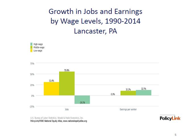
Friedman used the Equity Atlas to describe the challenges of rising inequality and persistent racial inequities in Lancaster, PA: the site of the conference. Friedman presented Lancaster’s economic and workforce challenges and described how growing good, accessible jobs and investing in the skills and capabilities of its less-educated communities and growing communities of color are central to the region’s economic prosperity and competitiveness.

Friedman made several key points:

Income disparity is growing in Lancaster

While Lancaster is growing more middle-skills jobs than many other regions, wages are relatively stagnant across the board, contributing to widening inequality. Between 1980-2012, households at the 10th percentile (the bottom 10 percent) saw their incomes increase by a mere 0.3 percent compared to incomes at the 90th percentile (the top 10 percent) which increased 13 percent. 

Credit: Adam Friedman/Presentation at the Equitable Economic Development Conference 

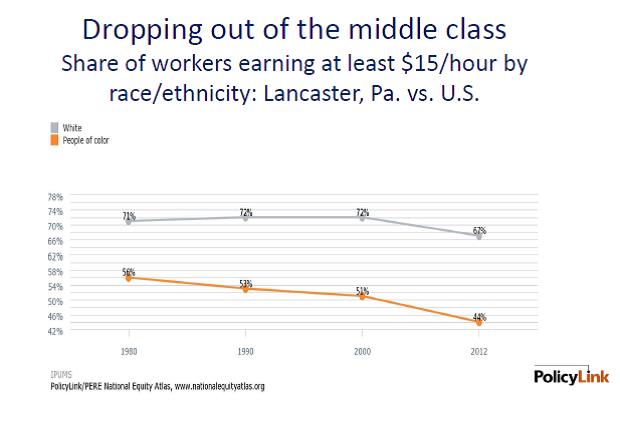
The region’s workers of color face a large wage gap. While about 67 percent of White workers earned at least $15/hour during the 2008-2012 period, only 44 percent of workers of color did.   

Credit: Adam Friedman/Presentation at the Equitable Economic Development Conference 

The Lancaster region is not adequately preparing any of its racial/ethnic groups for the jobs of the future

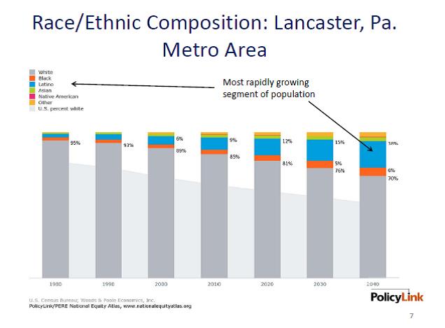
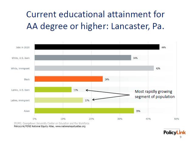
Latinos are the regions fastest growing population but only 13 percent of Lancaster’s U.S.-born Latinos will be prepared for the more than 44 percent of jobs that will require an Associate’s degree in 2020.

Credit: Adam Friedman/Presentation at the Equitable Economic Development Conference  

Credit: Adam Friedman/Presentation at the Equitable Economic Development Conference 

Lancaster would be stronger with racial economic inclusion

These racial economic inequities take a toll on Lancaster’s economy: the regional economy could have been $1 billion larger in 2012 if there were no racial gaps in income.

Urban Manufacturing as a Strategy for Equitable Economic Development

Urban manufacturing is one equitable economic development and job creation strategy that regions like Lancaster should consider. Growing middle-wage jobs is critical for regions because they provide pathways to economic security and also because living wage jobs are the critical counterpoint to rising housing costs. While manufacturing has been in decline for decades, cities and regions are experiencing a new wave of urban manufacturing—including the “maker economy” and facilities like TechShop that are making it possible to launch small manufacturing companies in cities as well as advanced and supply chain manufacturers.

Most efforts focused on supporting innovation sector growth do not include a focus on equity and inclusion for workers or neighborhoods. The Pratt Center’s Equitable Innovation Economy (EIE) initiative is taking on this challenge to help cities develop strategies that increase access and economic inclusion within the innovation economy and local manufacturing sectors. This effort, a partnership between Pratt, the Urban Manufacturing Alliance, and PolicyLink, centers around a learning community with four cities that are each working on different inclusive innovation economy sectors and strategies. Indianapolis, for example, is focused on attracting employers by reviving legacy industrial properties. San Jose is trying to create more career pathways into hardware manufacturing and the maker economy. Portland is focusing on their tech, green-tech and athletic and outdoor industries. New York is seeking to extend innovation-sector opportunity across its five boroughs.

Working together to share equitable job creation strategies, the four Cities are rejecting the age old notion that Cities must compete with one another for jobs and are instead sharing program ideas and best practices to lift each other up. The goal is to expand their network and the number of cities that are building equitable innovation sectors.

We look forward to updates about how the partners are advancing their equitable economic development goals and will highlight their progress as they move forward. Many thanks to Adam for sharing with us how he is using the Equity Atlas.

How are you using the Atlas in your work? Please let us know by filling out this survey or writing me at tsmiley@policlink.org.

National Journal Uses Equity Atlas Data to Examine Black Education Gaps in Metros

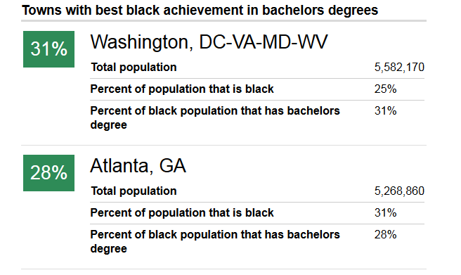
The most recent article in the Next America series on education gaps by race in metros uses the Equity Atlas to explore the “Best and Worst Cities for Educating Blacks.” Analyzing the data on Black college graduates who come from out-of-state versus native Black college graduates, Janie Boschma highlights how many of the regions with the highest levels of Black achievement like; Washington, Atlanta, Raleigh, Nashville and San Francisco, are still lagging in their preparation of their own Black youth for the jobs of the future. Boschma writes, “Educated transplants mask some of the actual low attainment levels of local students in these cities.”

National Journal Series 

Washington DC illustrates the phenomenon. While DC is top ranked for Black educational achievement in both high school and bachelor’s degree attainment, it is not preparing youth for the jobs of the future. According to a study referenced in the article, only 9 out of 100 students in DC public schools will attain a post-secondary degree, a requirement of 36 percent of the jobs created between 2000 and 2010. 

The analysis draws attention to the ongoing need to invest in the educational attainment of local Black youth, even where attainment levels are high-ranking.

Where attainment levels are low, investment in Black youth is even more crucial for long-term economic prosperity. Milwaukee has the lowest Black educational achievement of Bachelor’s degrees and is tied with three other cities; Minneapolis, New Orleans and Miami, for the second worst attainment of high school degrees -- only 14 percent of Milwaukee’s Black residents have a Bachelor’s degree.

Sociology professor at the University of Wisconsin-Milwaukee, William Velez, told the National Journal Series that, “if you have a large minority population that is not getting a college education they're not going to get the good jobs and contribute to the economy the way a college graduate can do. We have real challenges here in Milwaukee.”

This story is the third in a series using data from the Atlas, read about the others here.

Public Policy Research Center Releases an Equity Profile of St. Louis

The University of Missouri- St. Louis Public Policy Research Center (PPRC) just released an equity report of the St. Louis Region based on National Equity Atlas data. Mark Tranel, the director of PPRC, told St. Louis Public Radio that the report is meant to “be a tool for government agencies and non-profit organizations working to bridge disparity gaps in St. Louis.” Founded 25 years ago, PPRC does applied policy research to promote the region’s progress and prosperity. In an effort to understand inequity in the region, the report authors explored the changing demographics, persisting racial inequities, and the economic benefits of an equitable regional economy. The St. Louis economy would have been nearly $14 billion larger in 2012 if there were no racial gaps in income.

The first section of the report explores the changing demographics of the St. Louis region and projects that by 2040, people of color will be 33.4 percent of the population, up from 20 percent in 1980. Communities of color have also been driving growth since 1990 whereas White growth decreased in 7 of 15 counties from 2000-2013 and was marginal in the remaining 8 counties.

Using the Equity Atlas framework for an equitable economy, the report details indicators of economic vitality, readiness and connectedness. Large racial disparities persisted across all three categories. In terms of economic vitality, White St. Louisans make about $5 more per hour than St. Louisans of color, a slight reduction from the $6 gap in 1980. The unemployment rate for people of color in St. Louis was twice the rate of White unemployment and was the highest it had been since 1980.

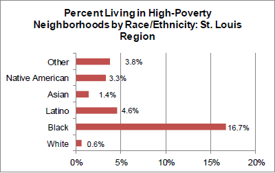
There were also large racial disparities in measures of connectedness. One of the report’s most unsettling findings is that nearly 17 percent of Black St. Louisans live in high-poverty neighborhoods compared with less than one percent of Whites.

Credit: University of Missouri–St. Louis/Public Policy Research Center

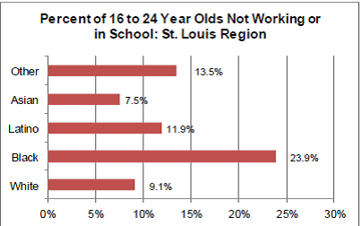
Youth of color were more disconnected from education and work in St. Louis, which is likely to hinder their ability to participate, thrive, and contribute to the region’s workforce and economic prosperity.

Credit: University of Missouri–St. Louis/Public Policy Research Center

Ultimately, the report outlined the enormous potential economic gains of racial equity: the region’s economy could be $14 billion larger with an average of 63% income gains for people of color. The authors hope that the report will be a tool for government agencies as the St. Louis region joins, “a growing number of metropolitan areas that are proactively addressing issues of equity.”

We look forward to seeing how advocates and policymakers use this report as a tool to create a more equitable and prosperous St. Louis region. This report also provides a terrific model of how local communities can develop their own Equity Profiles using data available in the National Equity Atlas.

National Journal Series Analyzes Education and Workforce Issues in Metros Using National Equity Atlas Data

Last week, the National Journal began a series of stories exploring the skill and education gaps between whites and communities of color in the workforce based on data in the National Equity Atlas. The series is led by journalist and editorial director Ronald Brownstein, who has written extensively about the political and economic ramifications of America’s changing demographics, and leads the Journal’s Next America project exploring these issues.

The first article in the series, Education Gaps Pose Looming Crisis for U.S. Economy, examined the education gaps between Whites and Blacks and Whites and Latinos on high school graduation and bachelor’s degrees across the nation’s largest 150 metros. They found large gaps across all types of metros, including those experiencing fast job growth, with smaller gaps only in metros that are “struggling to attract and hold college graduates of any race” such as Flint, Youngstown, and Allentown. Sarah Treuhaft, director of Equitable Growth Initiatives at PolicyLink, spoke with Brownstein about these findings. "It is clear that growth alone does not solve these issues, and we really need to look at structural issues," she said.

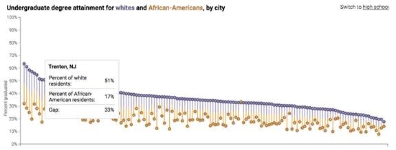
The article includes new data interactives showing education levels by race and racial gaps: 

Credit: Ronald Brownstein and Janie Boschma/National Journal

The second piece in the series, Fastest Growing Cities Import their College Graduates, explores how many of the fast-growing regions with large racial education gaps are, as Manuel Pastor, director of PERE, said, “masking a lot of their problems with the importation of highly skilled labor.” Using additional data provided by PERE, Brownstein looked at the shares of college grads among the in- and out-of-state working-age populations in the 20 metros that added the most jobs since 2000. He found enormous gaps in most of the cities, including Denver, Baltimore, Charlotte, and more, as illustrated in the chart below.

Credit: Ronald Brownstein and Janie Boschma/National Journal

We are looking forward to seeing additional stories in the series and will share links here when they are up.

Introducing Four New Indicators: Median Age, Asthma, Diabetes, and Commute Time

Today we are excited to announce the addition of four new indicators to the Atlas:

  • Median Age
  • Asthma
  • Diabetes
  • Commute Time


Here’s what you can find for each of the indicators:

Median age: What’s the average age of residents in your community?

Latinos and other communities of color are comparatively younger than whites in most regions. As younger populations grow increasingly diverse and the senior population remains largely white, ensuring the success of youth of color – our future workforce – will become increasingly important to regional economies.

What it measures

This indicator measures the average age of residents by race/ethnicity.

Key facts

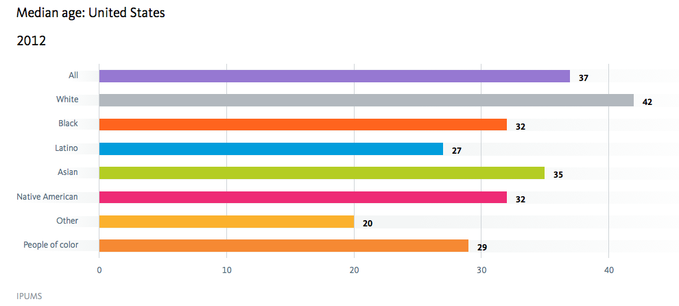
  • People of Other/mixed race and Latinos are the youngest racial/ethnic groups in the United States, with a median age of 20 and 27, respectively.
  • The median age of people of color is about 13 years younger than Whites: 29 compared to 42 years old.


How to find it

  1. Click indicators on the navigation bar
  2. Select the “Median age” indicator under Demographics
  3. Select “By race/ethnicity” in the breakdowns underneath the chart
  4. Here is what you will see

Credit: Median age by race/ethnicy/National Equity Atlas 

This data can be used to support strategies that would ensure all youth, including low-income children of color can access the education and supports they need to succeed. For example, the implementation of Universal Pre-K in Tulsa has proven to have strong economic and social benefits, improving future earnings potential by thousands of dollars.


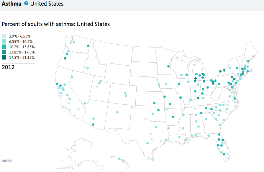
Asthma: What share of adults suffer from asthma?

Healthy workers are critical to a healthy regional economy.  However, adult asthma leads to more frequent absences from work, and can result in lower productivity on the job.  Asthma is more than a physical health problem; its prevalence and severity are directly affected by environmental, housing and social conditions often present in lower income communities of color.  Poor children are more likely to live in neighborhoods with known toxicities and attend schools and recreation centers filled with undetected asthma triggers.  As a result, low-income families spend more of their time and limited resources addressing asthma-related hospitalizations.

What it measures

Percent of adults with asthma by race/ethnicity.

Key facts

  • Nationally, one in every seven Native Americans and those of Other/mixed race suffer from asthma.
  • Among the largest 150 metropolitan regions, Vallejo, CA has the highest share of adults with asthma (14 percent). Yet within the same state, the nearby region of Salinas, CA has one of the lowest rates at 6 percent (ranking 143rd).


How to find it

  1. Click indicators on the navigation bar
  2. Select the Equity indicator “Asthma” under Readiness
  3. Select “Ranking,” “Region,” and “All” in the breakdowns underneath the chart
  4. Here is what you will see

Credit: Percent of adults with asthma by race/ethnicity/National Equity Atlas

Data on asthma rates can be used to press for the reduction of hazardous chemicals, pesticides and emissions from industrial plants, automobiles, and diesel engines in your community. It can also be used to call for targeted green jobs and investments in communities with high risks and inequities.


Diabetes: What share of adults are diabetic in your state or region?

Healthy neighborhoods provide residents with access to parks, healthy food, clean air, safe streets, and health care and social services. When communities lack these components, residents are more likely to suffer from chronic diseases such as obesity, diabetes, heart disease, which in turn affect their ability to fully participate in the workforce.

What it measures

Percent of adults with diabetes by race/ethnicity.

Key facts

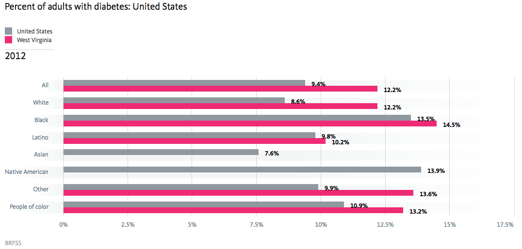
  • West Virginia has the highest share of adults with diabetes: 12.2 percent compared to 9.4 percent nationally.
  • Latinos in West Virginia have the lowest rate of diabetes (10.2 percent), compared to 12.2 percent of Whites, and 14.5 percent of Blacks.


How to find it

  1. Click indicators on the navigation bar
  2. Select the Equity indicator “Diabetes” under Readiness
  3. Select “By race/ethnicity” in the breakdowns underneath the chart
  4. Enter West Virginia in the “Compare” field
  5. Here is what you will see

Credit: Percent of adults with diabetes by race/ethnicity/National Equity Atlas 

Data on diabetes rates can be used promote healthy eating and active living in your community. Policies and programs that improve the quality of school lunches, access to farmers markets, and create opportunities for physical activity can improve health outcomes for all residents.


Commute time: How does average travel time to work vary by race/ethnicity in your state or region?

In an equitable region, all workers would have comparable commute times regardless of race/ethnicity. Long commute times indicate a lack of nearby job opportunities and slow transit options, and can lead to high transportation and child care costs, job instability, and lower quality of life for workers.

What it measures

Average travel time to work (minutes) by race/ethnicity.

Key facts

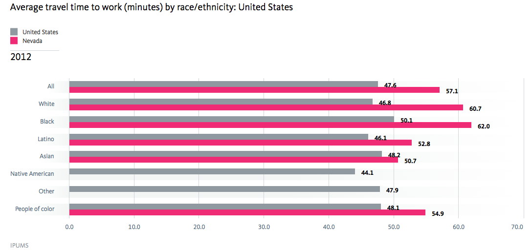
  • The average commute time for U.S. workers using public transportation is 47.6 minutes, nearly double the commute time of workers using private modes of transit (24.5 minutes).
  • Blacks on average have the highest public transit commute times at 50.1 minutes, followed Asians at 48.2 minutes, and those of other/mixed race at 47.9 minutes.
  • Commute times vary significantly by geography. For example, public transit users in Nevada on average spend 10 more minutes commuting to work (57.1 minutes). For black workers it’s even longer at 62 minutes.


How to find it

  1. Click indicators on the navigation bar
  2. Select the Equity indicator “Commute time” under Connectedness
  3. Select “By year,” “Public,” and “2012” in the breakdowns underneath the chart
  4. Enter Nevada in the “Compare” field
  5. Here is what you will see

Credit: Average travel time to work (minutes) by race/ethnicity/National Equity Atlas 

This data can be used to advocate for the development of robust public transit systems including buses and bus rapid transit that connect low-income communities to jobs, education and training opportunities, and services. Transit-oriented developments (TODs) that include clear equity goals can be an effective tool to expand affordability and access low-income residents and prevent displacement of both people and small businesses.


We hope you'll enjoy exploring these new indicators! Please share your thoughts on these Atlas additions, and tell us how you'll be using this data to inform change in your community. You can contact us at info@nationalequityatlas.org.

Want to Create Your Own Local Equity Atlas? Start Here

Have you explored the National Equity Atlas and want to dig in deeper to understand how access to resources and opportunity is distributed across the neighborhoods in your region? It might be time to start thinking about developing your own local equity atlas. And a new set of resources from the Coalition for a Livable Future – the creators of the nation’s first regional equity atlas back in 2007 – is now available to help guide you through the process.

The National Equity Atlas was inspired by local equity atlases: data tools that local leaders, advocates, and policymakers are using to inform decision-making and make the case for inclusive policies and practices at the local, regional, and state level. Local equity atlases allow users to examine access to opportunity by race and geography. In Atlanta, Denver, Los Angeles, and New York (in addition to Portland), these atlases have put important facts, analyses, and data visualizations in the hands of changemakers, and they are being used to shape investment decisions and policy.

We’ve written several “Data In Action” stories about how advocates are using these local data resources to advance systems and policy change:


As the pioneers of the approach, the Coalition for a Livable Future has learned a great deal about how to successfully build a local equity atlas, and they want to share those learnings with the many cities that have approached them for advice and the broader field. They teamed up with the Oregon Health Care Quality Corporation to develop an online toolkit and are also hosting two webinars in May:

  • RESOURCE: The Equity Atlas Toolkit shares information about the uses of such atlases and describes the process of creating an equity atlas to support research, coalition-building, and policy change. It describes what equity atlases are and why they are valuable tools, and includes sections on planning, building a team, engaging stakeholders, selecting indicators, creating maps, developing a website, and conducting outreach and education.
  • WEBINAR: Equity Atlas Basics, May 12, 2015 11:00-12:00pm PST. Learn more about what equity atlases are and how they can empower communities to advance equity. Register Online
  • WEBINAR: Building an Equity Atlas, May 27, 2015 11:00-12:00pm PST. This webinar focuses on the equity atlas development process. Learn about how you can develop an equity atlas for your community. Register Online

Meet Our Four Newest Indicators

The National Equity Atlas is a living resource, and we are thrilled to announce the addition of four new indicators to the site:

  • Wages: $15/hr
  • Income inequality: 95/20 ratio
  • Diversity index
  • Contribution to growth: Immigrants
     

Here is a breakdown of each new indicator: 

Wages: $15/hour: What share of full-time workers earn at least $15 per hour?

In an equitable economy, all workers would earn a living wage that allows them to meet their basic needs, as well as their family's. While the value of a living wage depends on family size and cost-of-living, many are advocating for $15 per hour as a new bare-bones baseline (this equals $31,200 annually for full-time work).

What it measures

This indicator measures the share of full-time workers earning at least $15 per hour. It available by race/ethnicity, gender, and educational attainment, and over time (since 1980).

Key facts

  • Only 57 percent of women earn at least $15 per hour compared with 68 percent of men.
  • Latinas are the least like to earn at least $15 per hour (40 percent), followed by Native American women and Latino men (46 percent).
  • 50 percent of Black women at least $15 per hour, compared with 57 percent of Black men and 62 percent of White women.


How to find it

  1. Click Indicators in the navigation bar
  2. Select the Equity indicator "Wages: $15/hr" under Economic Vitality
  3. Select “By gender” in the breakdowns underneath the chart
  4. Here is what you will see

Credit: Share of workers earning at least $15/hour by race/ethnicity/National Equity Atlas 

Momentum is growing across the country to change these numbers and ensure that all workers can earn at least a living wage. Use this data to inform policy and organizing strategies such as raising the minimum wage or passing a living-wage ordinance. In the city of Los Angeles, for example, the two-year Raise LA campaign led to a new living wage ordinance raising the wages of hotel workers to $15.37 per hour.

Income inequality: 95/20 ratio: How unequal is your state or region?

Rising inequality is one of the defining challenges of our generation, and there is a growing consensus that inequality is not just bad for those left behind—it is bad for our economy and democracy as a whole. Recent research shows that this is true for metropolitan regions as well as nations. Harvard economist Raj Chetty and his collaborators found that regions with lower inequality and segregation provide their residents with more chances to move up the economic ladder. And Manuel Pastor and Chris Benner found that regions with less inequality are more economically resilient and experience longer periods of growth.

What it measures

This indicator measures inequality using the 95/20 ratio, which is represents the income earned by the households at the 95th percentile (just making it into the top 5 percent) divided by the income earned by the households at the 20th percentile (just falling into the bottom 20 percent). Nationwide, households at the 95th percentile earned $181,768 in 2012, and households at the 20th percentile earned $19,888, for a 95/20 ratio of 9.14. In other words, households at the 95th percentile earned more than 9 times the incomes of households at the 20th percentile.

Key facts

  • Inequality has consistently grown over the past several decades: the 95/20 ratio was 6.91 in 1980 and grew to 9.14 by 2012.
  • Among the largest 150 regions, Bridgeport, CT has the highest inequality on this measure (95/20 ratio of 14.08), and Ogden, UT has the lowest (5.72).
  • Regions within the same state can have very different levels of inequality: Durham, NC, for example, has the 10th highest inequality (95/20 ratio of 10.29) and Charlotte, NC ranks 42nd (8.71).


How to find it

  1. Click Indicators in the navigation bar
  2. Select the Equity indicator "Income inequality: 95/20 ratio" under Economic Vitality
  3. Enter “Durham” as your region in the box near the top right corner of the page
  4. Select “Ranking” in the breakdowns underneath the chart
  5. Enter “Charlotte” in the Compare box under the chart
  6. The chart below is what you will find

Credit: Household income, 95th and 20th percentile/National Equity Atlas 

Press for policies to reduce inequality, such as expanding the Earned Income Tax Credit (EITC) and pursuing full employment. Washington, DC, for example, recently upgraded its local EITC by increasing its amount and extending it to workers without children and non-custodial parents.

Diversity index: How racially diverse is your community?

Diversity—in the context of inclusion—is a driver of innovation, business growth, and economic progress. Research shows that companies with more diverse workforces are more competitive, with greater market share, higher revenues, and more customers. McKinsey & Company’s recent analysis, for example, found that more diverse companies (in the top 25 percent) were 35 percent more likely than those in the bottom 25 percent to have financial returns above their industry medians.

What it measures

The diversity index measures the representation of six major racial/ethnic groups (White, Black, Latino, Asian/Pacific Islander, Native American, and Mixed/other race) in the population. The maximum diversity score (1.79) would occur if each group were evenly represented in the region.

Key facts

  • Nationally, the diversity index is 1.1 now, and it was .71 in 1980.
  • Hawaii (1.3) and California (1.29) are the most diverse states, and Vermont and Maine (both .3) are the least diverse.
  • Vallejo (1.45) and San Francisco (1.48) are the most diverse among the largest 150 regions, and McAllen, TX (.37) and Portland, ME (.34) are the least diverse. Chicago ranks 21st (1.19).


How to find it

  1. Click Indicators in the navigation bar
  2. Select the indicator "Diversity index" under Demographics
  3. Enter “Chicago” as your region in the box near the top right corner of the page
  4. Select “Ranking” as your breakdown under the chart
  5. Select “Region” as your geography under the chart
  6. Here is what you will find

Use this data for policy change

Use this data to develop and advocate for policies that ensure all of the diverse groups in your community can access the resources and opportunities they need to reach their full potential. Due in large part to the advocacy of the Illinois Coalition for Immigrant and Refugee Rights, Illinois has passed policies, like the Office of New Americans and the Illinois DREAM Act, that have made it one of the most welcoming states for immigrants.

Contribution to growth: Immigrants

Immigration is a significant driver of population growth nationwide, and in many distressed communities, new immigrants are fueling neighborhood revitalization and business growth. Policies that increase access to education, services, and living-wage jobs for immigrants, and remove barriers to their full and equal participation, will help immigrants and their entire communities thrive.

What it measures

This indicator measures the net change in population by nativity, broken down for six major racial/ethnic groups. It also measures the share of the net change in population attributable to immigrants (restricted to range between 0 and 100 percent).

Key facts

  • Nationally, the U.S.-born population grew by 19 million between 2000 and 2012, and the immigrant population grew 8.7 million, contributing 31 percent of total population growth.
  • There are three states where immigrants contributed all of the net population growth between 2000 and 2012: Michigan, Rhode Island, and New York.
  • Immigrants contributed all of the net population growth between 2000 and 2012 in 16 of the largest 150 regions, including Dayton, New Orleans, and Detroit.​


How to find it

  1. Click Indicators in the navigation bar
  2. Select the indicator "Contribution to growth: Immigrants" under Demographics
  3. Enter “Rhode Island” as your state in the box near the top right corner of the page
  4. You will see the below chart


Credit: Change in population by nativity/National Equity Atlas 

Use these facts to advance policies to promote immigrant inclusion ranging from facilitating citizenship to improving language access and extending voting rights to residents who are aspiring citizens. New Haven, for example, launched the Elm City Resident’s Card in 2007 and became the first city to issue a municipal ID card as a strategy to protect and integrate its growing immigrant population into the community.

How Our Foundation is Using an Equity Framework—and Equity Data—to Guide Our Investments

For 95 years, the Community Foundation for Greater Buffalo has been committed to realizing its vision of a vibrant, inclusive region with opportunity for all. Our foundation makes the most of its clients’ generosity by bringing together seemingly different groups to develop collaborative solutions that realize this vision in Western New York. Now, more than ever, there is momentum to take on the region’s longstanding challenges and reverse the decline of the past decades.  

One of our key community goals is to improve racial equity. Approximately 90 percent of all board-directed resources support communities of color. While racial equity stands on its own, it is also a critical factor in addressing our goal to improve educational achievement for low-income students. Other goals include enhancing and leveraging significant natural resources (using an environmental justice perspective), and strengthening the region as a center for architecture, arts and culture by ensuring that all children have access to consistent arts instruction. 

Key Equity Data Points Driving Our Work

Data that is disaggregated by race and ethnicity plays an important role in grounding our work and, in combination with storytelling, helps to inform our key initiatives. Powerful data points that drive our portfolio include the following:

  • The Buffalo Niagara region ranks 98th out of 100 metros in black/white equity and 89th in Latino/white equity (from the U.S. Census)
  • People of color are disproportionately clustered in urban centers and Buffalo is the third poorest city in the U.S. (also from the U.S. Census)
  • Population growth in the region is driven mainly by foreign-born people of color, recent immigrants to America (from City Vitals 2.0)


Our foundation selected these three data points very intentionally to make the case for increasing racial and ethnic equity, especially as a driver for economic growth. As communities of color grow as a share of the population, it is even more urgent to dismantle racial barriers and ensure all of our residents can access the educational and economic opportunities they need to contribute to the region’s revitalization, resilience, and prosperity.

Our Racial Equity Framework

We also adopted a framework introduced by PolicyLink to close the racial wealth gap through seven strategies:

1)     Fortify the cradle-to-career pipeline

2)     Reconnect the long-term unemployed

3)     Grow businesses owned by people of color

4)     Build power among a workforce comprised of people of color

5)     Open up access to economic opportunities in high-growth sectors

6)     Build wealth in communities of color

7)     Leverage urban resurgence to grow income and wealth

We adopted this framework because it articulates the community-level strategies needed to support a stronger regional economy that decreases our racial disparities and increases the equity dividend: the benefits to our whole region that will come from expanding opportunity for all. The framework also gave our board a new way to evaluate their work and investments.

Investing in a Data-Driven Equity Strategy: Say Yes Buffalo

Equity data plays a major role in several of foundation-supported initiatives that bring together stakeholders across multiple sectors to advance the seven strategies. One of the Community Foundation’s most powerful data-driven cross-sector partnerships is Say Yes Buffalo, which is aligned with the PolicyLink strategy to fortify the cradle-to-career pipeline. “Recognizing the clear link between future economic prosperity and educational achievement, the Foundation committed to launching Say Yes Buffalo in late 2011,” said Clotilde Perez-Bode Dedecker, President and CEO of the Community Foundation for Greater Buffalo. “Say Yes Buffalo is an unprecedented, cross-sector partnership, focused on increasing post-secondary completion rates for urban youth.”

While the driving force behind Say Yes Buffalo is a universal scholarship program offered to students in the Buffalo Public Schools, financial aid for college is just one component of the effort, which seeks to remove all barriers to educational success. To the academic, health and behavioral challenges our students face, Say Yes Buffalo and its partners are putting people and programs run by respected community-based organizations directly into the Buffalo Public School buildings. For example, in 2014 with the help of Erie County and the Community Foundation for Greater Buffalo, 19 schools now have an on-site mental health clinic to provide students and families easy access to social and emotional supports.  

To date, Say Yes Buffalo has provided scholarships for over 1,500 high school students and after just the first year, the number of Buffalo Public High School graduates enrolling in two and four-year institutions increased by 9-percentage points.

“The leadership of the Community Foundation has set the groundwork for the transformational work of Say Yes Buffalo,” said Alphonso O’Neil-White, chair of the Say Yes Buffalo Scholarship Board. “Say Yes Buffalo and its partners are committed to implementing data-driven programming to enhance Say Yes Scholarships by removing barriers that prevent students from being academically successful.”

Credit: Say Yes Buffalo

Equity Data Helped NYC Advocates Expand Transit Access Through Bus Rapid Transit

Better policies and more equitable outcomes result when data informs policymaking. In New York City, advocates used data to highlight urgent transit needs and built out the transit system to meet these needs. Maps and charts compiled into a Transportation Equity Atlas provided power visuals of the racial and economic inequities in the city’s transit system. Advocates could then point out where transit routes could be placed to better serve low-income communities and communities of color. This data gave policy makers the information they needed to make the transit system more equitable.

The Pratt Center for Community Development has been working on transportation equity since 2007. New York City has a widely developed public transportation system and the Pratt Center wanted to see how well it was serving all New Yorkers. To do so, the Center developed a Transportation Equity Atlas with maps illustrating where people lived and worked to understand commuting patters of 289,000 residents in 13 predominately low- and moderate income communities in Manhattan, Queens, Brooklyn, and the Bronx, as well as nearly 300,000 workers at major job centers.

Through this analysis, the researchers found substantial disparities in transportation access between higher-income, professional workers and low-wage manual and service workers. The Atlas showed that over 750,000 New Yorkers traveled more than 60 minutes each way to work and two-thirds of these commuters were from households that earn less than $35,000 per year. Workers or color were also more likely to have longer commute times.

The Pratt Center and its partners in the coalition Communities United for Transportation Equity (COMMUTE) began to explore whether Bus Rapid Transit could improve transit options and reduce commuting times for underserved communities. Together, they created a vision for a citywide Bus Rapid Transit Network that would collect fares before riders boarded, have dedicated street lanes, and receive priority at traffic signals to allow the buses to quickly connect underserved neighborhoods and workplaces.

The data on the racial and economic inequities of transportation access helped bring the coalition together to focus on transportation equity. As Joan Byron, Pratt Center’s Director of Policy said, “Data helped move people and make the case for Bus Rapid Transit. The basic thing data did was raise up transportation and transit access as an equity issue.” This was a new and uniting issue for many advocates according to Byron. “Social, economic, and environmental justice advocates work on a vast array of issues and there wasn’t a sense of ownership of transportation as a social justice issue. The disparity in commute times across race and issue showed how commuting time was, in fact, a racial and social justice issue.”

The coalition’s vision became a reality when the city’s transit departments launched the Select Bus Service (SBS) program that incorporated key Bus Rapid Transit features in 2008. The Phase 2 study from the transit agencies adopted the Pratt Center transit equity approach and looked at underserved areas and difficult connections to identify priority transit corridors. As the map below shows, seven SBS routes have been implemented providing substantial reductions in travel times and improved reliability to low-wage residents and communities.

The data in the Transportation Equity Atlas combined with the data presented in the Bus Rapid Transit vision has helped decision makers and advocates work together to improve transit access for workers across the five boroughs. They are now working toward an even more expensive Bus Rapid Transit system.

Byron said, “As they (the transit agencies) have moved forward on the Bus Rapid Transit routes, they have engaged in a real process with stakeholders down the corridor. The agencies have really learned to work with communities.”  The result is a transit system that is more accessible and responsive to all New Yorkers, regardless of race or income.

Tell the Census to Keep Important Questions on the ACS

The National Equity Atlas is part of a growing movement toward data-driven decision-making and policy happening in this countryand consistent collection of data by government agencies is a critical foundation for these efforts. But data is almost always on the short-list when it comes to government spending cuts.

Case in point: the Census Bureau just announced plans to drop six questions about undergraduate education and family structure from the American Community Survey. At first glance, these cuts might sound fairly benign, but in reality, it would be a huge loss. These data points are critical for understanding—and developing policy solutions for—some of the country’s most pressing challenges.

Here are some of the equitable economy-related questions that we will not be able to answer if these cuts go forward:

  • Are America’s students learning the skills that are in increasing demand by employers?
  • Are we reducing racial inequities for students of color and female students in access to STEM (Science, Technology, Engineering and Mathematics) education
  • Which undergraduate fields of study lead to good-paying jobs? In which fields is there greater pay equity by race and gender?

Please join us and other data advocates in telling the Census not to cut these questions! Send Jennifer Jessup in the Department of Commerce (jjessup@doc.gov) an email request to keep these questions.

My letter is below. You can use it as a template to make your own points or simply copy and paste it into an email with a quick note at the top saying “I agree with Justin Scoggins’ points in his letter below. These questions are important for researchers, practitioners, and advocates working to ensure equitable access to higher education, strengthen the workforce, and build an equitable economy.” Whatever you do, please copy the folks at the University of Minnesota who are leading the advocacy effort (nhgis@umn.edu).

For more information:


Dear Ms. Jessup,

I am writing to express my dismay at the intent to drop questions on marital history and field of undergraduate study from the American Community Survey (ACS). I can understand the constraints imposed by budgets and wanting to keep the survey less burdensome for respondents – which can arguably improve response rates and data quality – but the costs of losing this valuable information are likely to outweigh any gains. These two particular sets of questions are highly important to the study of the impacts of changing family structures as well as field of study on economic and policy outcomes.

There are currently no other regularly updated and sufficiently detailed sources of information in the U.S. on marriage, divorce, widowhood, and remarriage. Given the ways in which federal allocation of Social Security and other entitlement programs are, in part, based on marital status, lack of good data means less efficient allocation and forecasting of public expenditures. This constrains our understanding of how marriage impacts economic well-being (which is particularly important as family structures shift).

There are myriad reasons why the questions on field of undergraduate study are important to keep. As costs of education are spiking, real questions are surfacing about the financial prudence of making an investment in one’s education – long assumed to be the most sound. Of course, financial returns vary widely by field of study, so without this information it is not possible to draw any strong conclusions on the value of this investment or whether its returns are in fact diminishing. Keeping this question will allow us to provide data-driven answers.

Perhaps more important, the questions on field of study help us understand how well we are doing at improving equity in pay by race and sex, and also at equipping the next generation with the sorts of skills that are in increasing demand by the labor market – such as those gained from a background in Science, Technology, Engineering and Mathematics (STEM) fields. Our nation is faced with the challenge of a stark underrepresentation of young people of color in STEM fields, a challenge that is particularly alarming (even for those less concerned with social and racial equity) given imminent demographic trends that suggest people of color will be the majority of the workforce by 2050. Fortunately, there are people and organizations from various sectors working to improve access to STEM fields of study and equity in pay, but without good data the ability to track progress will be difficult at best.

The proposed elimination would sacrifice accuracy for efficiency. Given the high stakes in accurately measuring demographic and educational shifts, it is vital that we preserve these questions. I appreciate your consideration of my thoughts on this matter and hope that prompt action is taken to avoid the loss of these valuable questions from the ACS.

Sincerely,

Justin Scoggins
Data Manager
USC Program for Environmental and Regional Equity

Pages