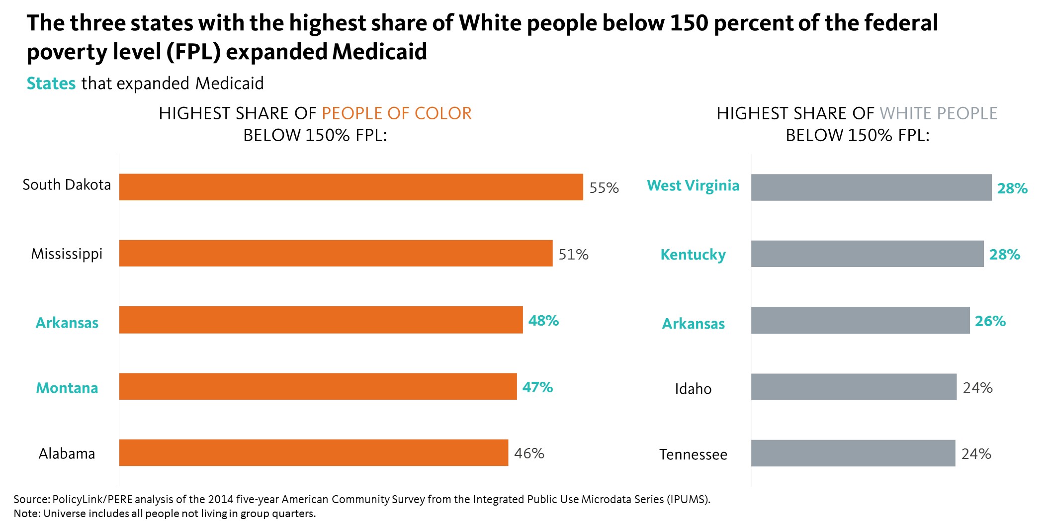
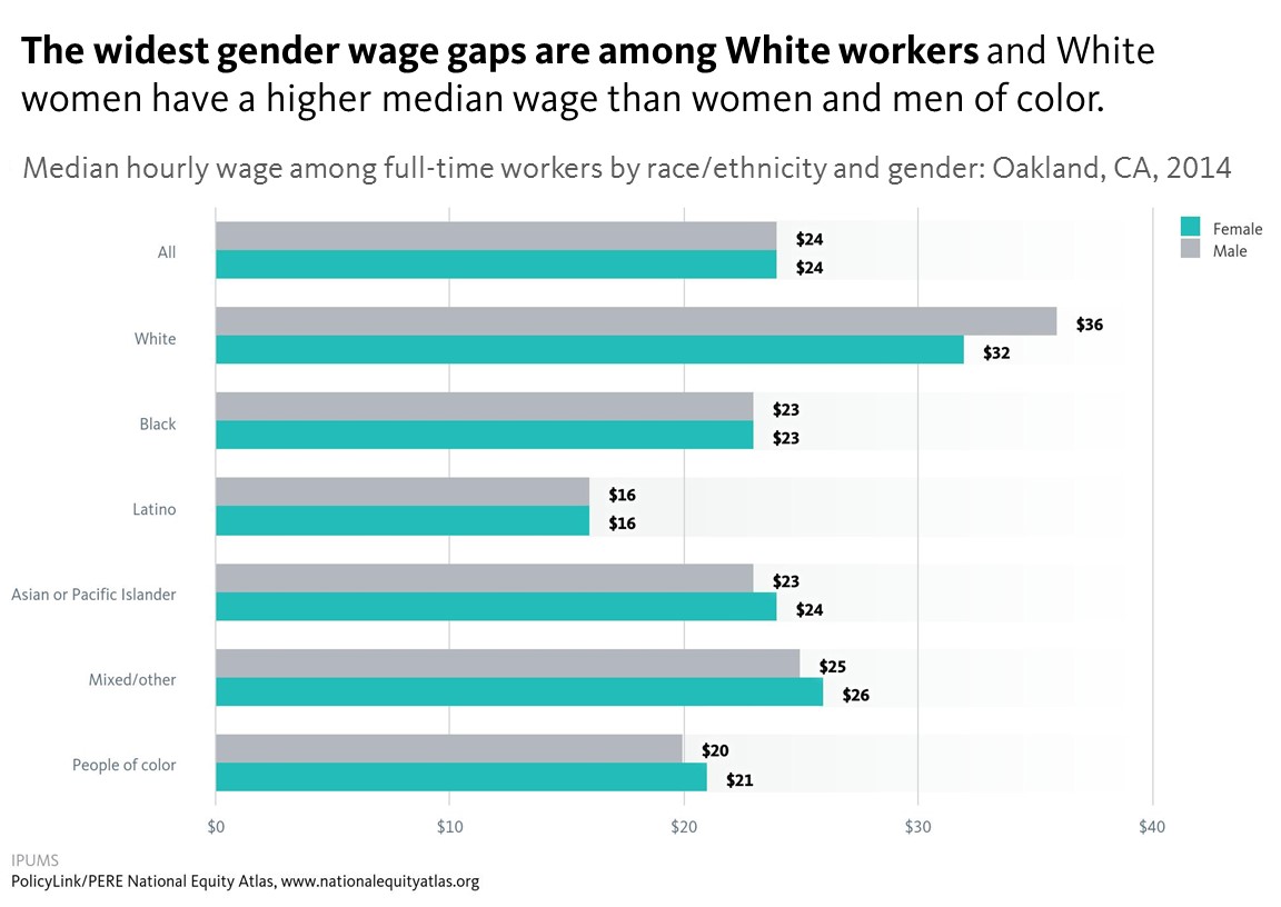
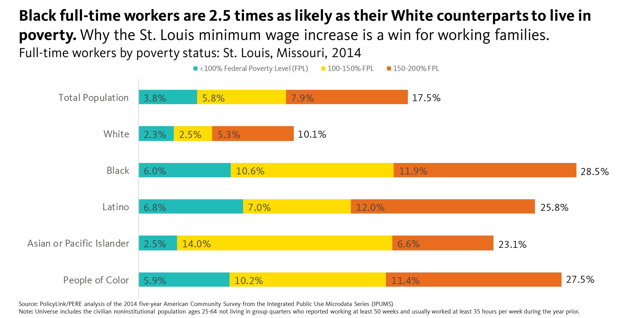
To add equity data to the national dialogue about growth and prosperity, every week the National Equity Atlas team posts a new chart from the Equity Atlas related to current events and issues.
UPDATE 2/24/17: The House of Representatives may bring its HUD funding bill for the remainder of FY17 to the floor for a vote next week. Rep. Paul Gosar will likely file an amendment that adopts some or all of the language in Local Zoning Decisions Protection Act of 2017. The National Fair Housing Alliance, PolicyLink, the ACLU, and the National Low Income Housing Coalition have coordinated to prepare a sign on letter in opposition to Rep. Gosar’s expected amendment. CLICK HERE to read and sign on to the letter, and please share with your local, state, and national networks! The deadline to sign on is Tuesday, February 28.
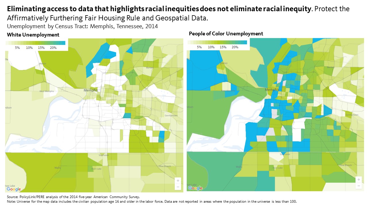
Just a month in the new administration, there are growing concerns among data analysts, researchers, and advocates about the preservation of federal databases, particularly those that disaggregate by race/ethnicity. Earlier this month, Representative Gosar (Arizona-04) introduced the “Local Zoning and Property Rights Protection Act of 2017” and Senator Lee (Utah) introduced the Senate Companion version. The bill is a general attack on the Affirmatively Furthering Fair Housing (AFFH) rule, which seeks to reduce racial segregation and concentrated poverty while expanding opportunity for all, but more specifically, the bill is an attack on data itself. Section 3 states: “no Federal funds may be used to design, build, maintain, utilize, or provide access to a Federal database of geospatial information on community racial disparities or disparities in access to affordable housing.”
Under the guise of “protecting local zoning,” this bill strips the ability of local officials to access consistent data about their jurisdictions. This bill goes beyond attacking HUD for requiring recipients of federal funding to address racial disparities in opportunity. It seeks to prevent local officials from even knowing about those disparities in the first place. It is an attack on the ability of local officials to advance effective, data-driven policy solutions.
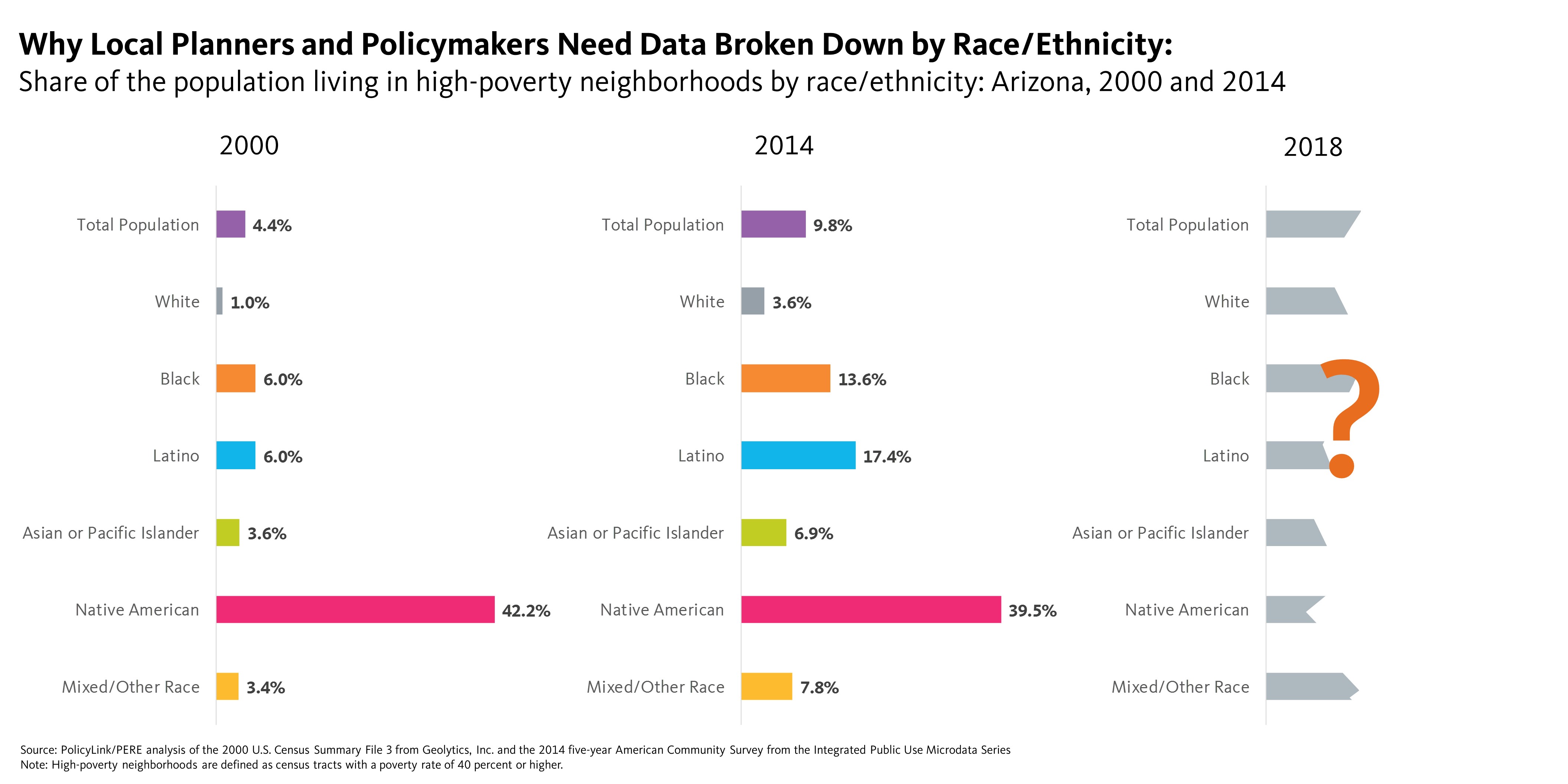
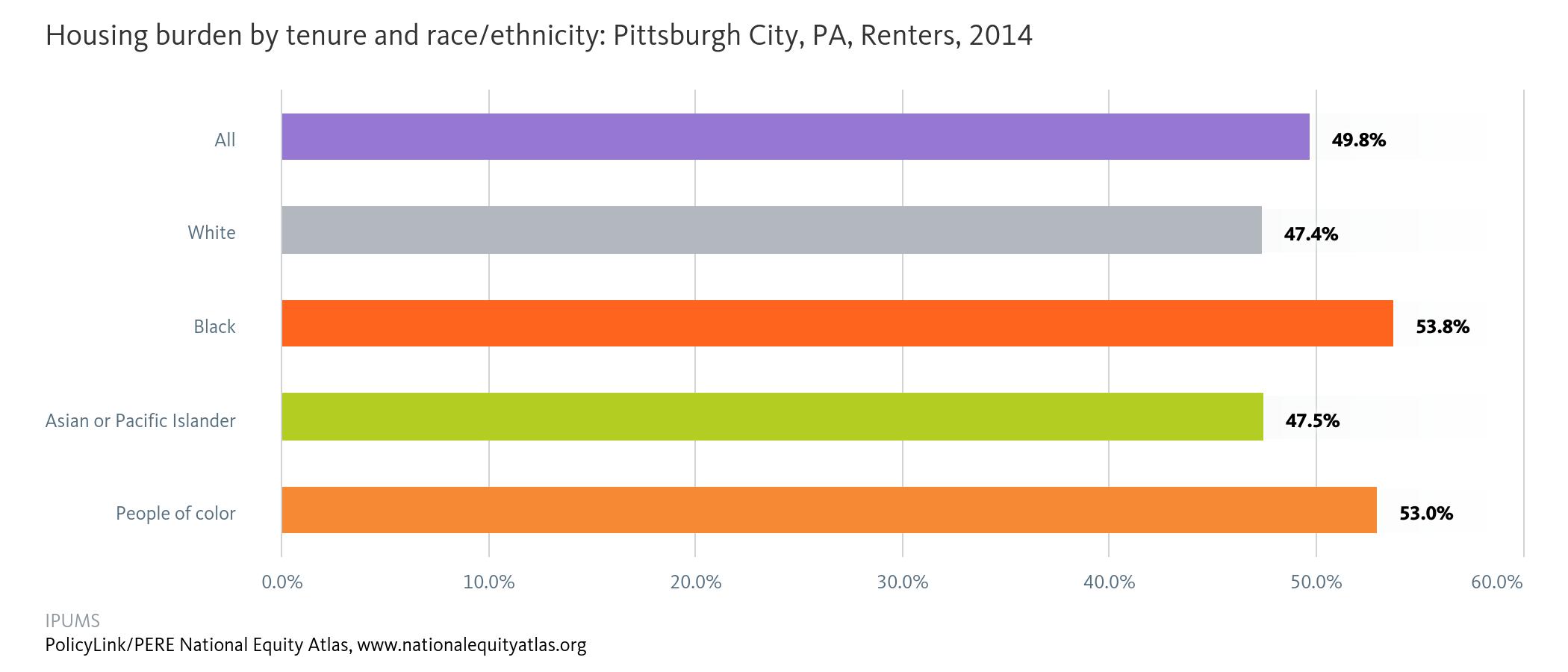
To call attention to the very real danger that federal data disaggregation tools — like those used to enforce fair housing standards or track health disparities — will be defunded and eliminated, this week’s chart looks at neighborhood poverty in Arizona over time. Without disaggregated local data, planners and decision makers would only be able to see that overall the share of the population living in high-poverty neighborhoods (defined as census tracts with a poverty rate of 40 percent or higher) in the state more than doubled from 4.4 percent to 9.8 percent from 2000 to 2014. But it is clear that not all populations are equally impacted by concentrated poverty in Arizona. The White population is the least likely to live in concentrated poverty: less than four in every 100 White Arizona residents live in a high-poverty neighborhood. Native Americans, on the other hand, are nearly 11 times more likely than Whites to live in high-poverty neighborhoods. Latinos are nearly five times as likely as Whites to live in high-poverty neighborhoods. Poverty looks different for White people than for people of color because people of color are significantly more likely to live in high-poverty neighborhoods even if they are not poor. This not only highlights a long history of federally supported racial residential segregation, but it also underscores the importance of informed data-driven planning and policymaking.
 Despite the threats to the AFFH rule and tool that arms local decision makers with the data to make informed decisions, some states and localities, including California and Philadelphia are vowing to push forward with their efforts to further fair housing. California Department of Housing and Community Development Director, Ben Metcalf, said in a recent article, with or without the federal fair housing rule, the State of California will continue to approach work through the AFFH rule because it furthers outcomes the state values: “ensuring that folks growing up poor in California’s communities have a shot of accessing the middle class and avoiding some of the negative consequences associated with segregated communities or neighborhoods of highly concentrated poverty.” Similarly, Philadelphia completed the nation’s first AFFH plan and the city’s director of planning and development promised: “If it isn’t important at the national level, it’ll still be important at the local level and will still inform a lot of the decisions we make.”
To see how neighborhood poverty varies in your city, region, or state, visit the National Equity Atlas, type in your community, and post the chart on social media using #equitydata and #SaveTheData. The data can also serve as a talking point when contacting local elected officials, local government staff, members of Congress, businesses, developers, and other decision makers. Include examples (like Philadelphia) of how AFFH is beneficial to the community. If you’re already using Equity Atlas, HUD, or Census data to guide your organizing or policymaking efforts, consider writing a letter and op-ed in support of the AFFH rule and other federal data disaggregation efforts.
For responses and reactions to the bill and threats to fair housing, check out the statement from the National Low Income Housing Coalition and a New York Times article on the tough battle ahead.

 It’s important to note that not all immigrants are undocumented or refugees, but it’s not uncommon for families and households to be mixed-status—meaning some members of a household or family may have documentation while others do not. Even though the executive orders thus far have targeted undocumented people as well as refugees from seven majority-Muslim countries, this type of rhetoric, surveillance, and enforcement has cascading impacts on all immigrants and people of color.