
Introducing the Housing Precarity Indicator
With a nationwide housing shortage and rental affordability crisis, there are thousands of neighborhoods in diverse communities across the United States where many lower-income residents are at risk of displacement from their homes. This displacement comes in both voluntary (out-migration from the neighborhood) and involuntary forms (eviction). In many cases, the displacement of low-income residents is part of gentrification, where new investments in market-rate housing and commercial developments accompany the outflow of longtime working families.
Anti-displacement advocates, public officials, researchers, and other concerned residents could benefit from more detailed data about the communities that face heightened levels of risk from displacement and eviction. To support these efforts, the National Equity Atlas now includes Indicator data for Housing Precarity (HP). The Atlas team developed this Indicator in partnership with Dr. Tim Thomas (formerly with the Urban Displacement Project (UDP) at the University of California, Berkeley) and the Eviction Research Network, who devised the original research methodology, known as the Housing Risk Precarity Model.
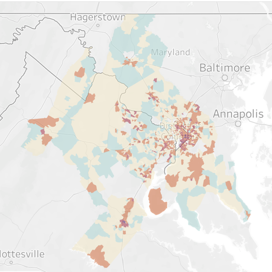
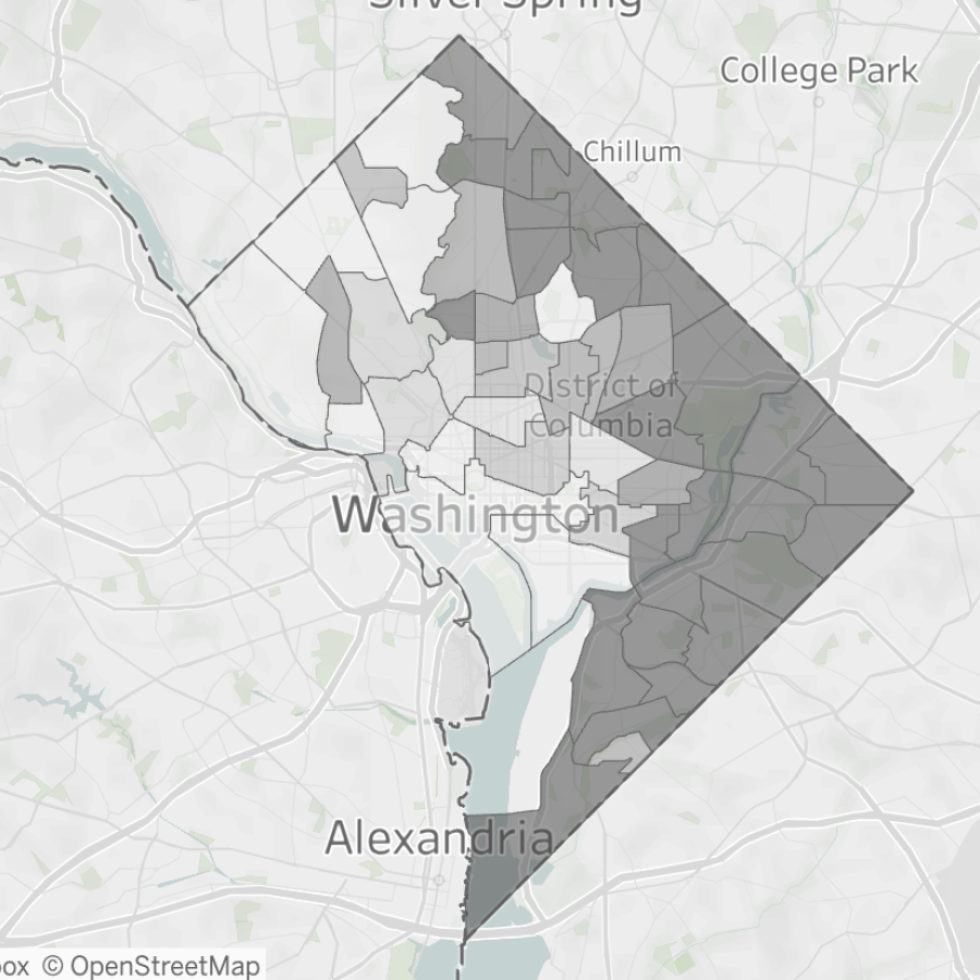
Here we provide a high-level summary of the Housing Precarity Indicator, examples of questions you can explore with the data, potential use cases, and additional considerations for people who want to incorporate HP data into their work. You can visit our interactive Indicator charts for Housing Precarity data, as well as two dashboards that visualize the data in regional and city-level maps. One dashboard provides HP data for individual census tracts in the 148 largest metropolitan areas in the contiguous United States, and the other dashboard aggregates individual census tracts into larger neighborhood clusters or districts for ten major US cities.

What does the Housing Precarity Indicator show?
The Housing Precarity Indicator is a single figure that summarizes the relative risk of housing displacement and eviction for residents in a particular neighborhood. HP assigns a risk level (“Extreme, High, Elevated, At Risk, Lower Precarity”) to individual census tracts.* That is, HP measures risk at the neighborhood level, not for individual households. Two separate data metrics are used to create these risk levels. You can view the risk levels for these two metrics individually or as a composite risk level (Overall Precarity) that combines data from both metrics:
- Displacement of low-income residents. Each census tract is assigned a score based on the net five-year migration rate for all households with incomes below 80 percent of the area median income (AMI) between 2018 and 2022. This includes low-income (between 50 and 80 percent of AMI), very low-income (between 30 and 50 percent), and extremely low-income (below 30 percent) households. A negative net migration rate means the tract lost more low-income residents than it gained during this five-year span, which translates to a higher level of Displacement Risk.
- Eviction rates. This metric uses 2018 and 2019 court data on eviction lockouts to measure the eviction rates in each census tract relative to the statewide rate. An eviction level higher than the state average translates to a higher level of Eviction Risk.
HP data points are displayed as percentages, showing the share of renter households in a given geography (the US, state, metropolitan region, county, city) who live in census tracts at each of the five different risk levels.
- For instance, if we show that the share of Latinos in the state of Louisiana at Elevated Risk is 25 percent, it means that 25 percent of Latino renter households in Louisiana live in neighborhoods with Elevated Housing Precarity. It does not mean that 25 percent of all Latino renters are at an Elevated Risk of Housing Precarity.
- Other Indicator graphs group the data by neighborhood risk level. For instance, in this breakdown of Housing Precarity in Wayne County, Michigan, by educational attainment, we can see that 23 percent of Wayne County renters in Lower Risk neighborhoods have a head of household with a bachelor’s degree or higher, compared to 33 percent of renters in High or Extreme Risk neighborhoods.
You can also view Housing Precarity Indicator mapping data on our interactive dashboards, including HP Risk levels for individual census tracts, as well as renter data for ten cities that cluster census tracts together into larger neighborhoods or districts.
What are the data sources?
The Housing Precarity metric uses 2018–2022 American Community Survey (ACS) five-year estimates data to calculate Displacement Risk and court data from 2018 and 2019 to measure Eviction Risk. The model that determines the relative levels of Displacement and Eviction Risk based on raw data values was built on data from the 2015–2019 ACS five-year estimates. We use the 2019–2023 ACS 5-year estimates data to determine the socioeconomic and demographic composition of the census tracts in the dataset.
What kinds of questions can the Housing Precarity Indicator data answer?
What share of Black renters in the Tulsa, Oklahoma metropolitan area live in neighborhoods with High or Extreme Housing Precarity?
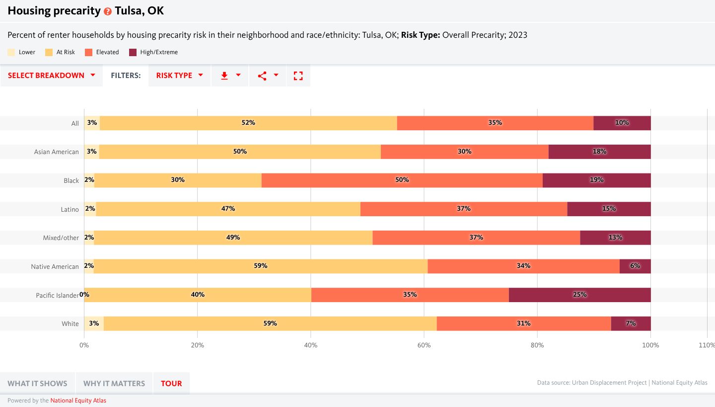
By selecting the Geography Type as Region and the Geography as Tulsa, OK, By race/ethnicity in the Select Breakdown menu, and Overall Precarity under Risk Type, we can see that 19 percent of Black renter households in the Tulsa metropolitan area live in neighborhoods with High or Extreme levels of Housing Precarity. Only Pacific Islander renters have a higher share of households in the most precarious neighborhoods (25 percent). [Link to indicator page]
Are renters in neighborhoods with higher Housing Precarity more or less likely to have children compared to renters in neighborhoods with less risk?
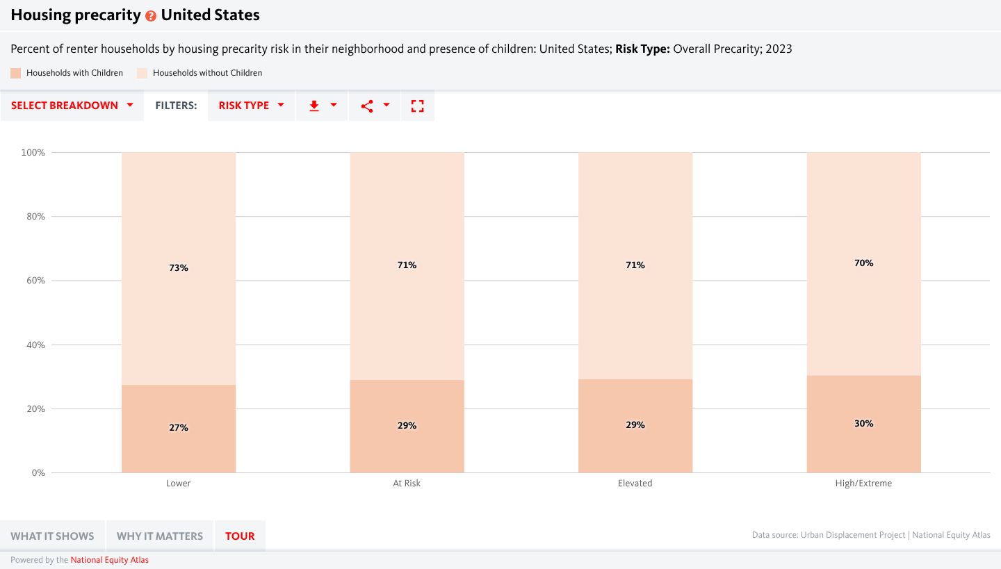
By selecting the Geography Type as Nation, By presence of children in the Select Breakdown menu, and Overall Precarity under Risk Type, we can see that US renters in neighborhoods with higher Housing Precarity are slightly more likely to have children than renters in less precarious neighborhoods. In High and Extreme Risk neighborhoods across the country, 30 percent of renter households have children under 18, compared to 27 percent of renters in Lower Risk census tracts. [Link to indicator page]
Which state has the greatest share of renters who live in areas with an Elevated Eviction Risk?
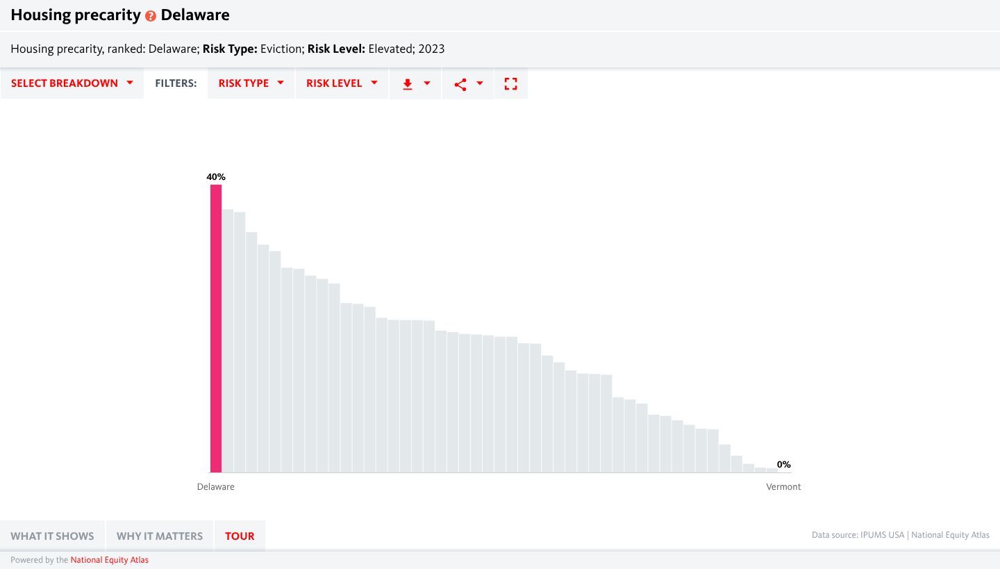
Select the Geography Type as State, Ranking in the Select Breakdown menu, Eviction under Risk Type, and Elevated under Risk Level. We can see that in Delaware, 40 percent of renters (about 41,400 renter households) live in census tracts with an Elevated level of Eviction Risk. [Link to indicator page]
Which counties in the St. Louis, Missouri metropolitan area have the highest share of renters living in census tracts with Elevated Housing Precarity or higher?
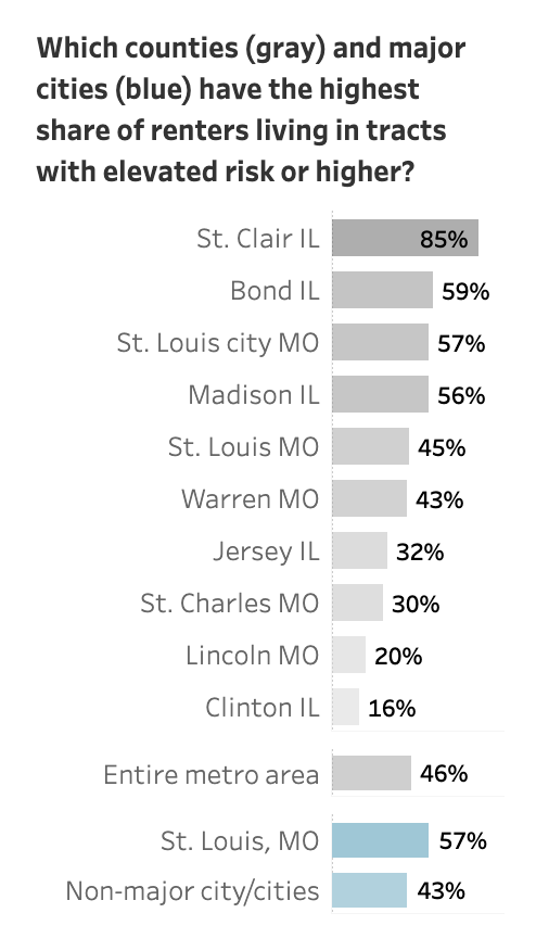
On the Mapping the Housing Precarity Indicator tract-level dashboard, set the Choose Risk Type menu to Overall Precarity and select St. Louis, MO under the Choose Metro Area menu. The bar chart on the upper right displays the counties and major cities in the metro with the highest percentage of renters living in Elevated Risk tracts or higher. St. Clair County in Illinois has the highest share, at 85 percent of renters.
Which Community Reporting Areas in the city of Seattle, Washington have the highest concentrations of renters living in tracts with Elevated Overall Precarity or higher?
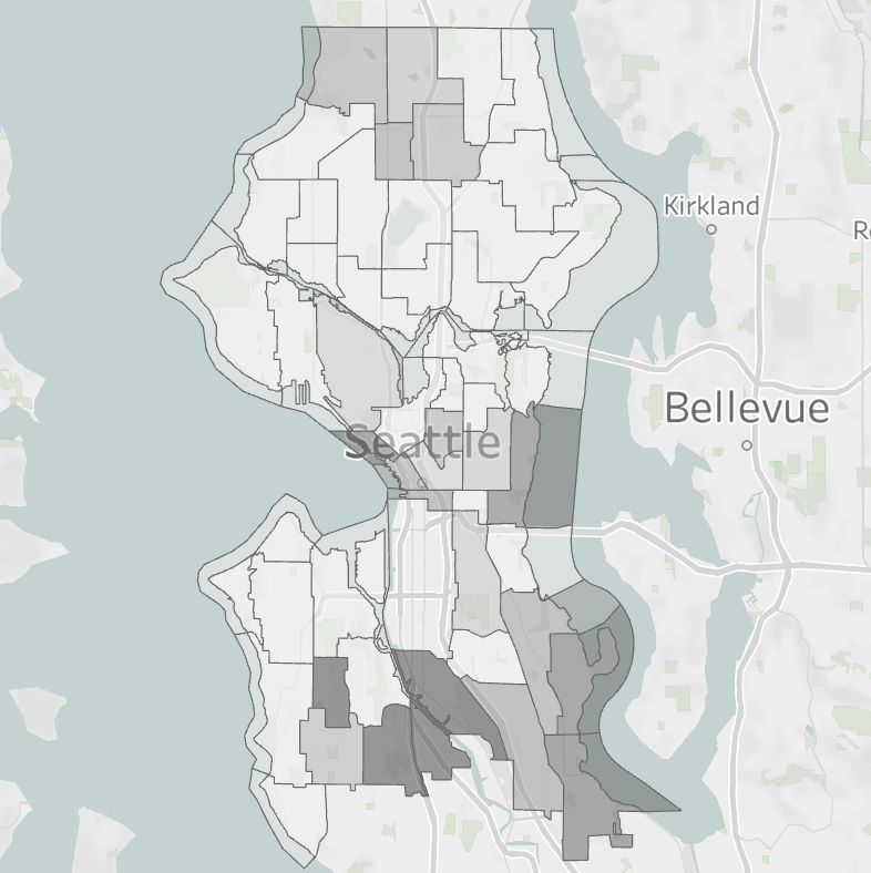
On the Mapping the Housing Precarity Indicator district and neighborhood-level dashboard, set the Choose Risk Type menu to Overall Precarity and select Seattle, WA from the list of cities. As the map shows, neighborhoods with heightened Housing Precarity levels are largely clustered at the city’s southern edge. In four southside Community Reporting Areas (Georgetown, High Point, Highland Park, and South Park), 100 percent of renters live in tracts with Elevated Risk or higher.
How can this data be used?
Housing Precarity Indicator data can support many different users of the National Equity Atlas, from everyday community members and grassroots leaders to data and policy experts. We recommend pairing HP data with additional data, research, and on-the-ground community engagement to help place the data in context and paint a fuller picture of any given community. The following examples are just some of the ways that users can apply HP data to their work, political organizing, and personal education.
- Supporting public policy decisions. The Housing Precarity Indicator is a metric that could support public institutions and lawmakers committed to improving housing stability among their constituents. A city, county, or state government agency might incorporate HP data alongside other data and research into strategic plans for housing development, rental assistance programs, or other public resources. In such cases, public agencies could use HP mapping data to identify priority neighborhoods or particular populations based on their heightened risk of Housing Precarity. Using HP data as part of the criteria for resource allocation could help public agencies maximize the impact of their investments by focusing on the areas and people facing heightened risks of displacement, eviction, and houselessness.
- Refining research on economic inequity. The Housing Precarity Indicator dataset can support researchers and data analysts exploring similar issues around community well-being. Quantitative analysts might compare HP data across other census tract-level data to explore the correlation between Housing Precarity and other measures of well-being. Qualitative researchers might use HP data to focus their studies on specific neighborhoods and populations. For instance, a research team at the University of Texas at Houston is using the Housing Risk Precarity Model to identify potential participants for a ground-level study on the mental health consequences of stress from the risk of eviction following the end of COVID-19 eviction moratorium laws.
- Mobilizing advocates and informing communities. While government institutions and academic researchers can use this data, so too can community-based organizations and grassroots advocates. By condensing several data points into a single metric, the Housing Precarity Indicator offers a more accessible tool for non-data experts who want to educate the public, mobilize their neighbors, and convince their elected officials about their desired policy changes. Advocates can connect HP statistical data on Displacement and Eviction Risk to stories and lived experiences from community members who experience these risks in their daily lives.
What other information and data should users take into consideration?
While a singular metric like our Housing Precarity Indicator offers a more accessible framework to explore socioeconomic and eviction data, no single metric is capable of telling the whole story. As with any kind of research, the HP metric serves as an opportunity for policymakers, researchers, and advocates to interweave this data with other sources of knowledge. Standardized metrics are highly useful in drawing comparisons between geographies and populations across the entire nation, but local contexts and histories are just as important for our understanding of housing precarity in a given community.
By sharing this data, we hope that it provides answers while provoking many more questions. Here are some other points to consider when applying the HP data to public policies, research projects, and advocacy efforts:
- The current release of the Housing Precarity Model uses eviction records from 2018 and 2019 due to the limited availability of nationwide court data. As a result, the Eviction Risk data does not account for eviction trends since the onset of COVID-19. Many households with unpaid back rent have faced the threat of eviction following the end of federal, state, and local eviction moratorium laws. In addition, sweeping changes to federal tax policy and safety net spending under the second Trump Administration will threaten the livelihoods of many more working families in the years to come. Additional data, research, and storytelling are necessary to understand how displacement and eviction trends in any given neighborhood have changed since the onset of the COVID-19 pandemic.
- Residents in higher-risk neighborhoods do not experience the risk of displacement equally. Since the Housing Precarity Indicator identifies neighborhoods that have already experienced a net loss of low-income households and heightened eviction rates, it stands to reason that some residents in higher-risk areas include newer, higher-earning households whose migration into the neighborhood coincided with the out-migration or displacement of former working-class residents from the neighborhood. These residents are far less likely to be at risk of displacement compared to their lower-income neighbors. Additional data, research, and storytelling are required to understand how the residents of neighborhoods at greater risk of displacement experience that risk differently.
- The Housing Precarity data includes just a single year, making it difficult to understand changes in a neighborhood’s risk level over time. As a snapshot of neighborhood conditions in the late 2010s, HP data is useful to compare neighborhoods and regions across the US, but it cannot be used to track changing conditions in a single neighborhood over time. Additional data, research, and storytelling are essential to flesh out the particular conditions that have characterized displacement and gentrification in a given community over time, such as:
- Have entire neighborhoods already turned over because of prior waves of displacement? Gentrification, displacement, and urban redevelopment are trends that all predate the last decade. A neighborhood might appear as relatively lower risk because it had already lost most of its low-income residents at the time of data collection.
- What effects have local anti-displacement efforts had in mitigating the impact of gentrification? On-the-ground neighborhood organizing, policy advocacy, and equitable community development can have real impacts on keeping working families in their homes, thus reducing the local rates of displacement and eviction. However, these neighborhoods might still be at risk of future displacement as economic and social conditions change.
- Have entire neighborhoods already turned over because of prior waves of displacement? Gentrification, displacement, and urban redevelopment are trends that all predate the last decade. A neighborhood might appear as relatively lower risk because it had already lost most of its low-income residents at the time of data collection.
- There may be an undercount of evictions in neighborhoods with higher rates of informal eviction. Since the Housing Precarity Indicator uses eviction court data to measure each neighborhood’s relative risk of eviction, the resulting figures do not account for evictions that occur outside of the court system. Housing researchers and advocates note that many evictions occur as a result of a landlord harassing their tenants, illegally changing the locks, paying their renters to leave, or engaging in other forms of coercion. As such, eviction court records may not convey the full extent of eviction trends in a given neighborhood, especially in jurisdictions with poor tenant protections or in communities with more informal tenancy agreements.
- Previous waves of displacement are not always a predictor of future displacement. While tools like the Housing Precarity Indicator are important in understanding recent trends in neighborhood turnover, they cannot predict the future. As economic conditions, housing markets, and political opportunities change, so too will the neighborhoods and residents at the greatest risk of displacement. This is especially true in the context of climate change, as climate-related disasters threaten to displace a growing number of people across the US.
- Gentrification is not just about housing; it is also an issue of commerce. While housing development is a key factor behind displacement in neighborhoods with greater housing precarity, so is business development. New commercial investments in office space, retail, food, nightlife, and recreation can bring new clientele into historically underinvested neighborhoods, pushing out older businesses while spurring the development of new market-rate housing to meet emerging consumer demand. However, data on small businesses is much harder to compile at a national level compared to data on income and housing. Additional data, research, and storytelling are necessary to understand the impact of business investments on displacement in a given neighborhood or region.
This is not to say that commercial or housing investment in historically marginalized neighborhoods is inherently bad. Inclusive and equitable community investments are very much necessary to create good jobs and safe affordable housing. However, this kind of investment can become an issue if it comes at the expense of existing residents in favor of newer consumers with greater spending power. A balance is necessary between new market opportunities and a shared, cross-sector commitment to serving all residents in the neighborhood regardless of income.
Footnotes
* The interactive indicator tables on our site group census tracts with High and Extreme Housing Precarity into a single category, because in many areas the number of Extreme Risk neighborhoods tends to be small. However, our dashboards with mapping data distinguish High and Extreme Risk census tracts, so it is possible to see which specific neighborhoods are at the highest risk of displacement and/or eviction.
The dataset excludes census tracts with fewer than 50 people per square kilometer, as well as military areas. Census tracts with high shares of student and/or retiree populations feature Eviction Risk data, but not Displacement Risk data, because students and older adults are more likely to be low-income, and students move frequently.