Step-by-Step Guide to Create Your Own $15/Hour Fact Sheet

With three easy steps you can create a dashboard with six charts showing who earns at least $15/hour in your community.
This tutorial describes how you can create a $15/hour fact sheet for your community using Atlas data and Tableau. All you will need is a Tableau Public account and an internet connection. Instructions on how to set up a Tableau Public account can be found on our Using Tableau page.
Step 1: Login to your Tableau Public account at https://public.tableau.com/s/
Step 2: Open the Starter Viz in Tableau Public and click "edit" in the top right corner
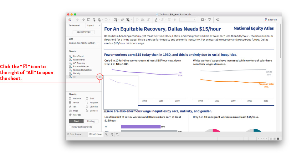
Step 3: Adjust for your geography by clicking on the icon to the right of the "All" sheet name
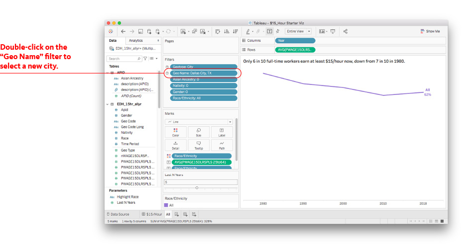
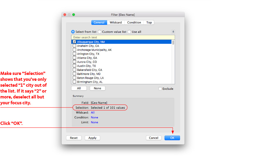
Double click on the Geo Name pill in the Filters card.
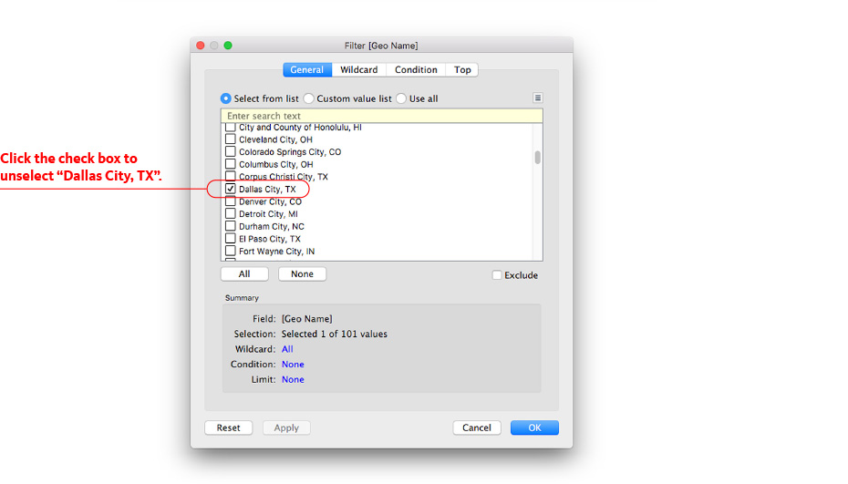
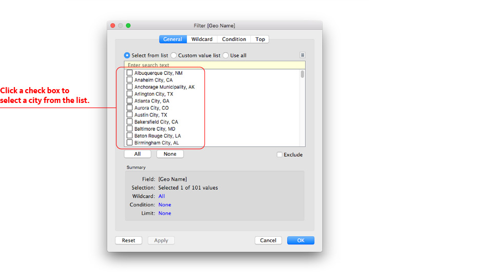
Unselect “Dallas City, TX” and select your city from the list of available geographies. Once you confirm only one selection has been made, click “OK” in the popup window.
Navigate back to the $15/hour Dashboard tab at the bottom of the browser screen.
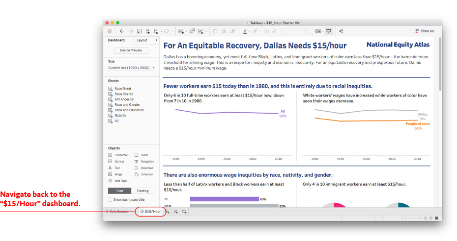
All the data visuals are now updated to show the data for the city you selected!
Customize your Fact Sheet
Use the guide below to explore the data and update the text in the factsheet.
1. Explore: What does the data show for your community?
Explore the updated data for your selected geography and highlight key takeaways from the data that shows who currently earns a living wage in your community.
Guiding questions to consider:
- What share of workers earn at least $15/hour? How has it changed over time? Does that trend look different for White workers than for workers of color?
- Which racial group is the most likely to earn a living wage? Do you observe any differences by race?
- When looking at race and gender, which workers are the least likely to earn at least $15/hour? How has that changed over time?
- Look at immigrant versus US-born workers: do you observe any differences based on nativity?
- Look at Asian or Pacific Islander ancestry to observe subgroups within each population: do you observe any differences between subgroups? Are all subgroups able to access $15/hour wages at the same rate as the Asian or Pacific Islander group overall?
- Has higher education attainment changed over time for the overall population? How about within each racial group? Are workers with similar education attainment equally likely to be earning at least $15/hour across racial groups? Do differences in educational attainment explain the different rates?
Consider adding: Help your audience understand who are the workers that a living wage would most benefit. Interview workers that currently earn less than $15/hour about their experiences and include quotes or insights from those interviews in the viz.
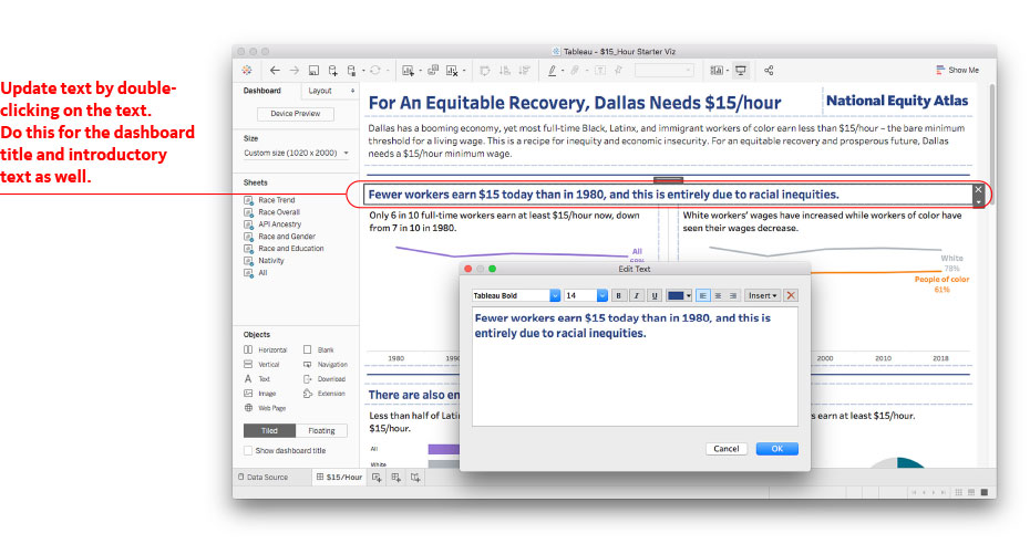
Double-click on any header to edit the headlines and titles for each chart.
2. Help your audience understand the context and why this matters:
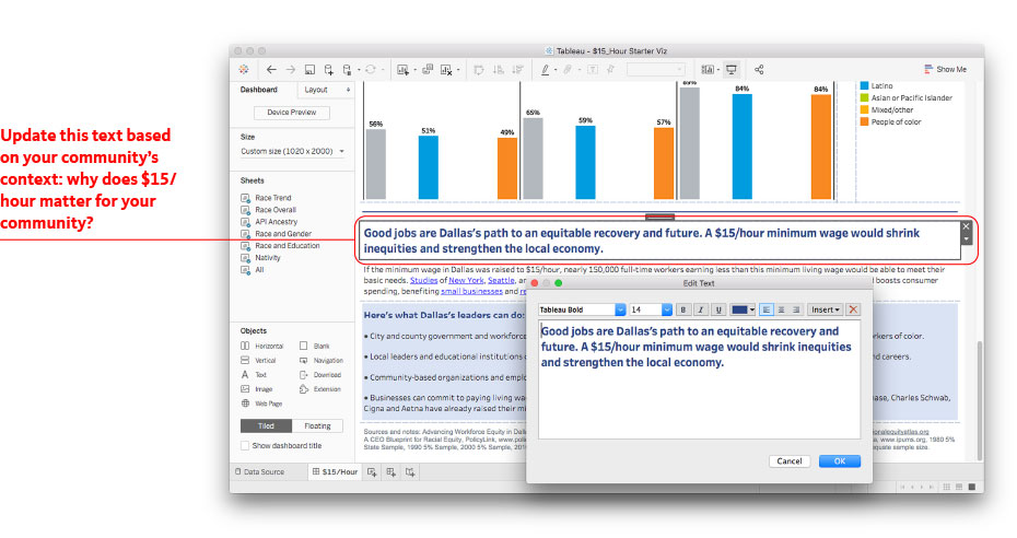
In the Tableau workbook, edit the text to include key information that would ensure your audience understands what current wage conditions are for workers in your community, and why a $15/hour or living wage would improve equity and how it would impact the local economy.
Guiding questions to consider:
- What is the current minimum wage in your city/state? What is the current tipped wage?
- When was it last updated? Does it match the living wage needs? (If you are unsure of the living wage for your location, you can look this up using the MIT Living Wage calculator)
- Have there been any key legislative changes or laws regarding minimum wage in your city/county/state?
- Who comes to mind when most people imagine a worker in your community that would benefit from $15/hour? Is that an accurate profile?
Consider adding: Include a profile or quote of someone who represents a key population who is currently not earning a living wage in your city/county/state.
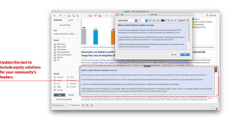
3. Include Equity Solutions:
In the Tableau workbook, edit the text regarding what leaders can do. Include key information that would ensure your audience understands what specific policies and actions they can support and advocate for that would ensure a living wage for all workers.
Guiding questions to consider:
- Why would a $15/hour minimum wage improve equity in your city/county/state?
- What can your policymakers do to ensure that all workers are paid a living wage?
- Is there any specific legislation currently being discussed?
- What can businesses do to ensure that all their workers are paid a living wage?
- What do you want your audience to take as a next step to support a living wage for all workers?
- Are there additional resources you want to include to help people learn more or take next steps? Consider including references to other resources and organizations.
Consider adding these equity solutions to your viz:
- Raise the minimum wage federally and at the local or state level.
- Enact living-wage laws that require government offices and contractors to pay living wages.
- Strengthen workers' rights to organize and bargain collectively for a living wage, including passing the Protecting the Right to Organize (PRO) Act.
- Establish standards to ensure public investments in economic development and infrastructure create living-wage jobs.
- Pursue full-employment economic policies that promote hiring, increased work hours, and living wages for low-wage workers including a federal job guarantee.
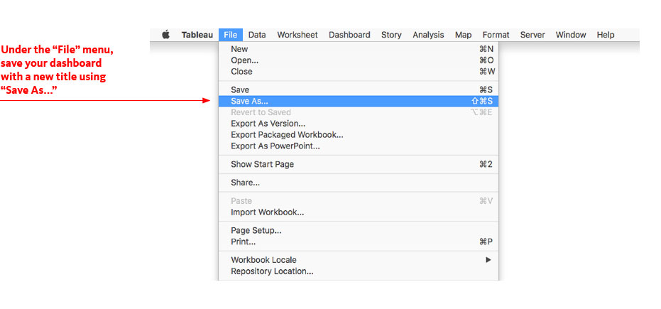
4. Publish your Dashboard
You can now click publish to see your final dashboard! In the File menu, click on "Save As…", name your workbook then click “Save”.
Once the workbook has uploaded successfully, you will automatically be taken to your Tableau Public profile page, where you can view your final dashboard. Click on "Edit details" in the top pop-up banner to edit your title, description, and select settings including if you want to allow others to download and explore the workbook.
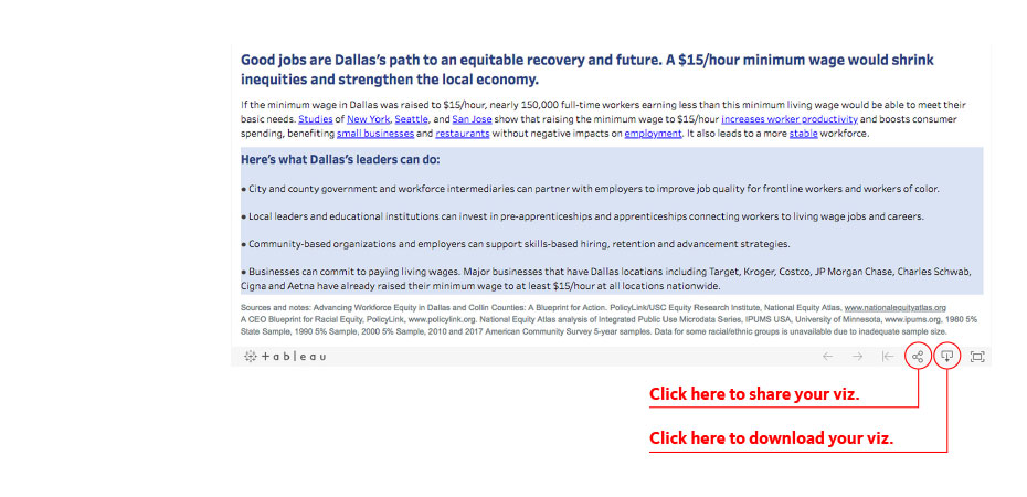
5. Share your Dashboard
You can share your dashboard several ways:
- Send a link: Copy the link and share it!
- Send an email using your default email application: Click on the email icon.
- Share on Twitter or Facebook by clicking on the corresponding icons.
- Embed the dashboard on your website: Copy the embed code and paste it in your web page HTML.
You can also download the visualization as an image, PowerPoint, or PDF file.
Submit your customized fact sheet to the Racial Equity Data Lab!
Submissions are reviewed by the National Equity Atlas team and selected vizzes may be highlighted in the Racial Equity Data Lab Gallery. Click here to share your viz with us.