Introducing the Racial Equity Index

The National Equity Atlas team is excited to announce the launch of the Racial Equity Index, our newest data resource designed to provide a single comparative metric for racial equity in US cities, regions, and states.
Six years ago, we created the National Equity Atlas as a tool to measure, track, and make the case for inclusive growth. With 30 indicators measuring demographic change, multiple dimensions of economic and social equity, and the economic benefits of racial economic inclusion, the Atlas presents deeply disaggregated data, and hundreds of customizable displays, for 301 geographies.
Now, for the first time, it also includes an integrated and holistic measure to compare the state of equity across different places, developed in response to your call for a more comprehensive, summary picture of how communities were doing on our equity metrics. The Racial Equity Index is designed to support advocates, policymakers, and other leaders to quickly understand the issue areas where outcomes are most inequitable, and the populations who are most impacted. This innovative tool can help communities identify priority areas for advancing racial equity, track progress over time, and set specific goals for closing racial gaps.
The Racial Equity Index is a summary score that provides a snapshot of how well a given place is performing on racial equity compared to its peers — comparing cities to cities, regions to regions, and states to states. Because equity means both closing racial gaps and ensuring that everyone is doing well, the Racial Equity Index is based on two components: an inclusion score that indicates the extent of racial gaps in outcomes for a series of nine equity indicators, and a prosperity score that indicates how well the population is doing overall on those same indicators.

How It Works
First, each geography is assessed based on a set of nine unique equity indicators from the National Equity Atlas, as shown in the table below. For every geography, each indicator is translated into an inclusion value, ranging from 1 to 100, where 100 indicates the most racially inclusive outcomes observed for the geographic type (city, region, or state). The composite inclusion value for all nine indicators becomes the inclusion score for that place. (For more information on the construction of the index, see the methodology.)
Next, each indicator is converted into a prosperity value, also ranging from 1 and 100, where 100 indicates the most positive overall outcome for that geographic type. The composite prosperity value for all nine indicators is calculated for the whole population in that geography, and the result is the prosperity score for that place.
Finally, the prosperity score and the inclusion score are averaged to derive the Racial Equity Index, reflecting overall population outcomes as well as racial/ethnic inclusion.
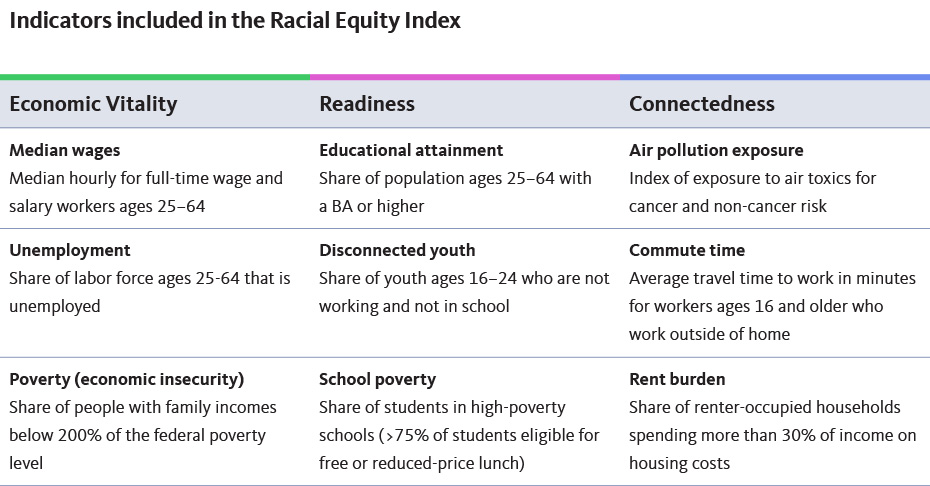
We selected these indicators to capture a range of both people-focused and place-based equity metrics that are available for all geographies in the National Equity Atlas, to include a range of interrelated systems where structural racism is manifest, and to allow for tracking change over time (both retrospectively and in the future). This set of indicators does not encompass all dimensions of racial equity; notably, we are not able to integrate any measures related to the criminal-legal system or wealth due to limited data availability.
What It Shows
The Racial Equity Index is designed to compare equity outcomes — using a composite score for both inclusion and prosperity — for one type of geography at a time to see how a place is doing relative to its peers. Scores are calculated independently for each point in time reported in the Index, so changes over time should be understood as relative changes (that is, a change in ranking compared to the performance of peer geographies) rather than as absolute changes in indicator values.
In addition to reporting the overall inclusion score and prosperity score for each place, the Racial Equity Index overview breaks down outcomes in each geography by the three indicator categories shown in the table above: Economic Vitality, Readiness, and Connectedness.
Along with the raw indicator data included on the National Equity Atlas, this comparative analysis helps to identify the issue areas in greatest need of improvement for a given place. For instance, the Minneapolis metro has one of the highest prosperity scores among the 150 largest metropolitan regions (#6 out of 150), but one of the lowest inclusion scores (#149 out of 150). This indicates that while overall population outcomes are better in Minneapolis than in most other regions, racial gaps are more pronounced. A couple of examples can help illustrate this dynamic.
In the Minneapolis region, the overall rate of poverty/economic insecurity (the share of people with household incomes below 200 percent of the federal poverty level) is 23 percent — one of the lowest in the nation. But this figure obscures tremendous racial inequities: just 16 percent of White residents in the Minneapolis metro are economically insecure, compared to 57 percent of Black residents and 50 percent of Native American residents. This is reflected in the region’s Racial Equity Index scores for poverty: a prosperity score of 92 (because the overall rate is better than in most other places), but an inclusion score of 1 (indicating that racial inequities for this indicator were worse than any other region). The Racial Equity Index reveals that in the Minneapolis metro, building an equitable economy will depend on solutions that reduce poverty, support economic security, and build pathways to the middle class targeted to the Black, Indigenous, and Latinx populations experiencing the greatest inequities. The differences between the region's prosperity and inclusion scores for each indicator are illustrated in the charts below.The Minneapolis region scores well for prosperity across all indicators, especially unemployment and poverty/economic insecurity, but is in the bottom half of regions for eight out of ten indicators.
Note that the Racial Equity Index should not be used to compare different geographic types; for example, you can use the index to compare the performance of the largest cities in Texas, but you cannot use it to compare Houston’s performance to the state overall.
Prosperity Scores by Race/Ethnicity
The index also powers another unique metric for understanding equity within and across different places: prosperity scores by race/ethnicity. These scores offer a snapshot of prosperity score gaps between racial/ethnic groups, revealing which groups are doing well and which are not, providing deeper context for understanding the overall scores for a given place.
Prosperity scores by race/ethnicity are derived for each geography for the six major racial/ethnic groups, and for all people of color combined. Because these scores are derived from the overall prosperity scores in each place, they can be used to make comparisons across racial/ethnic groups within a given place as well as between places (again, comparing cities only to cities, regions only to regions, and states only to states).
For example, among the 100 largest cities, the prosperity score for the Black population is highest in Plano, Texas (with a score of 67), signaling that Black residents of Plano are faring better on the underlying indicators than their counterparts in other cities. Yet Plano’s Black population still experiences significant racial gaps in most index indicators, especially educational attainment and median wages, as shown in the chart below.
The largest equity gaps facing Plano’s Black community are for the indicators of educational attainment, median wage, and poverty/economic insecurity. This snapshot can help advocates contextualize the more detailed data in the National Equity Atlas when comparing equity outcomes within their city and across neighboring or peer cities. Black workers in Plano have a median wage of $23 per hour — higher than the national average of $18 for all Black workers in the United States, but significantly trailing the city’s overall median wage of $29 per hour.
To learn more, see our analysis for some of the key findings for cities and metros, or visit the Racial Equity Index summary page to explore the data for your city, region, or state.