Chart of the Week: #FairHousingThanksObama
To add equity data to the national dialogue about growth and prosperity, every week the National Equity Atlas team posts a new chart from the Equity Atlas related to current events and issues.
Today from 2pm to 3pm, the National Fair Housing Alliance is sending President Obama “thank you” messages over Twitter for his unprecedented support of fair housing. Specifically, NFHA is using the tag #FairHousingThanksObama to highlight his accomplishments such as being the first presidential administration to use disparate impact to enforce the Fair Housing Act and for urging the U.S. Department of Housing and Urban Development (HUD) to finalize the Affirmatively Furthering Fair Housing Rule (AFFH).
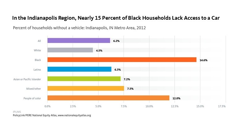
This week’s chart highlights why the AFFH rule, currently under threat, is needed to help cities, counties, regions, states, and housing authorities expand housing choices, connect residents to employment, transportation, quality education, and healthy food and foster inclusive communities free of discrimination. As the chart below shows, the Black population in the New Orleans region is significantly more likely to live in high poverty neighborhoods — nearly eight times more likely than Whites. Such high-poverty neighborhoods are often lacking access to assets which enhance opportunity. The AFFH rule helps jurisdictions identify barriers to opportunity by measuring neighborhoods’ proximity — or lack thereof — to high-performing schools, public transit, local labor markets, healthy environments and other key community assets.

Last year, the City of New Orleans and the Housing Authority of New Orleans (HANO) became one of the first of 20 jurisdictions to submit a joint Assessment of Fair Housing (AFH) plan to HUD. The plan's development was guided by equity, as defined by PolicyLink: "just and fair inclusion into a society in which all can participate, prosper, and reach their full potential." To learn more about the New Orleans effort, which included unprecedented coordination between local institutions, residents, housing, transportation, and health advocates, and community organizations, read this article from America’s Tomorrow.
To see rates of neighborhood poverty in your community and how your community ranks among the largest 150 metro areas, visit the National Equity Atlas, type in your metro area, and share the charts using #equitydata.