New Data Highlights Vast and Persistent Racial Inequities in Who Experiences Poverty in America

Already the majority of children under five years old in the United States are children of color. By the end of this decade, the majority of people under 18 years old will be of color, and by 2044, our nation will be majority people of color. This growing diversity is an asset, but only if everyone is able to access the opportunities they need to thrive. Poverty is a tremendous barrier to economic and social inclusion and new data added to the National Equity Atlas highlights the vast and persistent racial inequities in who experiences poverty in America.

On June 28, we added a poverty indicator to the Atlas, including breakdowns at three thresholds: 100 percent, 150 percent, and 200 percent of the federal poverty line. We also added an age breakdown to the new poverty indicator, in response to user requests for child poverty data, which allows you to look at poverty rates across different age groups including the population under 5 and 18 years old as well as those 18 to 24, 25 to 64, and 65 and over.

Why examine different levels of poverty? In 2012, the federal poverty level was less than $12,000 for a single person and roughly $23,000 for a family of four with two adults. Many believe that this is too low. The National Center for Children in Poverty argues, for example, that families need an income at least double the federal poverty level to meet basic needs. Another critique relates to the varying costs of living across communities. $23,000 will go much further in a lower-cost region like McAllen, TX compared with a high-cost one like San Francisco or Washington, DC. To understand the broader universe of families experiencing economic insecurity, this analysis focuses mainly on the population below 200 percent of poverty.

 People of color have the highest rates of economic insecurity, while Whites saw largest increase since 2000

Looking at how the share of people living at or below 200 percent of poverty has changed since 1980, we see a few trends. First, economic insecurity (defined in this way) decreased for all racial/ethnic groups except Latinos, who saw an increase of two percentage points over the three decades. During the same time period, Latinos went from just 6 percent of the population to 16 percent and were the fastest growing population over the last decade. In other words, the same demographic group driving growth and change is increasingly experiencing economic insecurity.

Second, the largest overall increases in economic insecurity over the past three decades in the U.S. occurred between 2000 and 2012. During that period, rates increased for all groups except Asian and Pacific Islanders (APIs). Interestingly, Whites have seen the largest increase in economic insecurity since 2000 despite having the lowest rate by far of all major racial groups.

Third, while there are large racial inequities in who experiences economic insecurity, it is a widespread challenge that affects all racial/ethnic groups including Whites. Half of people of color live below 200 percent of poverty compared with only a quarter of Whites but that does not mean Whites are immune to poverty – that percentage represents nearly half of the total U.S. population below 200 percent of poverty.

The share of people of color experiencing economic insecurity ranges from less than a quarter of people of color in Honolulu to nearly two in three people of color in Brownsville, TX

While nationally just under half of all people of color fall below 200 percent of poverty, local percentages vary considerably across metropolitan regions, from 65 percent in Brownsville, TX to 23 percent in Honolulu. In order to understand these numbers, it is important to consider the local cost of living, since poverty rates are universal, while costs of living vary tremendously by region. We can do that by looking at “regional price parities" (or RPPs). Calculated by the U.S. Department of Commerce Bureau of Economic Analysis, RPPs indicate relative differences in the cost of goods and services across states and metropolitan areas.  They are expressed as a percentage of the average national price level, and range from the highest cost region, Honolulu, at 123 down to McAllen, TX, the lowest cost region in the Atlas, at 84.9.

In general, places with the highest rates of economic insecurity also tend to have lower costs of living: Four out of the five regions with the largest shares of people of color living at or below 200 percent of poverty fall within the bottom third of the 150 largest U.S. metros with the lowest cost of living. And the five regions with the lowest shares of people of color below 200 percent of poverty fall within the 10 most expensive metros in the Atlas. But an affordable rent under this poverty threshold would be less than $1,150 a month for a family of four—which would be nearly impossible to find in these higher cost regions.

The demographic makeup of the regions with the largest shares of people of color experiencing economic insecurity are at both ends of the spectrum: Hickory and Scranton are much whiter than the U.S. as a whole while Brownsville, McAllen, and Visalia are much browner. But they all have one thing in common: people of color are projected to drive the vast majority of population growth over the next couple decades while the White population is expected to decline.

Communities of color are actually the fastest growing segments of the population in most regions, including those with majority White populations, but they continue to face barriers to educational and economic opportunities, stifling their own potential, the potential of the regions where they live, and that of the country as a whole.

Black and Native American children most likely to experience poverty

When looking at the population under 18 years old, roughly 63 percent of Black and Native American youth live below 200 percent of poverty compared with 31 percent of White and API youth. Children of color are nearly twice as likely as White children to be economically insecure. Even more alarming is that the share of kids under 5 years old, who are already predominately children of color, is even higher. More than two in three Black, Native American, and Latino children under five years old live below 200 percent of poverty. Given what we know about the adverse effects of child poverty, it is alarming that the two largest groups of kids of color, Latinos and Blacks, have the highest poverty rates.

The implications of these findings are far-reaching. Not only will the children of today become the workers of tomorrow, who will be expected to support the growing retired population, but child poverty is also estimated to cost the U.S. economy $500 billion a year, underscoring the importance of racial equity for enduring prosperity. Explore poverty in your city, region, or state here. For more data highlighting the gap between the aging white population and the growing population of youth of color, see the racial generation gap indicator.

National Equity Atlas: June Update

Over the past several weeks, we've been analyzing our new ancestry data and also just added two new indicators on poverty and working poverty.
 
Analyzing Ancestry Data 

We recently completed a series of analyses of last month’s racial subgroup data update. Our analysis of homeownership among the Asian and Pacific Islander (API) population found that rates of homeownership range from 25 percent for Samoans up to 68 percent for Taiwanese. Looking at educational attainment and youth disconnectedness among the API population we saw that Southeast Asian and Pacific Islander groups fare much worse than their South and East Asian counterparts. Examining wage disparities within the Latino population, we found that Central Americans tend to earn the least. And our review of unemployment in the Black population shows how certain Sub-Saharan Africans, many of whom are immigrants, have unemployment rates more comparable to the national average. Check out the Data in Action section of the Atlas website to stay up to date on analyses released throughout the month.

New Poverty and Working Poor Indicators

High rates of poverty impact everyone, costing our economy billions of dollars annually and weakening the middle class and democracy. And as the low-wage sector has grown, the share of adults who are working full-time jobs but still cannot make ends meet has increased, particularly among Latinos and other workers of color. The Atlas now includes indicators for the percentage of individuals living below three poverty thresholds (100, 150, and 200 percent of the federal poverty line) and by age so you can understand child poverty, as well as the percentage of full-time workers living below each of the three thresholds
 
Webinars

Join the National Equity Atlas team for a live demo of our new Poverty and Working Poor equity indicators on July 12, 12:00 – 12:30 pm PT / 3:00 – 3:30 pm ET. During this 30-minute webinar, we will walk you through these indicators and policy strategies to advance racial economic inclusion and equitable growth in your community. Register here. Video from the June 22 live demonstration of the Atlas, sponsored by the W.K. Kellogg Foundation, can be viewed here

National Equity Atlas in Measure Up

The Build Healthy Places Network — which connects leaders and practitioners across the health and community development sectors—has just added the National Equity Atlas to its microsite of resources and tools, MeasureUp. You can find the National Equity Atlas on their Mapping Tools page.
 
Thank you!
The Equity Atlas team at PolicyLink and the USC Program for Environmental and Regional Equity (PERE)

A Closer Look at Black Unemployment Using Ancestry Data

The Black population in the United States historically faced widespread discrimination in the labor market, and studies reveal that employers continue to discriminate on the basis of race. Racial bias as well as other structural and institutional barriers are reflected in the Black unemployment rate, which is consistently about double the rate for Whites. However, disaggregating such socioeconomic indicator data shows that this is not true of every subgroup within this population. As with other racial/ethnic groups in the U.S., the Black population is quite diverse with varying levels of success in the labor market. Examining the diversity of experiences within the Black community in the United States can provide a better understanding of barriers to unemployment.

This analysis explores the variation in the unemployment rate within the Black population. On May 23, PolicyLink and the USC Program for Environmental and Regional Equity added new ancestry breakdowns to six indicators in the National Equity Atlas. This is the fifth in a series of analyses of the new data.

The unemployment rates reported in the Atlas for 2012 reflect a five-year average of the American Community Survey (ACS) microdata, which reflect the state of the U.S. job market at the height of the recession (and thus are higher than today’s rates for all groups). The Black population had the highest unemployment rate at 13 percent, compared to the national average of 8 percent. Disaggregating the data reveals that some subgroups had unemployment rates more comparable to the national average.

Blacks of North and Sub-Saharan African Ancestry Have the Lowest Rates among the Black Population

At 9 and 11 percent respectively, Blacks of North and Sub-Saharan African ancestry have the lowest rates of unemployment within the Black population. Both of these groups are predominantly comprised of immigrant communities. Although those figures appear to be low relative to the overall Black average, they still are above the national average of 8 percent.

But even within the Sub-Saharan population, rates vary widely, from as low as 6 percent for Blacks of Kenyan ancestry to as high as 21 percent for Blacks of Somalian ancestry. These two neighboring countries in the horn of Africa ironically represent each end of the spectrum of unemployment rates for Blacks in America. Blacks of Nigerian and Ethiopian/Eritrean ancestry – the two largest subgroups of Sub-Saharan immigrants residing in the U.S. — both have unemployment rates of 9 percent, well below the average for all Blacks in the U.S.

Blacks of North and Sub-Saharan African Ancestry Have Higher Levels of Education

As with unemployment, the various Black subgroups differ in levels of educational attainment. Black immigrants tend to have higher levels of education: Among Black immigrants in the U.S., 29 percent reported having a BA or higher, compared with 18 percent for U.S.-born Blacks. Some Black communities have much higher education levels. For instance, 63 percent Blacks of Nigerian ancestry, 49 percent Blacks of Egyptian ancestry, 47 percent Blacks of Kenyan ancestry indicated they have a BA or higher, compared with 34 percent of Whites.


A Closer Look at Unemployment in the Nigerian Community

Blacks of Nigerian ancestry, 63 percent of whom are immigrants, represent the largest Sub-Saharan subgroup in the U.S. The New York, Houston, and Washington, DC metro areas have the largest populations of Nigerians in the country, and together account for 34 percent of all Nigerians living in America.

As illustrated in the chart above, the unemployment rate for Blacks of Nigerian ancestry is 9 percent in New York, 11 percent in Houston, and 8 percent in Washington, D.C. By contrast, unemployment among the African American subgroup is 13 percent in New York, 10 percent in Houston, and 9 percent in Washington, D.C. The trend in the greater Houston metro area is not consistent with the rest - the African American/Other Black subgroup has lower unemployment rates when compared to Blacks of Nigerian ancestry in that region. When looking at factors such as education levels for these two subgroups in the Houston area, the data shows the opposite of what we would expect.  Blacks of Nigerian ancestry still have a greater number of their population with a B.A or higher at 66 percent, when compared to only 22 percent for African American/Other Blacks in that region.

Furthermore, although both subgroups have higher unemployment rates when compared to the overall unemployment rates in these regions — 8 percent in New York, 6 percent in Houston, and 6 percent in Washington, D.C. — the gap is wider for the African American/Other Black subgroup in two of the three cities with the largest concentration of Blacks of Nigerian ancestry.

Solutions to High African American Unemployment

While a combination of factors such as systemic racist policies and widespread employment discrimination have certainly played a part, it is hard to ignore a problem unique to the U.S., a country with the highest levels of incarceration rates that puts a disproportionate amount of able-bodied African American men and women out of the workforce. Moreover, disaggregated data shows that those who indicated to be African American/Other Black represent one of the subgroups that fare the worst when it comes to unemployment rates and education levels, whereas their immigrant counterparts are either doing as well as the national average or in some cases better. This begs the question of what causes this disparity.

Although it is easier to address the skill deficiency part of the puzzle rather than the discrimination piece when explaining rampant unemployment levels in the Black community, a combination of policies and advocacy efforts to address both issues could remedy parts of the problem. Policies that increase workforce development programs for African Americans by itself may not be sufficient as Blacks of the same skill set have a harder time finding a job due to discrimination when compared to their White counterparts. Therefore, pairing workforce development programs with aggressive job placement programs might do a better job of increasing the chances of employment. Additionally, while it is difficult to change the explicit and implicit biases of employers towards Black applicants, implementing subsidy programs that would reward employers to hire qualified members of the Black community may also increase the chances of employment for Blacks.

Lastly, unless drastic measures are taken to decrease the prolific rates of mass incarceration in the U.S. that has disproportionately impacted the African American community and to implement policies such as Ban the Box that would increase the employment chances of formerly incarcerated individuals, no amounts of job training and job placement programs will truly address the issue of high unemployment rates in the African American community.

National Equity Atlas Added to Health and Community Development Site, MeasureUp

The Build Healthy Places Network—which connects leaders and practitioners across the health and community development sectors—has just added the National Equity Atlas to its microsite of resources and tools, MeasureUp. On this site, they’ve curated some of the best examples of measurement and action in addressing the social determinants of health, spanning logic models, data sets, mapping tools, issue briefs, and videos. MeasureUp is intended to help advocates and practitioners measure and communicate the impact of their work.
 
You can find the National Equity Atlas on their Mapping Tools page.


New Data on Homeownership by API Subgroups Uncovers Gaps by Ancestry

The diverse range of Asian, Pacific Islander, and Native Hawaiian communities in the United States represents many different languages and countries of origin. When these communities are grouped together into a single “Asian or Pacific Islander” (API) category, that aggregated group appears to do quite well by common measures of social and economic success. But looking at the data this way obscures important differences in experience – for example, among Native Hawaiians, third-generation Japanese Americans, and Burmese immigrants – and hides the particular challenges faced by many groups within that broader community.

On May 23, PolicyLink and the USC Program for Environmental and Regional Equity added new ancestry breakdowns to six indicators in the National Equity Atlas. This, the fourth in a series of analyses of the new data, examines the homeownership indicator.

This indicator is emblematic of the “American dream” and provides an important measure of family wealth and asset building. It also reveals vastly different outcomes among API subgroups. Of course, analyzing socioeconomic data cannot convey the range of chronic stresses caused by racism and stereotypes; but it can provide a better understanding of the diversity of experiences that exist within the API community in the United States.

Homeownership Is Significantly Lower Among APIs than Non-Hispanic Whites

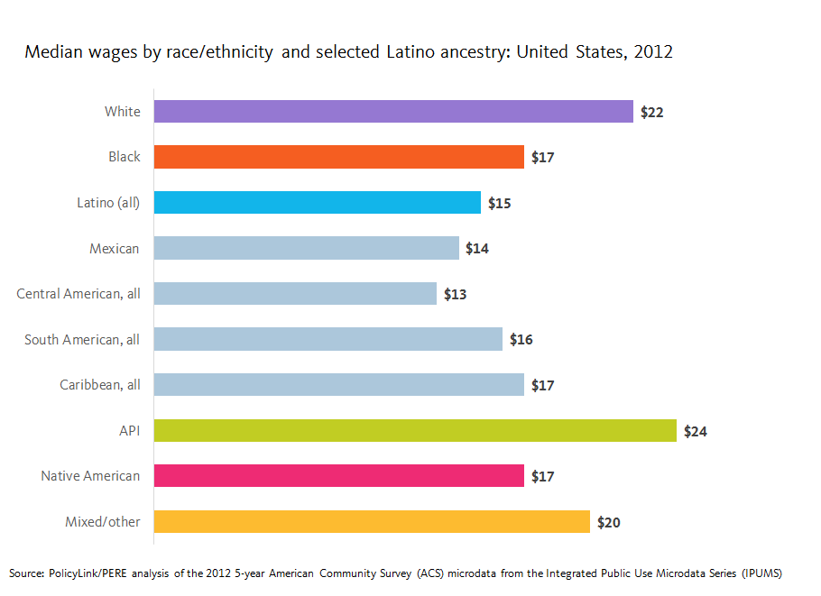
For many of the indicators of economic vitality and readiness included in the National Equity Atlas, Asians and Pacific Islanders and Native Hawaiians (APIs), as a group, appear to be doing better than their White counterparts. Compared to Whites, the API community earns higher median wages, achieves greater levels of educational attainment, and experiences lower rates of unemployment and youth disconnection.  However, this trend does not extend to homeownership.


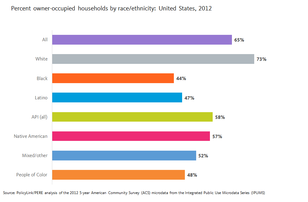
As the chart above illustrates, APIs have a homeownership rate of 58 percent — 10 percentage points higher than the rate for all people of color combined, but 15 percentage points lower than the homeownership rate of Whites (73 percent). Still, the relatively high rate of homeownership for APIs compared to other groups of color masks underlying differences within the diverse experiences of different API populations and reinforces the model minority stereotype.

What Does Examining Homeownership by Subgroup Tell Us?

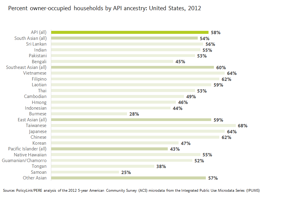
Among all APIs, 58 percent of households are owner occupied. Between the various API subgroups, however, rates of homeownership vary widely. The lowest rates of homeownership are found among those of Samoan (25 percent), Burmese (28 percent), and Tongan (38 percent) ancestry. At the other end of the spectrum, the highest rates of homeownership are found among two Southeast Asian ancestry groups —Vietnamese (64 percent) and Filipino (62 percent) — and three East Asian groups: Taiwanese (68 percent), Japanese (64 percent), and Chinese (62 percent). But one East Asian group lags far behind the others: homeownership among people of Korean ancestry is just 47 percent.

Some of this difference may be explained by other factors related to family economic vitality: people of Korean ancestry attain average educational levels but earn lower median wages and experience higher rates of unemployment than other East Asian ancestry groups. Yet overall racial gaps in homeownership between Whites and APIs confirm that measures of education, employment, and wages do not necessarily predict homeownership rates.  

How Do These Patterns Differ Across U.S. Regions?

Even within a given ancestry group, of course, rates of homeownership are affected by a host of factors related to regional economic conditions, migration patterns, and local real estate markets. Among the U.S. regions with sufficient data to report homeownership rates for people of Korean ancestry, there are significant variations. Overall, these rates range from 30 percent in the Austin, Texas metro area to 66 percent in the Riverside, California metro area, as illustrated below. The five metro areas with the highest rates of homeownership among those of Korean ancestry are Riverside, California (66 percent); Denver, Colorado (65 percent); Washington, DC (61 percent); Houston, Texas (61 percent); and Portland, Oregon (60%) — all rates above the national average not only for the Korean subgroup but for all APIs.

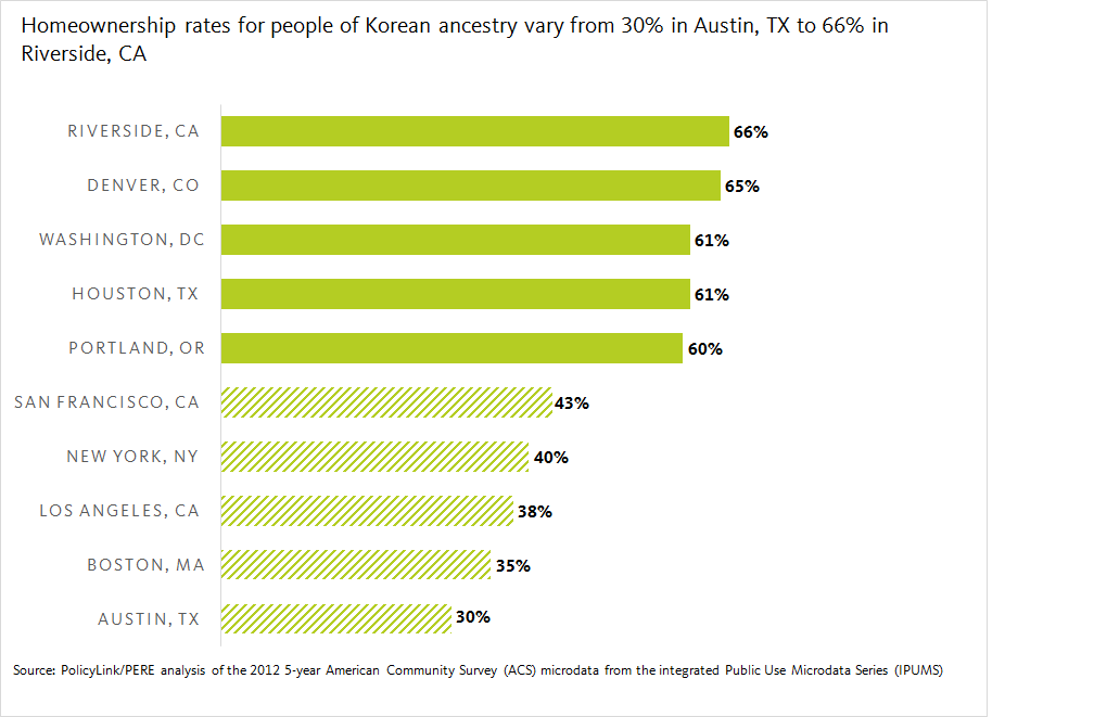
It is perhaps not surprising that the five metro areas with the lowest rates of homeownership in the Korean ancestry subgroup, shown below, coincide with some of the most expensive real estate markets in the country: San Francisco, California (43 percent); New York, New York (40 percent); Los Angeles, California (38 percent); Boston, Massachusetts (35 percent); and Austin, Texas (30 percent). In these regions, homeownership among the Korean ancestry subgroup is well below the national average.

Yet is also important to note that in each of these metro areas, homeownership among residents of Korean ancestry is also significantly lower than the regional rate of homeownship for all residents. In San Francisco, New York, and Los Angeles, there is a 12 percentage-point difference between the Korean subgroup and the regional average. In Boston, the gap is 27 percentage points. And in Austin, where overall homeownership is 58 percent, the gap is a staggering 28 percentage points.

Disaggregated Data Can Inform Tailored Housing Policy Solutions

Homeownership can be an important pillar of financial security and a tool for economic mobility for low- and middle-income families. But various social and market forces continue to produce barriers to homeownership for communities of color. Often these barriers are related to family income and assets, but redlining, discriminatory lending, and structural racism are also at play.

Disaggregated data can help advocates and policymakers identify the specific challenges that put homeownership out of reach for particular communities and identify strategies to alleviate them. This data makes clear that groups working on issues related to financial inclusion, asset building, and homeownership in a given region should identify whether particular groups are being left behind, work to identify specific barriers, and target outreach and resources to those who need them most.  For example, In New York, Asian Americans for Equality provides homeownership support services through its community development fund, including multilingual counseling, outreach, and education in Cantonese, Mandarin, Spanish, and Korean.

Explore the status of homeownership in your city or region here.

Data by Ancestry Shows Wage Differences Among Latinos in the United States and Selected High-Cost Metros

In the United States, Latino workers earn the lowest median wages of any major racial group: just $15, compared with $22 for their White counterparts — a 32 percent difference. While these national measures bring into focus one of the most significant racial wage gaps in the country, they also obscure differences that exist within the broader Latino population as well as regional differences in wages and cost of living.

On May 23, PolicyLink and the USC Program for Environmental and Regional Equity added new ancestry breakdowns to six indicators in the National Equity Atlas. This is the third in a series of analyses of the new data, examining the “median wages” indicator for Latino workers.

Latinos Are Paid Significantly Less than Workers in Other Racial Groups – And Central Americans Tend to Be Paid Least of All

Among all U.S. workers, Asians and Pacific Islanders earn the highest median wages ($24), followed by Whites ($22), other/mixed race workers ($20), Blacks ($17), Native Americans ($17), and Latinos ($15). Yet as new data in the National Equity Atlas shows, average pay ranges widely within each of these groups. Among Latino subgroups, workers of Panamanian, Venezuelan, Chilean, and Argentinian ancestry earn the most – $19 per hour – while those of Guatemalan and Honduran ancestry earn an average of just $12 per hour. As the chart below illustrates, workers of Caribbean and South American ancestry tend to earn more than the average Latino worker, while those of Mexican and Central American ancestry tend to earn less than other Latinos.

Low Wages Persist for Central American Groups Even in Highest-Cost Regions

As the data in the Atlas shows, wages tend to vary widely by region due to local economic conditions. To take a closer look at differences in pay within the Latino community, we examined median wages in the 25 U.S. metros with the highest cost of living, measured by something called “regional price parities" (or RPPs). Calculated by the U.S. Department of Commerce, Bureau of Economic Analysis, RPPs indicate relative differences in the cost of goods and services across states and metropolitan areas.  They are expressed as a percentage of the average national price level. For example, the most expensive U.S. metro in 2013 was Honolulu, HI, with an RPP of 122.5, while the least expensive was Beckley, WV, with an RPP of 78.

On average, the highest cost metros have the highest median wages; yet they also have staggering levels of wage inequality.  The table below compares the wages of non-Hispanic White workers with their Latino counterparts of Central American ancestry in the three metro areas with the largest Central American populations: Los Angeles, CA; New York, NY; and Washington, DC. These three regions also happen to be ranked among the top 10 most expensive metros in the country.

In the Los Angeles metro area, Latino workers of Central American ancestry earn a median hourly wage of $12.30 compared with $29.70 for their White counterparts, representing a wage gap of 59 percent. In the New York metro, the median wage for Latinos of Central American ancestry is $13.00 compared with $30.45 for White workers, resulting in a wage gap of 57 percent. The wage disparity is even greater in the Washington, DC region, where Central American Latinos earn a median wage of $14.10 but White workers earn $35.15, making the racial wage gap between these groups a staggering 60 percent.

These differences are partly reflective of vast disparities in educational attainment between these groups. In Los Angeles, just 12 percent of Central American Latinos have earned at least an associate’s degree, compared with 57 percent of Whites; in New York, 14 percent of Central American Latinos compared with 58 percent of Whites; and in Washington, DC, only 11 percent of Central American Latinos compared with 69 percent of Whites.

Wages Vary Widely Both Among and Between Racial Groups

Los Angeles is home more than 718,000 Latinos of Central American ancestry — the largest such population in the United States. The graphic below illustrates the median wages of the six major racial groups in the Los Angeles metro region, as well as disaggregated data for Latinos. As the chart illustrates, the median wages of Central Americans trail not only other racial groups, but other Latinos as well. Workers of Guatemalan ancestry in Los Angeles earn an average of $11 per hour; Salvadorans, $12; Hondurans, $11; Nicaraguans, $15; and Costa Ricans, $19. Among Central American workers in Los Angeles, only those of Costa Rican ancestry earn higher average wages than Latino workers in general.

Disaggregated Data Critical to Developing Regional Inclusive Growth Strategies

We know that America’s future economic strength will depend on growing good jobs and ensuring that all workers — regardless of race, gender, or zip code — have access to stable employment with family-supporting wages and benefits. Latinos are the fastest-growing group in the United States, so ensuring that they are paid a fair, living wage is not only essential to family economic security but also to the vitality of our regional and national economies. 

The new data on the National Equity Atlas highlight the need for disaggregation when developing strategies to address economic inequity, from targeted economic development and workforce efforts to worker organizing. By developing a clearer picture of the groups and communities struggling to make ends meet through low-wage work, advocates and policymakers can tailor their support to those who need it most.

Data by Ancestry Illustrates Difference in Educational Attainment across Asian and Pacific Islander Communities


Educational attainment is a key data point that has been used perpetuate the “model minority” myth suggesting that the Asian and Pacific Islander (API) population achieves higher socioeconomic success than other major racial/ethnic groups. For advocates of the API community this is concerning, especially for those subgroup populations that fare much worse than average across socioeconomic indicators.  For these groups, their struggles are rendered invisible by the myth of the model minority, which has implications for their prospects in the workforce.

On May 23, PolicyLink and the USC Program for Environmental and Regional Equity added new ancestry breakdowns to six indicators in the National Equity Atlas. This is the second in a series of analyses of the new data, focusing on the “educational levels and job requirements” indicator for the API community.

Southeast Asian and Pacific Islander Adults Have the Lowest Rates of Educational Attainment

Data from the Georgetown University Center on Education and the Workforce predict that by 2020, 43 percent of jobs will require an Associate’s degree or higher. And 33 percent of jobs will require at least a Bachelor’s degree. In aggregate, APIs tend to have higher education levels compared to other major racial/ethnic groups – 60 percent of working age APIs (adults between ages 25 and 64) have at least an AA degree. That’s about double the percentage for all people of color and surpasses all other major racial groups. However, once we disaggregate these data by ancestry we see that there is a fair amount of variation within the API community.

While APIs have some of the highest rates of educational attainment across major racial/ethnic groups, some groups have much lower than average rates. Nationally, this particularly rings true for Southeast Asian and Pacific Islanders groups. Only about one in five Tongan, Samoan, Laotian, and Cambodian working age adults have an AA degree or higher, proportions similar to those of Latinos (20 percent) and Native Americans (23 percent). On the other hand, some South and East Asian groups have the some of the highest levels of educational attainment: roughly three-quarters of Indian (77 percent) and Taiwanese Americans (75 percent) have a BA degree of higher.

Pacific Islander populations consistently had lower levels of educational attainment across regions which does not bode well for these groups attaining jobs of the future. For example, the Salt Lake City region has a significant Pacific Islander population, but only 6 percent of working age adults have a BA or higher while the share of jobs requiring that level of education will be 29 percent in 2020.

Higher Rates of Educational Attainment for Indian and Chinese Adults, but Some Geographic Variation

While the national trend generally holds true across cities and regions, place has a definite impact on educational attainment levels for some API subgroups, especially those groups that nationally have some of the highest levels of educational attainment. For example, Indians from regions in California’sCentral Valley are much less likely to have an AA degree or higher than their counterparts in the state’s larger regions: 36 percent of Indian’s in Bakersfield have an AA degree or higher compared to 93 percent in San Diego. It is important to note that these differences are not just due to differences that regions have in terms of educational attainment. In this example, educational attainment is lower overall in Bakersfield than in San Diego, but Indians still have lower than average attainment among API group in Bakersfield whereas in San Diego, Indians have the highest attainment among APIs.

In some cases, a subgroup’s geographic variation can differ between a region and its central city. For example, 32 percent of Chinese working age adults in the city of Philadelphia have an AA degree of higher, compared to 57 percent for the region, suggesting disparities between the city and its suburbs. Similar trends holds true in other northeastern regions including Boston and New York.


Disaggregated Data Critical to Developing Regional Inclusive Growth Strategies

We know that America’s future jobs will continue to require ever-higher levels of education, but the model minority myth presupposes that API communities are already reaching those levels. Noting that API communities are some of the fastest-growing communities in the nation, it is important that all subgroups are adequately prepared to participate in an exceedingly more knowledge-driven economy.

These data — and the new disaggregated data provided on the National Equity Atlas — highlight the need for disaggregation when addressing disparities and gaps in educational attainment in communities of color, so that advocates and policymakers can ensure equitable education and job attainment opportunities.

Data by Ancestry Reveals High Levels of Disconnectedness Among Specific Asian and Pacific Islander Communities

Asian and Pacific Islander activists and organizations have warned about the “model minority” myth for decades. While the Asian and Pacific Islander (API) population as a whole often fares above average on socioeconomic indicators, such metrics render invisible subgroup populations within the API community who face barriers to economic opportunities and inclusion. Data on “youth disconnectedness” – people ages 16 to 24 who are neither working nor in school — for the API population by ancestry illustrates the importance of examining more deeply disaggregated data. While API young adults have the lowest rate of disconnectedness among major racial/ethnic groups, with 8 percent of API youth being disconnected compared with 18 percent for youth of color as a whole, rates for some API communities are double or triple the API average.

On May 23, PolicyLink and the USC Program for Environmental and Regional Equity (PERE) added racial/ethnic breakdowns by ancestry to five indicators in the National Equity Atlas. Data is available for a given Atlas state, region, or city when the sample size is large enough (at least 100 survey responses). This is the first in a series of analyses of the new data, focusing on the “disconnected youth” indicator for the API community.

Pacific Islander, Cambodian, and Burmese Youth Face the Highest Rates of Disconnectedness Nationally

While API young adults have the lowest rate of disconnectedness among major racial/ethnic groups — 8 percent, compared to 27 percent for Native Americans, 22 percent for African Americans and 18 percent for Latinos, certain groups within the API community face much higher rates. Pacific Islander youth in particular face persistently higher rates of disconnectedness. The average rate of disconnection for all Pacific Islander youth — 20 percent — falls between the overall Black and Latino averages. Among Samoan young adults in the U.S., for example, 22 percent are disconnected. Tongan, Native Hawaiian, and people who identify as “Other Pacific Islander” also have rates hovering around 20 percent.

Disconnectedness is a challenge among other Asian subgroups as well. Outside of Pacific Islanders, Cambodian young people have the highest rate of disconnection (17 percent), followed by Burmese youth (16 percent), and Laotian youth (15 percent).The challenge of youth disconnectedness is fairly consistent for Pacific Islanders across the states and regions for which data is available. “Disconnected youth” data is available for Pacific Islanders for five states (Hawaii, California, Texas, Utah, and Washington). Pacific Islander youth are faring the worst in Hawaii (26 percent disconnected), Washington (25 percent), and Utah (22 percent). In all three states, Pacific Islander youth face the highest levels of disconnectedness within the API community. Pacific Islander youth are doing better on this indicator in California (16 percent) and Texas (9 percent). In California, the Laotian and Cambodian populations have the highest levels of disconnectedness among the API community (both at 19 percent); and in Texas, the Taiwanese population is the most disconnected (12 percent).

There were four regions where data was available for Pacific Islanders (Los Angeles, San Francisco, Honolulu, and Seattle). Again, California’s Pacific Islanders had lower levels of disconnection, at 13 percent in San Francisco and 12 percent in Los Angeles, but still face higher rates than the API averages in those regions (8 and 7 percent, respectively). Honolulu’s “Other Pacific Islander” population (reporting a Pacific Islander ancestry other than Native Hawaiian, Guamanian or Chamorro, or Samoan), have the highest rate of disconnection within the Asian populations across all regions, at 34 percent.

Overall Low Rates of Disconnection for Chinese, Filipino, and Indian Young People, but Higher Rates in Certain Metros

API subgroups with very low rates of disconnection at the national level — including the three largest Asian subpopulations (Chinese, Filipino, and Indian) — can have high levels of disconnectedness in certain regions. Among Chinese young people as a whole, just 6 percent are not working or in school. But among the 25 regions for which data is available for Chinese, the rate of disconnection ranges from less than one percent in Ann Arbor and Lansing, Michigan to nearly 12 percent in the Phoenix region.

Filipino youth have an average youth disconnectedness rate of 9 percent, but this ranges widely in the 16 regions for which data on Filipinos is available, from a low of 5 percent in Chicago to a high of 17 percent in Las Vegas. Though the overall rate of disconnection in Las Vegas is 19 percent, the rate for Filipinos is more than double the rate for Chinese youth. The other regions with elevated levels of disconnectedness for Filipino youth are Vallejo (14 percent) and Stockton (13 percent).

The average rate of disconnectedness for Indian young people is 9 percent, but among the 16 regions for which data is available, the disconnected youth rate ranges from a low of 3 percent in Miami to a high of 17 percent in Detroit. Indian youth also face particularly high levels of disconnection in San Jose (16 percent).


Disaggregated Data Critical to Developing Regional Inclusive Growth Strategies

From local initiatives to the White House Council for Community Services and partnerships between organizations like YouthBuild and Starbucks, a range of stakeholders have joined forces to provide opportunities for the over 5.5 million young people in the U.S. who are not working or in school. Ensuring that these youth, over half of which are youth of color, have access to meaningful educational and employment opportunities is essential for inclusive economic growth. This data highlights the need for additional racial disaggregation when developing programs and policies targeted at disconnected youth especially given regional variation. Relying solely on aggregated data of the API community as a whole, may lead to over-generalized and deceiving conclusions. Explore the variation in disconnection from school and work among young people in your city or region here.

Ancestry Counts: New Data Helps Create Clearer Picture of Economic Opportunity


The right data is critical to inform effective policy solutions — but data describing the state of equity for particular racial and ethnic communities at the local level is often difficult to access. That is why the National Equity Atlas has added new racial subgroup data to its demographic and economic opportunity indicators.

The latest update better describes the incredible diversity within broad racial/ethnic groups, and can be used to develop targeted strategies to advance racial equity and inclusive growth. Now, when users go to the “detailed race/ethnicity" indicator, they can select “by ancestry” and see more detailed breakdowns of the Asian/Pacific Islander, Black, Latino, Native American, and White populations (e.g., Filipino, Jamaican, Puerto Rican). Users can also select “by nativity and ancestry” to get a breakdown of the share of each group who are immigrants versus U.S.-born.

These detailed racial/ethnic breakdowns have been added to several of the Atlas's economic opportunity indicators, including: median wage, unemployment, the percentage of workers making $15/hour, disconnected youth, homeownership, and educational attainment. As an example of what these data can reveal, the Atlas team will be posting a series of analyses on the “Data in Action” section of this site, beginning with today’s posts on the "disconnected youth" and "educational attainment" indicators for the Asian and Pacific Islander (API) community:
 
“Asian and Pacific Islander activists and organizations have warned about the ‘model minority’ myth for decades. While the API population as a whole often fares above average on socioeconomic indicators, such metrics render invisible subgroup populations within the API community who face barriers to economic opportunities and inclusion.”
 
The National Equity Atlas team will be hosting a 30-minute live demo of the latest data release on Thursday, May 26, 2016, at 3 p.m. Eastern/12 p.m. Pacific. Please register here.
 
You can also read more about the update in today’s Next City article, “More Muscle Added to Equity Tool.”
 
Thank you!
 
The National Equity Atlas team at PolicyLink and the USC Program for Environmental and Regional Equality (PERE)

National Equity Atlas: April Update

Dear Equity Atlas Users,

Since we launched the Atlas in October 2014, we have wanted to include data that better describes the incredible diversity within broad racial/ethnic groups and challenges the “model minority” myth that impedes action and progress toward racial equity and inclusive growth.
 
We are excited to be taking a first step toward that goal by adding two new breakdowns to our “detailed race/ethnicity” indicator. Now, when you go to that indicator, you can select “by ancestry” and see more detailed breakdowns of the Asian/Pacific Islander, Black, Latino, Native American, and White populations (e.g., Filipino, Jamaican, Puerto Rican). You can also select “by nativity and ancestry” to get a breakdown of the share of each group who are immigrants versus U.S.-born.
 
To provide some more detailed data for smaller areas, we also created broader geographic categories (e.g., South Asian, Southeast Asian, East Asian, Pacific Islander) that combine a number of ancestries. For a large, diverse region like Los Angeles (see screenshot below), you will get data for many ancestry categories, while for a smaller, less diverse region like Charleston, you will see fewer of the detailed ancestry categories.
 
We hope you enjoy digging in to the data! Here is a blog post highlighting some takeaways from the new data. In a few weeks (on May 23), we will be adding these more detailed racial/ethnic breakdowns to several of our economic opportunity indicators, including:

  • Unemployment
  • Wages: Median
  • Wages: $15/Hour
  • Disconnected Youth
  • Educational Levels
  • Homeownership


Thank you!
 
The National Equity Atlas team at PolicyLink and the USC Program for Environmental and Regional Equity (PERE)


Pages