The National Equity Atlas is a living resource, and we are thrilled to announce the addition of four new indicators to the site:
- Wages: $15/hr
- Income inequality: 95/20 ratio
- Diversity index
- Contribution to growth: Immigrants
Here is a breakdown of each new indicator:
Wages: $15/hour: What share of full-time workers earn at least $15 per hour?
In an equitable economy, all workers would earn a living wage that allows them to meet their basic needs, as well as their family's. While the value of a living wage depends on family size and cost-of-living, many are advocating for $15 per hour as a new bare-bones baseline (this equals $31,200 annually for full-time work).
What it measures
This indicator measures the share of full-time workers earning at least $15 per hour. It available by race/ethnicity, gender, and educational attainment, and over time (since 1980).
Key facts
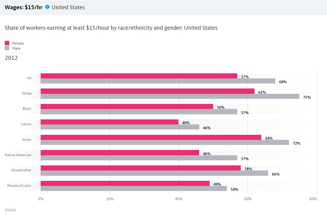
- Only 57 percent of women earn at least $15 per hour compared with 68 percent of men.
- Latinas are the least like to earn at least $15 per hour (40 percent), followed by Native American women and Latino men (46 percent).
- 50 percent of Black women at least $15 per hour, compared with 57 percent of Black men and 62 percent of White women.
How to find it
- Click Indicators in the navigation bar
- Select the Equity indicator "Wages: $15/hr" under Economic Vitality
- Select “By gender” in the breakdowns underneath the chart
- Here is what you will see
Credit: Share of workers earning at least $15/hour by race/ethnicity/National Equity Atlas
Momentum is growing across the country to change these numbers and ensure that all workers can earn at least a living wage. Use this data to inform policy and organizing strategies such as raising the minimum wage or passing a living-wage ordinance. In the city of Los Angeles, for example, the two-year Raise LA campaign led to a new living wage ordinance raising the wages of hotel workers to $15.37 per hour.
Income inequality: 95/20 ratio: How unequal is your state or region?
Rising inequality is one of the defining challenges of our generation, and there is a growing consensus that inequality is not just bad for those left behind—it is bad for our economy and democracy as a whole. Recent research shows that this is true for metropolitan regions as well as nations. Harvard economist Raj Chetty and his collaborators found that regions with lower inequality and segregation provide their residents with more chances to move up the economic ladder. And Manuel Pastor and Chris Benner found that regions with less inequality are more economically resilient and experience longer periods of growth.
What it measures
This indicator measures inequality using the 95/20 ratio, which is represents the income earned by the households at the 95th percentile (just making it into the top 5 percent) divided by the income earned by the households at the 20th percentile (just falling into the bottom 20 percent). Nationwide, households at the 95th percentile earned $181,768 in 2012, and households at the 20th percentile earned $19,888, for a 95/20 ratio of 9.14. In other words, households at the 95th percentile earned more than 9 times the incomes of households at the 20th percentile.
Key facts
- Inequality has consistently grown over the past several decades: the 95/20 ratio was 6.91 in 1980 and grew to 9.14 by 2012.
- Among the largest 150 regions, Bridgeport, CT has the highest inequality on this measure (95/20 ratio of 14.08), and Ogden, UT has the lowest (5.72).
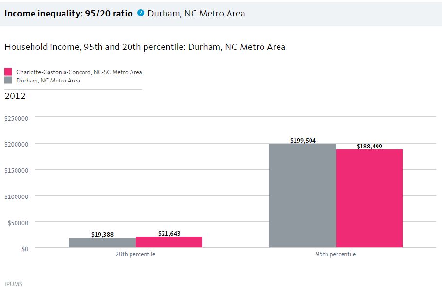
- Regions within the same state can have very different levels of inequality: Durham, NC, for example, has the 10th highest inequality (95/20 ratio of 10.29) and Charlotte, NC ranks 42nd (8.71).
How to find it
- Click Indicators in the navigation bar
- Select the Equity indicator "Income inequality: 95/20 ratio" under Economic Vitality
- Enter “Durham” as your region in the box near the top right corner of the page
- Select “Ranking” in the breakdowns underneath the chart
- Enter “Charlotte” in the Compare box under the chart
- The chart below is what you will find
Credit: Household income, 95th and 20th percentile/National Equity Atlas
Press for policies to reduce inequality, such as expanding the Earned Income Tax Credit (EITC) and pursuing full employment. Washington, DC, for example, recently upgraded its local EITC by increasing its amount and extending it to workers without children and non-custodial parents.
Diversity index: How racially diverse is your community?
Diversity—in the context of inclusion—is a driver of innovation, business growth, and economic progress. Research shows that companies with more diverse workforces are more competitive, with greater market share, higher revenues, and more customers. McKinsey & Company’s recent analysis, for example, found that more diverse companies (in the top 25 percent) were 35 percent more likely than those in the bottom 25 percent to have financial returns above their industry medians.
What it measures
The diversity index measures the representation of six major racial/ethnic groups (White, Black, Latino, Asian/Pacific Islander, Native American, and Mixed/other race) in the population. The maximum diversity score (1.79) would occur if each group were evenly represented in the region.
Key facts
- Nationally, the diversity index is 1.1 now, and it was .71 in 1980.
- Hawaii (1.3) and California (1.29) are the most diverse states, and Vermont and Maine (both .3) are the least diverse.
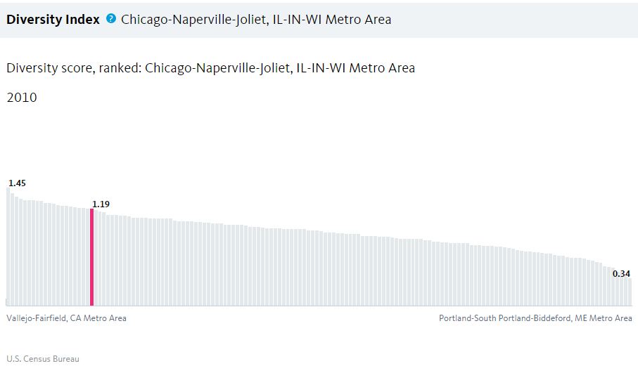
- Vallejo (1.45) and San Francisco (1.48) are the most diverse among the largest 150 regions, and McAllen, TX (.37) and Portland, ME (.34) are the least diverse. Chicago ranks 21st (1.19).
How to find it
- Click Indicators in the navigation bar
- Select the indicator "Diversity index" under Demographics
- Enter “Chicago” as your region in the box near the top right corner of the page
- Select “Ranking” as your breakdown under the chart
- Select “Region” as your geography under the chart
- Here is what you will find
Use this data for policy change
Use this data to develop and advocate for policies that ensure all of the diverse groups in your community can access the resources and opportunities they need to reach their full potential. Due in large part to the advocacy of the Illinois Coalition for Immigrant and Refugee Rights, Illinois has passed policies, like the Office of New Americans and the Illinois DREAM Act, that have made it one of the most welcoming states for immigrants.
Contribution to growth: Immigrants
Immigration is a significant driver of population growth nationwide, and in many distressed communities, new immigrants are fueling neighborhood revitalization and business growth. Policies that increase access to education, services, and living-wage jobs for immigrants, and remove barriers to their full and equal participation, will help immigrants and their entire communities thrive.
What it measures
This indicator measures the net change in population by nativity, broken down for six major racial/ethnic groups. It also measures the share of the net change in population attributable to immigrants (restricted to range between 0 and 100 percent).
Key facts
- Nationally, the U.S.-born population grew by 19 million between 2000 and 2012, and the immigrant population grew 8.7 million, contributing 31 percent of total population growth.
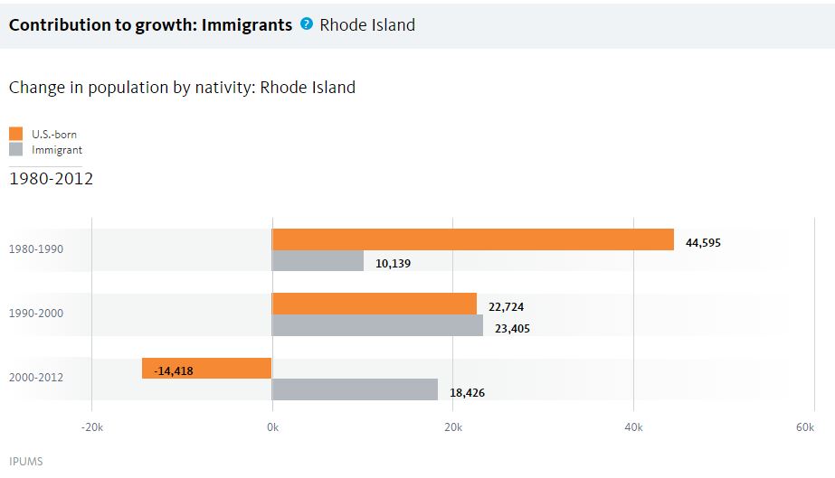
- There are three states where immigrants contributed all of the net population growth between 2000 and 2012: Michigan, Rhode Island, and New York.
- Immigrants contributed all of the net population growth between 2000 and 2012 in 16 of the largest 150 regions, including Dayton, New Orleans, and Detroit.
How to find it
- Click Indicators in the navigation bar
- Select the indicator "Contribution to growth: Immigrants" under Demographics
- Enter “Rhode Island” as your state in the box near the top right corner of the page
- You will see the below chart
Credit: Change in population by nativity/National Equity Atlas
Use these facts to advance policies to promote immigrant inclusion ranging from facilitating citizenship to improving language access and extending voting rights to residents who are aspiring citizens. New Haven, for example, launched the Elm City Resident’s Card in 2007 and became the first city to issue a municipal ID card as a strategy to protect and integrate its growing immigrant population into the community.