National Equity Atlas Now Includes More Detailed Racial Subgroup Data

Since its debut in October 2014, the National Equity Atlas has disaggregated most of its 31 demographic and equity indicators by race/ethnicity using broad categories defined by the U.S. Census. Today, we are excited to announce the release of more detailed demographic data based on self-reported ancestry for all major racial groups in the U.S. Data for the Asian/Pacific Islander (API), Black, Latino, Native American, and non-Hispanic White populations is now disaggregated by ancestry as well as by nativity (i.e., immigrant or U.S.-born). On May 23, we will be adding these more detailed race/ethnicity cuts to six economic opportunity indicators: median wage, unemployment, the percentage of workers making $15/hour, disconnected youth, educational attainment, and homeownership.
 
We’ll confess: the more detailed socioeconomic indicators are what is really compelling, and you’ll have to wait a little bit longer for them. But the demographic data provides important context, helping you to better understand the racial/ethnic composition of your community, and how it is changing, at a more granular level. Below are some key takeaways from the new data.
 
Immigration policy shows up in the data
 
U.S. immigration policy has and continues to impact our demographics. Two-thirds of the 15.1 million Asian/Pacific Islanders in the U.S. are immigrants, and one in four is a Chinese or Indian immigrant. Due in part to immigration laws, this segment of the population is highly educated. More than 90 percent of the nearly 20,500 Indians of working age in Minnesota have at least a bachelor’s degree as do 86 percent of the 11,400 Chinese people of working age in Irvine, CA. The sheer size of the Chinese and Indian immigrant populations influences overall API averages on many socioeconomic indicators, masking some of the differences among the various populations within the API community and highlighting the importance of disaggregating by racial subgroups.
 
Asian and Pacific Islander communities cluster in Pacific Rim cities, but also inland cities like St. Paul
 
Of the 100 largest cities, New York City, San Francisco, and Los Angeles have the largest populations of Chinese people, while Long Beach, CA has the largest population of Cambodians followed by Philadelphia, PA and Stockton, CA. The cities with the largest Indian populations include New York City, San Jose, and Fremont, CA, while St. Paul, MN, Fresno, CA and Sacramento, CA have the largest Hmong populations. The Los Angeles and Seattle regions are home to the largest populations of Samoans outside of Hawaii while the San Francisco region has the largest population of Tongans. Explore the API subgroups more here.
 
People of Mexican, Puerto Rican, and Dominican heritage also cluster in certain cities
 
The immigrant to U.S.-born ratio for Latinos is basically the reverse of that for APIs. Nearly two in three of the 50.5 million Latinos are born in the U.S. Mexicans make up more than half of the total Latino population followed by “Other Latinos,” respondents who identified as Latino but did not specify a specific nationality or ancestry. The regions with the largest Mexican populations are in California and Texas while the regions with the largest populations of Puerto Ricans are located entirely in the east with the exception of Los Angeles (which ranked 15th). The city of Los Angeles is home to 14 percent of Salvadorans in the U.S., of which 35 percent are U.S.-born and New York City is home to 42 percent of the total Dominican population, 40 percent of whom are U.S.-born. Explore the Latino subgroups more here.
 
Data reveals differences within Black and White populations
 
Nearly 3.7 million people identified as non-Hispanic White with American Indian ancestry. This population is thus included in White averages and as a White subgroup but is 1.8 times larger than the total Native American/Alaskan Native (NAAN) population. Ten percent are located in Texas with 94,000 American Indian non-Hispanic White-identified people in the Dallas region alone. Aside from “Other Native American/Alaskan Native,” Cherokees make up the largest subgroup of the total NAAN population and more than 28,000 Cherokees live in the Tulsa region. Roughly 2.4 million non-Hispanic White people identified as Middle Eastern/North African (MENA). Seventeen percent of the MENA population lives in the Los Angeles region though the New York City, Chicago, and Detroit regions also have sizeable MENA populations. Eighty-six percent of Black/African Americans identified as “Other Black,” which is largely comprised of those identifying simply as “African American” to the ancestry question. Jamaicans were the next largest subgroup followed by Haitians. Well over half of the Jamaican and Haitian populations live in the New York City or Miami region.
 
We invite you to explore your city or region and look out next month for the release of socioeconomic indicators at the more detailed race/ethnicity level. Feel free to contact us with any questions or let us know how you’re using the data!

National Equity Atlas: March Update

Dear Equity Atlas users,

It has been an eventful couple of weeks! Since Leap Day, the Atlas has grown by three new indicators, been featured at the White House, and powered new data-driven stories about the economic imperative of equity in The AtlanticGrist, and elsewhere. Here is a recap:

New Data on School Poverty

  • The concentration of students of color in schools where most of their classmates are poor is a major driver of the achievement gap — and a critical indicator of whether communities are setting up their young people to succeed. Our new School Poverty indicator shares this data by race/ethnicity, grade level, and over time, from 2000 to 2014.
  • Ron Brownstein and his “Next America” team at The Atlantic used our data to investigate trends and solutions in the nation’s 100 largest cities, producing three stories: "The Concentration of Poverty in American Schools," "Separate and Still Unequal," and "Where Children Rarely Escape Poverty" (focusing on Charlotte).
  • Writer Alan Gottlieb drew on Atlas data to explore school poverty trends in Denver and Colorado Springs for The Colorado Trust’s blog.


New Data on Air Pollution

  • Decades of studies show that people of color are far more likely to live in polluted neighborhoods, leading to greater risks of asthma, cancer, and other health problems that hinder well-being and productivity. Last week, we added two indicators—Air Pollution: Exposure Index and Air Pollution: Unequal Burden—that measure the level of exposure to air toxics for residents as well as the extent to which a given demographic group shoulders a disproportionate burden of the area’s air pollution.
  • Grist’s Aura Bogado wrote about how these indicators reveal how race still trumps poverty when it comes to air pollution in “Money doesn’t matter: White people breathe cleaner air.
  • We presented these new indicators alongside the EPA’s EJSCREEN mapping tool on a webinar co-sponsored by the EPA and the APA titled “New Data Tools for Supporting Analysis of Equitable Development and Environmental Justice.” Watch it here.


White House Opportunity Project 

We added these new environmental indicators as a part of the White House Opportunity Project effort to “build digital tools that help families, community leaders, local officials, and the media to access what they need to thrive” based on open data provided by federal and local governments. Check out the other tools or read Tanvi Misra’s overview for CityLab.


Next Up: Disaggregating the Asian, Latino, and Black Populations

Now that those indicators are out, we’ve begun diving back into the data to work out our method for providing more detailed subgroup data for demographic and selected socioeconomic indicators. Stay tuned for a launch schedule.


Thank you for being a part of the movement to use data to build an equitable economy! Please take a moment to tell us how you are using Atlas data.

The National Equity Atlas team at PolicyLink and PERE

School Poverty Data Highlighted in The Atlantic


In a recent story in The Atlantic, Janie Boschma and Ronald Brownstein use new data from the National Equity Atlas to explore the racial concentration of school poverty. In “The Concentration of Poverty in American Schools,” Boschma and Brownstein note that in about half of the nation’s largest 100 cities, most Black and Latino students go to schools where at least 75 percent of all students qualify as poor or low-income. They write,

“This systemic economic and racial isolation looms as a huge obstacle for efforts to make a quality education available to all American students. Researchers have found that the single-most powerful predictor of racial gaps in educational achievement is the extent to which students attend schools surrounded by other low-income students.”

Percent of students by school poverty level: United States, 2014


The authors discuss the root causes of concentrated poverty as well as promising school integration models from Dallas and New York City as strategies to address these gaps. The Atlantic also cites the National Equity Atlas’s school poverty indicator in the stories “Separate and Still Unequal” and “Where Children Rarely Escape Poverty.”

National Equity Atlas: February Update

Dear Equity Atlas users,

Greetings! Please see below for a round-up of additions to the National Equity Atlas in the last quarter of 2015. 

We also have a favor to ask: If you have been using the Atlas, would you write a short testimonial about what you used it for and what impact it had/what you liked about it? We have a specific opportunity to share a user testimonial in a new national resource, and an ongoing need to document how our data is informing community action. Please share your two-sentence testimonial here.
 

New Data

  • In October, we added the 100 largest cities to the Atlas, increasing the number of geographies represented to 301! Check out our webinar releasing the data.
  • We added gender and race/ethnicity breakdowns to two economic indicators: Unemployment and Wages: Median (gender is also available for the Wages: $15/hr indicator).


New Reports

  • We analyzed the potential economic gains of true full employment for the Fed Up Coalition. Our series of fact sheets (for the U.S. as a whole and 12 metros) illustrate the improvements to employment, income, GDP, poverty, and tax revenue if everyone who wanted a job could find one — regardless of race, ethnicity, or gender.


In the News

  • Matt Vasilogambros of the National Journal analyzed the racial wage gaps in America’s metros using Atlas data, reporting on the continued gaps even among highly-educated workers and the worst and best regions for Black, Latino, and Asian workers on this measure.
  • In January, the Chicago Tribune used Atlas data — revealing that by 2020, 47 percent of Chicago’s jobs will require an associate’s degree or higher, yet only 29 percent of U.S.-born Latinos and 28 percent of U.S.-born blacks in the area currently have that level of education — to frame a story about strategies to prepare young people of color for the jobs of the future.
  • The Nonprofit Technology Network (NTEN) invited Atlas team member Sarah Treuhaft to write about the Atlas and the practice of combining data with narrative for policy change on its blog.

Data In Action


Webinars

 
Thank you for using our data and being a part of the movement to build an equitable economy!

The Equity Atlas team at PolicyLink and PERE

Indicator Update: Unemployment Data Now Disaggregated by Both Gender and Race

The National Equity Atlas includes historical data on unemployment at the national, state, regional, and city levels. We have recently updated this indicator to provide more detailed information on unemployment by gender as well as race/ethnicity; here’s an overview of the unemployment data available in the Atlas and how you can use it.

What it measures

The unemployment rate reported in the Atlas is calculated as the number of people ages 25–64 who are out of work divided by the number who are in the labor force, defined as working or actively seeking employment (over the last four weeks). No data is reported for demographic subgroups with insufficient sample sizes.

Atlas users can compare unemployment by gender both within and between racial groups, and track trends over time, with data going back to 1990.

What it shows

According to the Federal Reserve Bank of New York, the unemployment gender gap (the difference between female and male unemployment rates) “virtually disappeared after 1980–except during recessions, when men’s unemployment rates always exceed women’s.” This is reflected in the data for the United States presented in the Atlas with the overall gender gap near zero in both 1990 and 2000, but with men’s unemployment rates exceeding women’s by 0.6 percentage points in 2012. (Because the data reported for 2012 represents a 2008-2012 average, these figures span the period during and immediately following the Great Recession.) In our 2012 data, women’s unemployment was lower than men’s in 45 states (plus the District of Columbia), 61 of the 100 largest cities, and 110 of the 150 largest metro areas.  

The newly disaggregated data also show that in each gender group, unemployment remains significantly higher among people of color. Nationally, unemployment for White men was 7 percent, compared with 10 percent for men of color. Among women the gap was even greater: 6 percent unemployment for White women and 10 percent for women of color. Of course, these figures vary greatly among different regions. For example, the tables below list the regions with the lowest unemployment rates among men and women of color.

The Atlas makes it easy to dig a little deeper and compare rates of unemployment across different racial and gender groups. The following chart displays more detailed information for the Anchorage, AK metro region, which has one of the highest gender unemployment gaps in country:

Unemployment rate by race/ethnicity and gender: Anchorage, AK Metro Area, 2012

To explore this data for another region, city, or state, visit the National Equity Atlas.

1.       Click on Indicators in the navigation bar;

2.       Select the Unemployment indicator under Economic Vitality;

3.       Select “By gender” in the breakdowns underneath the chart.

You can also learn more about strategies for addressing inequities in employment and where to find supporting data, and check out “Full Employment for All: The Social and Economic Benefits of Race and Gender Equity in Employment”—a report prepared by PolicyLink and the Program for Environmental and Regional Equity (PERE).

Chicago Tribune Cites Atlas Data on Changing Demographics and Educational Needs for Digitized Economy

In today’s Chicago Tribune, Mark Caro and Kathy Bergen use data from the National Equity Atlas to describe Chicago’s changing demographics and the widening skills gap the city will face in the coming years (“Chicago's future hinges on retooling schools for digital age”). Four years from now, in 2020, 47 percent of all jobs in the Chicago metro area will require at least an associate degree—but less than a third of Latinos and African Americans in the area have attained that level of education. Because people of color will make up almost half of the region’s population by then, Caro and Bergen explain, city leaders must act now to better meet the education and job-training needs of tomorrow’s workforce. They describe model solutions from around the country, like the innovative curriculum at Dalton High School in Dalton, Georgia, and the apprenticeship program at Siemens’ manufacturing plant in Charlotte, North Carolina. Read the story here and then visit the National Equity Atlas to learn more about education requirements and job readiness in your region.

Now on the National Equity Atlas: Median Wages by Gender


We are excited to introduce new data on the National Equity Atlas: our median wages indicator is now disaggregated by gender as well as race. Here we will describe what the indicator measures, discuss some related national trends, and show you how to get more information on the gender pay gap and what can be done to address it.

What it measures

This indicator reports the median hourly wages (in 2012 dollars) of full-time wage and salary workers ages 25–64, by gender and race/ethnicity.  As the chart below illustrates, you can compare wages by gender both within and between racial groups, and track trends over time with data going back to 1990.


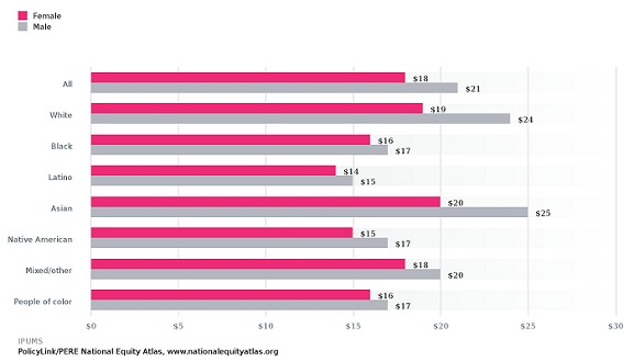
Above: Median Hourly Wage by Race/Ethnicity and Gender, United States

National trends

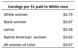
Nationwide, full-time working women now earn $0.86 for every dollar earned by their male counterparts, compared to $0.71 in 1990; this seems like encouraging progress, but according to a study by the Economic Policy Institute, 40 percent of that progress is explained by declining wages among men. The data in the Atlas support this conclusion: while women’s wages have risen by about 6 percent over the last few decades, men’s wages have fallen by nearly 13 percent. In addition, research has shown that the women continue to earn less than men not only because of differences in education, occupation, and family needs, but also as a result of gender discrimination and bias in the workplace. Across the U.S., White women earn about $0.79 for every dollar earned by White men, and the gaps are even larger for most women of color:

As the new data in the Atlas clearly indicate, gender pay gaps can’t be understood in isolation from racial pay gaps. Exploring some national trends can show how these dynamics are interconnected:

  • Overall, men earn more than women in all 50 states, all of the 150 largest metro areas, and 98 of the 100 largest cities. Nationally, men earn more than women within each racial group, and this trend holds true for the majority of metros and cities as well.
  • White women earn more than women of color in all 50 states, all of the 150 largest metros, and all but one of the 100 largest cities (excluding Hialeah City, Laredo City, and  Portland-South Portland-Biddeford, ME Metro, for which there are insufficient data to make such a comparison). These inequities persist even among women with similar levels of educational attainment. College-educated women of color, for example, earn an average of $23 per hour, compared to $28 per hour for White women with the same level of education.


New in the Atlas: City-level data

The greatest gender wage equality has been achieved at the city level, particularly in places where White women earn the most and men of color earn the least compared to White men—meaning the cities with the smallest gender pay gaps have some of the steepest racial pay gaps in the country.

Let’s take a closer look at Los Angeles as an example. In L.A., one of only two cities in the U.S. where women’s median hourly wages are slightly higher than men’s, men of color earn less than half the pay of their White counterparts: 

Above: Median Hourly Wage by Race/Ethnicity and Gender, Los Angeles 

White men are paid dramatically more than all other workers in the city of Los Angeles: White women earn $0.83, women of color earn $0.50, and men of color earn just $0.47 for every dollar earned by White men. Differences in education, occupation, and experience account for some but not all of these disparities; this is why the disaggregated data presented in the National Equity Atlas and other data tools like Clocking In (produced by Race Forward) are so important and powerful: they can help advocates and policymakers push forward creative, multidimensional solutions by showing how economic and social inequities are multilayered.

Strategies for reducing gender wage gaps

It is clear that city, state, and national leaders should focus on strategies that will address both gender and racial wage gaps, such as increasing the minimum wage, enacting living-wage laws, guaranteeing paid sick days, preventing wage theft, ensuring fair scheduling, and targeting economic development and workforce efforts to grow high-opportunity sectors that provide pathways to good jobs for people without four-year degrees. More specifically, strong protections against gender wage discrimination, like California’s new equal pay statute, can help ensure that workers are fairly compensated regardless of their gender.


How to get the data for your community

Visit the National Equity Atlas to explore data for your city, region, or state:

1.       Click on Indicators in the navigation bar;

2.       Select the Wages: Median indicator under Economic Vitality;

3.       Select By gender in the breakdowns underneath the chart.

Higher Education Doesn’t Close the Wage Gap for People of Color

In two recent National Journal articles, Matt Vasilogambros uses data from the National Equity Atlas to explore how the wages of workers in America’s 150 largest metro areas differ according to race/ethnicity and educational attainment (here and here). The Atlas provides data on median hourly wages broken down by race/ethnicity and level of education.

Overall, White workers earn more than people of color in every metropolitan area in the country—and the same pattern holds true within each category of educational attainment. (There are a handful of metro areas, most of which have incomplete data on the wages of workers of color, where Asians edge out Whites for the highest average pay.) Vasilogambros notes that “this gap in earn­ings between races and eth­ni­cit­ies is well-doc­u­mented, as are its reas­ons: Work­ing-age people of col­or tend to be young­er, have less ex­per­i­ence in skilled labor, and are less edu­cated than whites.”

While it is true that median hourly wages tend to rise with increasing educational attainment, so do racial wage inequities. According to Valerie Wilson, the dir­ect­or of the Eco­nom­ic Policy In­sti­tute’s Pro­gram on Race, Eth­ni­city, and the Eco­nomy, wage gaps have grown the most for college graduates. Data from the National Equity Atlas show that these hourly wage gaps are greatest (around $7 per hour) in cities like San Jose, San Francisco, and New York, where average levels of education and median wages are much higher. The narrowest gaps—still around $2 per hour—are seen in metro areas where the median pay for all workers is far below the national average. As Wilson puts it, “Things tend to equal out at the bot­tom, un­for­tu­nately.”

Sarah Treuhaft, the dir­ect­or of equit­able growth ini­ti­at­ives at Poli­cyLink, underscores the significance of these wage inequities, which are expected to grow as U.S. demographics continue to change. “It im­pacts the over­all eco­nomy,” says Treuhaft. “If people are not earn­ing as much pay, they have less money to save, to edu­cate their child, to spend in the eco­nomy, which fosters more eco­nom­ic activ­ity. Over­all, that ra­cial gap in wages adds up to a big gap in eco­nom­ic prosper­ity for the re­gion.”

Chicago’s VOYCE Coalition Uses Disaggregated Data to Pass Landmark School Discipline Reform Bill

Voices of Youth in Chicago Education (VOYCE), a youth-led alliance for education and racial justice in Chicago and greater Illinois, has been lifting up the stories of young people of color who experience overly harsh and racially biased discipline in schools to advocate for more equitable and safer schools for everyone.

Zero tolerance policies that mandate suspension or expulsion for certain offenses emerged in the 1980s, largely in response to rising juvenile arrest rates. The passage of the Gun-Free Schools Act in 1994 required states that wanted access to federal education funding to pass laws mandating yearlong suspensions for students who brought firearms to school. While the original intent of zero-tolerance policies was to make schools safer with a tough-on-crime approach to major offenses, over time, minor violations of school codes of conduct became grounds for suspension or expulsion. One young person from VOYCE reported getting suspended for skipping one class—an extreme disciplinary response that resulted in a disruption of the student’s learning.

Zero-tolerance policies have not only failed to make schools safer but also encouraged punishment practices that prevent youth—especially youth of color—from succeeding at school and being prepared to enter the workforce. 

These practices are not simply ineffective; they have harmful repercussions. School suspensions can disrupt young people’s lives and increase the likelihood that they will be arrested. Even more troubling, the increased likelihood of arrest is highest among youth who do not have significant criminal histories. And youth who do have prior criminal histories are more likely to recidivate while suspended from school. This phenomenon of schoolchildren being channeled into the criminal justice system has been referred to as the school-to-prison pipeline. The suspension of young people—like the member of VOYCE who was suspended for skipping a single class—increases their likelihood of arrest or recidivism, when they should be the classroom.

Recognizing that school suspensions should be the last resort rather than the first response, VOYCE lifted up city- and state-wide data on suspensions, expulsions, and youth arrests to successfully advocate for and pass state legislation mandating the implementation of more fair and effective disciplinary practices instead of zero-tolerance.   

Uncovering racial inequities in school discipline

To reach legislators, VOYCE advocates needed compelling data to communicate the urgency of the harmful outcomes and disparate impact of these punishment practices in their communities. They launched the Campaign for Common Sense Discipline, and analyzing data disaggregated by race and ethnicity was a critical first step of their work.

The coalition analyzed 2012-13 Chicago Public Schools (CPS) and Chicago Police Department data and found alarming disparities in suspensions and expulsions and widespread criminalization of students of color. Black students were more than 30 times more likely to be expelled and had six-and-a-half times more suspensions than their White peers. Students of color were also far more likely to be criminalized: 96 percent of all arrests were of Black and Latino students.

VOYCE also analyzed U.S. Department of Education Office of Civil Rights data and Illinois State Board of Education data and found that state-wide there were over 272,000 out-of-school suspensions of Illinois students, more than 2,400 expulsions, and more than 10,000 arrests in just one school year. About 13 percent of all students enrolled in Illinois public schools had been suspended, but VOYCE knew that actual suspension rates were much higher because charter schools are not required to report suspension numbers.

VOYCE’s analysis also found that suspensions, expulsions, and arrests added up to a significant loss of time in the classroom for Illinois students: more than one million instructional days per year. This was the data point that really captured the attention of decision-makers, according to Jose Sanchez of VOYCE, because it showed how exclusionary discipline was disrupting student learning and creating an enormous barrier to student success.

Data underpins policy wins for safer and more equitable schools in Illinois

Using data and organized public action to get the attention of local and state decision makers, VOYCE was able to advocate for and successfully pass two bills that will curb the devastating impacts of these discriminatory policies and make public schools safer and more inclusive for all Illinois students. 

SB 2793, the first bill that the Campaign successfully advocated for, was signed into law in August 2014 and requires every school to provide data on out-of-school suspensions, expulsions, and removals that is disaggregated by race and ethnicity, gender, age, grade level, and limited English-proficiency status. The availability of good data, disaggregated by race and ethnicity, was an essential ingredient in VOYCE’s second legislative victory: the passage of a bill that made zero-tolerance policies the last resort for school discipline.
 

SB 100 is the most comprehensive attempt by any state to address the causes and dire consequences of the school-to-prison pipeline, and youth advocates from VOYCE played a key role in securing its passage. VOYCE youth drafted a version of the bill in 2012 and sent youth representatives to all legislative hearings about the bill. SB100 passed on May 20, 2015, with broad bipartisan support. It mandates that suspensions and expulsions become the last resort in school discipline, not the first response. The bill also works to make schools more equitable by holding public and charter schools to the same disciplinary standards and by providing academic and behavioral support to struggling students. Instead of excluding students by expelling or suspending them, SB 100 is working to put students back on the road to graduation and a future in the workforce.

Credit: VOYCE Coalition.

With these two victories under their belt, the advocates of VOYCE are currently focusing on developing guidelines for the implementation of SB100. They want to ensure that the resources being shifted away from zero tolerance policies are shifted toward practices that make schools more equitable and safe. Their recommendations will be released in Spring 2016.

The VOYCE coalition’s policy wins exemplify the power of equity data—in the hands of active, engaged communities—to drive positive change in public school systems. The majority of public school students in the United States are now students of color, and their success is critical to the success of their communities and the economy as a whole. Reforming the overly harsh disciplinary policies that have adversely affected students of color for 25 years is a critical step toward ensuring all children can succeed at school and build a strong 21st century workforce. If America’s schools are to open doors of opportunity for everyone, they must have zero tolerance for discriminatory practices. 

Merging Data and Story to Win More Equitable Policies

Original post on NTEN.org

Compelling facts have always been a key ingredient in winning policy campaigns, and the rise of web technology has opened the floodgates for data that would have been out of reach to all but the most dogged advocates just 20 years ago.

But while we are awash in data, it is often like Coleridge’s famous line: “Water, water, everywhere; nor any drop to drink.” The sheer volume of data is overwhelming, and the data that is accessible is often not the right data. Advocates working for equity—just and fair inclusion for all—need data that is broken down by race, age, geography, income, and other dimensions. They also need a way to frame the data—a narrative that explains how and why these inequities matter.

As an organization founded to advance economic and social equity through policy change, PolicyLink is working to fill this need and equip changemakers with a data-backed narrative to help them win.

Equity Is the Superior Growth Model

About five years ago, Angela Glover Blackwell, the founder and CEO PolicyLink, saw the kernels of a new and powerful narrative for equity advocates. The 2010 Census results were out and they showed that the country was continuing to grow more diverse. Meanwhile, the Occupy Wall Street movement was bringing inequality to the public’s attention and new research was showing how rising inequality was a risk not just for those being left behind, but for the growth and prosperity of entire regions and nations.

Angela wove these threads together into a new story about the centrality of racial and economic inclusion not only as a moral imperative—which it continues to be—but as an economic one. America is bolting toward having a multiracial, people-of-color majority within just a few decades. Our growing, diverse workforce and population is a tremendous asset in the global economy—one that can only be fully manifested if people of color can access the resources and opportunities they need to participate in and contribute to growth and democracy. Dismantling lingering racial barriers and creating pathways to educational and economic security and success is critical to their future and the future of their communities and the country as a whole. The take-home is clear—equity is the superior growth model.

Building a Data-Backed Narrative

Data was at the heart of this framing from the beginning. Recognizing the importance of disaggregated and regularly updated data to keep the message fresh and give it legs, PolicyLink joined forces with the Program for Environmental and Regional Equity at the University of Southern California (PERE). PERE is a research and policy shop headed by Dr. Manuel Pastor who is a prominent researcher, speaker, and writer on issues of changing demographics, racial equity, and the economy. PERE conducts all kinds of research, but our partnership drew on their deep-bench strength in quantitative research and the development, maintenance, and facility with large datasets.

Our team worked together to produce a framing paper, America’s Tomorrow: Equity Is the Superior Growth Model (PDF), that bolstered the narrative with powerful statistics, maps, and charts and shared it with our networks of advocates and the broader world.

Going Local: Tailoring the Narrative to Regional Realities

The national story was critical for starting this narrative shift work, but we knew that advocates and policymakers needed data for their own community to put it to use. PERE painstakingly built the data infrastructure to make that possible, drawing from multiple data sources including historical economic data and demographic projections, aligning this data to consistently-defined boundaries for 202 geographies: the 150 largest regions, all 50 states, the District of Columbia, and the United States as a whole.

Equipped with this data, we began working with collaborations of local leaders who were developing regional sustainability plans. In about a dozen diverse counties, regions, and states, we developed Equity Profiles that document their changing demographics and performance on a host of equity indicators. These profiles helped these changemakers understand the trends in their communities, link these trends to the experiences of their constituents and community members, and develop shared narratives about how and why equity and inclusion mattered to their economic futures.

From the Heartland metros of Omaha and Kansas City to diverse regions like Miami and Houston, demographic change was a salient issue. Even in predominantly-White communities, Latinos, Asians, African Americans and other communities of color are usually driving population growth, and breathing new life into disinvested commercial corridors. Combining the demographic data with metrics showing how different groups are excelling—or in many cases, being left behind—on key indicators of economic success, health, education, and more was a good starting point for having productive local discussions about race, equity, and opportunity.

Coming together around the data helped these collaborations grow stronger, identify areas of focus, and bring on new partners. In Rhode Island, the profile led directly to policy action. After seeing how communities of color were responsible for all of the state’s population growth yet faced major barriers to economic opportunity, then-Governor Chafee opened a new Office of Diversity, Equity, and Opportunity focused on inclusive hiring and contracting in government jobs.

The local data strengthened our own advocacy as well. In California, the Alliance for Boys and Men of Color, which we coordinate, married economic imperative data and messaging with the voices of youth leaders to successfully win a slate of state policies that reform harmful “zero tolerance” school discipline approaches, invest in career pathways for men returning from prison, and more. As youth advocate Angel Diaz put it, “If adults look at young people as assets to be developed instead of problems to solve, we can change the future.” We found that the mix of data, narrative, and testimonials is a potent advocacy tool.

Democratizing Data via the National Equity Atlas

From the beginning, our goal was to democratize this data and make it widely available to advocates and policymakers. Released last October, the National Equity Atlas is a one-of-a-kind resource to track, measure, and make the case for inclusive growth at the local, state, and national level.

The Atlas makes detailed data disaggregated by race, nativity, education, income, and more available through a user-friendly interface. At the click of a button, you can access 29 field-tested indicators of demographic change, racial and economic inclusion, and the economic benefits of equity for the 202 geographies in our database. The “equity is the superior growth model” narrative is embedded throughout the site, providing context for how the data matters for equitable growth, along with policy ideas, real-world examples, and links to additional data and policy resources

The Atlas is also a living resource, and next week we will be adding data for the 100 largest cities to the site (join us for the release webinar), and more indicators and data cuts (including disaggregating the Asian population) are in the works.

Data itself is not social change. But data combined with a story can power the bolder, smarter, more targeted strategies that communities need to leverage their increasing diversity as an asset and secure a bright economic future for all of their residents.

Pages