Getting Started with the Lab

The Racial Equity Data Lab is a space for equity champions to combine their own expertise on their community’s experiences, assets, and needs with the deeply disaggregated data in the Atlas using Tableau Public.

In the Lab you can:

1. Access Tableau 

Visit our Using Tableau page to set up your own account to use the Tableau Public app or work directly in the Tableau Public site using your internet browser.

2. Create Your Own $15/Hour Fact Sheet

Download our starter viz to create and customize a $15/hour fact sheet for your geography. The Step-by-Step Guide provides instructions on how to select your geography, customize the elements of the $15/hour fact sheet, explore the data, and incorporate your own expertise on why a $15/hour minimum wage matters for racial equity in your community.

3. Access Data

Access Tableau-ready data sets to download Tableau starter workbooks for Atlas indicators. The Housing Burden starter workbook and Median Wages starter workbook include built-in features such as example charts, filters, and parameters to allow users to explore the data by year, geography, race, sex, nativity, and ancestry. 

4. Design Your Own Data Visualizations

Using Data Visualization Basics and best practices, create a data visualization that illustrates key data points, identifies underlying causes and drivers of inequity, and lifts up powerful equity solutions.

5. Explore Equity Data Visualizations

Explore our Gallery page to view other racial equity data visualizations built through the Lab. 


Getting Started with the National Equity Atlas

The National Equity Atlas is a one-stop-shop for data and policy ideas to advance racial equity and shared prosperity. Our focus is providing equity metrics that are deeply disaggregated by race/ethnicity, gender, nativity, ancestry, and income for the largest 100 cities, 150 regions, all 50 states, and the United States as a whole.

We built this site to democratize data and make the facts accessible and actionable to everyone — including the grassroots organizations that possess invaluable firsthand knowledge of inequities yet often lack the resources to gather, analyze, and display the quantitative data so crucial to policy campaigns to address them. At the click of a button, you can see how your community is doing in comparison to other communities according to our Racial Equity Index and 30 relevant, useful, field-tested indicators of racial and economic equity.

Now we are thrilled to share the latest innovation in our suite of data and policy tools: the Racial Equity Data Lab. The Lab is a new space on the Atlas designed to help equity advocates and campaign leaders to build  custom Atlas-powered  dashboards, data displays, and maps. The Lab has everything you need to tell your community’s equity story: ready-to-use datasets, data visualization basics, and a step-by-step guide to get you started. It also includes a starter visualization that you can use as a template to create a $15/hour factsheet for your community.

Ready to dig in to the National Equity Atlas? Here are the essential features to help you explore the indicators and unlock the power of our unparalleled data disaggregation.

1. Indicator and Geography Selection Toolbar: Your Home Base

Next, explore the individual indicators in the Atlas. Once you are on the page for any indicator, the first interactive element you will find is the Indicator and Geography Selection Toolbar. This toolbar allows you to choose which of our 30 indicators you want to explore for any of the 272 geographies in the National Equity Atlas. To do so, follow these five steps:

A) Select any indicator, either from the dropdown menu under Indicators or from the Indicators introductory page
B) Choose your indicator group (Demographics, Economic Vitality, Readiness, Connectedness, or Economic Benefits)
C) Choose your indicator from the dropdown menu
D) Choose your geography type (Nation, State, Region, City)
E) Choose your geography from the dropdown menu
 
Here is how it looks for our Race/ethnicity indicator for the Orlando region:
 
Note that the number of geography types available to you will differ from indicator to indicator, based on data availability. For example, you will not see “City” for the Economic gains: Racial equity in income indicator because data is not available for those smaller geographies for that indicator.
 
Also, once you are on an indicator page, scroll down for key insights about the indicator, the drivers of inequity, policy solutions to consider, and additional resources.
 
  • MASTER IT: Change the geography and pull up the trend data for a community. What groups are growing and which are shrinking?

2. Chart Breakdowns and Filters: Explore the Data

The Chart Breakdown and Filters feature is the true engine for data exploration in the National Equity Atlas. This is where you can disaggregate the data such as race/ethnicity, race and nativity, race and gender, ancestry, and poverty level. It is also where you can get indicator-specific breakdowns of the data, such as business ownership by race and by industry or commute time by race and transportation mode.

Take these steps to use the Chart Breakdown and Filters feature:

A) Select your breakdown
B) Select one or more filters
 

Here is how it looks for our Working poor indicator for the city of Albuquerque:

  • MASTER IT: Explore the different breakdowns and filters for this indicator. Which groups are most likely to be working full-time but still in poverty or economically insecure (living below 200 percent of poverty) in your community?

3. Compare: See How Your Community Stacks Up

A fourth essential feature — also in the Indicator and Geography Selection Toolbar — is the Compare function. Comparison is a very important method for analyzing equity metrics, allowing you to see how your community (or a group in your community) is doing in relation to other communities (or the same group in a different community). This can help you understand the extent of disparities, assess what are the drivers of inequities, identify strategies to remove barriers, and set goals for progress on eliminating inequities.

Here is how to use the Compare function:

A) Select compare
B) Select a comparison geography type from the dropdown menu
C) Select a comparison geography from the dropdown menu
 
And this is how it looks for our Working poor indicator, comparing the city of Albuquerque to the state of New Mexico: 

Note that the Compare function is not available for indicator breakdowns that contain multiple categories over multiple years (like the Race/ethnicity indicator you just looked at) because the display would not be legible.

  • MASTER IT: Compare working poverty trends in your city and your state.

4. Map Filters and Full Extent: Visualizing Patterns

Mapping data by geography puts spatial inequities — which are also racial inequities, due to housing segregation and discrimination — into stark relief. The National Equity Atlas team has worked hard to create a custom mapping system that enables clear visualization of patterns across communities and correlations between race, place, and income.

Follow these steps to Map Filters and Full Extent features:

A) In the chart breakdown, select the map breakdown
B) Under map geography, choose your geography type (Nation, State, Region, City)
C) Select map filters
D) Select map full extent
E) Select a demographic group
F) Use the slider to see how communities with higher and lower shares of your selected demographic group perform on the indicator
 
Here is how it looks for our Rent burden indicator for the St. Louis metro region, looking at majority Black communities by selecting Percent Black, 50% in the map filter:

5. Downloads and Social Media Buttons: Share and Use Data Visualizations

The National Equity Atlas is a tool for community action, and we wanted to make it easy for you to use the data to highlight issues of inequity, build support for campaigns, and make your case for solutions with policymakers and others in positions of power. We also believe in open data and know that you want to be able to explore the raw data yourself. That’s why we built more sharing and download functionality into the National Equity Atlas.

Follow these steps to access our Download and Sharing features:

A) Select download type (Image or Excel worksheet)
B) Select sharing type (Facebook, Twitter, Email)
 
Here is how it looks for our Rent burden map for St. Louis:

  • MASTER IT: Download an Excel file to examine the data behind a chart or map. Post a National Equity Atlas chart or map on your Facebook or Twitter page.

6. Racial Equity Index

The new Racial Equity Index — available for all geographies in the Atlas — allows you to track how well your community is doing on a set of nine equity indicators compared with other communities (and over time). The index summarizes an inclusion score (which measures racial disparities on nine indicators) and a prosperity score (which measures overall performance levels on those same indicators), and can be further broken down into its components to help you identify the most important challenges and areas of progress to develop targeted equity strategies. You can also examine the prosperity score for each of six major racial/ethnic groups. Here is how to access the index:

A) Go to the Racial Equity Index under Research
C) Choose your geography type (Nation, State, Region, City)
D) Choose your geography from the dropdown menu
E) Explore the data
F) Go back to Racial Equity Index to examine the Prosperity scores for the Black, Latinx, Native American, Asian or Pacific Islander, Mixed/other race, and White Populations.
 
Here is how the index page looks for Minneapolis-St. Paul metro region.
 
Thank you for exploring the National Equity Atlas! We hope you are excited enough about these features to let your colleagues know about this new tool. We encourage you to join the discussion on social media using the hashtag #equitydata.

Step-by-Step Guide to Create Your Own $15/Hour Fact Sheet

With three easy steps you can create a dashboard with six charts showing who earns at least $15/hour in your community.

This tutorial describes how you can create a $15/hour fact sheet for your community using Atlas data and Tableau. All you will need is a Tableau Public account and an internet connection. Instructions on how to set up a Tableau Public account can be found on our Using Tableau page.

Step 1: Login to your Tableau Public account at https://public.tableau.com/s/  
Step 2: Open the Starter Viz in Tableau Public and click "edit" in the top right corner
Step 3: Adjust for your geography by clicking on the icon to the right of the "All" sheet name

Screenshot showing icon to open All sheet

Double click on the Geo Name pill in the Filters card.

Screenshot showing select Geo Type filter

Unselect “Dallas City, TX” and select your city from the list of available geographies. Once you confirm only one selection has been made, click “OK” in the popup window.

Screenshot to unselect Dallas from list of geo types
Screenshot showing select city from list
Screenshow showing confirmation only one selection made

Navigate back to the $15/hour Dashboard tab at the bottom of the browser screen.

Screenshot showing navigation back to Dashboard tab

All the data visuals are now updated to show the data for the city you selected!

Customize your Fact Sheet

Use the guide below to explore the data and update the text in the factsheet. 

  1. Explore: What does the data show for your community?

Explore the updated data for your selected geography and highlight key takeaways from the data that shows who currently earns a living wage in your community.

Guiding questions to consider:

  • What share of workers earn at least $15/hour? How has it changed over time? Does that trend look different for White workers than for workers of color? 
  • Which racial group is the most likely to earn a living wage? Do you observe any differences by race?
  • When looking at race and gender, which workers are the least likely to earn at least $15/hour? How has that changed over time?
  • Look at immigrant versus US-born workers: do you observe any differences based on nativity?
  • Look at Asian or Pacific Islander ancestry to observe subgroups within each population: do you observe any differences between subgroups? Are all subgroups able to access $15/hour wages at the same rate as the Asian or Pacific Islander group overall? 
  • Has higher education attainment changed over time for the overall population? How about within each racial group? Are workers with similar education attainment equally likely to be earning at least $15/hour across racial groups? Do differences in educational attainment explain the different rates?

Consider adding: Help your audience understand who are the workers that a living wage would most benefit. Interview workers that currently earn less than $15/hour about their experiences and include quotes or insights from those interviews in the viz. 

Double-click on any header to edit the headlines and titles for each chart. 

Screenshot showing editing of headers by double clicking on text boxes
  1. Help your audience understand the context and why this matters:

In the Tableau workbook, edit the text to include key information that would ensure your audience understands what current wage conditions are for workers in your community, and why a $15/hour or living wage would improve equity and how it would impact the local economy.

Guiding questions to consider:

  • What is the current minimum wage in your city/state? What is the current tipped wage?
  • When was it last updated? Does it match the living wage needs? (If you are unsure of the living wage for your location, you can look this up using the MIT Living Wage calculator)
  • Have there been any key legislative changes or laws regarding minimum wage in your city/county/state?
  • Who comes to mind when most people imagine a worker in your community that would benefit from $15/hour? Is that an accurate profile?

Consider adding: Include a profile or quote of someone who represents a key population who is currently not earning a living wage in your city/county/state.

Screenshot showing edit context section
  1. Include Equity Solutions:

In the Tableau workbook, edit the text regarding what leaders can do. Include key information that would ensure your audience understands what specific policies and actions they can support and advocate for that would ensure a living wage for all workers.

Guiding questions to consider:

  • Why would a $15/hour minimum wage improve equity in your city/county/state?
  • What can your policymakers do to ensure that all workers are paid a living wage?
  • Is there any specific legislation currently being discussed?
  • What can businesses do to ensure that all their workers are paid a living wage?
  • What do you want your audience to take as a next step to support a living wage for all workers?
  • Are there additional resources you want to include to help people learn more or take next steps? Consider including references to other resources and organizations.

Consider adding these equity solutions to your viz:

  • Raise the minimum wage federally and at the local or state level.
  • Enact living-wage laws that require government offices and contractors to pay living wages.
  • Strengthen workers' rights to organize and bargain collectively for a living wage, including passing the Protecting the Right to Organize (PRO) Act.
  • Establish standards to ensure public investments in economic development and infrastructure create living-wage jobs.
  • Pursue full-employment economic policies that promote hiring, increased work hours, and living wages for low-wage workers including a federal job guarantee.

Screenshot showing edit equity solutions section
  1. Publish your Dashboard

You can now click publish to see your final dashboard! In the File menu, click on "Save As…", name your workbook then click “Save”.

Screenshot showing Save As from file menu to publish

Once the workbook has uploaded successfully, you will automatically be taken to your Tableau Public profile page, where you can view your final dashboard. Click on "Edit details" in the top pop-up banner to edit your title, description, and select settings including if you want to allow others to download and explore the workbook. 

  1. Share your Dashboard

You can share your dashboard several ways:

  • Send a link: Copy the link and share it!
  • Send an email using your default email application: Click on the email icon.
  • Share on Twitter or Facebook by clicking on the corresponding icons.
  • Embed the dashboard on your website: Copy the embed code and paste it in your web page HTML.

You can also download the visualization as an image, PowerPoint, or PDF file. 

Screenshot showing download and share buttons


Submit your customized fact sheet to the Racial Equity Data Lab!

Submissions are reviewed by the National Equity Atlas team and selected vizzes may be highlighted in the Racial Equity Data Lab Gallery. Click here to share your viz with us.

Rent Debt in America: Stabilizing Renters Is Key to Equitable Recovery

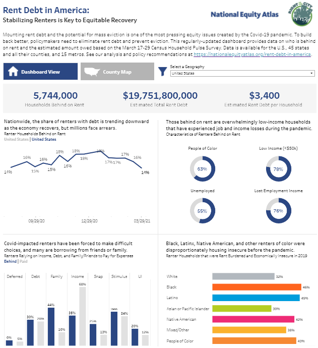
Our rent debt dashboard, produced in partnership with the Right to the City Alliance, equips policymakers and advocates with data on the extent and nature of rent debt in their communities to inform policies to eliminate debt and prevent the specter of mass eviction.

By Sarah Treuhaft, Michelle Huang, Alex Ramiller, Justin Scoggins, Abbie Langston, and Jamila Henderson

Mounting rent debt and the potential for mass eviction is one of the most pressing equity issues created by the Covid-19 pandemic. The vast majority of renters who are in debt are low-wage workers — disproportionately people of color — who’ve suffered job and income losses due to the pandemic. As of August 3rd, the federal eviction moratorium was temporarily extended to October 3rd for a more narrow subset of renters. While this extended order will cover the majority of renter households, when the order expires at the beginning of October, the renter households that still hold debt and lack protection by state or local moratoria will be at imminent risk of eviction and homelessness. Allowing this eviction tsunami to take place would be a moral travesty and a policy failure that would deepen inequities at a moment when the federal government has prioritized addressing systemic racism and ensuring an equitable recovery.

To inform policymaking and advocacy to prevent eviction and eliminate rent debt, the National Equity Atlas and the Right to the City Alliance launched a rent debt dashboard in April 2021 with near real-time data on the number and characteristics of renters behind on rent for the US, most states (currently 40 states), and 15 metro areas.* The dashboard also provides estimates of the amount of back rent owed for these geographies, as well as estimates for the number of households with debt and the amount owed for all counties in the states. Drawing current data from the Census Bureau’s Household Pulse Survey and the University of Southern California Center for Economic and Social Research's Understanding Coronavirus in America survey, the dashboard data is refreshed approximately every two weeks. Find our full methodology here.

Born out of the need for accessible, current data to inform local and state campaigns, the dashboard was produced in partnership with the Right to the City Alliance, a network of community-based organizations working in 45 cities and 26 states to prevent displacement, expand affordable housing, and build just, sustainable cities for all.

This analysis shares key insights from the dashboard, based on the June 23 - July 5 Pulse survey, along with action steps that local, state, and federal policymakers can take to stabilize the people most negatively impacted by the pandemic and facilitate equitable recovery by addressing the challenge of rent debt.

This is an update to our April 21, May 25, and July 7 analyses. We will be updating our dashboard and this analysis after the August 11 Pulse data release.

Rent debt continues to be a significant issue, with 6.4 million renter households behind on rent.

As of the first week of July 2021 6.4 million renters — 15 percent of all renter households — were behind on their rent payments. The federal eviction moratorium from the Centers for Disease Control and Prevention enacted in September 2020 provided these renters with some protection from eviction but will expire on October 3. And even now, the temporary eviction moratorium order does not apply to all renter households who might be at risk. A few states and cities still have moratoria banning eviction for nonpayment of rent. However, most renters with arrears live in the vast majority of states and cities that do not have moratoria and they are at imminent risk of eviction and homelessness. As a point of comparison, nearly 8 million households lost their homes to foreclosure due to the 2008 financial crisis.

The Pulse survey has been asking the question “Is this household currently caught up on rent payments?” every two weeks since August 2020. Nationally, the current share of renters with debt is down from a high of 19 percent in mid-January, but remains far higher than the pre-pandemic baseline. While data on rent debt is sparse, the 2017 American Housing Survey found that about seven percent of renters were unable to pay some or all of their rent.

South Carolina and Georgia have the highest share of renters with arrears among the 40 states analyzed.

The share of renters who are behind on rent is much higher than the national average in some states and metro areas. Among the 40 states with sufficient data to include in our analysis, South Carolina has the highest share of renters with arrears (28 percent), and at least 20 percent of renters are behind in the states of Georgia, New York, Pennsylvania, and Tennessee. Idaho and Montana have the lowest shares of renters with debt, at 6 and 4 percent, respectively.

Among the 15 metros included in the Pulse survey, New York and Riverside have the highest share of renters with debt (24 percent), followed by Seattle (21 percent), and Atlanta and Philadelphia (both at 19 percent). Phoenix and Miami are tied for the lowest share of renters in arrears among the 15 metros (8 percent).

Nationally, we estimate that rent debt amounts to about $21 billion.

According to our estimates, households that are behind on rent owe $3,300 on average, for a total of $21.3 billion nationwide. As this average suggests, the majority of households who are behind owe one or two months of back rent. However, a smaller but not insignificant number of renters have not been able to pay rent for many months and owe much larger amounts. Our analysis of the University of Southern California’s Understanding Coronavirus in America national survey finds that approximately 28 percent are one month behind, 22 percent are two months behind, 15 percent are three months behind, and the remaining 35 percent are more than three months behind.

The average amount owed depends primarily on local housing costs, so it varies significantly across states and metros. Among states, Hawaii has the highest average rent debt per behind-household ($5,600), while Arkansas has the lowest ($2,100). At the metro level, San Francisco and Washington DC have the highest average debts ($5,800 and $5,200, respectively), while Detroit has the lowest average debt by far ($2,500), followed by Phoenix ($3,200).

Our national estimates of rent debt fall somewhere in the middle of existing projections in terms of total debt, and on the lower end in terms of per household amount. In January, Moody’s Analytics projected that 6.3 million renters would owe a total of $33 billion in rent debt by March, at an average of $5,282 per household. Stout Analytics estimated that between two and five million renter households owed between $13 and $24 billion as of January. Both Moody’s and Stout used the Pulse survey to inform their estimates of the number of households behind. Using a very different methodology based on modeling employment losses, income supports, and spending choices at the household level, and not incorporating the Pulse survey data, the Federal Reserve Bank of Philadelphia estimated that 1.8 million renter households would owe $11 billion in rent in March, at approximately $6,100 per household.

With the incipient recovery, the number of renters with debt has declined nationwide since its peak in January, but has remained at 14 percent since late March. Most states and metros are following this decline.

Nationwide, the share of renters with debt trended downward from a high of 19 percent in January to 14 percent in late March, and has held steady around 14 percent for the past couple of months. Nearly all states and metros followed this general downward trend since their peaks. Between January and the beginning of July, the rates of renters behind on rent rose in only nine states, the District of Columbia, and four metro.

Among states, Georgia saw the largest spike in arrearages (from 18 to 25 percent behind), followed by Oregon (from nine to 12 percent). Missouri saw the most improvement (from 27 to 12 percent behind).

Among metros, Seattle saw the highest increase (from 13 to 21 percent behind). Dallas saw the greatest decrease (from 27 to 10 percent).

The vast majority of those who are behind on rent are low-income households who’ve lost jobs and income during the pandemic.

Today’s rent debt crisis is entirely a consequence of the pandemic’s economic fallout: 68 percent of those who were behind on rent in May had lost employment income at some point during the pandemic, according to the May 12-24 Pulse survey which asked respondents this question. As our other research has shown, low-wage workers, who are disproportionately workers of color, were hardest hit by pandemic job losses and are most likely to suffer from rent debt. Among households with rent debt, 81 percent are low-income (with earnings less than $50,000 per year) and 64 percent are renters of color. The majority (51 percent) are currently unemployed.

Renters have made tremendous sacrifices and tradeoffs to stay current on rent, including foregoing medical care, delaying payment of other bills, eating cheaper (and potentially less healthy) food, and voluntarily moving in with friends and family — increasing risk of Covid-19 exposure while losing their housing stability. One of the most surprising facts in the data is the high share of low-income renters who are paid in full: Among low-income households that lost employment income during the pandemic, 73 percent were not behind on rent as of May (also according to the May 12-24 Pulse survey).* This underscores how paying rent has remained a top priority for all renters throughout the pandemic, despite the moratoria on evictions.

Rent is not the only debt accumulating for renters.

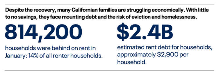
While our analysis focuses on back rent, renters’ pandemic debt crisis extends far beyond their obligations to their landlords. Many renters are borrowing from family and friends or taking on other forms of debt in order to make rent and pay for household expenses. Among households behind on rent, 46 percent borrowed from friends or family to pay rent, compared with just 15 percent of households current on rent. About 30 percent of all renter households, whether behind or current on rent, used a credit card (or some other form of debt) to pay rent. Many are behind on other bills, such as utilities or car payments. A survey of water debt in California found that 1.6 million households owed $1 billion on water bills — $500 on average.

Renters of color have been disproportionately impacted by the pandemic and are more likely to owe back rent, making them more vulnerable to eviction risk.

In the United States, renters are already a more vulnerable population as a whole: they have little housing security, paltry savings, and few legal protections from exorbitant rent increases or eviction (outside of a few states and cities with strong tenant movements). Historic and continuing housing and lending discrimination, as well as systemic inequities in our labor market, have contributed to large racial inequities in homeownership. Atlas data show that seven in 10 White households own their homes while the majority of Black, Latinx, and multiracial households rent.

The challenge of unaffordable rents and flat wages add to this underlying housing insecurity among renters. Renters were already in crisis when the pandemic began: about a third of White renters and just under half of Black and Latinx renters were both economically insecure (earning less than 200 percent of the federal poverty level) and rent burdened (paying more than 30 percent of their income on rent). Gender is another important axis: women of color are most likely to be rent burdened, and disproportionately face eviction.

Covid-19 added yet another layer of inequity to these preexisting disparities. Today, 24 percent of Black renters, 17 percent of Asian or Pacific Islander and Latinx renters, and 18 percent of multiracial renters are behind on rent, compared to 9 percent of White renters.

Eliminating Rent Debt is an Equity Imperative and a Moral, Economic, and Public Health Necessity

Today’s rent debt crisis is a microcosm of the wretched inequality of the pandemic: millions of renter households – most of them people of color – now face the burden of owing back rent due to a public health crisis that had extremely concentrated negative economic impacts on low-wage workers. These unequal consequences are not random, but the predictable result of past policies that left millions of families with no savings to draw upon in the face of an economic shock, as well as the failed early policy response to the pandemic. Although the CARES Act provided important unemployment benefits and cash assistance as well as an eviction moratorium that helped many pandemic-impacted renters, undocumented and mixed-status families were ineligible for assistance and the moratorium ended in July, leaving renters unprotected until the CDC enacted its moratorium in early September. Moreover, absent meaningful financial assistance to pay back rent, the moratoria simply delay eviction. Yet, the federal government provided no rent relief until December, nine months into the pandemic.

The magnitude of rent debt is a crisis in and of itself and the leading indicator of a potential eviction tsunami that would be a humanitarian disaster. Rent debt adds a heavy burden onto families who are already financially insecure and struggling during the pandemic, further limiting their choices and creating additional stress. It’s also contributing to the growth of the racial wealth gap: while renters, predominantly people of color, currently hold $20 billion in debt, homeowners, who are predominantly White, saw a $1.9 trillion increase in their home equity from the first quarter of 2020 to the first quarter of 2021 as competition for a constrained supply of homes drove prices up. At a time when racial equity is at the forefront of the policy debate, eliminating rent debt that has unfairly and unequally accrued for people of color should be an urgent priority.

Clearing rent debt is also key to staving off the specter of mass eviction, which would directly harm economically vulnerable families and their communities and have long-term ripple effects throughout our economy. Eviction has significant negative consequences for mental and physical health, educational outcomes, and household finances. Some evicted families and individuals would become homeless, with devastating consequences for long-term health and well-being as well as significant costs for local governments.

The health impacts of eviction and homelessness are even more severe during a pandemic. Research during the pandemic found that states that allowed evictions to proceed had more Covid infections and deaths than those with eviction moratoria. Although the vaccination campaign is in full swing and Covid cases are low in most states, there are hotspots with high infection rates and the longer-term picture remains uncertain.

Forgiving rent debt is also essential to an equitable and people-centered recovery: one in which those hardest-hit by the pandemic can fully participate and thrive.

For an Equitable and Just Recovery, Policymakers Must Clear Rent Debt and Prevent Eviction

Recognizing the catastrophic impact of mass eviction, policymakers have responded, albeit belatedly, by enacting eviction moratoria and establishing rent relief funds. The federal CDC eviction moratorium scheduled to expire last month was temporarily extended through October 3 for most renter households, and the American Rescue Plan (ARP) passed in January provided $21.5 billion for rental assistance programs as well as $350 billion in fiscal support for state and local governments, some of which could be allocated toward debt relief. The December 27 coronavirus relief bill also provided $25 billion in funding for rental assistance.

With the federal moratorium expiring in just a couple months and many state and local emergency rent relief programs supported by the ARP just getting off the ground, there is an urgent need to clear the debts of all tenants in need to prevent mass eviction. Throughout the pandemic, rent relief programs have not been reaching all of those in need. These programs must be structured to meet the scale of the crisis, both to efficiently deliver resources and to ensure that resources are distributed equitably, reaching the low-income renters of color who were both hardest hit by the pandemic and already housing insecure before Covid-19. Renters also need stronger eviction protections, including access to free legal assistance and eviction diversion programs. States and localities should extend their eviction moratoria until the pandemic rent debt crisis has subsided.

As they design rent relief programs, local and state policymakers should implement policies that adhere to the following equitable, common sense principles:

  • No renter, regardless of immigration status, should be evicted or burdened with years of debt for rent that they were unable to pay during the pandemic.
  • Rent debt due to the pandemic should be fully forgiven and should not be conditioned on landlords’ acceptance of funds or participation in programs.
  • Financial assistance to landlords should address the fiscal needs of landlords in danger of going out of business due to lost rent, with a particular focus on keeping small community-based landlords and nonprofit affordable housing operators solvent, rather than attempting to achieve full rent replacement for all landlords. California’s program, negotiated with the state’s landlord association, provides an example: landlords receive 80 percent of back rent owed.
  • Local municipalities’ authority to pass stronger eviction and debt protection laws should be preserved.
  • Landlords should continue to fulfill their legal obligations to tenants regardless of whether they receive assistance, including the duty to maintain habitable premises, refrain from harassment and retaliation against tenants, and respecting tenants’ legal rights.

    For more local policy ideas and examples, see https://ourhomesourhealth.org

    * The number of renter respondents to the Pulse survey for Arkansas, Delaware, Maine, Mississippi, North Dakota, Rhode Island, South Dakota, Vermont, West Virginia, and Wyoming was insufficient to produce reliable data to include in the dashboard.

    Special Preview: Neighborhood Mapping on the Atlas

    This webinar offered a special preview of new maps will allow users to understand how selected equity indicators vary across neighborhoods within a city or region and can help inform targeted strategies and investments.

    A New Hub for Racial Equity Data; Guaranteeing Good Jobs for All

    Dear Atlas Users,

    As we close out the eleventh month of the pandemic, an equity lens remains crucial to understanding the public health and economic impacts of Covid-19 — and the path forward. The Atlas team is proud to partner with advocates, local leaders, and policymakers at all levels of government to advance an equitable recovery and build an inclusive economy for all. Here are a few highlights from our recent work:

    Racial Equity Data Hub Democratizes Local Equity Data

    Last week, the Tableau Foundation launched its Racial Equity Data Hub, in partnership with the National Equity Atlas. The Hub is designed to provide data and tools needed to understand racism in all of its forms and to enable movement leaders to effectively use data to advocate for change. The Atlas team worked with Tableau expert Chantilly Jaggernauth of Lovelytics to produce two visualizations to include on the Hub. Our Black Prosperity in America visualization provides information about the Black-White wage gap in cities, metros, and states — and shows how educational attainment or upskilling alone won't solve it. The other visualization presents indicators of economic and political inclusion, education, and justice for the Black population in the Bay Area. Tableau invites community members to participate in shaping the Hub’s future growth through this forum

    How Local Leaders Are Activating the Recommendations in our Advancing Workforce Equity Reports

    This month, National Fund for Workforce Solutions President and CEO Amanda Cage hosted a series of conversations with local leaders who are using our recent Advancing Workforce Equity reports to support equity-driven workforce strategies in their communities. Watch to learn more about how this work is moving forward in BostonChicagoDallas, and Seattle.

    Atlas Data Cited in Congresswoman Pressley’s Federal Job Guarantee Resolution

    On February 18, Congresswoman Ayanna Pressley introduced a resolution on the federal government's obligation to create a Federal Job Guarantee to address the compounding effects of systemic racism, economic inequality, and climate change. The resolution cites National Equity Atlas data, noting that at least 100 million Americans live in or near poverty, and 28 percent of full-time workers earn less than $15 an hour. A Federal Jobs Guarantee would directly address these inequities by eliminating involuntary unemployment, decreasing poverty, and raising the floor for all low-wage workers while building stronger and greener communities. 

    - The National Equity Atlas team at PolicyLink and the USC Equity Research Institute (ERI)

    Measuring Community Power in the Bay Area

    Dear Atlas Users,

    Our team has been busy behind the scenes getting our new data and interface ready for you, but also made it to DC last month to share our work at Datapalooza. And we are excited to share new research on race and political power in the Bay Area, revealing how one of the nation’s most diverse regions is making some progress, yet has a long way to go toward political inclusion.

    New Analysis: Bay Area Diversity Not Reflected Among Top Elected Officials
    With all eyes on the presidential primaries, it is easy to forget about what is happening at the local level — yet local electeds make crucial decisions in arenas like policing, housing, and land use that can have significant equity implications. And while the race and gender of elected officials does not alone determine whether they will advance equitable policies, representation matters. This is why the Bay Area Equity Atlas includes the diversity of electeds as a key measure of community power. Today, the Atlas released new data covering the November 2018 and 2019 elections, and a comprehensive analysis in partnership with Bay Rising. While the region has made some progress on political representation over the past two years, it is still lagging behind: people of color hold 29 percent of top elected offices despite making up 60 percent of the population. API and Latinx community members are particularly underrepresented; they make up 50 percent of the population but hold just 20 percent of elected offices. Read more here

    On the Road: The Atlas at Health Datapalooza
    Earlier this month, the Atlas team headed to Washington, D.C. for the 2020 Health Datapalooza, a convening of policymakers, regulatory leaders, data analysts, tech start-ups, and community members committed to using data to improve health. To an audience of roughly 50 people, alongside our colleagues from County Health Rankings and Roadmaps and the City Health Dashboard, we discussed data challenges when it comes to existing national surveys and reporting as well as what to do when the most important data does not exist. We highlighted our collection of diversity of electeds in the Bay Area Equity Atlas as one response to this challenge.

    Thank you for your interest in our work.

    -- The National Equity Atlas team at PolicyLink and the USC Program for Environmental and Regional Equity (PERE)

    Join Us to Talk Disaggregated Data and COVID-19 This Friday

    Dear Atlas Users,

    We hope that you and your families are staying strong through this difficult time. Our team is in the process of determining how we can best support communities in their response to the outbreak, aligned with the solidarity economics prerogative laid out by PERE director Manuel Pastor in this this new op-ed. We hope you will join us on Friday to inform our approach.

    Register Now: Community Listening Session Friday at 12 PT/3 ET
    As the COVID-19 pandemic continues to unfold, its effects are highlighting and deepening the racial inequities entrenched in our economic system. We know that disaggregated data is a crucial tool to push forward policy solutions that center equity in the short-term and lay the foundation for an inclusive recovery. Please join this listening session with Manuel Pastor, Sarah Treuhaft, and others from the Atlas team from 12-1 PT/3-4 ET this Friday, April 3rd to hear how we are responding to rapidly changing conditions and share your data needs and interests to inform our approach going forward. Register here.

    New Fact Sheet: Fair Labor Practices Benefit All New Mexicans
    When New Mexican employers deny workers their earnings, they harm families and prevent wages from circulating through the local economy. The New Mexico Worker Organizing Collaborative (NMWOC) works to combat this wage theft, and the Atlas team worked with them to develop a fact sheet showing how Latinx immigrant and Native American workers are disproportionately vulnerable to employer theft and highlighting the challenge of weak enforcement. Our analysis found that twenty percent of open wage theft cases without any activity or investigation have been open for over a year. NMWOC will be using this data in their advocacy to protect workers and take back lost wages. Learn more here.

    New Brief: Disrupting the Drivers of Inequity in Biloxi
    As wages have stagnated for the majority of workers in the U.S. and inequality has skyrocketed, racial inequity has grown. In Biloxi, Mississippi, these inequities are deep, leaving many Black and Latinx households facing racial and geographic barriers to economic opportunity. The coastal community of East Biloxi has the potential to address some of these inequities through investment in the federal Opportunity Zone program. However, this will only happen if there is an intentional focus on lifting up the most vulnerable communities. Download the brief published in partnership with the East Biloxi Community Collaborative to learn more about how to leverage the Opportunity Zones program to benefit low-income residents and people of color.

    Access New Local Data on Life Expectancy
    Through the United States Small-Area Life Expectancy Estimates Project’s (USALEEP) new data tool, you can measure and compare differences in life expectancy in nearly every neighborhood across the country with an easy-to-use interactive map. The Robert Wood Johnson Foundation (RWJF) also released updated data for their life expectancy tool which allows users to compare life expectancy in their neighborhood to national averages. These tools will help community leaders examine the factors that may be influencing health differences – such as access to health care, affordable housing, child care, educational opportunities – and target solutions more effectively. Learn more about the USALEEP tool and RWJF tool.

    Thank you for your interest in our work.

    -- The National Equity Atlas team at PolicyLink and the USC Program for Environmental and Regional Equity (PERE)

    New Analysis Finds People of Color and Immigrants are Disproportionately Harmed by Labor-Market Impacts of COVID-19

    Dear Atlas Users,

    The brutal murder of George Floyd by the Minneapolis police was a stark reminder of the racism that permeates our institutions, threatens Black life, and diminishes us as a nation. We cannot achieve inclusive prosperity without addressing police brutality, and the Atlas team stands in solidarity with those protesting this unjust system and calling for transformative change. We are working hard to finalize the new Atlas system upgrade to share with you later this month, and have been partnering with other data providers to assess the unequal economic impacts of the COVID-19 pandemic by race, gender, nativity, and occupation. Here are a few highlights:

    New Analysis: Disaggregated Data on Economic Impacts of COVID-19 for US and 10 Metros

    Today, in partnership with Burning Glass Technologies and JPMorgan Chase, we released the most comprehensive analysis to date of the labor market effects of the coronavirus pandemic, aiming to inform equity-focused relief and recovery strategies. In addition to the US, we analyzed 10 metro regions: Boston, Chicago, Columbus, Dallas, Detroit, Los Angeles, Miami, Nashville, San Francisco, and Seattle. Our analysis reveals that people of color and immigrants are concentrated in occupations that have experienced the steepest declines in job opportunities and will likely be among the last to recover, putting Black, Latinx, and Native American workers at heightened risk of long-term unemployment. People of color are also overrepresented in low-wage essential jobs, and Native Americans and immigrants are most concentrated in essential jobs where opportunities are declining. Among the 10 regions, the economic impacts of the virus are uneven: metros with large tourism sectors (like Nashville and Miami) have been hit particularly hard, while diversified regional economies with strong tech sectors (like Seattle and SF) have fared somewhat better. Read the full analysis here.

    New Profile of Bay Area Essential Workers

    In May, the Bay Area Equity Atlas released three new analyses focused on frontline workers in the region, including two deep dives into workforce demographics in Sonoma and Santa Clara counties. We found that frontline workers in these counties and the Bay overall are disproportionately Latinx, Black, and women of color, which could help explain why these populations are more likely to contract COVID-19. Latinx workers represent 22 percent of workers in all industries but 31 percent of frontline workers while Black workers, who account for just 5 percent of all workers in the region, are concentrated in specific frontline industries including public transit (23 percent) and postal services (11 percent). These workers are more likely to live in poverty, lack health insurance, and have no internet access at home. Read our analyses here. Check out media coverage of this research from KQEDSF Gate, and La Opinion.

    National Equity Atlas In the News

    • Ron Brownstein at The Atlantic analyzed National Equity Atlas data and corresponded with Atlas team members to inform his new article about how racial inequity is “the crack in the foundation of cities’ new prosperity.” Looking at data on median wages for New York, Los Angeles, Chicago, Houston, Dallas, Atlanta, Miami, Seattle, Denver, Philadelphia, and Minneapolis, he found that racial wage gaps have grown in all of those cities between 1980 and 2015.
       
    • E&E News published an article describing the criticism and subsequent revision of CDC guidelines encouraging workers to commute alone in private vehicles to slow the spread of the coronavirus, lifting up Atlas data showing that nearly 20 percent of Black households and 12 percent of Latinx households do not have access to a car, compared to 6.5 percent of White households. "So yes, there is a race and class bias in saying, 'You can just drive to work,'" said Basav Sen, climate justice project director at the Institute for Policy Studies.

    Thank you for your interest in our work.

    -- The National Equity Atlas team at PolicyLink and the USC Program for Environmental and Regional Equity (PERE)

    How Our Data Helped Advance the Equity Movement in 2020

    Dear Atlas Users,

    Happy Holidays from the National Equity Atlas Team! This has been a year of tremendous economic and social turmoil. From the unfathomable human and economic costs of the Covid-19 pandemic to the murder of George Floyd and the national outcry against police brutality that followed, systemic racism has been at the forefront of public consciousness. In this pivotal moment, we are proud to have deepened our work with community advocates, broadened the reach of the Atlas, and strengthened our capacity to democratize the power of disaggregated data. Here are a few highlights:

    Revamped Atlas Offers Updated Data, New Indicators and Features

    In July, we released comprehensive updates to the National Equity Atlas This refresh includes new data visualization and mapping infrastructure, two new indicators (life expectancy and the economic benefits of eliminating rent burden), data and powerpoint downloads, more contextual information and examples, and more robust and up-to-date data. Check out our webinar training, designed to equip Atlas users with the know-how to access, understand, share, and use our data tools.

    New Racial Equity Index Offers Comparative Snapshot of Equity in US Cities, Regions, and States

    Our new Racial Equity Index tool is designed to help advocates identify key issue areas and populations for advancing racial equity in their communities. Based on nine Atlas indicators scored by both prosperity and inclusion, the Index includes a summary score that provides a snapshot of how well a given place is performing compared to its peers. Start here to learn more. 

    Atlas Analyses Power Campaigns to Protect Renters from Eviction

    The Atlas team supported the Our Homes, Our Health housing justice effort by producing eviction risk fact sheets for local campaigns in states, counties, and cities throughout the US. These resources include data on how many households are currently at risk of eviction, which households are rent burdened and economically insecure by race/ethnicity and gender, and the first-hand experience of renters impacted by the economic downturn. Find our complete set of factsheets here.

    Bay Area Equity Atlas Provides Unparalleled Insights on Racial Equity in the Region

    Our landmark regional equity atlas produced a variety of analyses this year that shed light on ongoing inequities in the Bay Area. Our police use-of-force report revealed that Black residents in wealthy suburbs and core cities experience disproportionate levels of police violence while our diversity of electeds analysis found that 80 of the Bay Area’s 101 cities have no Black leaders. Finally, our regularly-updating Covid dashboard, which tracks case rates by Zip code, revealed the outsized impact of the pandemic on Black and Latinx communities. Check out all our analyses and sign up for our newsletter here.

    Disaggregated Data on Economic Impacts of Covid-19 Point the Way to an Equitable Recovery

    Throughout the year we released several reports analyzing the rapidly evolving Covid-19 economy, and the ways in which people of color have been disproportionately harmed. These efforts include our June analysis of the early labor market impacts of the pandemic and our recent report examining longer-standing racial gaps in labor market outcomes and access to good jobs as well as the economic impacts of Covid-19 and the racial equity implications of automation. Through the Bay Area Equity Atlas, we produced a profile of the Bay Area's essential workforce, and we also partnered with San Juan College to create a research brief on the impact of the Covid pandemic and resulting economic fallout in New Mexico.

    Atlas in the News

    Our data and reports have been covered by various local and national media outlets and articles, including The Atlantic, Fast Company, and Next City, which all reported on findings from our Racial Equity Index. Outlets such as Politico and SFGate covered findings from our analyses, including our reports on workforce equity and Covid labor market demographics. Eliza McCullough also wrote an op-ed for Fast Company that argues Smart Cities must do more to ensure that residents of color thrive. See a complete list of media coverage here.

    We have big plans for the coming year, including new analyses, data tools, and partnerships, so stay tuned. Thank you for your continued interest in our work!

    - The National Equity Atlas team at PolicyLink and the USC Equity Research Institute (ERI)

    Pages